

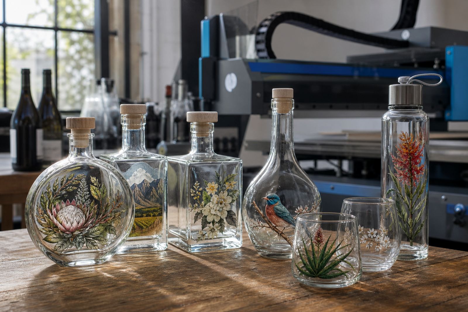
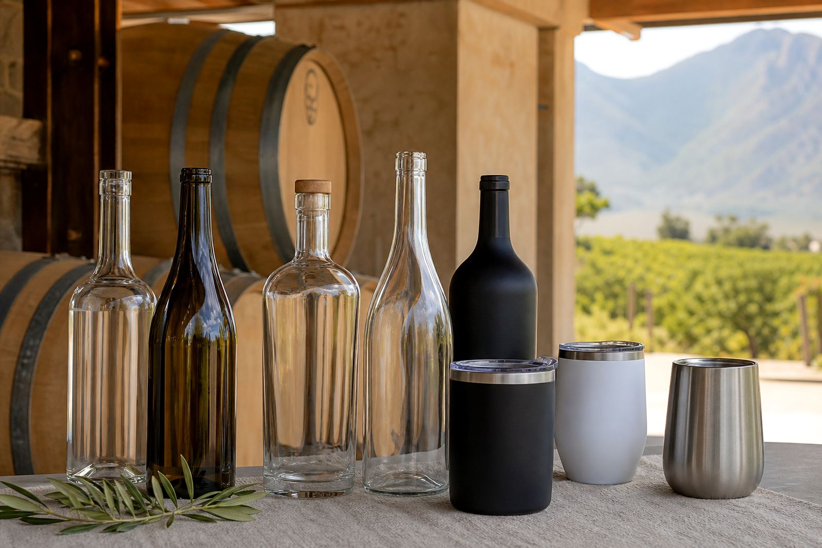
Picking the right bottle or tumbler for the job
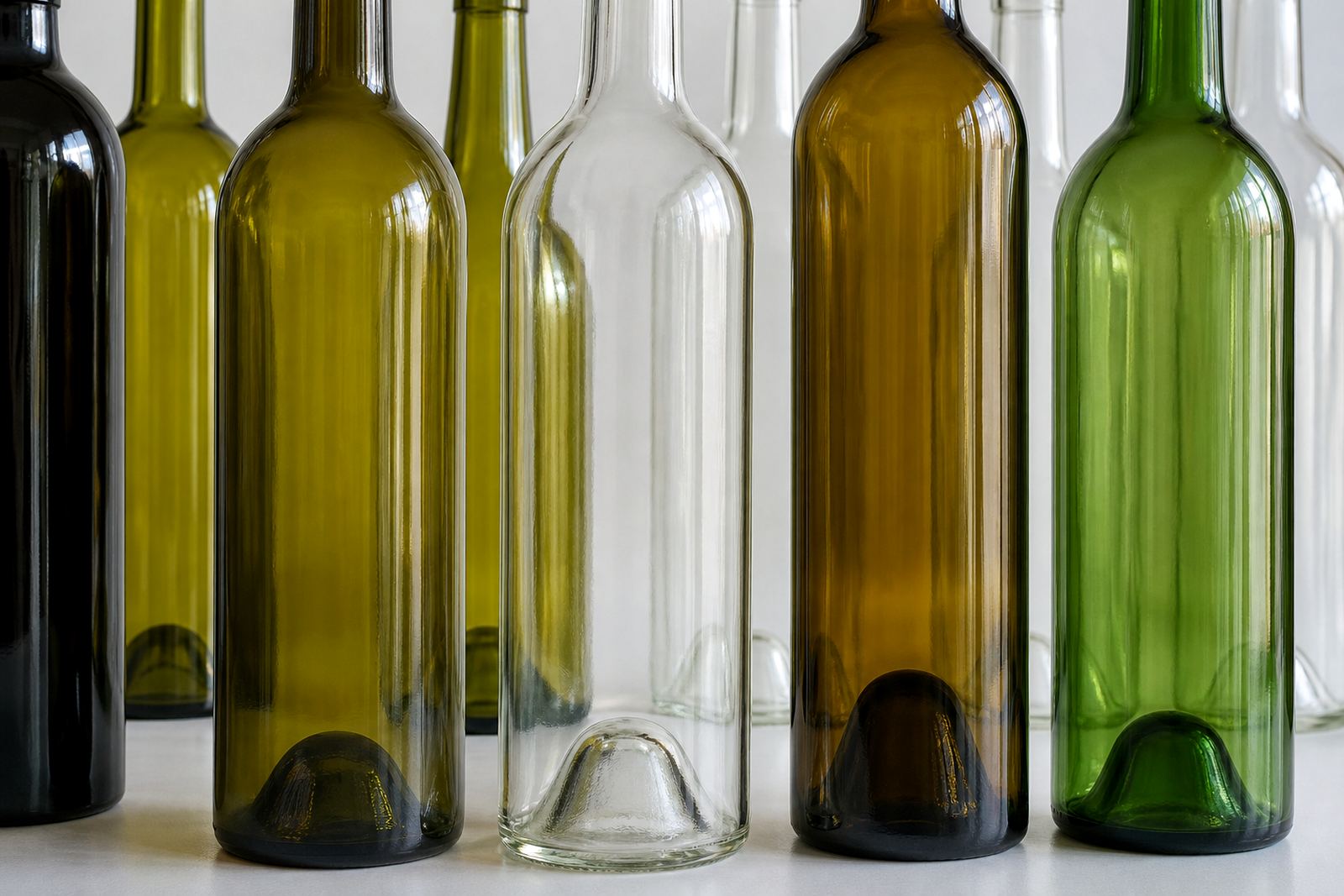
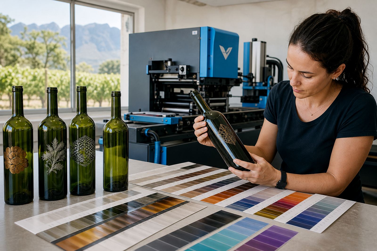
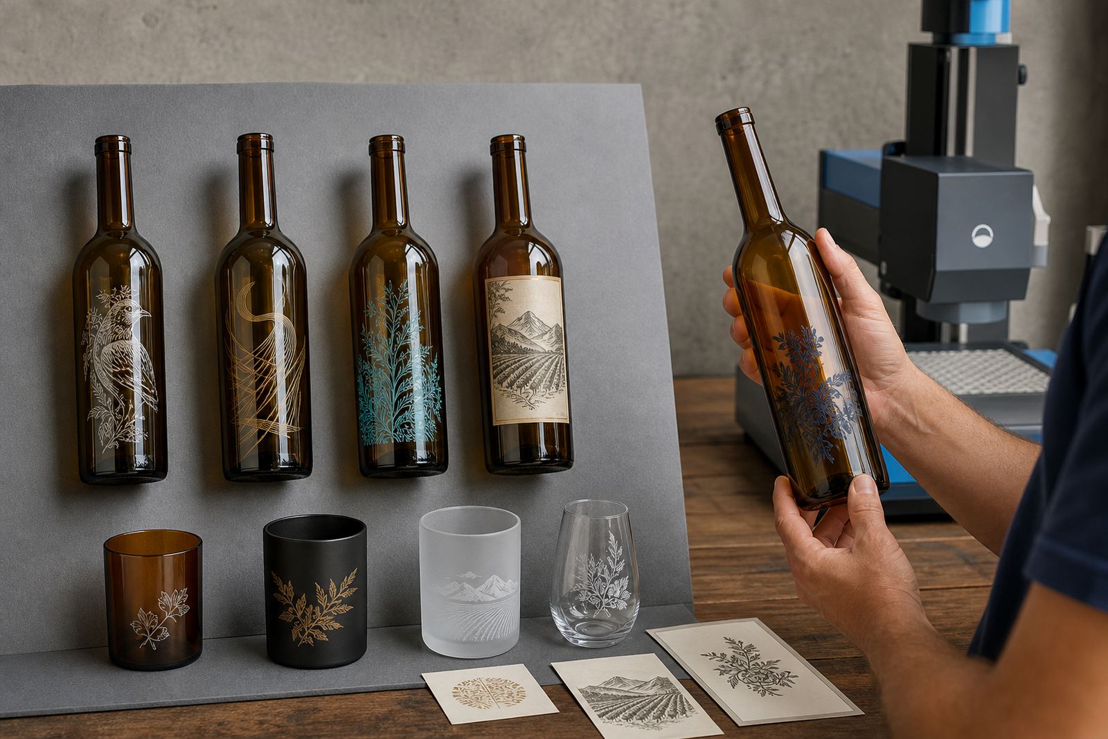
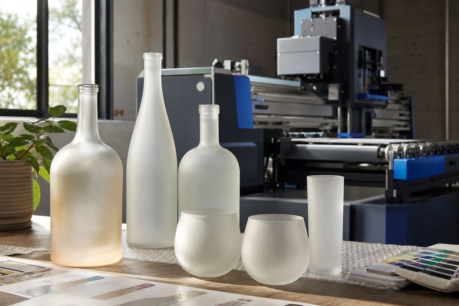
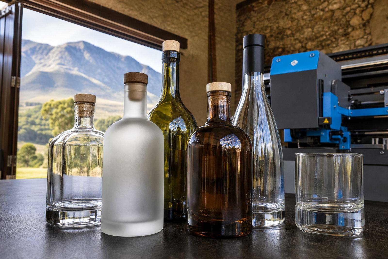
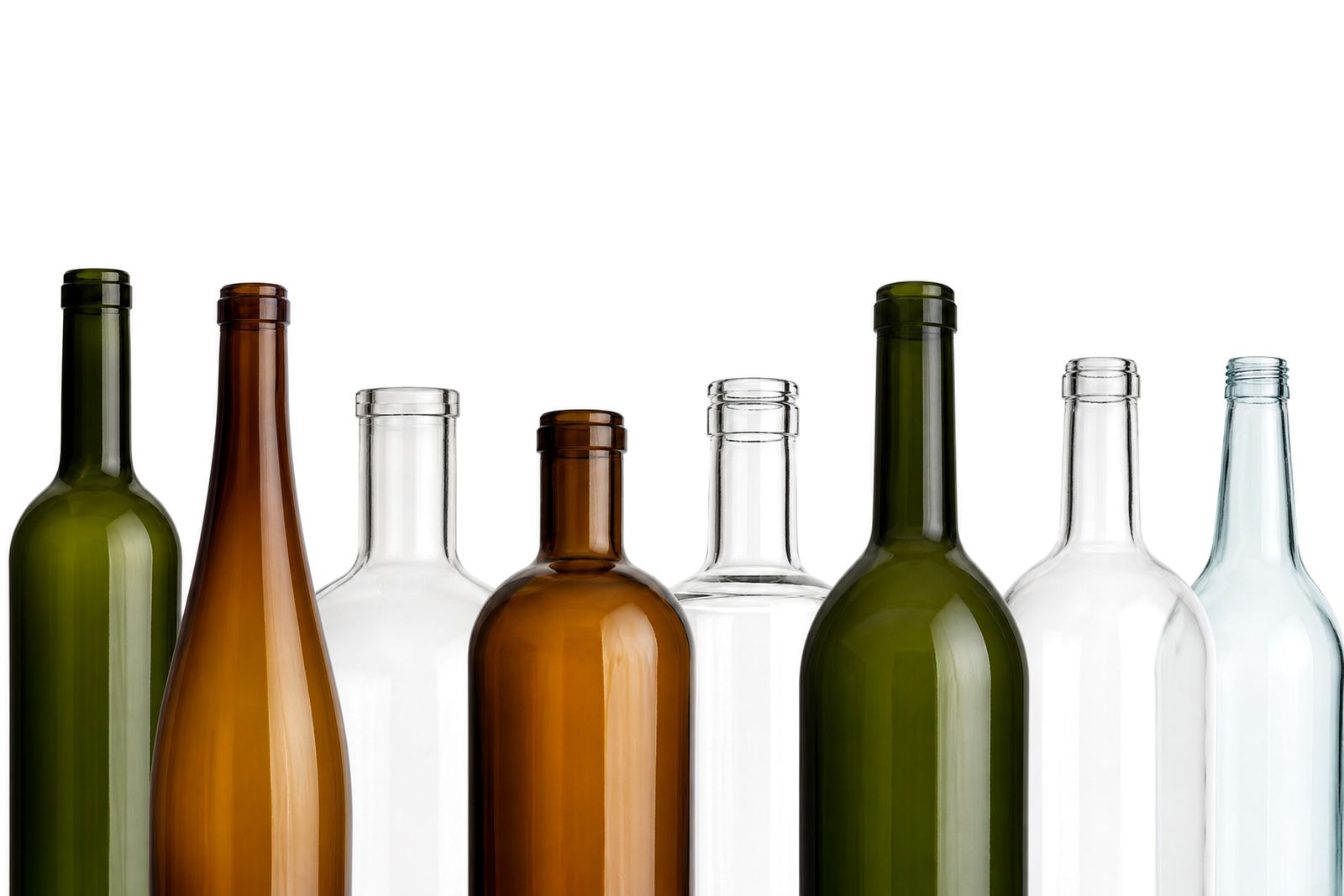
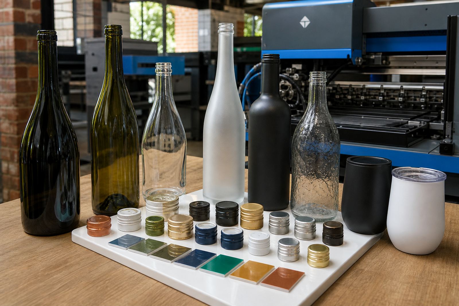
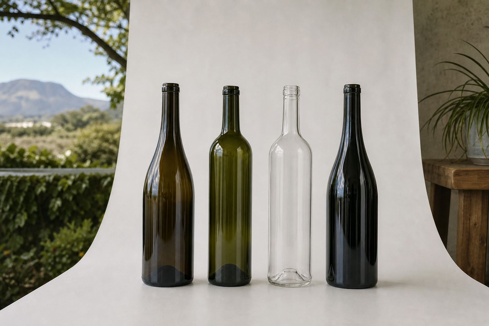
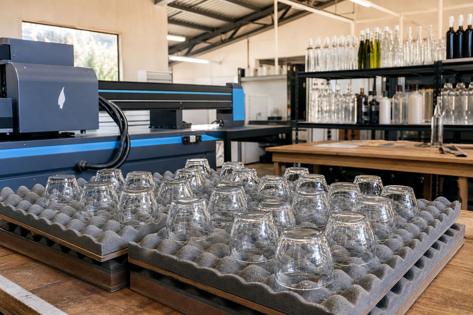
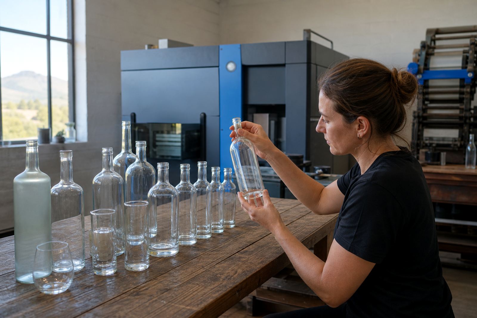
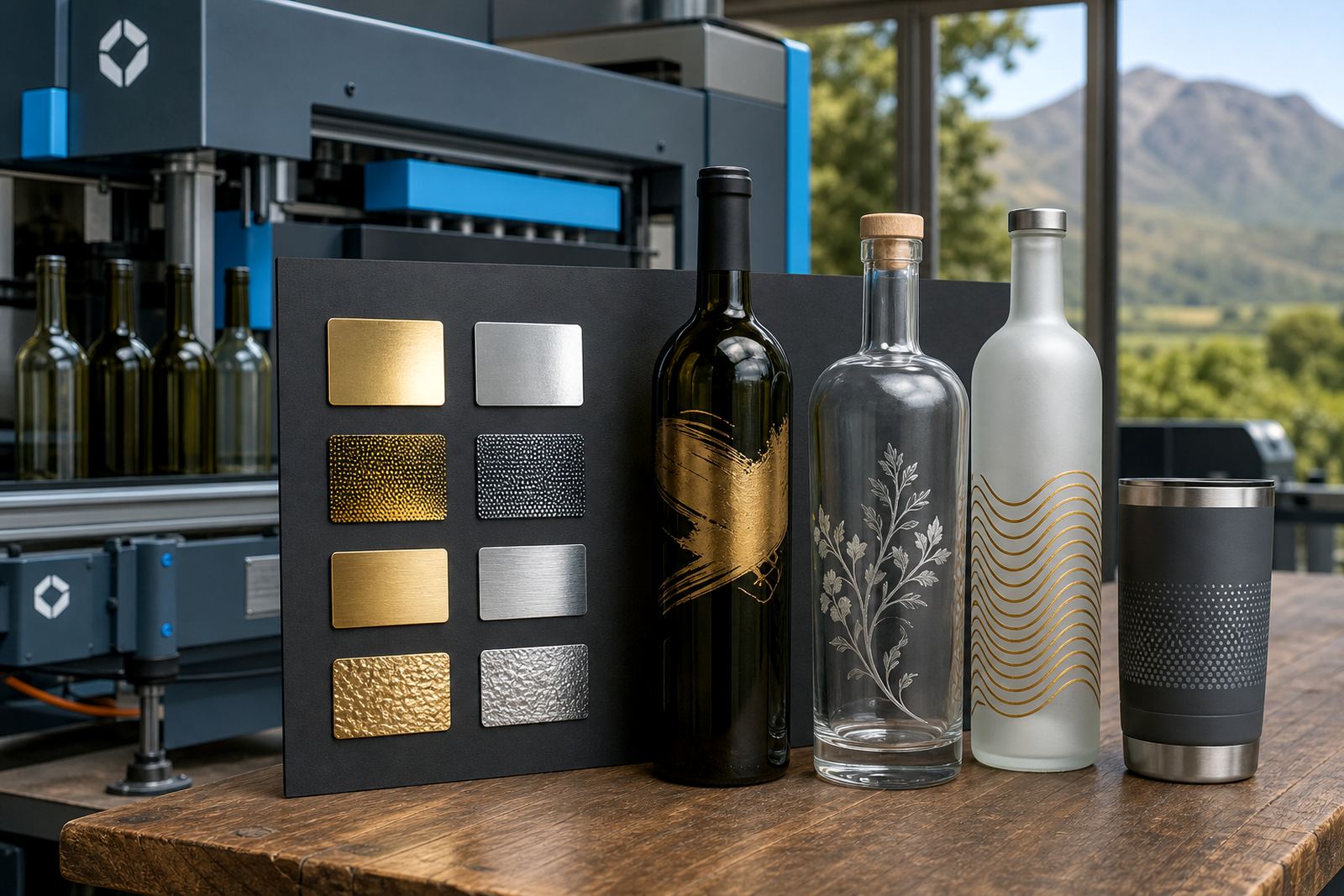
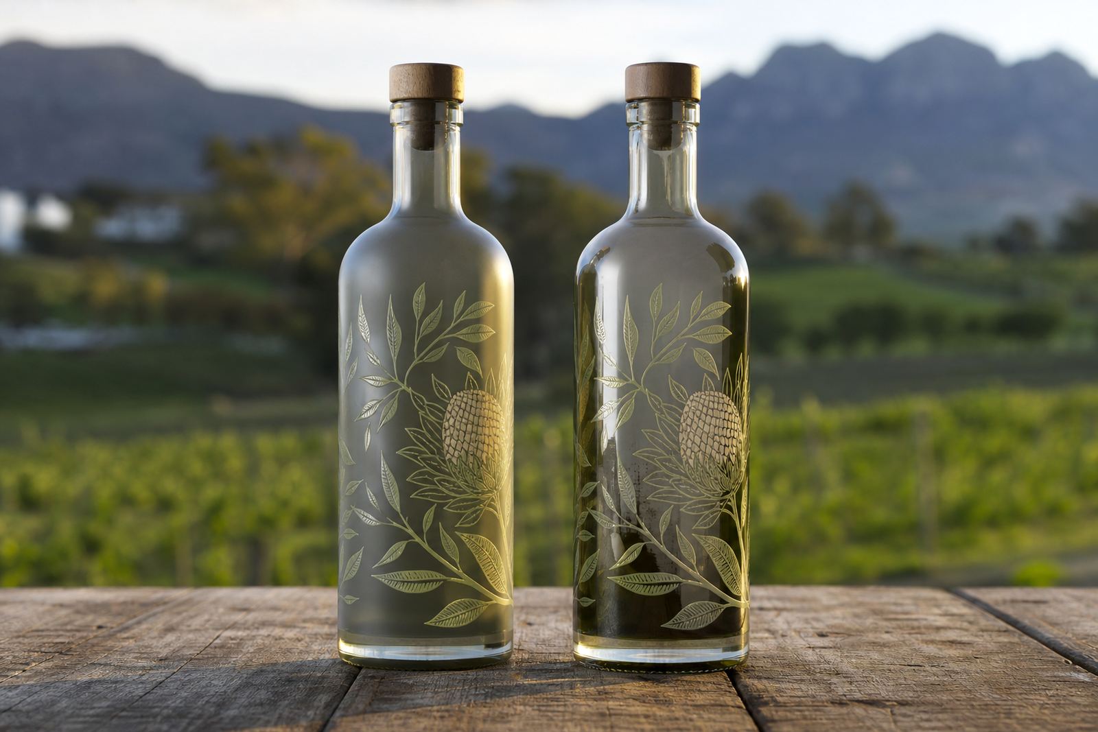
Choosing the bottle or tumbler carries the same weight as the artwork. Clear glass, frosted glass, coloured glass and coated drinkware each take print a little differently, so the finish should match the product and the setting it will be used in. A wine bottle for gifting needs a different treatment from a short gin bottle for shelf display or a water bottle for events and conferences.
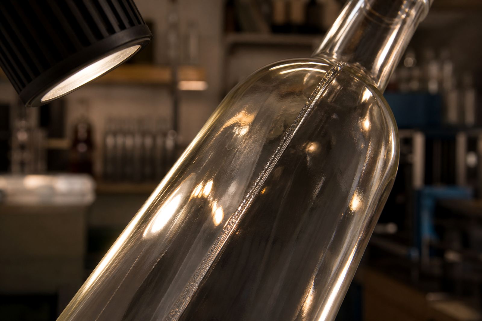
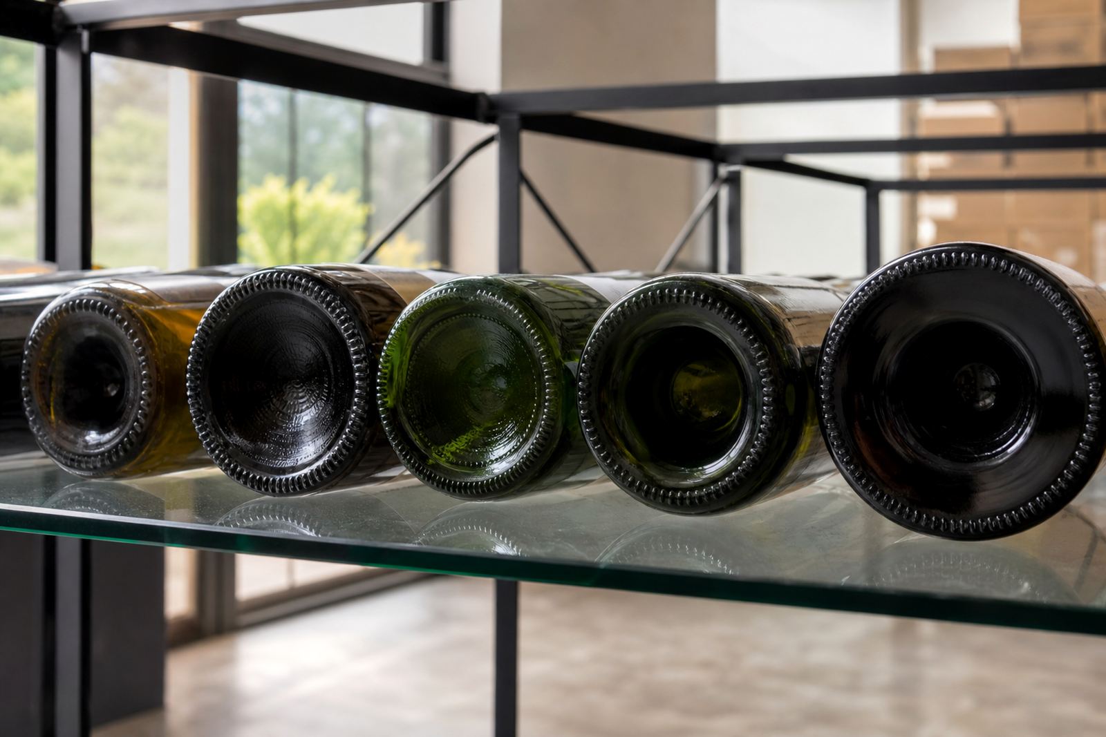
Shape also changes the result. Straight-sided bottles give more room for labels or direct print, while shoulders, curves and embossing can limit the print area. Narrow necks and deep bases affect handling during production and also how a label sits once the bottle is filled.
- Clear glass suits bright print and fine artwork.
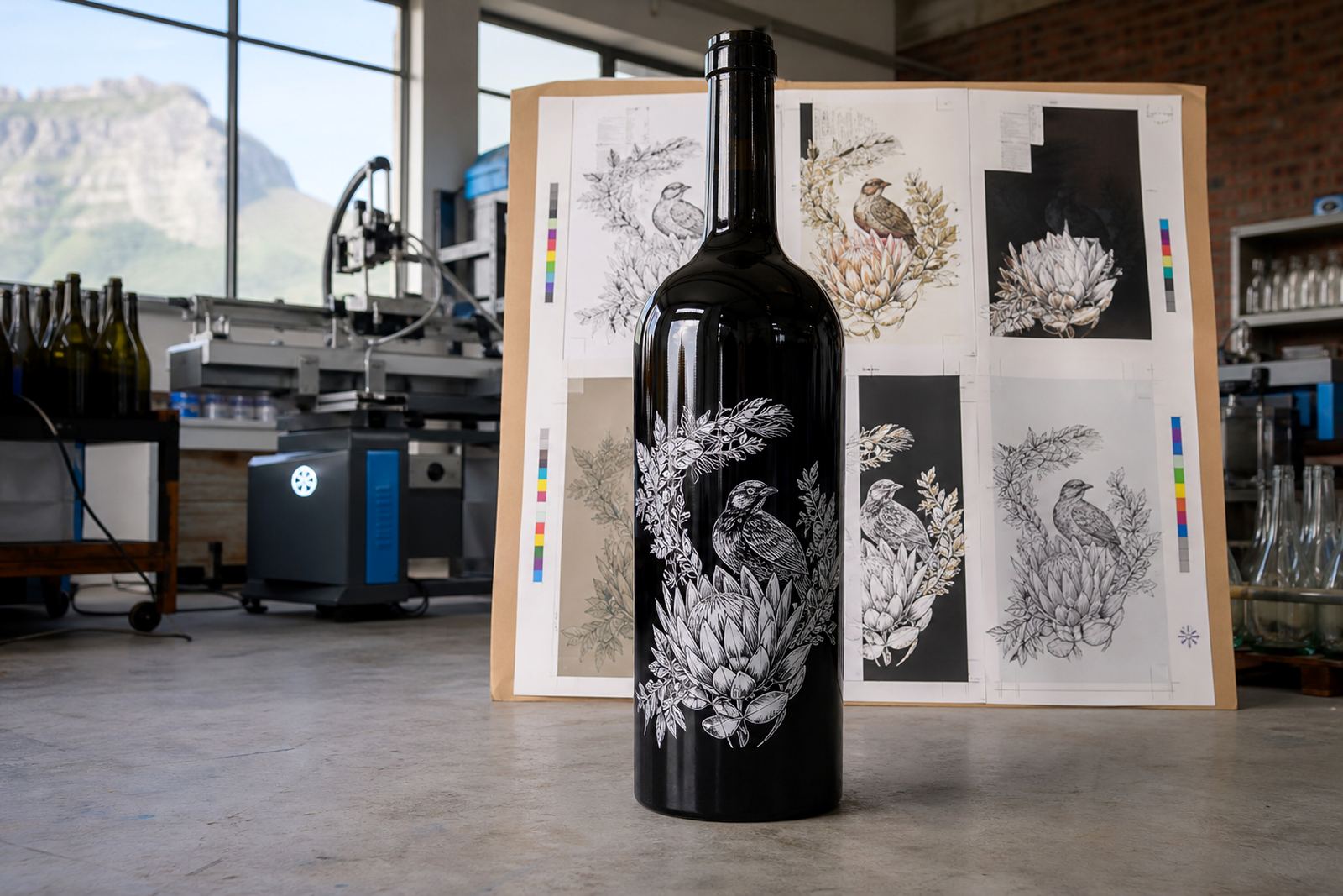
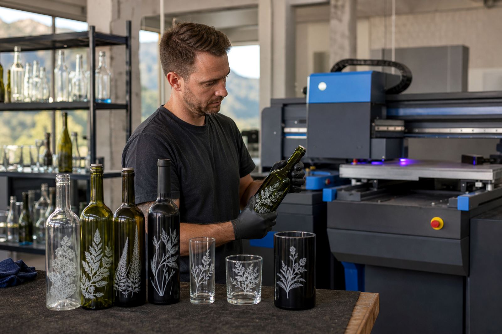
- Dark glass can mute colour, so white ink layers may help.
- Curved bottles need careful placement around the body.
- Drinkware with smooth panels usually gives the cleanest finish.
Direct print, screen print and ceramic enamel
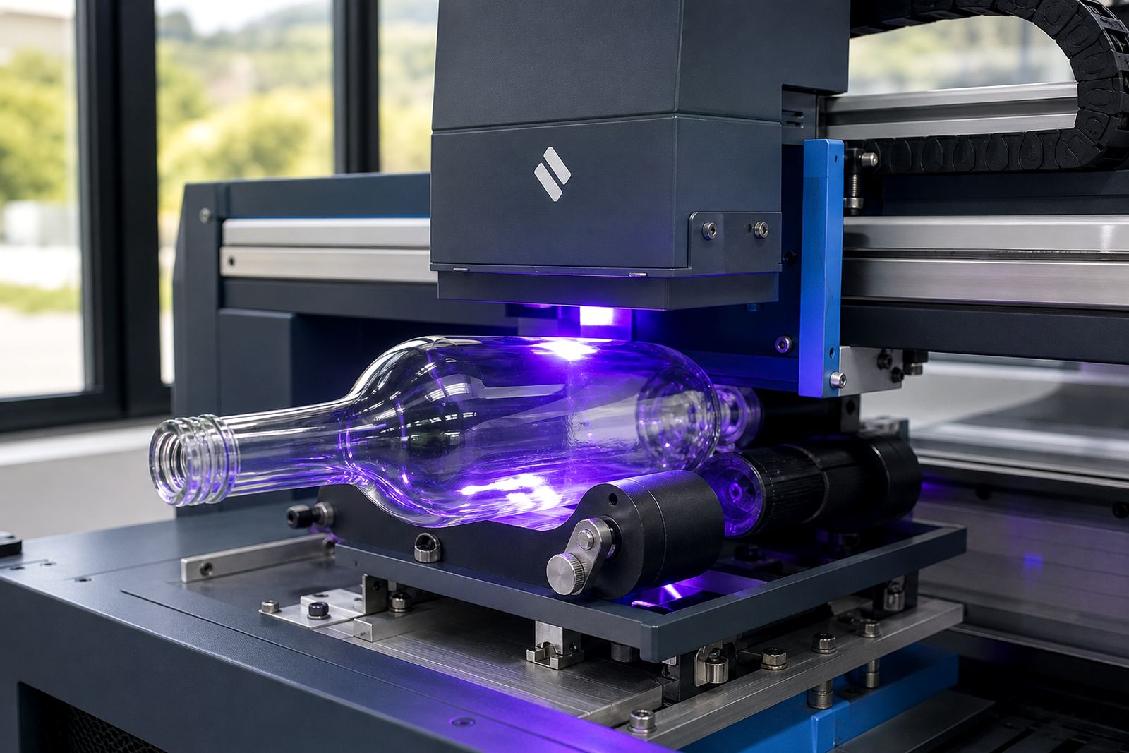
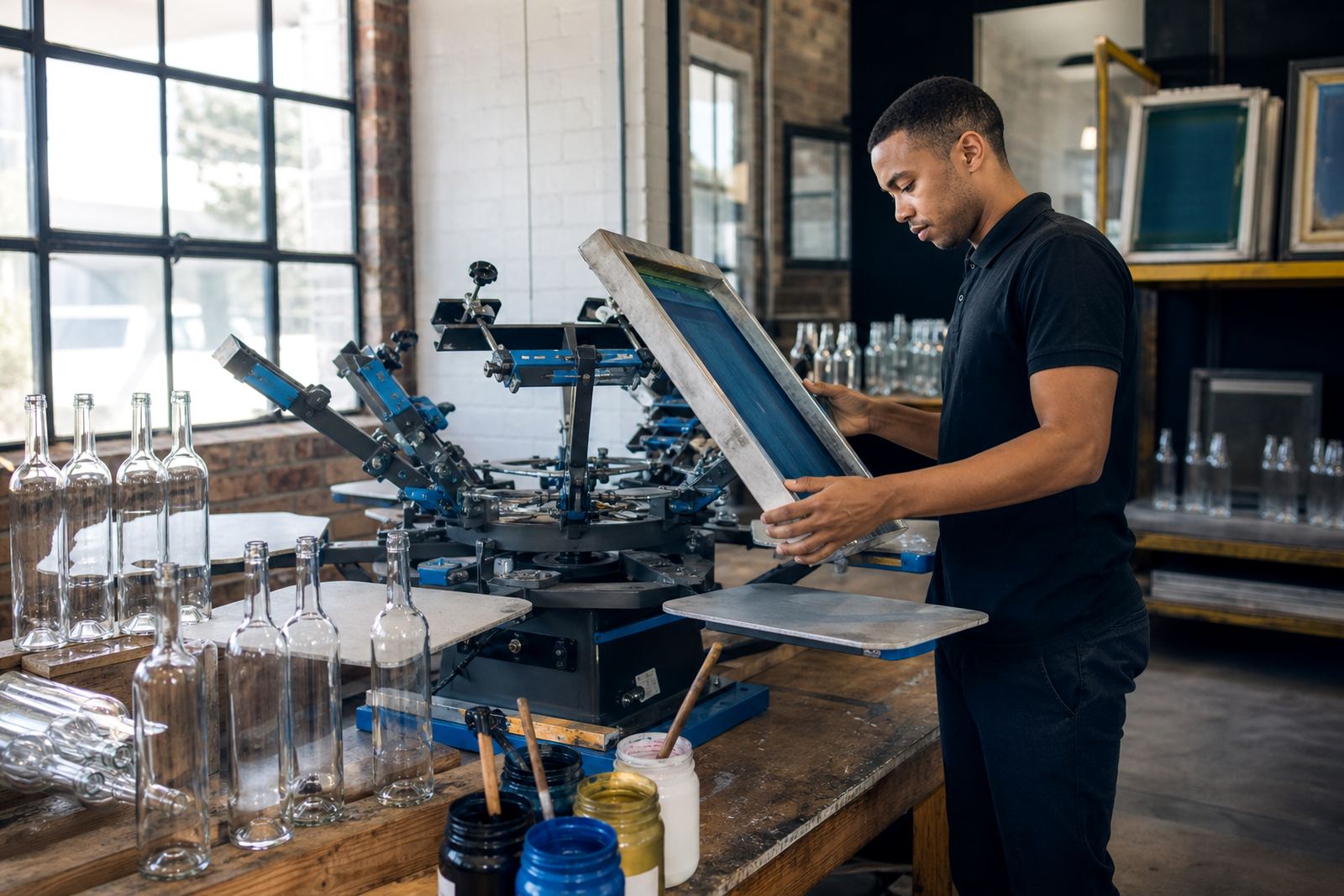
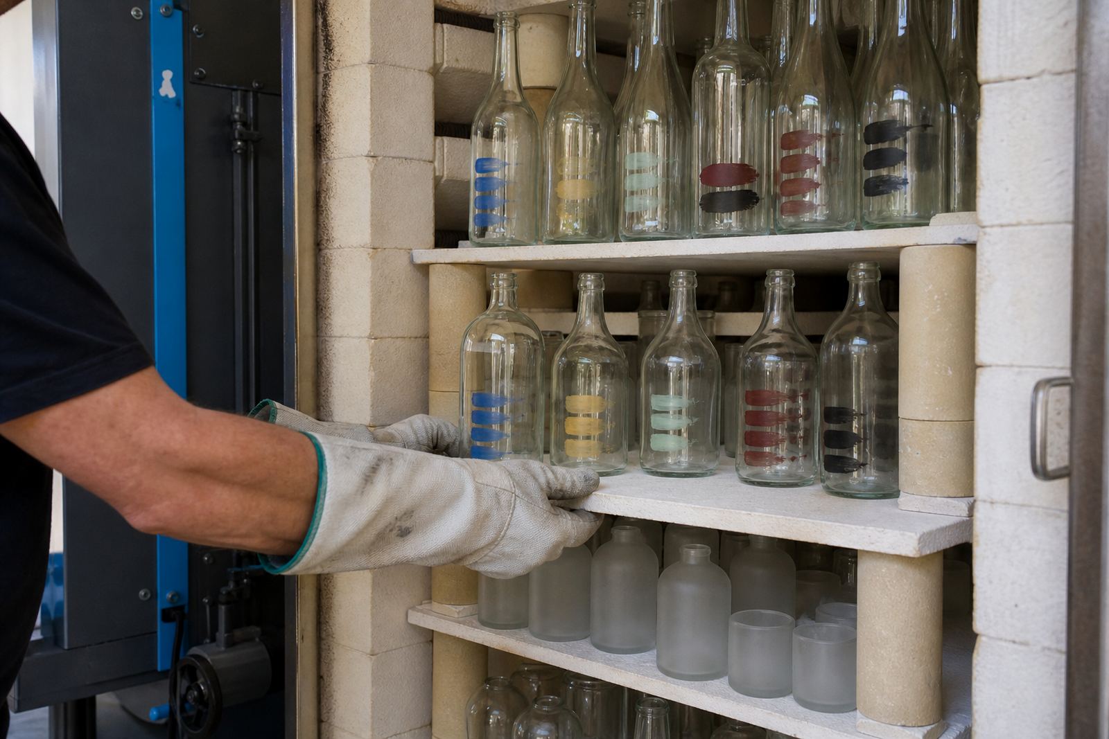
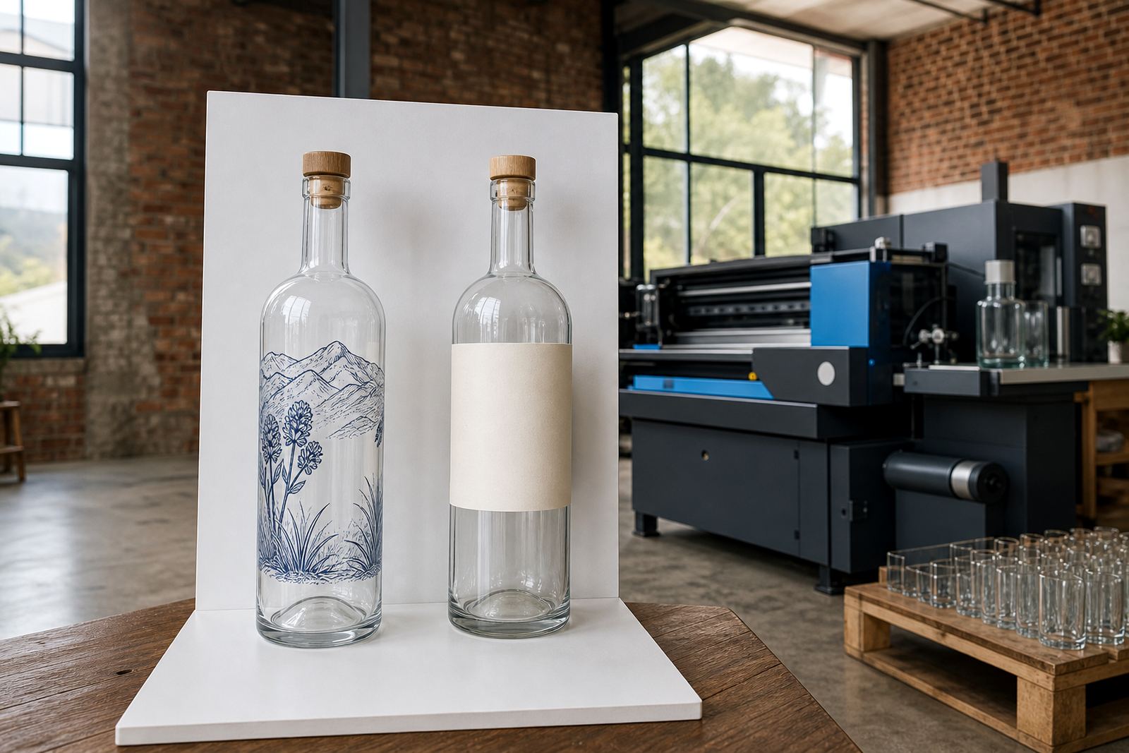
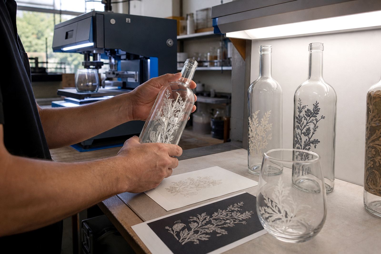
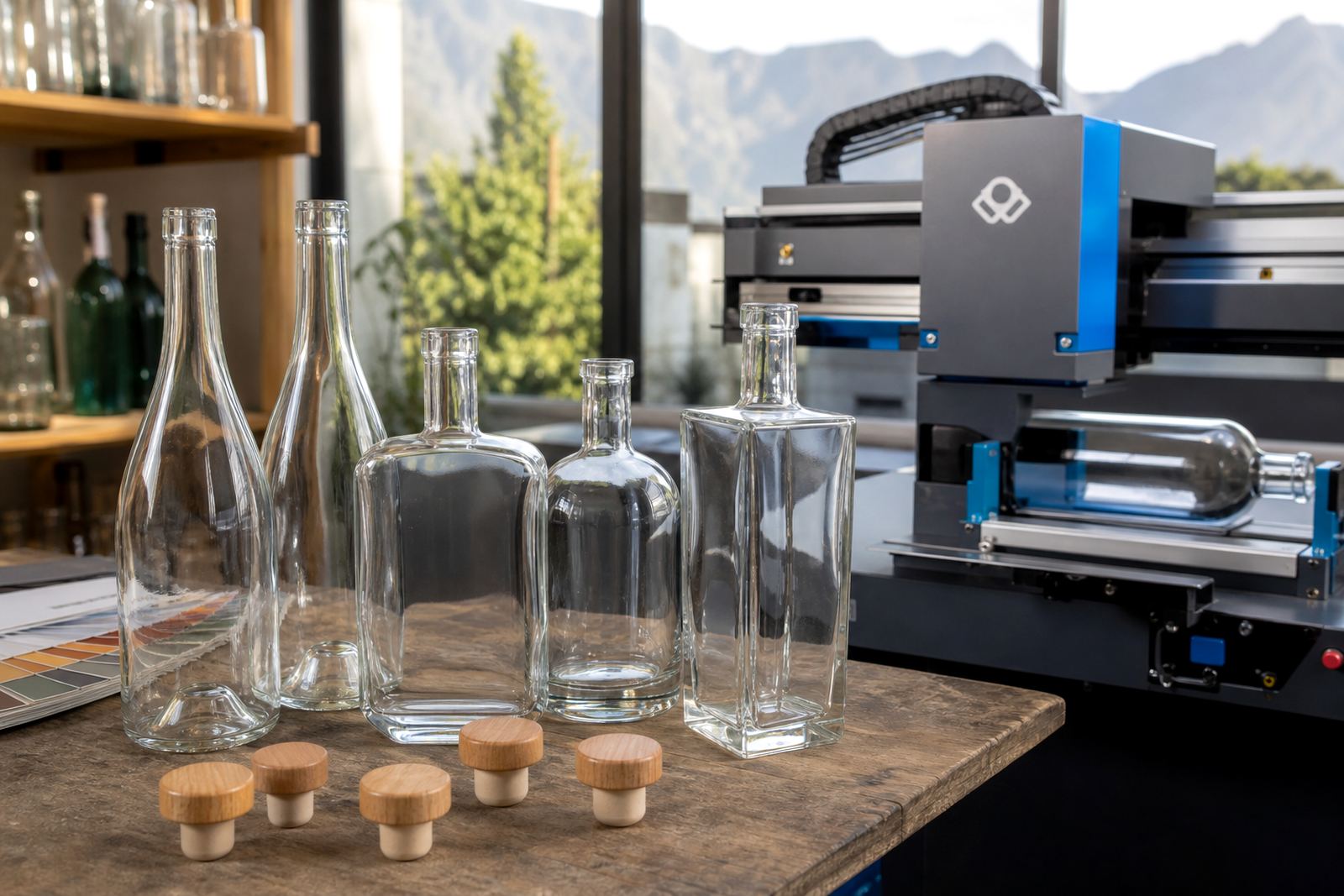
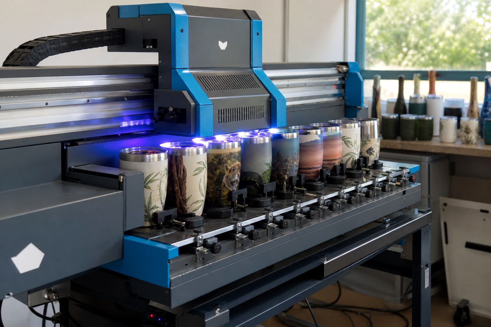
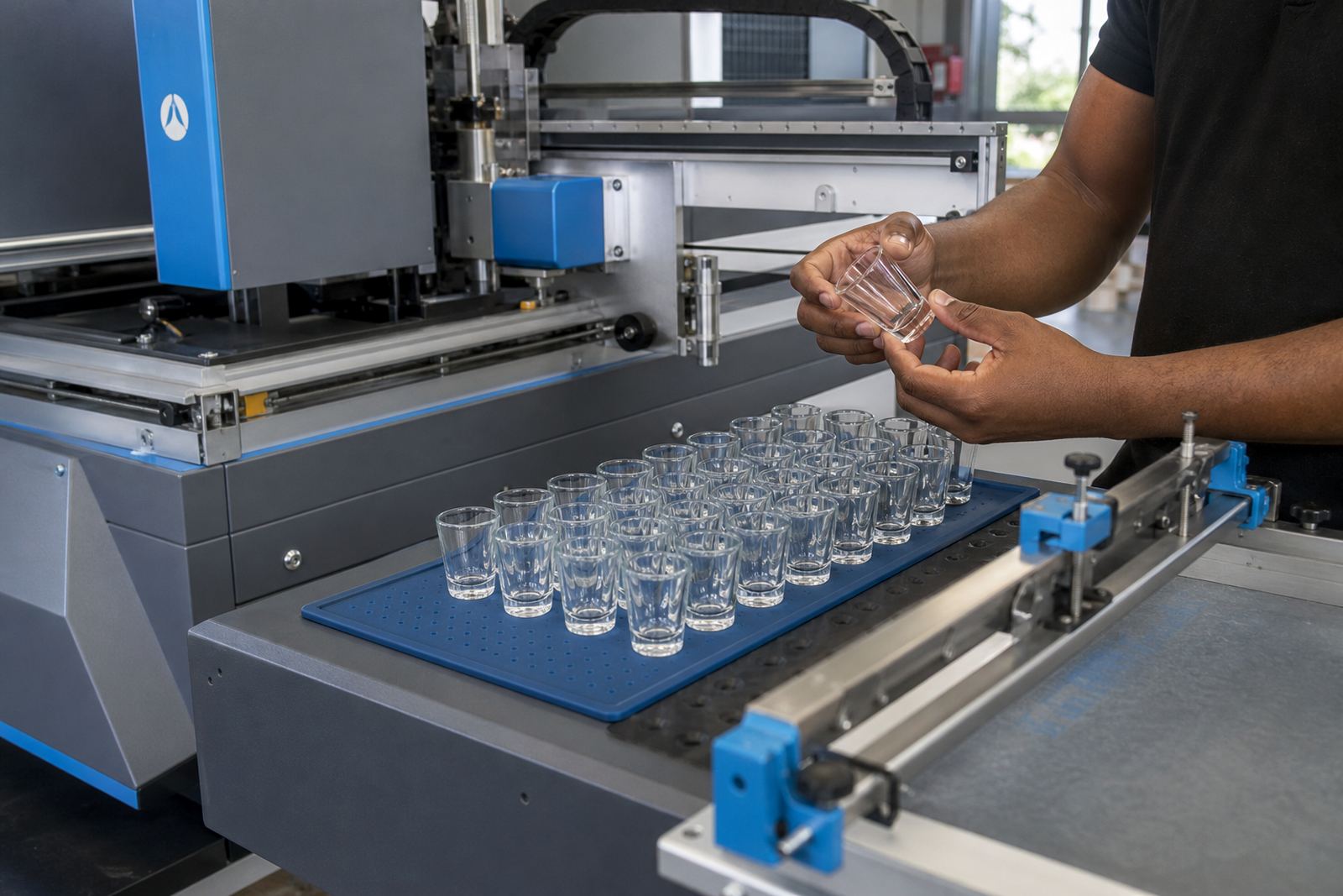
UV direct print places artwork straight onto the glass or drinkware surface and is useful for detailed logos, small batches and mixed artwork. Screen printing suits solid colour blocks and clean repeat runs, especially where the same artwork is used across a set of bottles. Ceramic enamel is chosen when a fired finish is needed on glass that must hold up under regular handling.
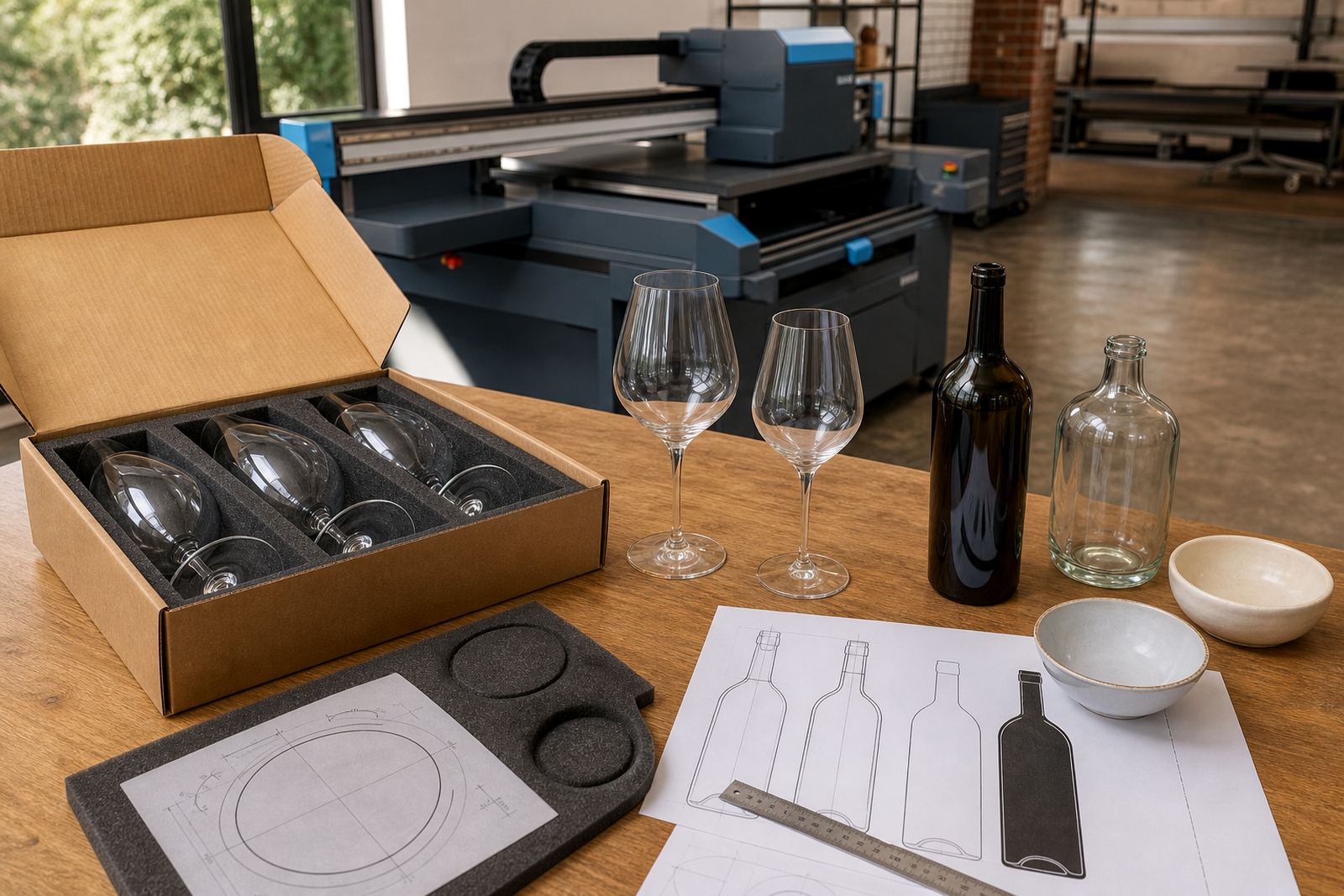
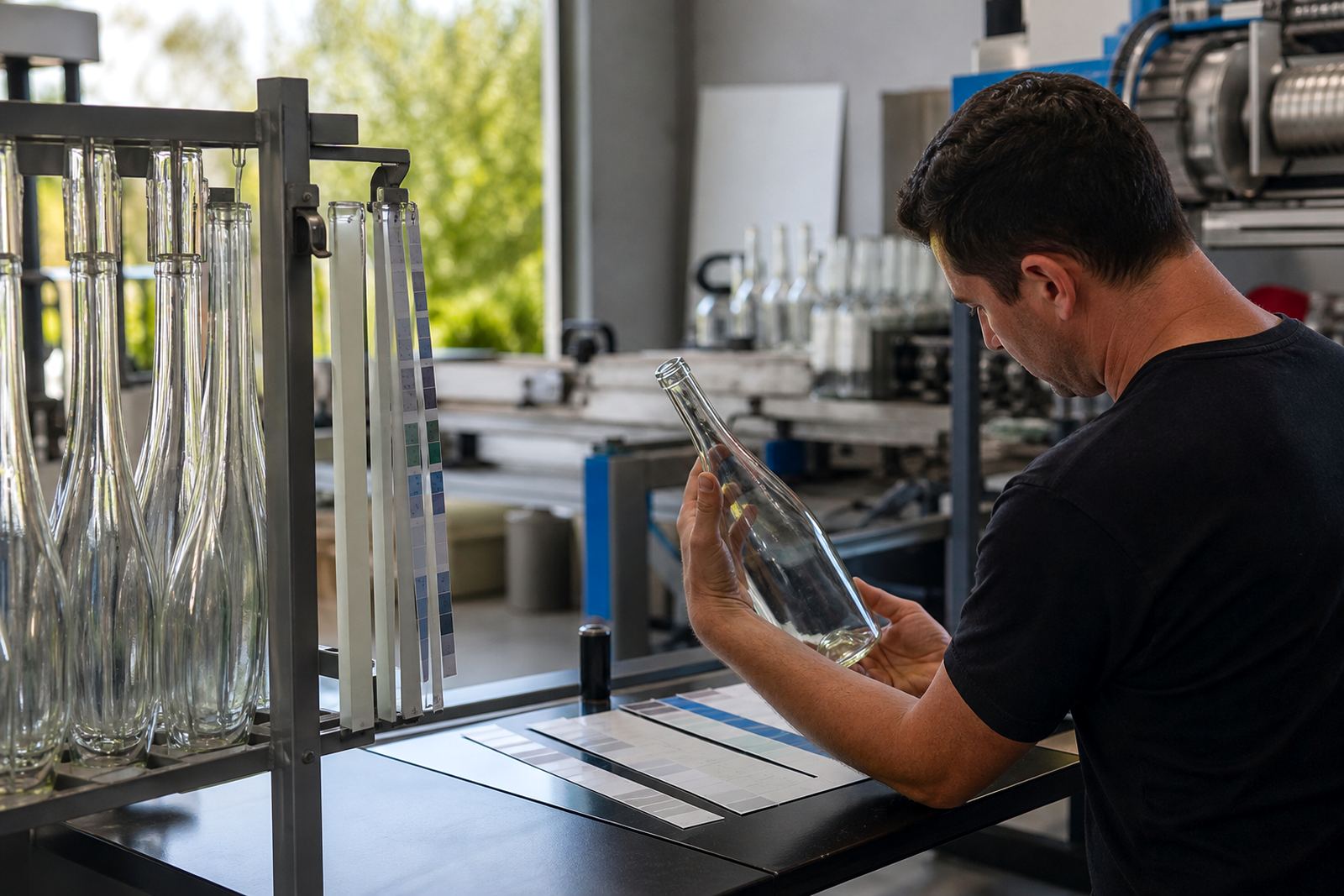
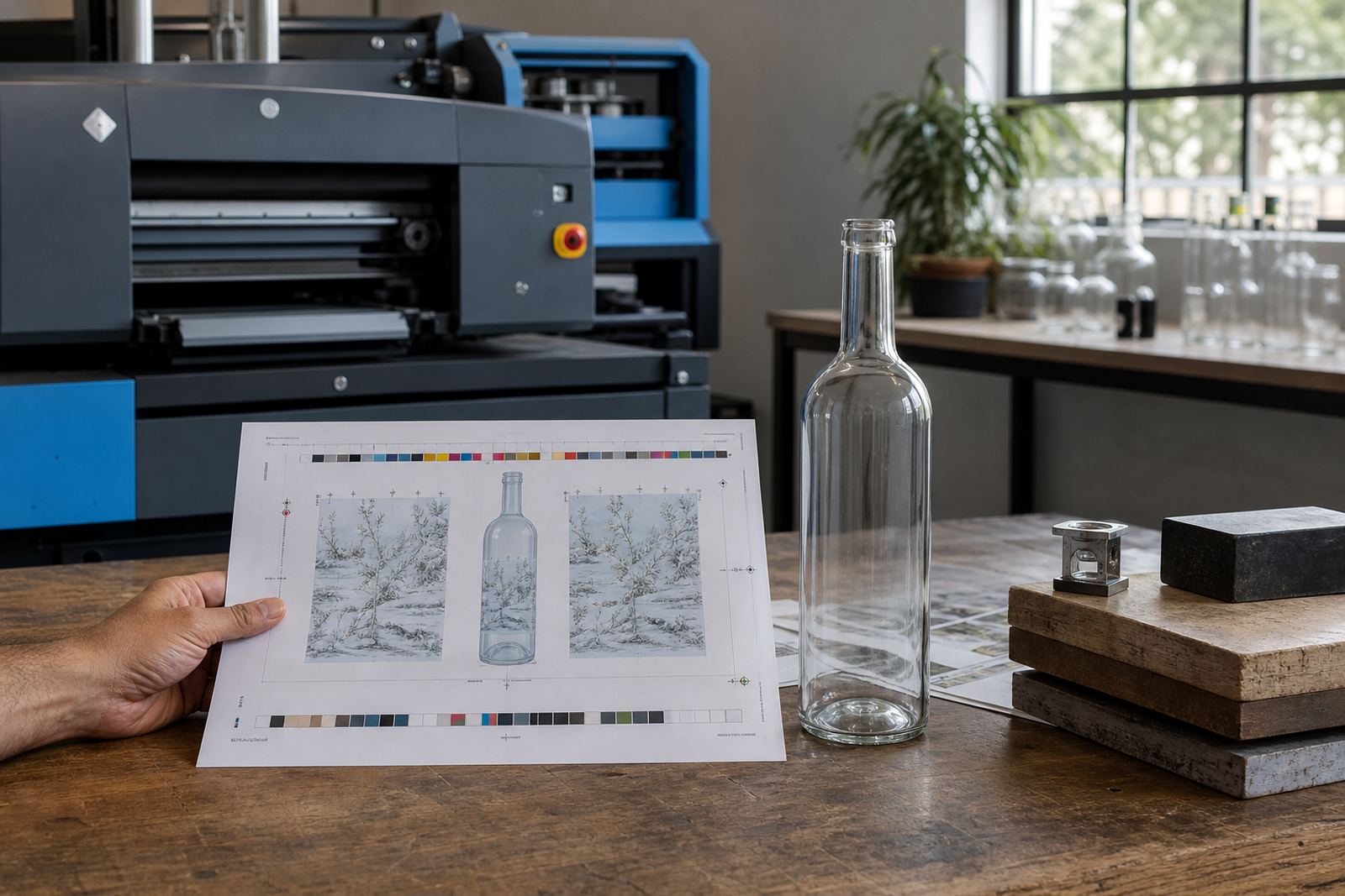
Each method has its own limits on texture, colour count and line thickness. Fine type, thin rules and tiny symbols need checking before the job moves ahead. A proof should show where the print sits, how much wrap is possible, and whether the artwork needs adjustment for the selected container.
- UV direct print handles detail well.
- Screen printing suits bold, even areas of colour.
- Ceramic enamel needs proper setup before firing.
- White ink layers help artwork stay visible on darker surfaces.
Labels when the bottle needs more flexibility
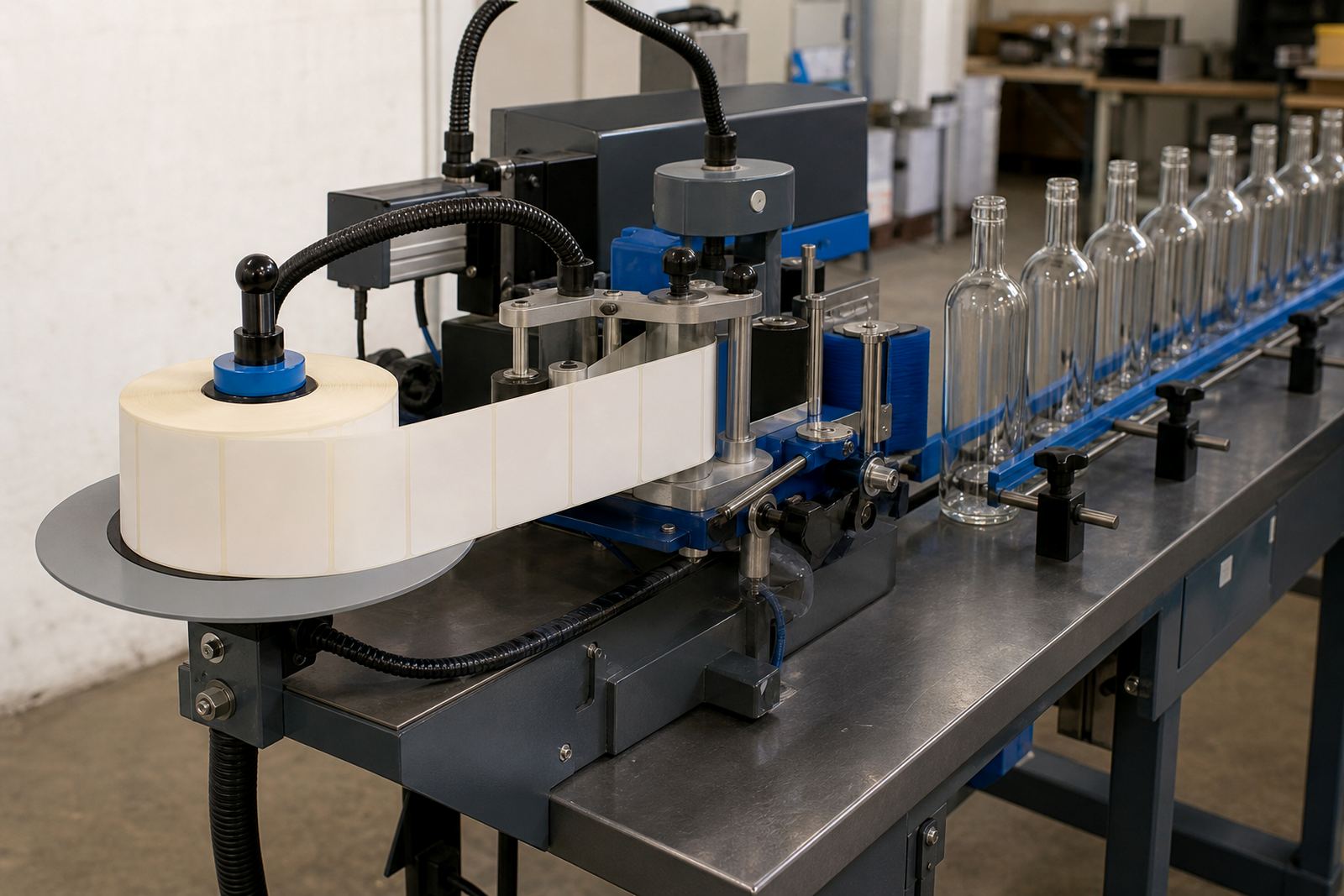
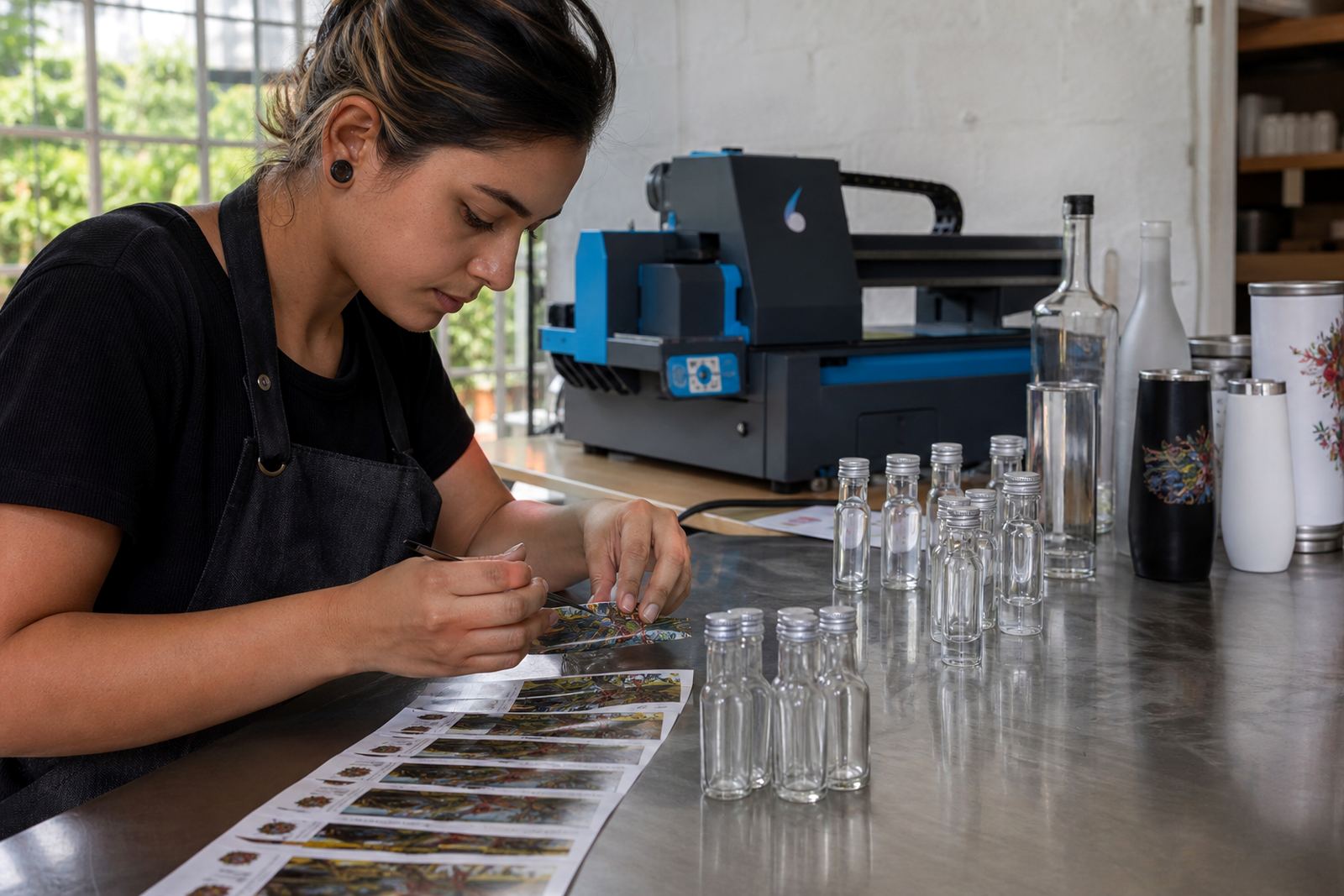
Labels are useful when the bottle shape is tricky, the run is short, or the branding needs ingredients, legal text or event details alongside the logo. They can be matte, gloss or textured, and they can wrap partly around a bottle or sit as a front label only. For water bottles and corporate gifts, labels often give the widest room for information.
Artwork setup matters here too. The label size has to match the panel on the bottle, and the adhesive choice should suit the surface and the way the bottles will be packed. For chilled drinks or coastal deliveries, moisture resistance becomes part of the brief.
- Labels help when direct print space is limited.
- They suit short-run seasonal work.
- They can carry more text than direct print.
- They need careful sizing around curves and seams.
Proofs, mock-ups and print-area planning
Before a run starts, the artwork should be checked against the real bottle or tumbler, not only against the artwork file. A proof shows colour placement, logo scale, white ink use and the printable zone. Mock-up visuals are useful when the design has to sit between embossing, a neck curve or a heavy base.
Print-area planning saves trouble later. A logo that looks neat on screen may sit too close to the edge once wrapped around glass. Small changes to spacing, contrast or line weight can make the finished piece cleaner and easier to read.
- Check logo size against the actual bottle profile.
- Confirm where the front panel begins and ends.
- Adjust colour contrast for clear or dark glass.
- Approve the proof before production starts.
Minimum runs for short batches and mixed orders
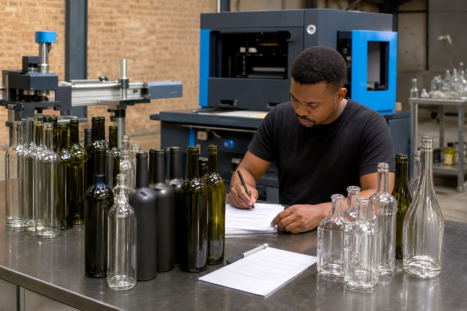
Short runs are common for tasting-room stock, private labels, launch gifts and event pieces. Minimum quantities can change with the method, the number of colours and whether the job includes several bottle types or drinkware shapes. A small batch of one item is not always the most workable option if the print setup needs separate screens or specialist prep.
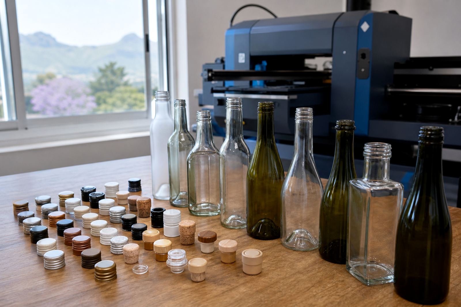
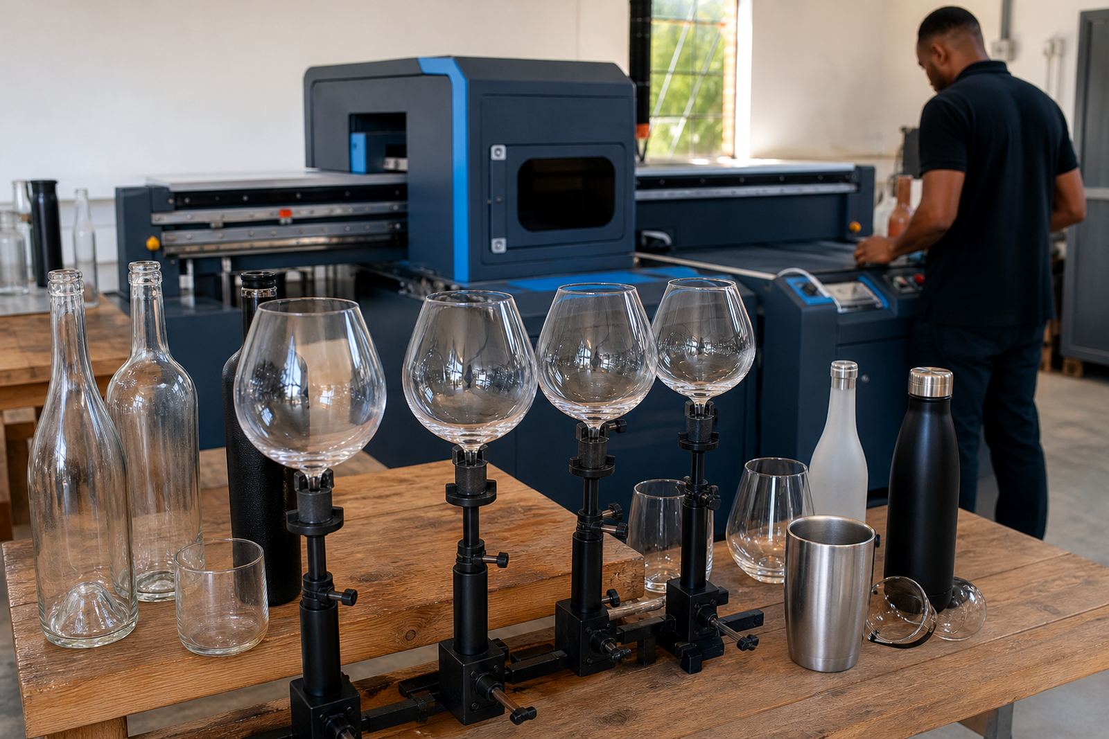
Mixed orders need more planning. Wine bottles, gin bottles, water bottles and tumblers may all use different print areas or finishing steps. That is where minimum run advice matters, along with packing briefs for cartons, crates or gift sets.
- One artwork file may not suit every container.
- Different decoration methods carry different setup needs.
- Short runs still need proper colour checks.
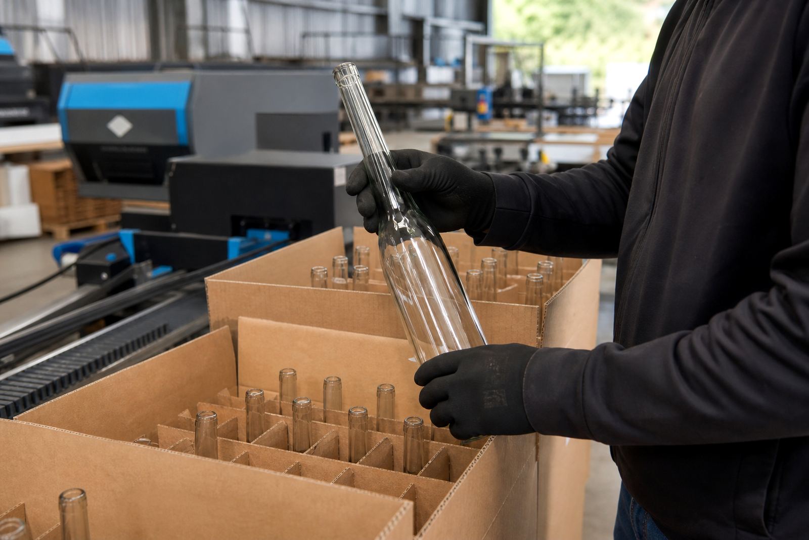
- Packing should match the final destination and handling.
Paarl production notes for South African deliveries
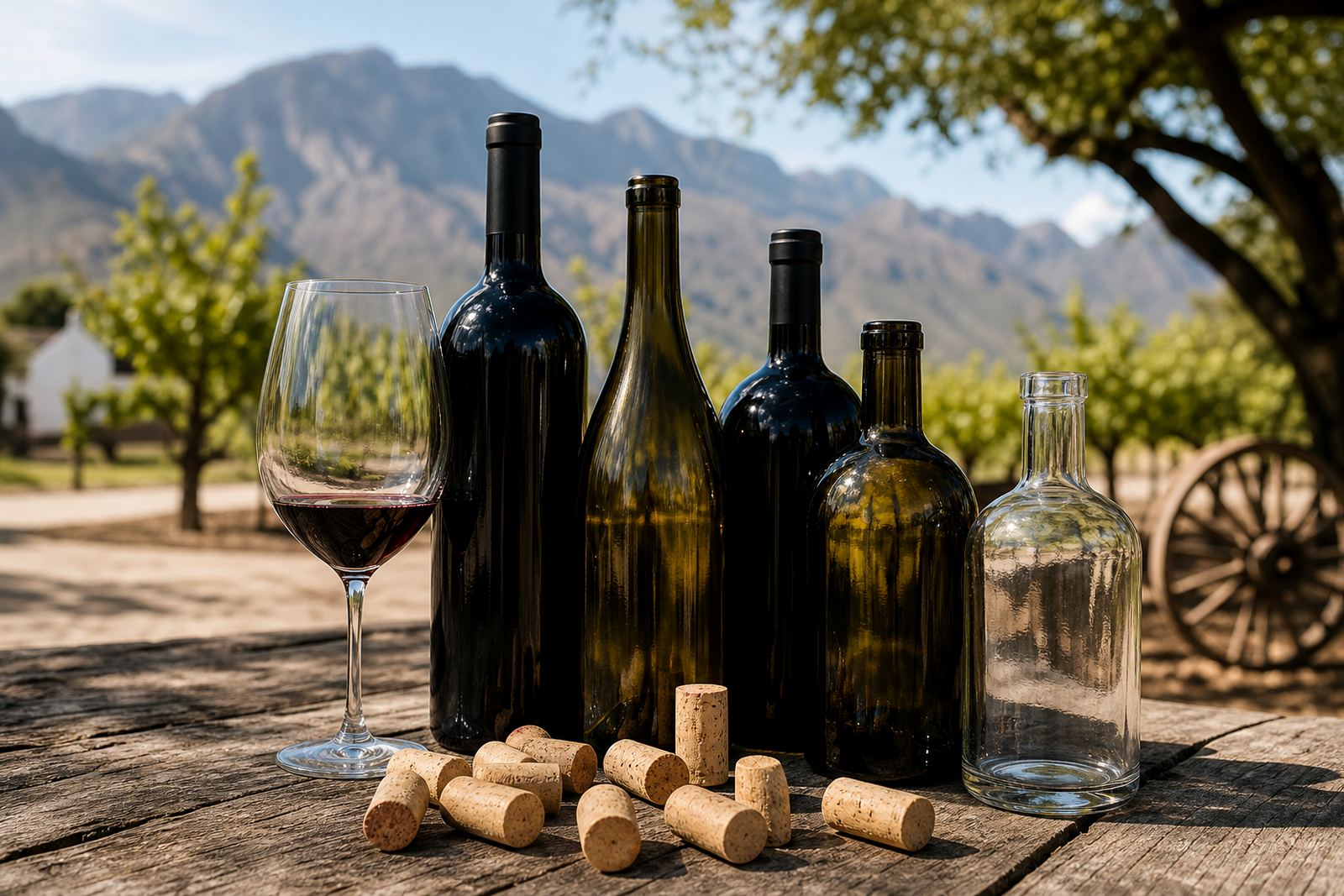
From Paarl in the Cape Winelands, the work often moves between tasting rooms, gifting briefs and event deadlines. Bottle decoration must travel well, so the finish, packing and carton layout matter when items are heading to Cape Town, Stellenbosch, Franschhoek, Johannesburg or Durban. Coastal humidity can affect labels and packed stock, especially where bottles are stored before dispatch.
A brief usually includes bottle type, artwork, quantity and any deadline linked to a launch or function. That keeps the job practical from the start and gives the print process enough detail to be planned properly.