When Clear Glass Gives the Artwork More Work
Clear glass suits wine bottles, gin bottles, still water bottles and glass drinkware because it lets the product itself stay visible. That can work well for premium gifting and event pieces, but the decoration has to be planned with the glass in mind. A pale logo on its own can disappear against the liquid or the table behind it, so the print has to be built to hold its own.
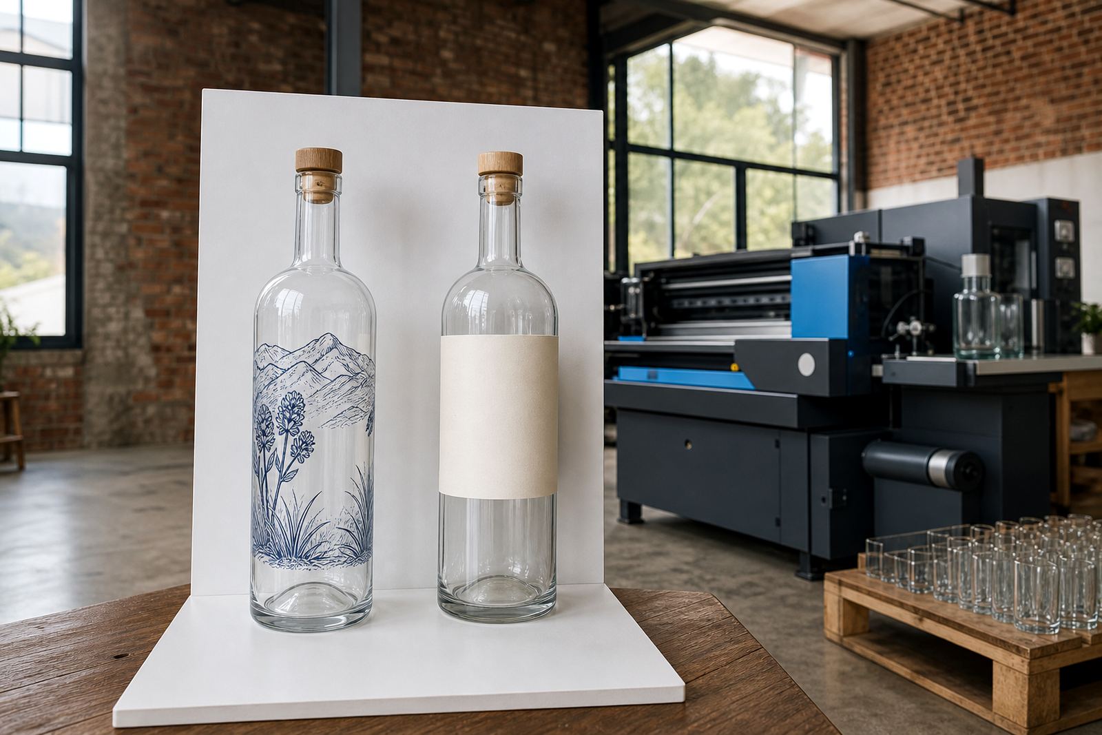
On clear glass, the artwork often needs a stronger base than people expect. White ink, a solid label panel or a darker keyline can help the design stand out without turning the bottle heavy or crowded. The aim is not to cover the glass, it is to make the branding readable from a short distance and still tidy in the hand.
For short runs, this matters even more. A small batch for a tasting, launch dinner or corporate gift set leaves less room for trial and error. The artwork has to suit the bottle shape, the neck curve and the fill level, especially when the same bottle must work for both shelf display and photos.
Methods That Hold Their Shape on Transparent Bottles
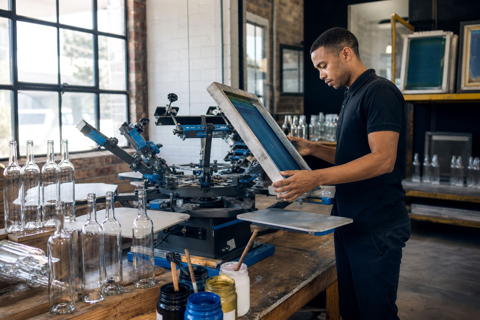
Clear glass can be decorated in a few ways, and each method suits a different finish. UV direct printing works well for sharper artwork, compact logos and short production runs where detail matters. Screen printing is often used when a strong colour block or a consistent repeated mark is needed. Ceramic enamel is a firmer option for bottles that need a more durable fired finish. Labels remain useful when the design needs more space, more colour depth, or a textured look.
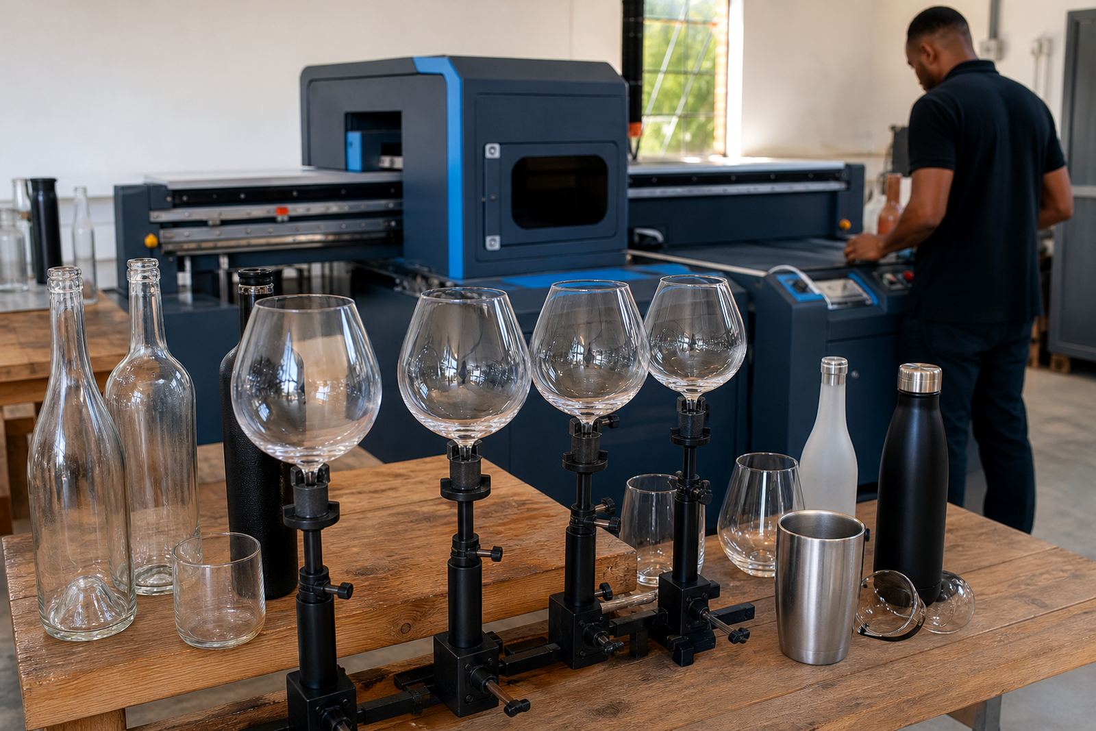
The choice depends on the bottle style and the result you want. A slim wine bottle may need a different treatment from a heavyweight gin bottle, and a straight-sided water bottle can handle artwork differently again. Glassware such as tumblers, stemless glasses and tasting glasses also calls for its own layout because the curve changes how the print sits.
- UV direct print is suited to fine detail and shorter runs.
- Screen printing is useful for solid colour areas and repeat consistency.
- Ceramic enamel gives a fired finish for glass that needs more permanence.
- Labels help when the artwork needs more room or layered colour.
White Ink Is Not a Detail You Leave for Later
White ink often makes the difference between a print that reads clearly and one that feels washed out. On clear glass, light colours can lose strength fast. Yellow, pale blue, blush tones and soft metallic effects may all need a white underlayer to stop them blending into the bottle or the liquid behind it.
That underlayer has to be placed with care. Too much white and the design can look flat. Too little and the colour disappears in practical light, which is not ideal for cellar counters, tasting rooms or event tables where lighting changes through the day. The artwork should be checked with the bottle outline, not just as a flat file on screen.
We often use white ink as a design layer, placed to support the artwork properly instead of being added later as a technical fix. If the logo has a pale crest, fine linework or small text, the support layer needs to follow that structure. Without it, the final bottle can look thinner than the proof suggested, and that is where the trouble starts.
Artwork Checks for a Bottle That Has to Read Cleanly
Artwork for clear glass should be checked for line weight, spacing and colour contrast before any production work starts. Thin serif type, tiny legal lines and pale gradients can look elegant in a file but weak on glass. A stronger layout usually performs better, especially where the bottle is handled by staff, guests or distributors.
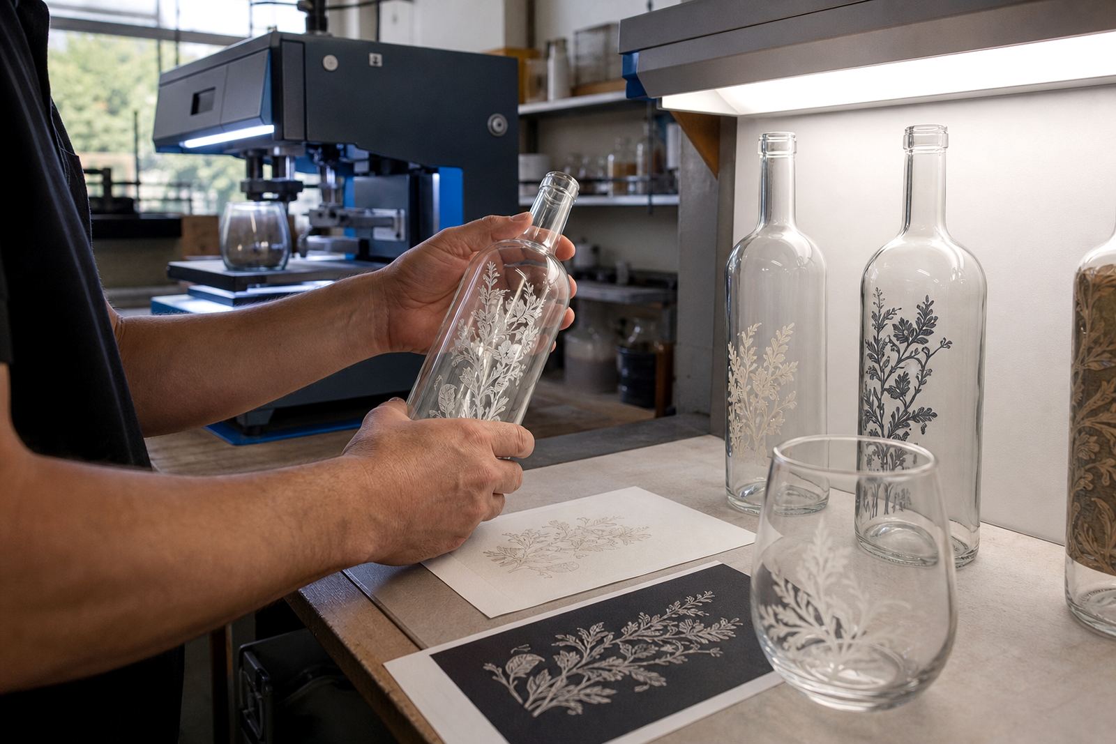
Proofs matter because they show how the decoration will sit on the actual shape. We use them to check the print area, the bottle shoulder, the neck wrap and any label margins. A clear bottle needs more precision than people expect, because a small shift can throw the whole balance off.
- Check logo size against the real bottle width, not just the artwork frame.
- Allow for the curve of the shoulder and neck.
- Use a bold weight for small wording so it stays legible at arm’s length.
- Ask for a mock-up when the bottle carries more than one element.
Short Runs for Tasting Rooms, Gifts and Event Tables
Short runs are common for clear glass because many projects are tied to a launch, season or one-off event. A winery may need branded water bottles for a tasting weekend. A distillery might want clear gin bottles for a small release. An events team may want matching drinkware for tables, hampers or sponsor packs. In each case, the print has to look finished without forcing a large minimum quantity that does not suit the brief.
Minimum runs depend on the method, bottle type and artwork complexity. Labels may allow more flexibility, while direct print methods usually need a setup that makes sense for the press and the final finish. It helps to know the quantity early, but the artwork should still be drawn with the final bottle in mind from the start.
For clear glass, the finish often carries as much weight as the message. A neat print on a transparent bottle can feel sharper and more considered than a busy design on a coated surface. That is why the planning has to hold both the look and the handling. A bottle that photographs well must also survive packing, transport and display.
A Paarl Job That Had to Stand Up in Daylight
For a recent Paarl project, the brief called for clear glass bottles that would sit on tables at a Cape Winelands function and still read properly in daylight. The first artwork draft used soft colour and fine lettering. On screen it looked tidy, but on the bottle it needed more contrast and a stronger white base to keep the logo visible against the drink and the background.
After the proof stage, the artwork was adjusted with heavier keylines and a cleaner placement on the front panel. That shift made the final bottles easier to read at a glance, especially when the tables were full and the room had mixed light. A minor adjustment ended up carrying the job from start to finish.
Clear glass is unforgiving in that way. It rewards good planning and shows up weak decisions without much mercy. Once the print area is right, though, the result can look crisp, light and well judged, which is exactly what many wineries, distilleries and event organisers are after.