The weight at the bottom changes the whole read
Heavy-base bottles are not only about thickness under the glass. The deeper punt and thicker heel change how a bottle sits, lifts and catches light, which is often the first thing a buyer notices on a counter or at a tasting table. For gin, single varietal wine, branded water and gift-pack drinkware, that extra base can make a shorter bottle feel more deliberate and more expensive, even before the label or print is added.
In our work from Paarl, heavy-base shapes often suit runs where the finish matters as much as the product inside. A straight-sided bottle with a deep base can carry a clean front panel, while a curved shoulder bottle needs tighter artwork planning so the print stays level and readable. The base does not print, but it affects everything around it, from bottle handling to how the artwork sits in relation to the shoulder and neck.
Heavy glass can also help with the feel of a full bottle in the hand. That matters for corporate gifting, tasting room retail and small event ranges where presentation carries the first impression. It is one of the reasons these bottles are often used for premium spirit-style products, even when the contents are still wine or water.
Bottle shapes that usually work well
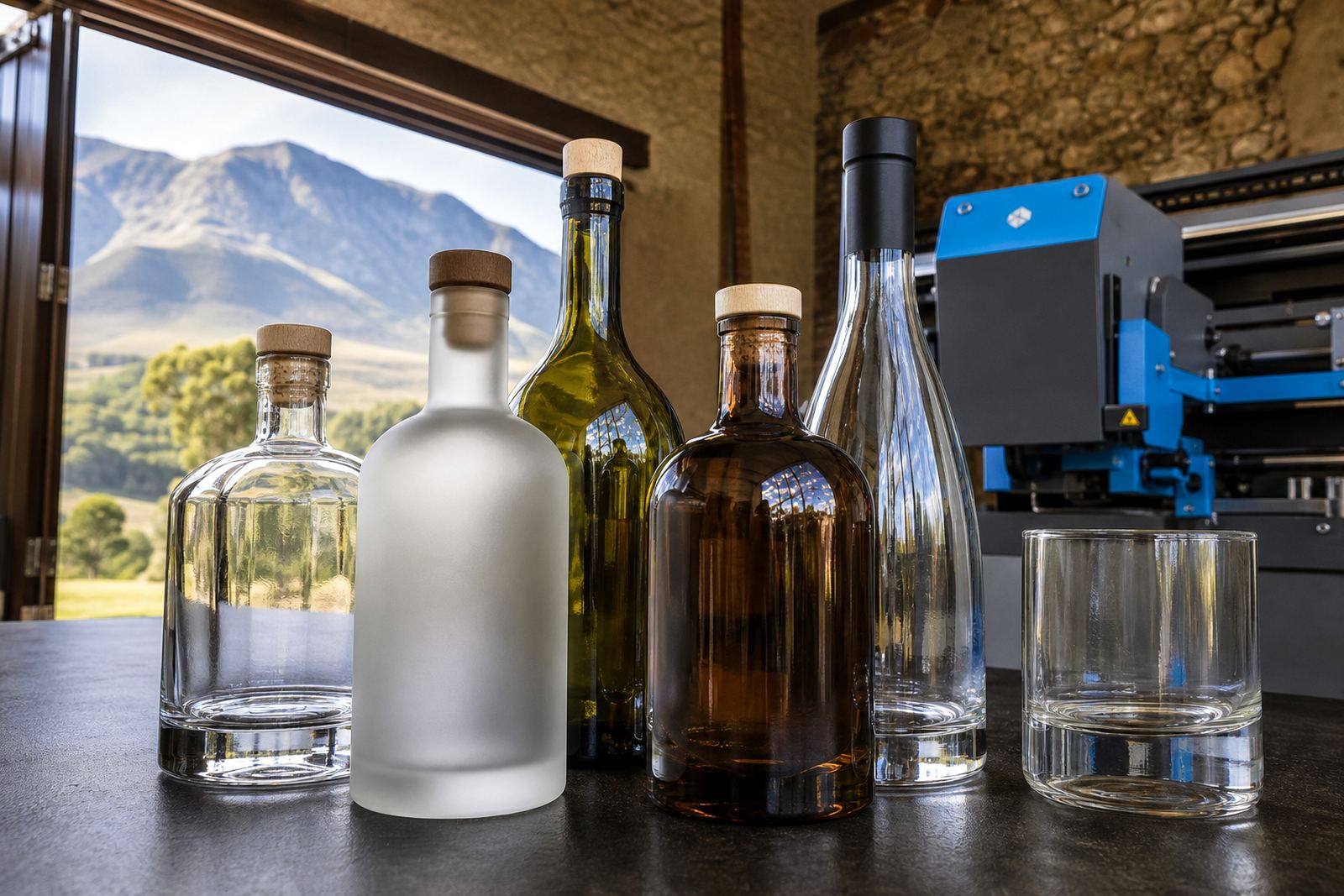
Heavy-base bottles come in several formats, and each one brings its own print space and handling needs. Some have tall shoulders for a longer label panel, while others have compact bodies with a wide base that gives a low, stable look. Glass colour also changes the effect, with clear glass showing the contents and flint-style finishes giving a brighter, cleaner feel under print.
Common bottle and drinkware types for this kind of job include:
- Wine bottles with a deeper punt and thicker heel
- Gin bottles with straight walls and a premium shoulder line
- Water bottles for hospitality, tasting rooms and events
- Heavy-base tumblers and glass drinkware for gifting sets
- Decanter-style glassware for limited presentation packs
In the Cape Winelands, we often see heavy-base bottles used for small-batch ranges where the packaging must feel settled and careful. The shape can support a minimalist label, a direct print panel or a two-piece approach with print plus label. For jobs sent to Stellenbosch, Franschhoek or Constantia, the bottle profile usually needs to match the room it will be used in, not only the shelf it will stand on.
Decoration methods that suit thick glass
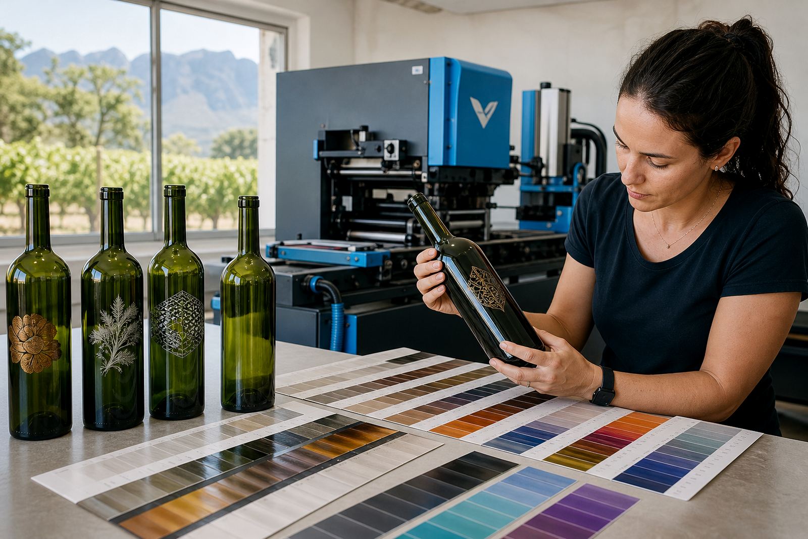
Heavy-base bottles can be decorated in more than one way, and the bottle shape usually guides the method. UV direct print works well when you want crisp artwork with solid colour blocks, clean lettering and controlled white ink layers on glass. It can suit short runs where the design must sit directly on the bottle, without a separate label edge.
Screen printing is often chosen for a bold, simple mark or a repeated wrap design. It gives good coverage on glass and works neatly when the artwork is not too fine. Ceramic enamel is used where the print must feel more permanent and heat-cured on the bottle surface, which can suit items that need a tougher decorative finish. Labels are still useful where the bottle has a complex curve, a narrow print zone or a design that needs more text than direct print allows.
- UV direct print for sharp artwork and short-run flexibility
- Screen printing for strong colour and clean brand marks
- Ceramic enamel for a durable kiln-fired finish on glass
- Labels when the bottle shape needs more artwork space
Heavy glass can be tricky if the print area sits close to a curve or shoulder break, so print area planning matters before anything is approved. A design that looks fine on a flat mock-up may need adjustment when mapped onto a real bottle body with a thick base and a narrower upper section.
Artwork proofs before glass goes on press
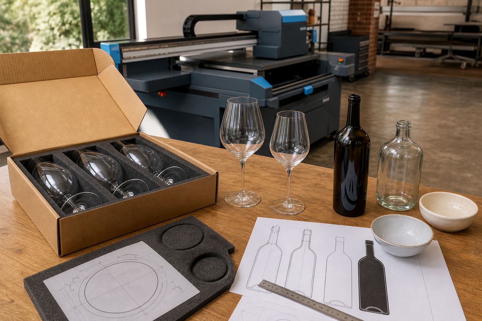
With heavy-base bottles, artwork checks are not a box-ticking step. A proof needs to show where the print lands on the actual bottle body, how the logo clears the shoulder, and whether the white ink or background colour holds its strength against the glass colour. That is especially important on clear bottles, where even a small shift in position can change the whole look.
We check artwork for line weight, colour separation, wrap position and text size before a run is approved. Where needed, mock-up visuals help show how the print will sit on the bottle shape. This matters for short runs of branded wine bottles, gin bottles and water bottles because the batch size leaves less room for wasted glass or avoidable rework.
Practical artwork points that usually deserve attention:
- Logo size against the bottle shoulder and heel
- Colour contrast on clear or tinted glass
- White ink coverage under light artwork
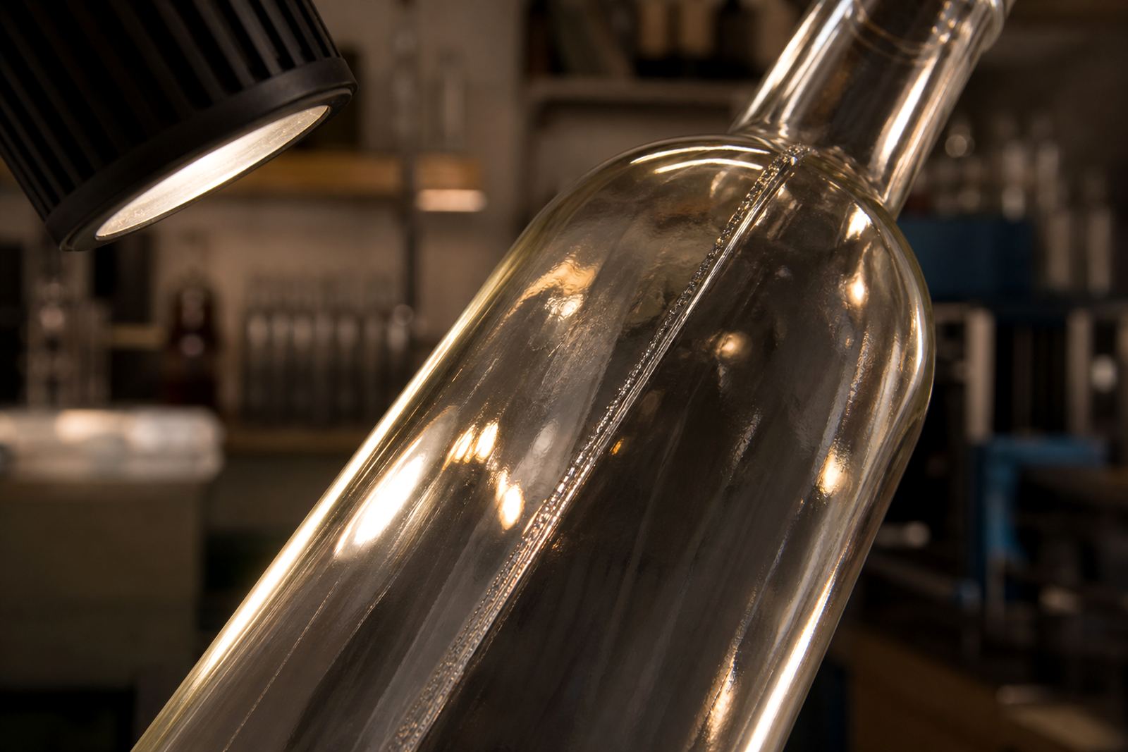
- Safe space around necks, seams and curves
- Text legibility when the bottle is viewed at an angle
For winery and distillery briefs, the proof stage also helps keep the label and the bottle print working together. A bottle with a heavy base can look balanced with a smaller label, but the artwork still needs enough presence to hold its own on the glass.
Short runs and minimums without the guesswork
Short runs make sense when the bottle is tied to a launch, a tasting room release, a seasonal gift pack or a corporate event. Heavy-base bottles are often used in these settings because they photograph well and feel substantial without needing large volumes. The minimum run depends on the method, the bottle shape and the amount of setup involved, especially where colour matching or multiple print passes are required.
For short-run jobs, planning the pack format early helps keep the whole process steady. That includes deciding whether the bottle will carry a full wrap, a front panel only, or a label plus print combination. It also helps to confirm packing before dispatch, because thick glass needs careful handling in transit, particularly for deliveries into Johannesburg or Durban where the road leg is longer.
In practical terms, the bottle itself, the print method and the packing brief all need to line up. A heavier base can raise the appeal of the finished piece, but it also means the bottle choice should be matched to the intended use rather than picked only on looks.
Paarl bottles with the right weight
A local cellar or distillery briefing in the Cape Winelands often starts with a bottle sample and ends with a proof on the exact glass shape. A heavy-base bottle can work well for a premium gin-style release or a water bottle for a tasting event, as long as the artwork keeps clear of the shoulder and the finish suits the glass. In Paarl, that usually means looking at the bottle in daylight first, then checking how the print sits once the proof is laid over the actual shape.
When a bottle has real heft, the decoration should not fight it. A strong wordmark, one or two colour blocks, or a clean label panel can let the glass do the visual work. More detail is not always better. On these bottles, restraint usually gives a cleaner result and avoids crowding the curve near the neck.
For delivery across Cape Town, Stellenbosch, Franschhoek, Somerset West, Constantia, Johannesburg and Durban, the same principle holds: the bottle must look right in the hand, not only in a photo. That is the value of heavy base packaging when it is matched properly to the artwork and the print method.