Where the curve starts taking space
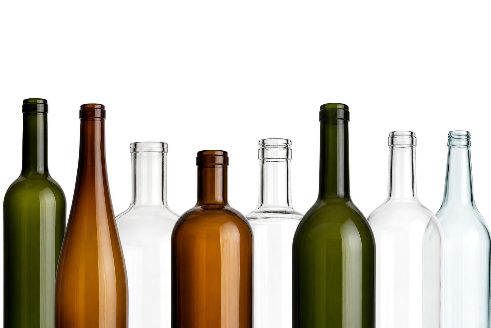
A straight-sided bottle is generous to work with. A shoulder curve is different, because the surface begins to rise and turn before the artwork has finished. That means the usable area is smaller than the flat face suggests, and the top edge can distort if the artwork climbs too high.
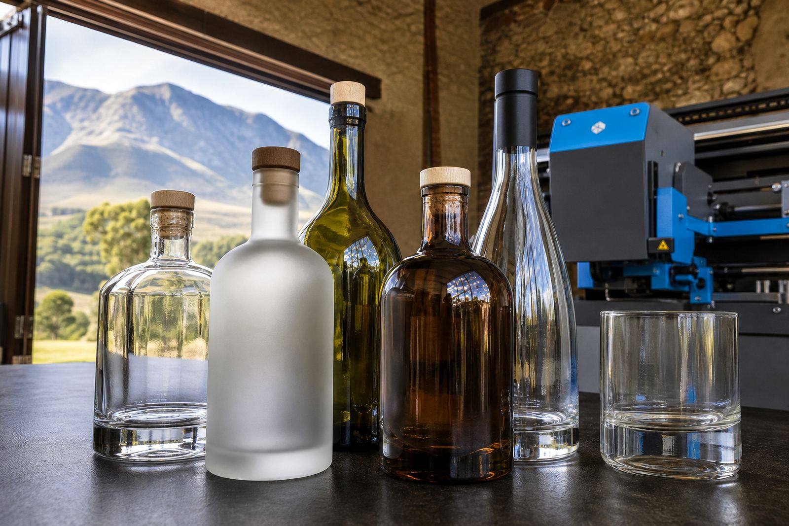
For wine bottles, gin bottles and many glass water bottles, the shoulder often controls where the main panel can sit. A label that looks neat on screen can creep into the curve once wrapped around glass, then the logo starts to taper or the text sits too close to the neck ring. With drinkware, the same thing happens on mugs with a slight taper and on some tumblers with a narrowed upper band.
When we plan a short run, the shoulder is one of the first measurements to check, not the last. That keeps the decoration honest to the shape in front of us.
How the print method changes the usable area
Different decoration methods handle shoulder curves in different ways. A direct print can carry detail across a flatter panel, while a label may need a smaller face and tighter placement to sit cleanly. Screen printing and ceramic enamel work well on glass and drinkware, but both depend on a stable print zone. The curve itself can cut that zone down faster than many people expect.
When white ink is part of the artwork, the edge of the print matters even more. On dark glass or tinted drinkware, white can give the colours strength, but only if the placement stays within the true flat area. If the artwork crosses into the shoulder curve, the white base can look uneven or the fine text can lose shape.
- UV direct print suits short runs with crisp text and layered colour.
- Screen printing suits solid blocks and repeat work on glassware.
- Ceramic enamel suits pieces that need a fired finish and good wear.
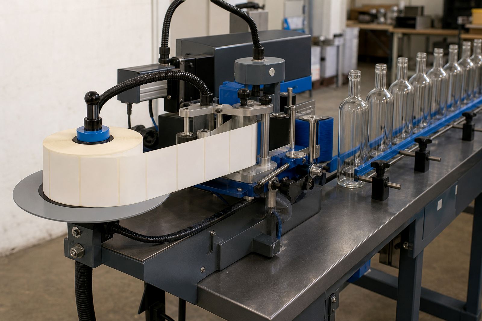
- Labels suit mixed shapes when the panel space is narrow or curved.
We match the print method to the bottle shape, not the bottle to the method.
Measuring the bottle before artwork starts
Artwork that looks balanced on a flat mock-up can drift once it meets a shoulder. That is why the bottle height, shoulder start, wrap width and label panel all need to be checked before layout is finalised. A few millimetres make a real difference on a slim neck bottle or a small branded tumbler.
In Paarl and across the Cape Winelands, we see plenty of bottles with strong shoulders that suit elegant labels but punish oversized artwork. A long line of copy may fit on paper, then the top line dips into the curve and reads badly from the shelf or the table. Keeping the key text lower, or moving a logo wider instead of taller, often solves the problem.
- Check the true flat print zone, not the widest face only.
- Leave breathing room near the shoulder break.
- Set fine lettering back from the curve’s outer line.
- Use a mock-up to test the shape before production.
That planning step saves the artwork from fighting the glass.
Paarl short runs with high shoulders
Picture a short run for a Paarl venue packing glass water bottles for an event and a small batch of gin bottles for gifting. The bottle body is generous, but the shoulder rises sooner than expected. If the logo is pushed too high, the top serif bends with the curve and the spacing looks off when the bottle is held at eye level.
The cleaner route is often to shorten the panel and move the artwork slightly lower. A label might sit best just under the shoulder break, while a direct print can use a tighter image area with a clear top margin. On some pieces, a white ink underlayer helps the colour hold its shape against amber or green glass, especially where the surface reflection is strong in natural light.
That same thinking applies to branded drinkware for functions in Stellenbosch, Franschhoek or Constantia. Tapered mugs and curved tumblers need the same respect for shape, or the result looks rushed even when the print itself is neat.
Proofs, mock-ups and the small fixes that matter
Proofs are not just for spelling. They show how the artwork sits against the shoulder, how much blank margin remains and whether a label edge will ride too close to the curve. A good proof also shows where colour may need support, especially on clear glass, dark glass or textured drinkware.
Before a run is signed off, we look at the line of the bottle, the print area and the behaviour of the chosen method. If the shoulder is narrow, a design may need to breathe more. If the bottle is squat and broad, the same design may need a wider lock-up so the artwork does not feel squeezed.
- Proofs show the real relationship between curve and artwork.
- Mock-ups help catch height problems before print prep begins.
- Artwork checks keep small text readable on tighter bottle shapes.
- Colour guidance helps on glass that changes tone under light.
That is the difference between a piece that sits well and one that looks forced.
Short runs need honest minimums and tidy packing
Short runs are practical when the bottle shape is clear and the decoration method is matched properly. Shoulder curves can reduce the usable area enough that a design needs to be simplified or resized, and that can affect the minimum run advice as well. If the artwork needs several passes, special white ink support or careful label alignment, the run should be planned with that in mind from the start.
Packing matters too. Curved shoulders can chip if bottles move against each other in transit, especially on mixed deliveries to Johannesburg, Durban or along the Cape route. A clear packing brief helps the team keep the cartons organised, label the batches cleanly and protect the print face from abrasion.
For wineries, distilleries and event organisers, the shoulder is not a minor detail. It decides what the bottle can hold visually, and it tells us where the artwork can sit with confidence.