Why lighter glass changes the print job
Lightweight bottles are popular for wine, gin and water because they reduce freight weight and can feel cleaner in the hand. The trade-off is that the glass can vary more across a batch, and that matters when ink, labels or enamel need to sit flat and read clearly on curved surfaces.
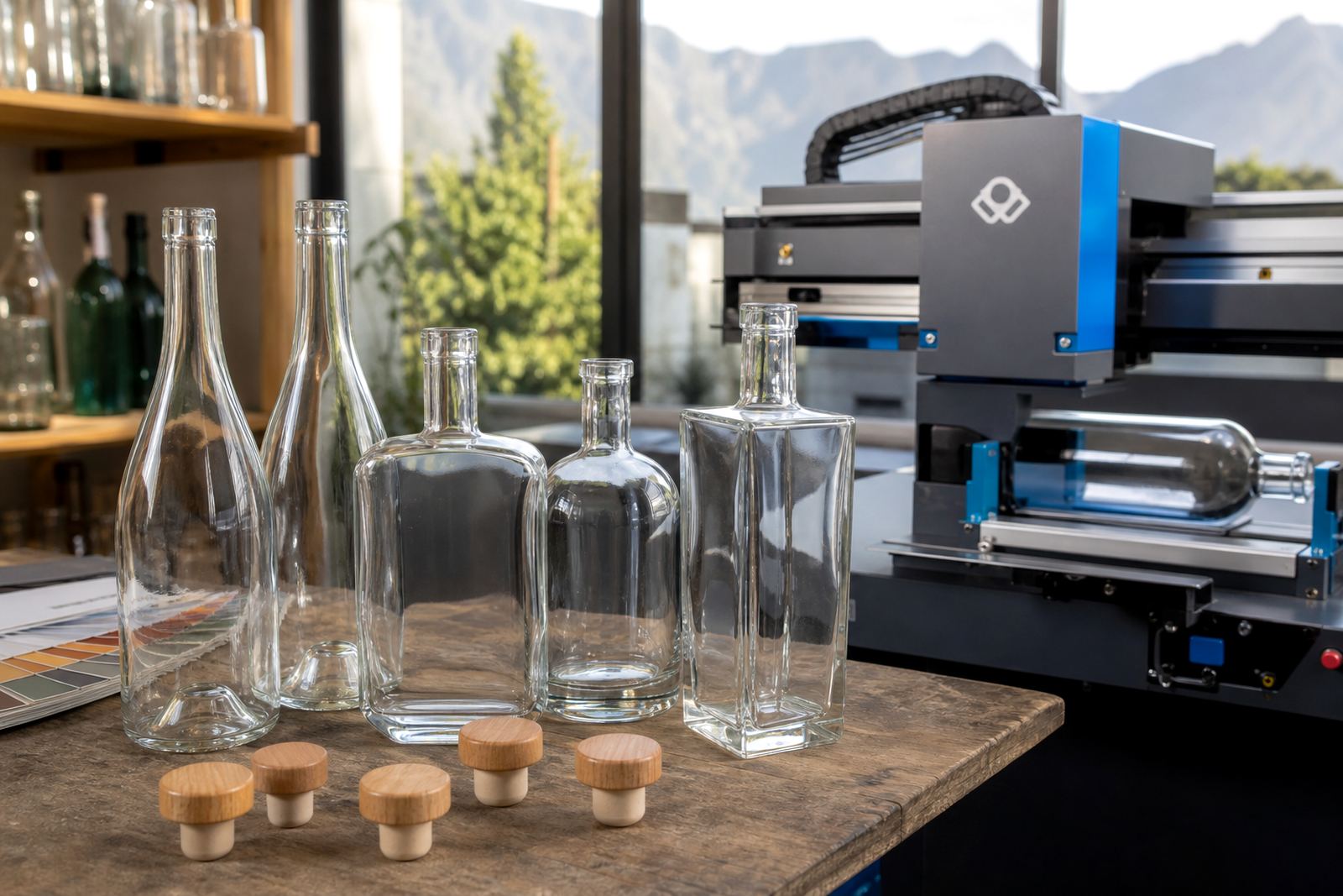
With a heavier bottle there is usually more tolerance for pressure and handling during print prep. Lighter glass can show small differences in shoulder shape, punt depth or side wall thickness, so the artwork has to respect the container instead of fighting it. Print area planning counts most at that stage.
- Check the bottle profile, not only the neck height.
- Allow for curved sidewalls where artwork may distort.
- Keep small text away from the steepest curves.
- Plan the finish around how the bottle will be packed and moved.
Decoration methods that suit lightweight bottles
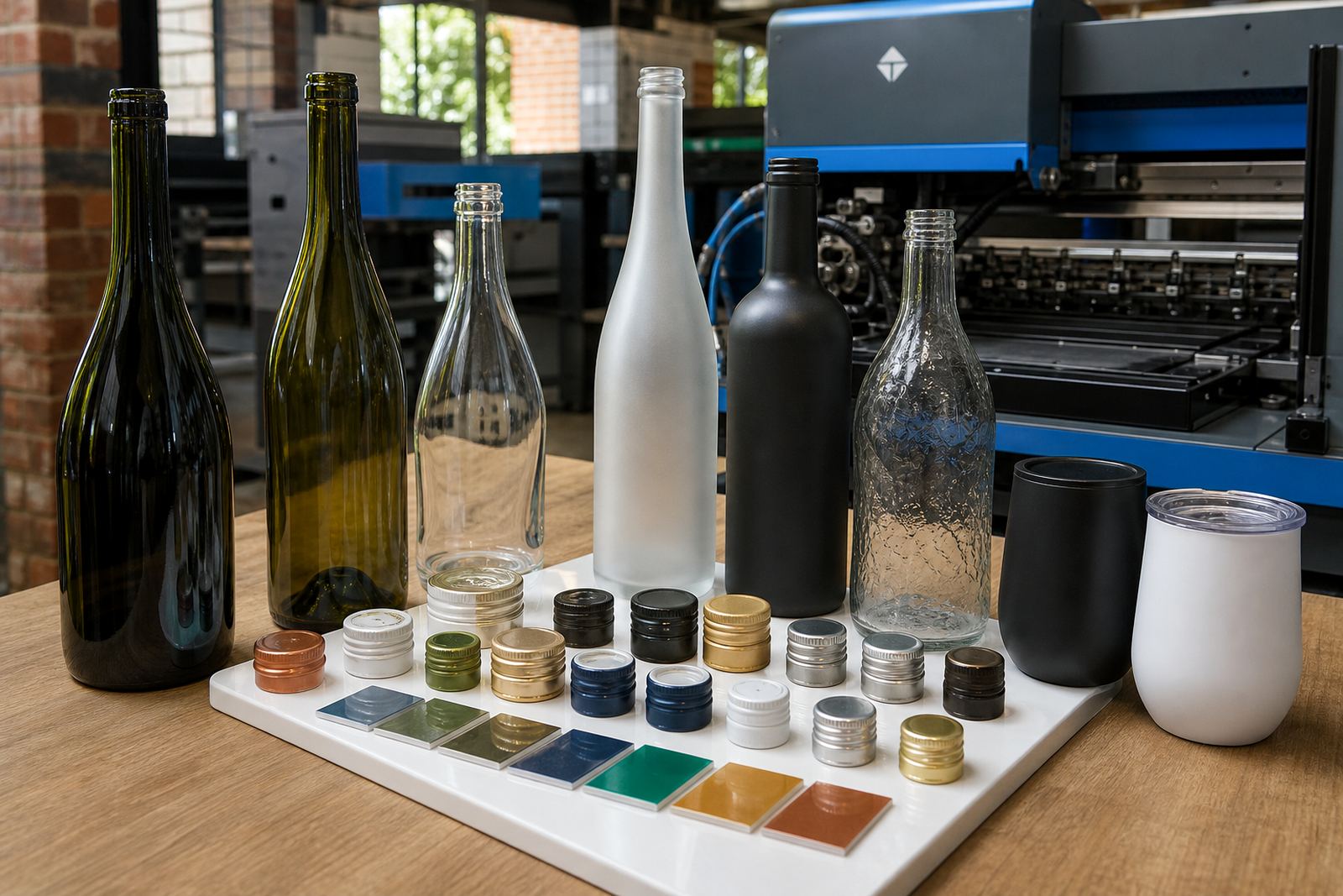
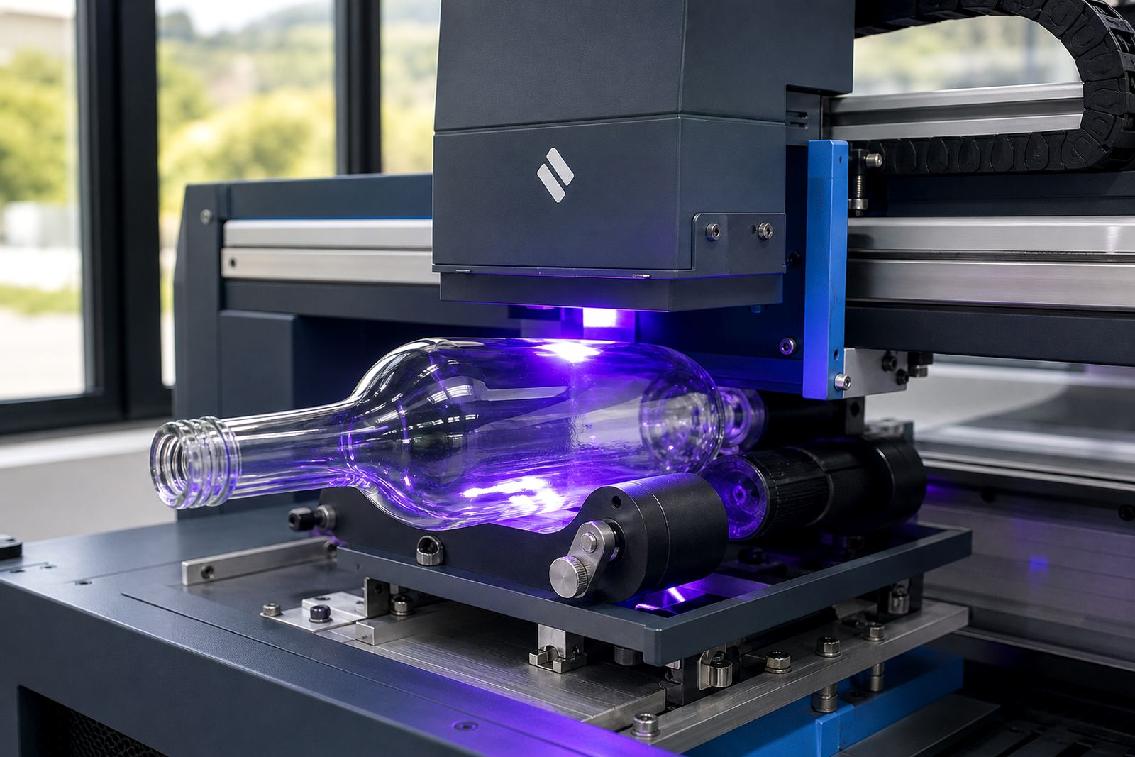
Different decoration methods handle lightweight glass in different ways. UV direct print works well for short runs where a clean, crisp image is needed on glass or coated drinkware. Screen printing suits simpler artwork and solid colour areas, especially where a durable finish is needed on bottles that will be handled often. Ceramic enamel is used when the brief asks for a fired finish with strong wear resistance, while labels are useful where the shape is tricky or the artwork carries more detail.
For wine, gin and water bottles, the best method depends on the bottle surface, the colour of the glass and the amount of handling expected after packing. A clear bottle for still water may need white ink layers to lift the artwork. A green or amber wine bottle may need stronger colour planning so the logo does not disappear into the glass tone. On drinkware, the wall curve and rim position also affect placement.
- UV print: good for short runs and detailed artwork.
- Screen printing: suited to solid brand marks and clear colour blocks.
- Ceramic enamel: useful where durability is important.
- Labels: practical for complex layouts or irregular bottle shapes.
Wall thickness, pressure points and handling
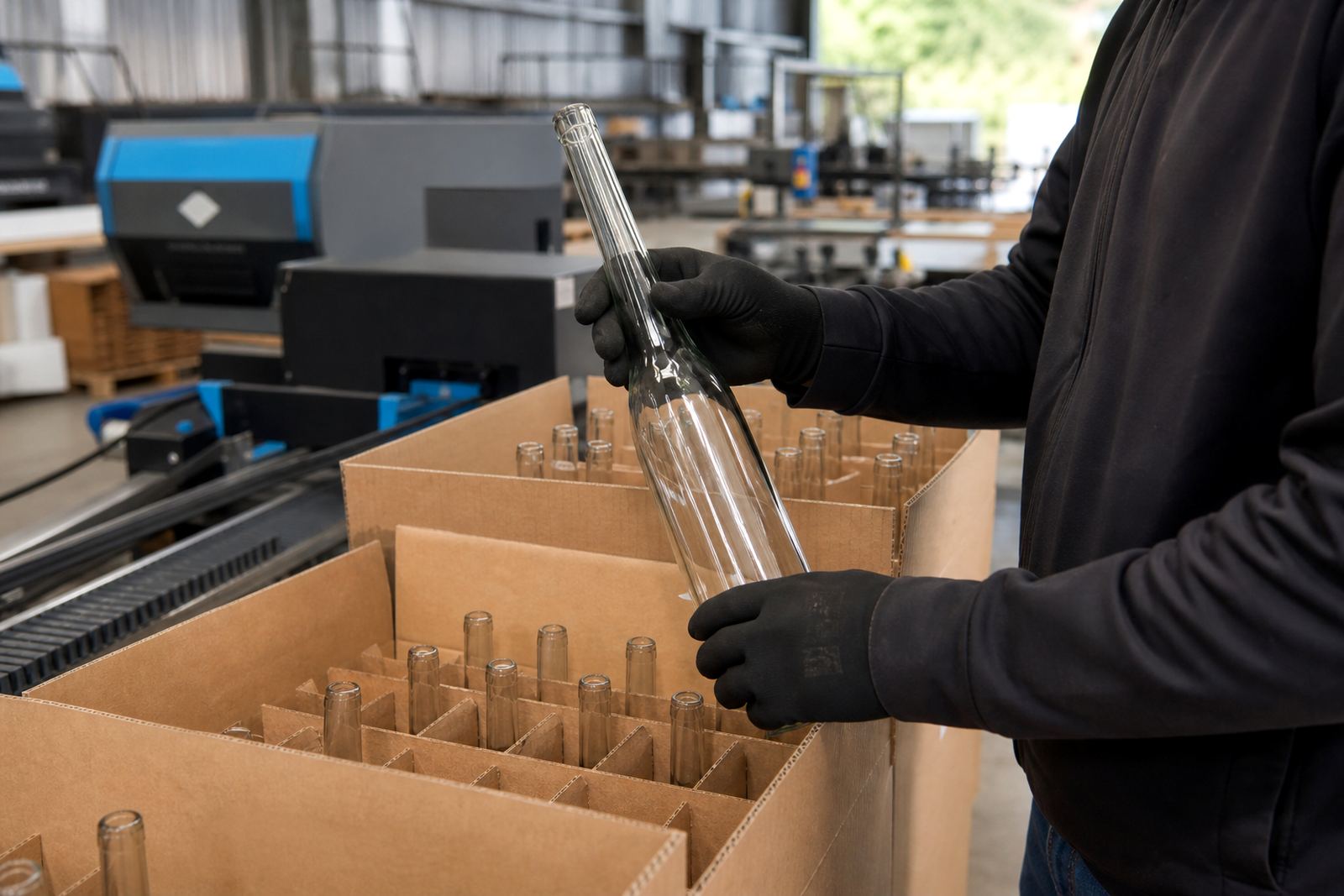
Lightweight glass needs sensible handling from the first carton to the finished pack. Thin walls can flex more under pressure, which means clamping, transport, sorting and packing all need care. This does not mean the bottle is fragile in every case, but it does mean the print plan must match the substrate instead of using a heavy bottle approach by habit.
Artwork placement also changes how the bottle is handled. If a print sits close to a seam, shoulder curve or narrow body section, the risk of visual distortion goes up. That is why mock-up visuals and proof approvals are useful before a run starts. They show where the logo lands, how far the text sits from the edge, and whether the label or print needs a smaller footprint.
In Paarl, we often see lightweight glass requested for tastings, corporate gifting and event packs where the box count matters. A bottle that saves mass can be practical for transport from the Cape Winelands to Cape Town or Johannesburg, but only when the print method and packing brief are matched to the bottle type.
Artwork checks before the first proof is signed off
Good artwork on lightweight glass starts with the bottle drawing, not only the logo file. The print area has to be checked against the exact bottle shape, because a design that looks neat on screen may sit too high on the shoulder or wrap too far around the body once it is on glass. Colour guidance is also important, especially where white ink layers are needed to support bright colours.
For short runs, the setup stage is where small adjustments save trouble later. The artwork coordinator may need to move fine type, thicken lines or reduce a busy layout so the print remains readable on a curved bottle. Proofs should show the decoration position, the colour build and any label size limits. If the run includes different bottle types, each one needs its own planning.
- Confirm the bottle size and finish.
- Check the printable area on the exact container.
- Review colour builds on clear, amber or green glass.
- Approve the proof before production starts.
Short runs for wineries, distilleries and event packs
Lightweight glass suits short production runs when a project needs branded bottles without a large printed volume. That is often the case for events, limited release gifting, tasting room packs and private labels for functions. The minimum run advice will depend on the decoration method and the bottle shape, because some methods work better on compact batches while others need a broader setup.
For a winery in the Cape Winelands, a lightweight wine bottle may be chosen for a small seasonal release where freight and handling matter. For a distillery, a shorter gin bottle with clear sides may need label artwork setup and a strong white layer behind the logo. For bottled water at a conference in Durban, the decoration may be kept simple so the bottle stays legible on tables, in coolers and in gift packs.
Short runs still need the same discipline as larger jobs. Packing briefs matter, especially when bottles travel to Stellenbosch, Franschhoek, Somerset West, Cape Town, Johannesburg or Durban. The final box count, pallet stack and delivery route all affect how the bottles arrive and how the printed surfaces hold up in transit.
Cape Winelands event bottle brief
A Paarl event organiser might ask for lightweight glass water bottles for a two-day function with mixed indoor and outdoor service. The bottles need to look sharp at table level, but they also need to survive repeated handling by staff moving between service points and storage areas. In that case, a clear bottle with a white underlayer and a restrained logo may work better than a dense label that wraps too far around the body.
For a smaller gin release, a lightweight bottle may be selected because it feels neat in the hand and is easier to box for corporate gifting. If the glass is thin and slightly curved, a screen print or label may be more suitable than a full coverage decoration. Our focus is on choosing a finish that suits the bottle, not on adding the most weight. It is to match the print to the bottle so the branding reads cleanly and the pack stays practical.
That is the point of checking the bottle, the artwork and the packing brief together. Once those parts line up, lightweight glass becomes a sensible option rather than a compromise.