The cap as a main packaging element
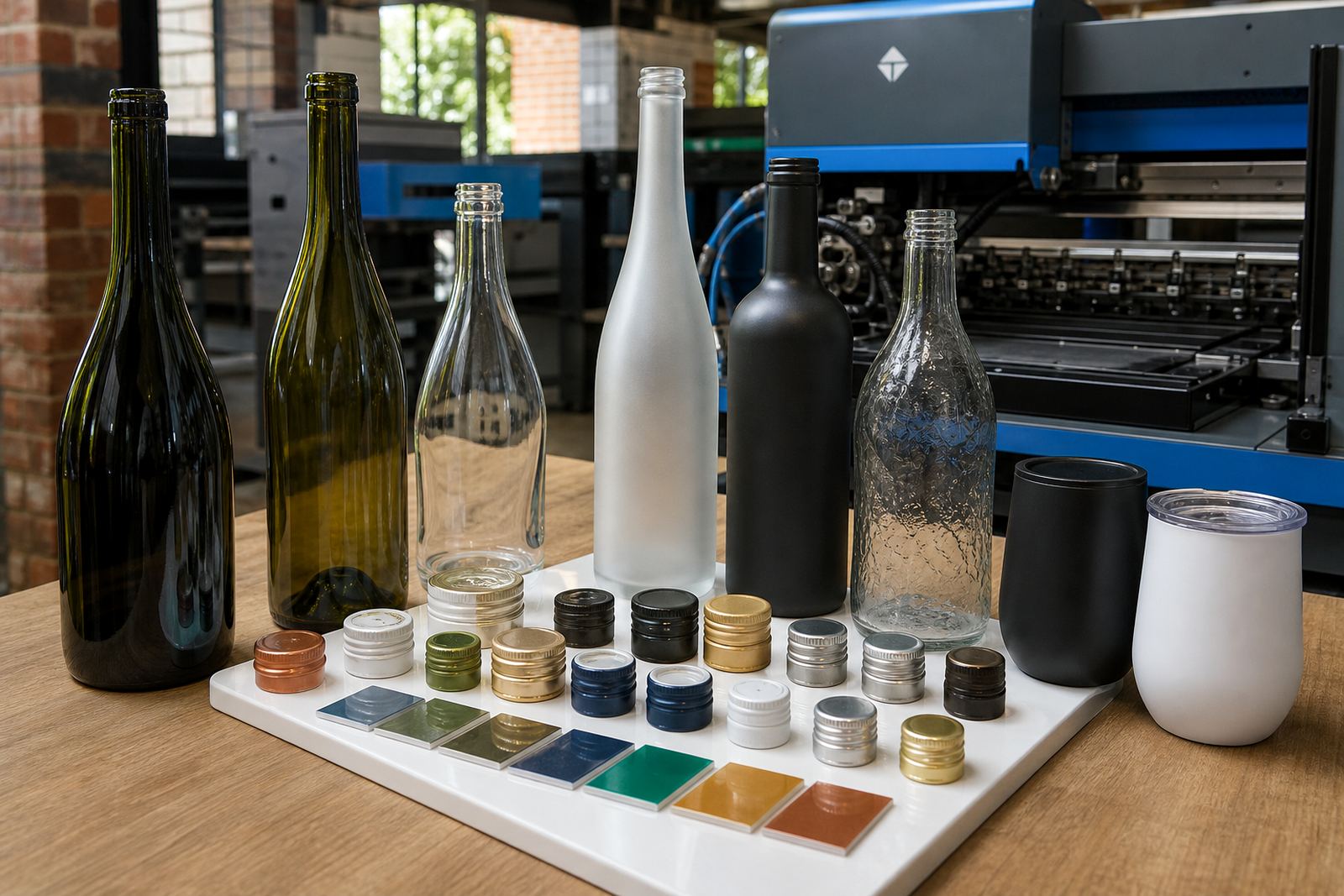
On wine, gin and still water bottles, the screwcap sits in full view, so its colour and sheen matter. A black, silver, gold or white cap can either frame the bottle artwork or fight with it if the tones are not planned together. In a small run, that choice carries weight because there is no room for a cap colour that feels detached from the rest of the pack.
For short runs, the neatest result often comes from lining up three things at once: the bottle colour, the cap finish and the artwork on the glass or label. A clear bottle with a white label and dark cap reads very differently from the same bottle with a pale label and brushed metal cap. The label may be small, but the cap is what people notice first when the bottle stands upright on a bar, table or tasting counter.
In Paarl and through the Cape Winelands, that matters for launches, gifts and event bottles where presentation has to feel deliberate. Coastal humidity in Cape Town or Durban can also make finish choice relevant when labels, caps and bottle surfaces are packed and handled before delivery.
Where screwcap presentation works best
Screwcaps suit brands that want a clean, modern line without extra collar details or loose finishing pieces. They are common on still wine, craft gin, sparkling water and premium drinking water where the bottle shape already does enough visual work. On short runs, that means less fuss at the decoration stage and a more controlled result across the carton.
Glass type changes the look as much as the cap does. Flint glass gives high clarity and suits bright labels. Amber glass pushes the cap and artwork into a warmer, more grounded space. Frosted or coated bottles reduce glare and can help white ink, metallic accents or darker label stocks show clearly. Drinkware such as tumblers, slim water bottles and stemless glasses follows the same principle, though the surface finish and print area need tighter planning.
- Clear glass suits fine detail and pale colour palettes.
- Amber glass gives depth to darker artwork and heritage styles.
- Frosted surfaces soften contrast and can make white ink stand out.
- Metal drinkware needs careful print-area planning before any decoration starts.
How cap colour links to print method
The decoration method changes how the cap reads against the bottle. UV direct print is useful where sharp colour blocks, small text or fine line work need a clean edge on glass. Screen printing gives a more solid, tactile feel and can carry simple artwork very well. Ceramic enamel is suited to bottles that need a fired finish and a more permanent mark. Labels give the widest flexibility when the artwork has gradients, photographs or many small details.
With a screwcap present, colour guidance becomes more than a cosmetic step. A bright label beside a dark cap can feel balanced if the artwork includes one dark anchor tone. A metallic cap beside light glass can look too hard unless the label or print includes a softer border or a matching neutral. White ink layers are useful on dark glass or coloured stock because they keep the message readable without changing the cap colour to compensate.
Artwork checks and print area planning help avoid a cap that feels visually unrelated to the bottle body. The artwork coordinator can map where the neck line, shoulder and label edges sit, then set the print prep around that profile before proofs go out for approval.
What a short run needs before the press starts
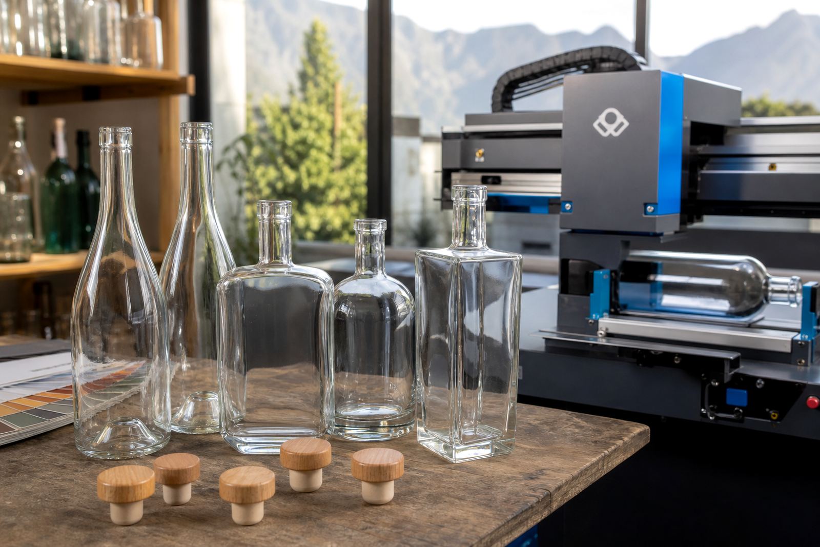
Short runs leave less room for correction, so the bottle has to be mapped properly before production begins. That includes the exact bottle shape, the neck finish, the cap style and the decoration zone. A wine bottle with a longer shoulder asks for different label proportions from a gin bottle with a taller body and more vertical space. Water bottles, especially for events, often need the artwork positioned higher so the logo stays visible when the bottle is in hand.
Proof approvals are part of that process. A proof should show scale, placement, colour balance and the way the screwcap sits with the artwork. Mock-up visuals make it easier to see if a dark cap is overpowering a pale label or if the bottle needs a stronger white layer under the print. That step saves the kind of mismatch that only shows up once the finished bottles are packed.
- Check the bottle profile and surface finish before finalising the artwork.
- Check whether the cap colour supports the label or print palette.
- Use mock-ups to judge the finished bottle as a whole.
- Keep the artwork clear where the neck and shoulder narrow the view.
Polished Paarl wine gift bottles
For a Paarl wine-gift order, a small batch of clear bottles was paired with screwcaps in a muted metallic finish. The label carried a restrained colour palette, with one deep tone from the artwork repeated in the cap choice so the bottle looked settled rather than overworked. The brief called for something neat enough for gifting, but not so formal that it lost its winelands character.
Because the run was limited, the print area was kept clean and the label shape was trimmed to suit the shoulder line. The result was a bottle that felt ready for a tasting room counter, a corporate hamper or an event table. Screwcap presentation adds value when the cap is chosen with the label and bottle, so the finished piece feels considered and consistent from neck to base.
For clients sending bottles to Cape Town, Stellenbosch, Franschhoek, Johannesburg or Durban, the same principle holds. The cap should not compete with the artwork once the cartons are opened. It should sit in the same visual language as the bottle, whether the order is for wine, gin or still water.
Packing, transport and the finish at arrival
Good presentation needs to survive the trip from print line to final handover. Screwcaps can scuff if bottles are packed too loosely, so carton layout, divider choice and handling notes matter. This is especially true for mixed orders where glass bottles and drinkware travel together. A packing brief helps keep the cap finish, label edges and printed areas in better condition by the time the cartons are opened.
When delivery goes to outlying spots like Somerset West or Constantia, or further afield to Johannesburg and Durban, the pack has to protect both the cap and the printed surface. A polished cap loses part of its effect if it arrives marked, and a carefully matched label can feel off if the carton has shifted during transit. The simplest fix is to plan the packing with the presentation work, so the cap, label and printed bottle still look right when the cartons are opened.
Clients who want screwcap presentation done properly usually start with the bottle shape, then the artwork, then the cap colour, then the pack. That order keeps the finish tidy and gives the final bottle the same discipline from proof to delivery.
The detail that holds the whole bottle together
Screwcap presentation works when the cap, print method and bottle finish speak to each other. The finish feels measured and deliberate, not loud. On a shelf, at a tasting or in a gift box, that control is often what makes the bottle feel finished rather than merely printed.
For wineries, distilleries and event organisers, the best results usually come from a practical mix of colour guidance, proof approvals and minimum run advice. That is where a small run can still look carefully considered, even when the brief changes from glass wine bottles to gin bottles or drinkware.