Why magnum bottles need different artwork thinking
A magnum gives you more surface area, but that does not mean the layout should be filled edge to edge. On larger bottles, the eye reads empty space differently, and a label or print that looks fine on a standard 750 ml bottle can feel too small or too busy once it moves onto a bigger format.
For wine, gin and water bottles, the main challenge is balance. Neck height, shoulder width and the central panel all change the way text, logos and decorative elements sit on glass. A clean layout often works better than a crowded one, especially when the bottle is meant to stand out on a tasting counter or gift table.
On magnums, proportion matters as much as colour. A strong mark in the right position usually outperforms a full-surface design that tries to say too much.
The bottle types and finishes that suit short runs
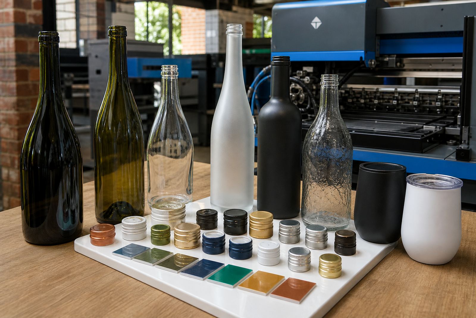
Magnum branding is usually ordered for glass bottles, though the same artwork thinking can extend to selected drinkware pieces when a range needs to match. Clear glass, tinted glass and heavier presentation bottles all behave differently under print, and the chosen finish should suit the content and the occasion.
- Wine magnums for cellar releases, private tastings and premium gifting
- Gin magnums for display bottles and event gifting
- Water bottles for corporate functions, venue hospitality and conference packs
- Matching glassware where the bottle and drinkware need one visual language
Some jobs suit direct print, while others are better handled with labels. The bottle shape, glass colour and expected handling all matter, because a tall bottle with a long shoulder needs a different artwork frame from a straight-sided bottle.
How the main print methods change the result
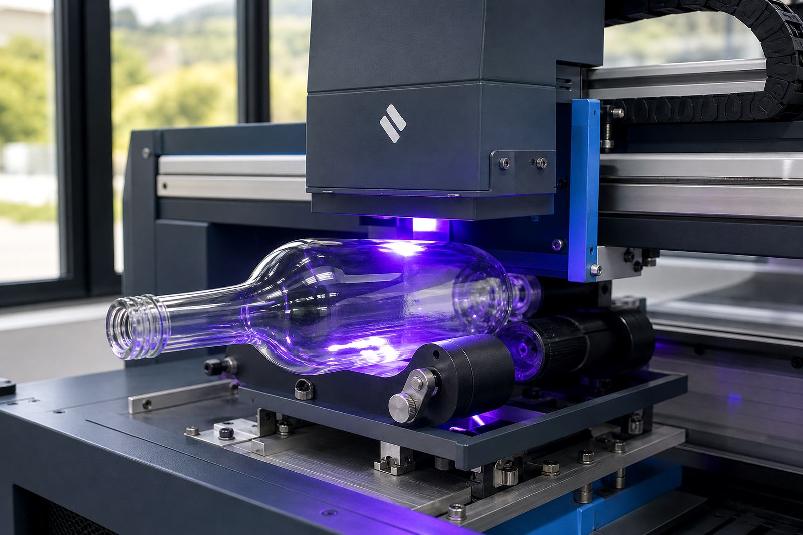
UV direct print is often used when a short run needs crisp detail on glass and a more immediate production setup. It works well for sharp logos, smaller type and selective colour blocks, provided the artwork is set up with the print area in mind.
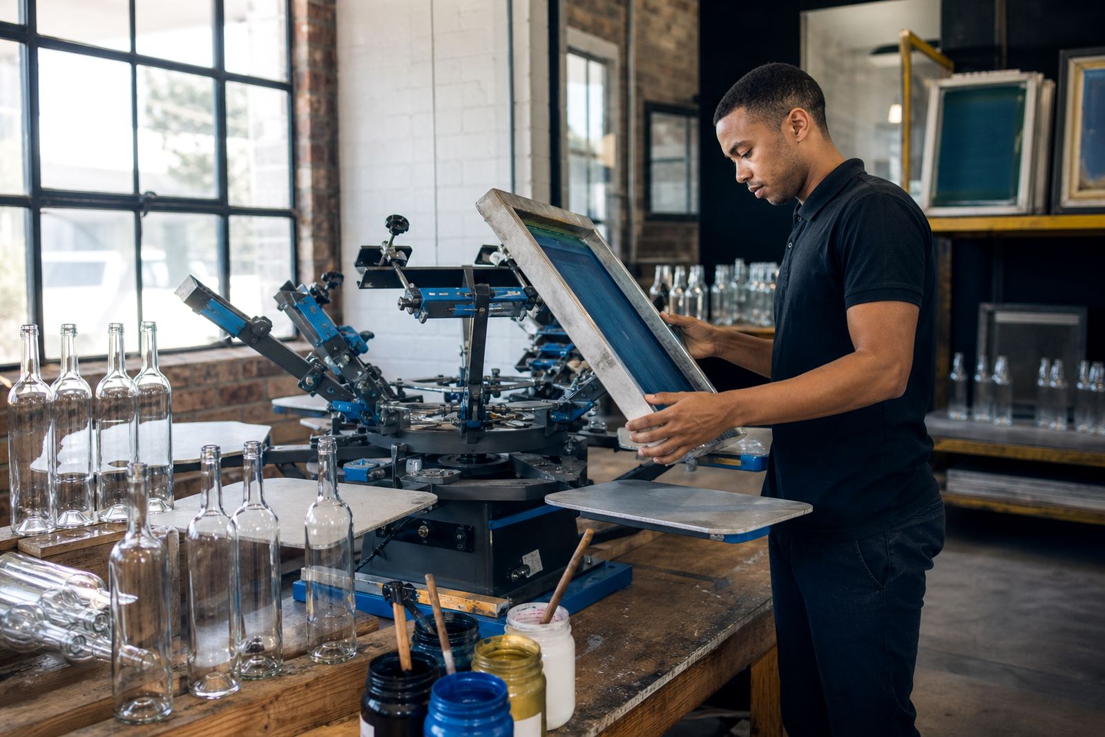
Screen printing suits fuller coverage and stronger colour laydown. It is useful when a design needs a solid appearance on a bottle that will be handled, packed and presented repeatedly. For special finishes, ceramic enamel can offer a more durable feel on glass, especially where the bottle is meant to stay in circulation or be kept as a keepsake.
Labels still have their place, particularly when the design needs flexibility across bottle shapes or when the artwork includes detail that is easier to manage on a printed label. The right method depends on the bottle, the quantity and the finish the client wants on the shelf or table.
Artwork checks that save a magnum from looking awkward
Before a run moves forward, the artwork should be checked against the actual bottle shape. A magnum may have more room, but that extra room can expose weak spacing, poor centring or type that is too small to read from a distance.
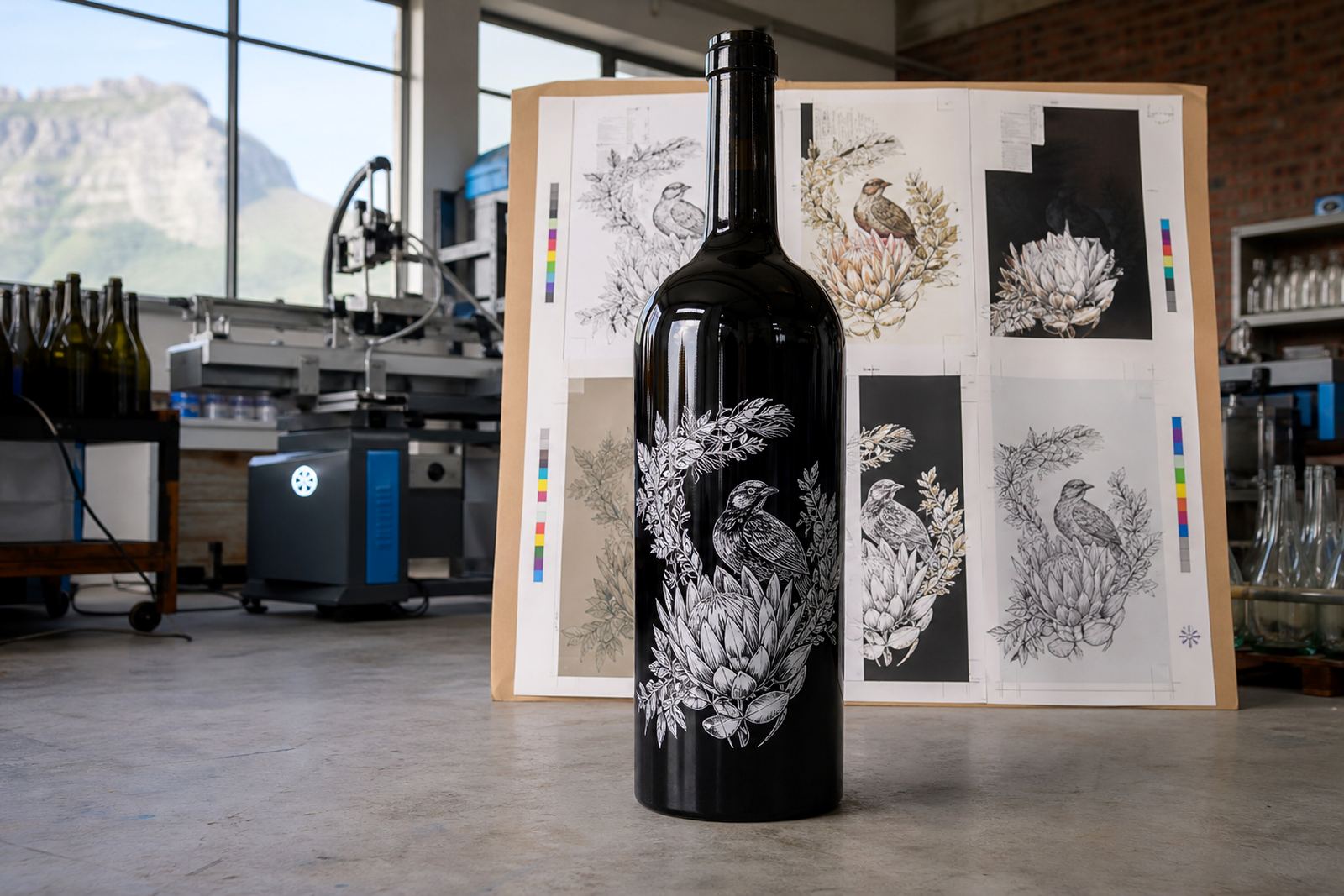
Proofs help catch those issues early. They also show how the white ink layer, any solid colour fields and the main message sit on the bottle. Where needed, a mock-up visual helps show whether the print needs to move higher, lower or slightly wider to follow the contour of the glass.
- Check the print area against the bottle dimensions, not only the flat artwork
- Keep type large enough for gift tables and cellar displays
- Allow space for neck and shoulder movement on curved glass
- Use white ink where colour needs extra body on dark or tinted bottles
- Approve the proof only after the layout feels right on the bottle shape
A magnum should feel deliberate. When the artwork is scaled properly, the bottle looks considered rather than simply enlarged.
Minimum runs and packing for smaller orders
Short runs make sense for launches, private functions and limited gifts, but the minimum run still has to suit the production method. A single bottle style with one print position is easier to manage than a mixed pack of different bottle shapes, finishes and artwork variants.
For smaller quantities, the packing brief becomes part of the job. Bottles need to be handled carefully, wrapped well and packed so the print area is protected in transit. That matters even more with magnums, because the larger size can shift in the carton if the packing plan is loose.
Practical planning keeps the job tidy. It also helps when the order is going to more than one location, such as a winery in Franschhoek, an event venue in Cape Town or a corporate delivery in Johannesburg.
Branded magnums for a Paarl function
A Paarl client wanting branded magnums for a small year-end function usually wants the bottle to feel premium without looking overworked. In that setting, a centred front panel, a restrained colour palette and a neat neck detail can carry the whole piece. The design has to read clearly when the bottle is on a table, not only when it is held up close.
For a local release, the best result often comes from keeping the label or print compact and giving the bottle room to breathe. That approach suits the larger format and avoids the heavy look that can happen when artwork is stretched across every available surface.
From the Cape Winelands to Cape Town, Stellenbosch, Durban and Johannesburg, the same principle holds. Magnum bottle branding works best when the artwork respects the shape first, then adds the decorative detail where it can actually be seen.
Where the bottle carries the message
A magnum already says something before the label is read. It signals scale, occasion and a bit of theatre, which is useful for gifting and special presentations. Good branding backs that message up instead of competing with it.
That is why colour guidance, print area planning and proof approvals matter so much. When the design is settled properly, the bottle looks finished from the first glance and still holds up when it is opened, poured and handled around a table.
For short runs across wine, gin and water bottles, the strongest result is often the simplest one. Good proportions, the right print method and careful setup make the magnum feel worth the space it takes up.