


Glass shapes that take decoration well
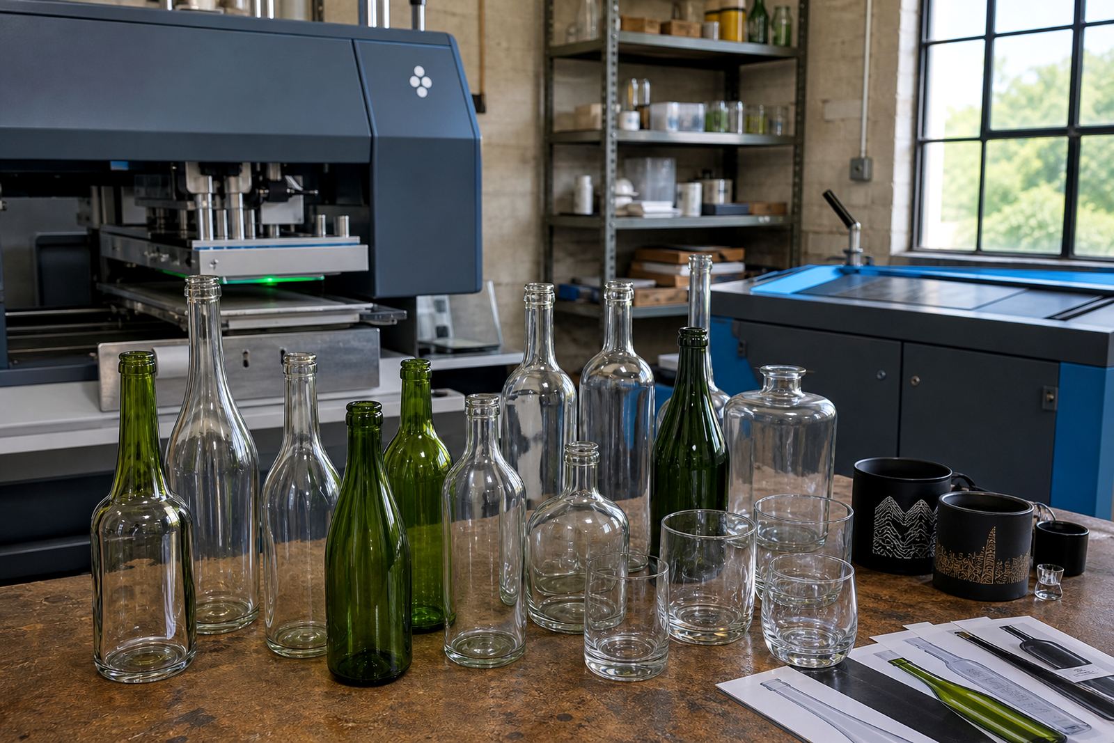
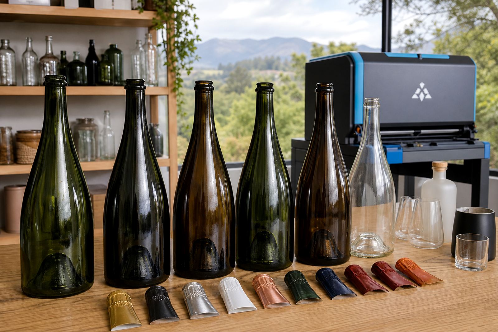
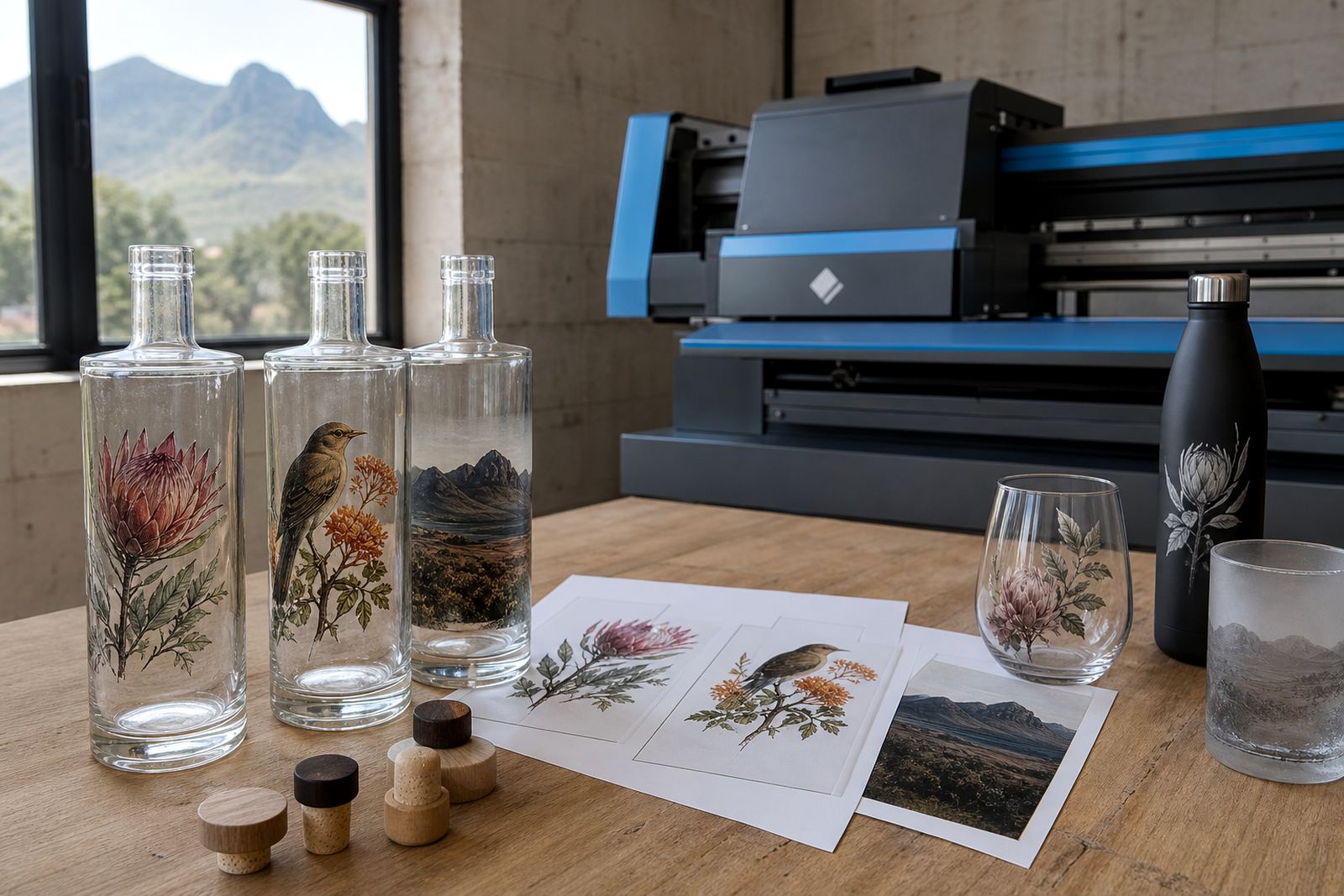
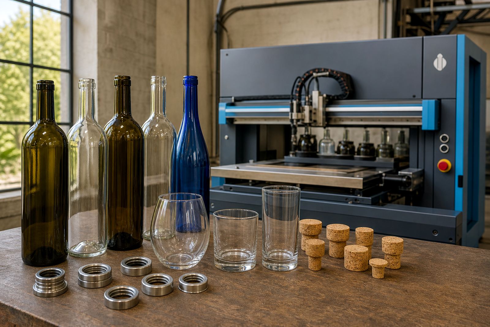
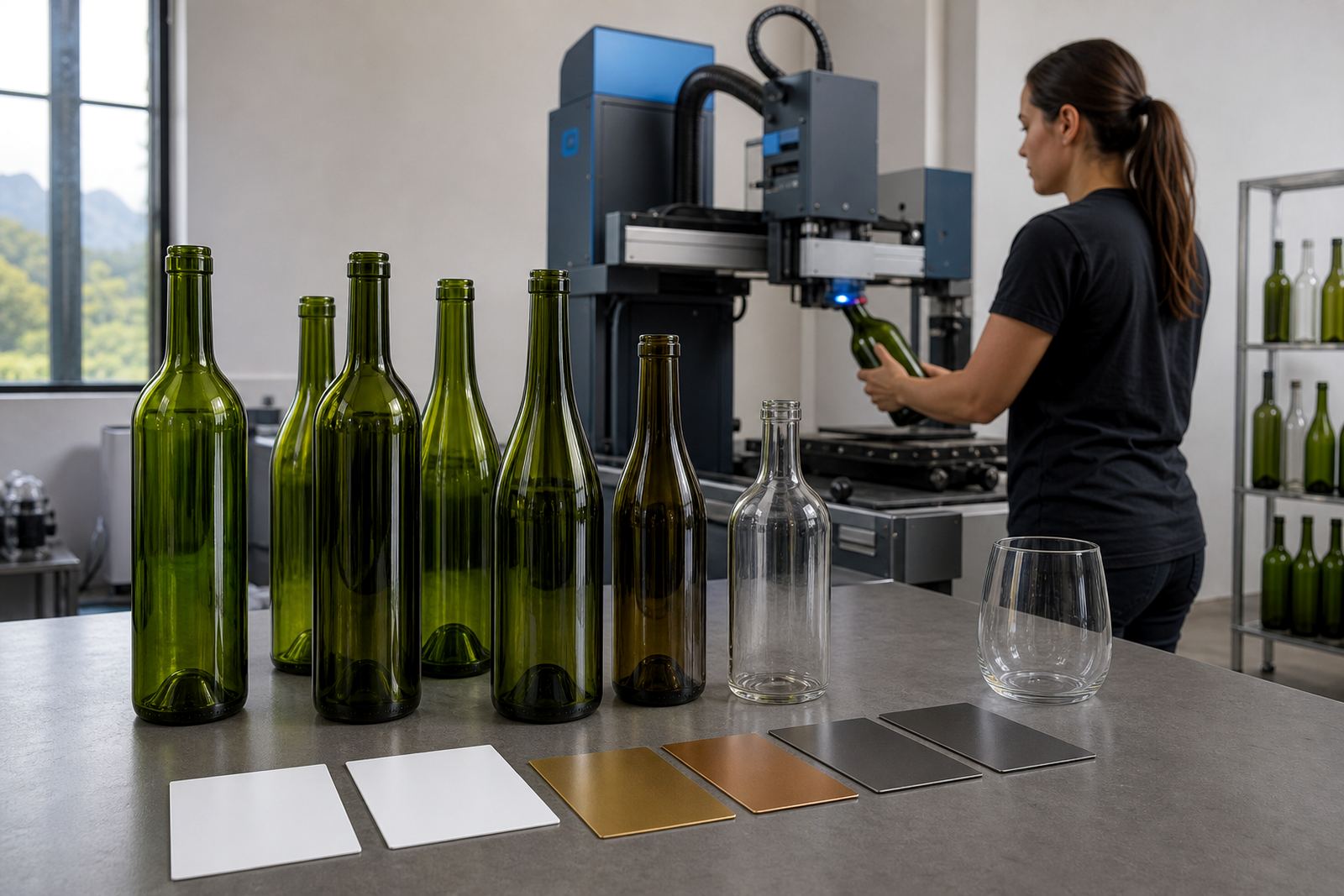
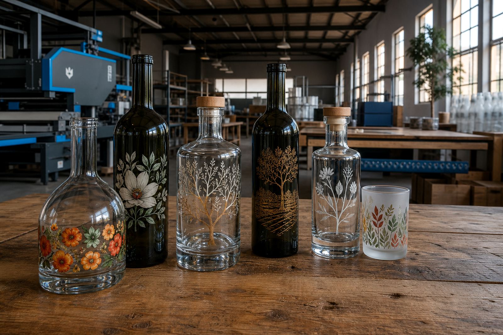
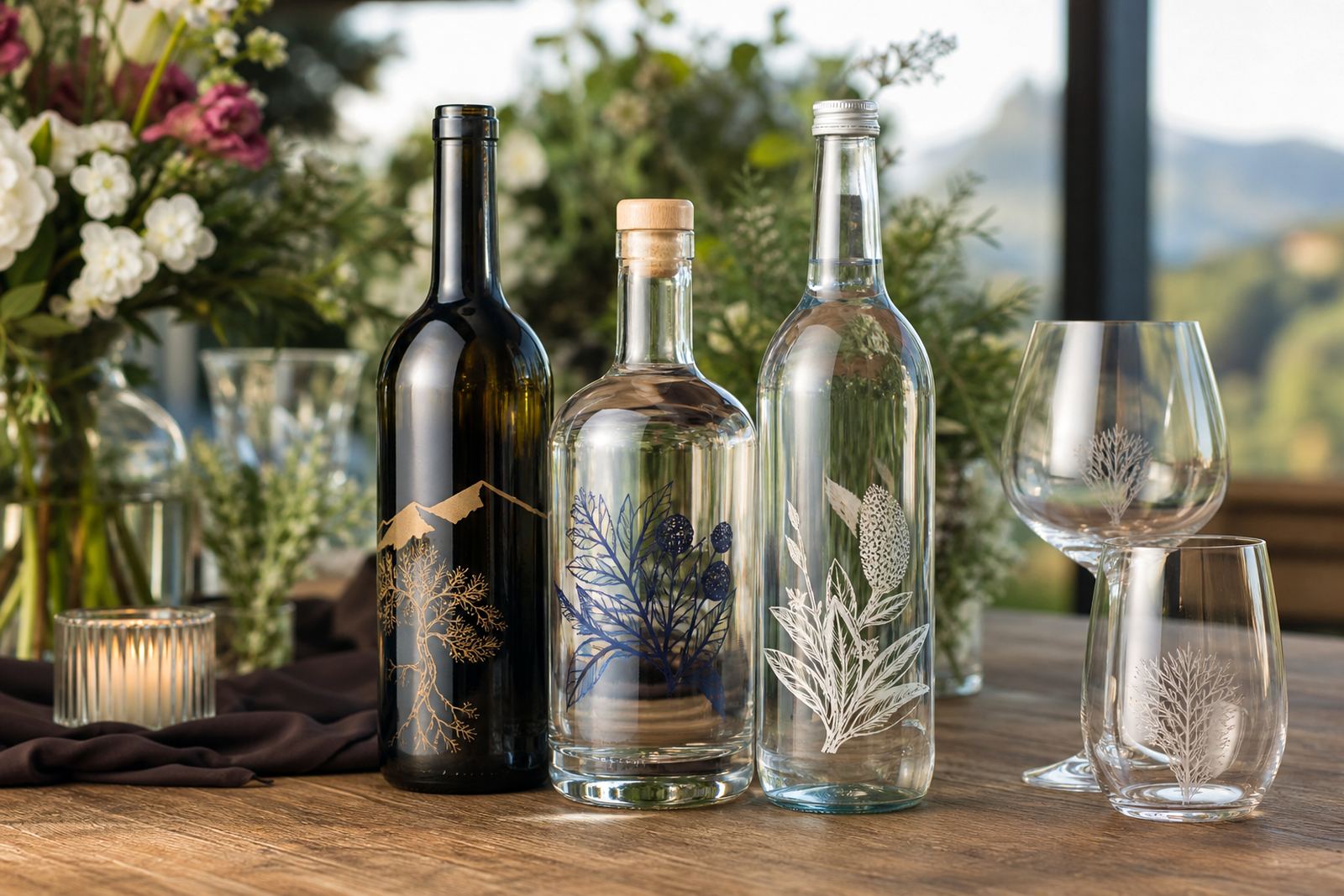
The bottle shape matters before any ink goes down. Straight-sided wine bottles, tall gin bottles, compact water bottles and wide drinkware surfaces all behave differently once a logo, crest or message is placed on them. Curved shoulders can shift artwork, while tapering glass changes how text reads from a distance.
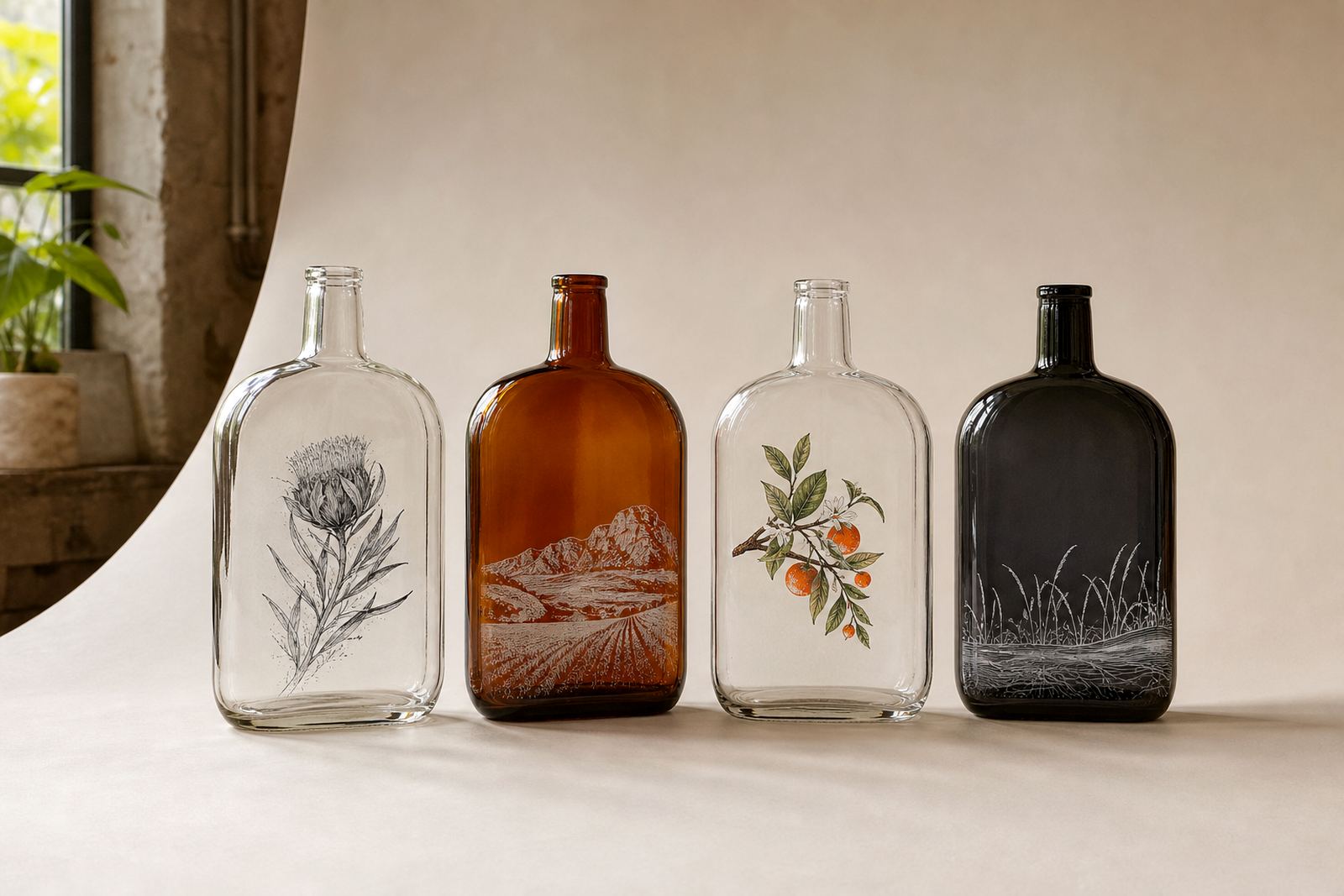
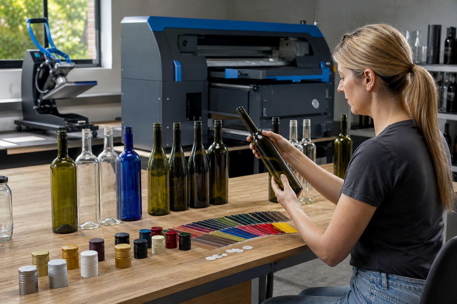
For short runs, it helps to match the vessel to the decoration method rather than forcing one format across everything. A clean label may suit a narrow neck and detailed artwork, while direct print can give a tighter result on a more even surface. Clear glass, flint glass and coloured glass each change how white ink, dark artwork and metallic tones carry across the bottle.
- Wine bottles for still or sparkling presentation
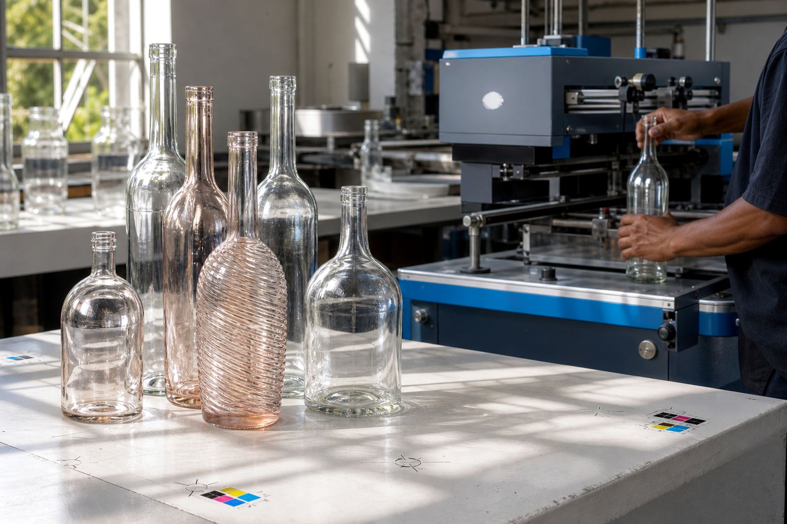
- Gin bottles with tall panels and strong shoulder lines
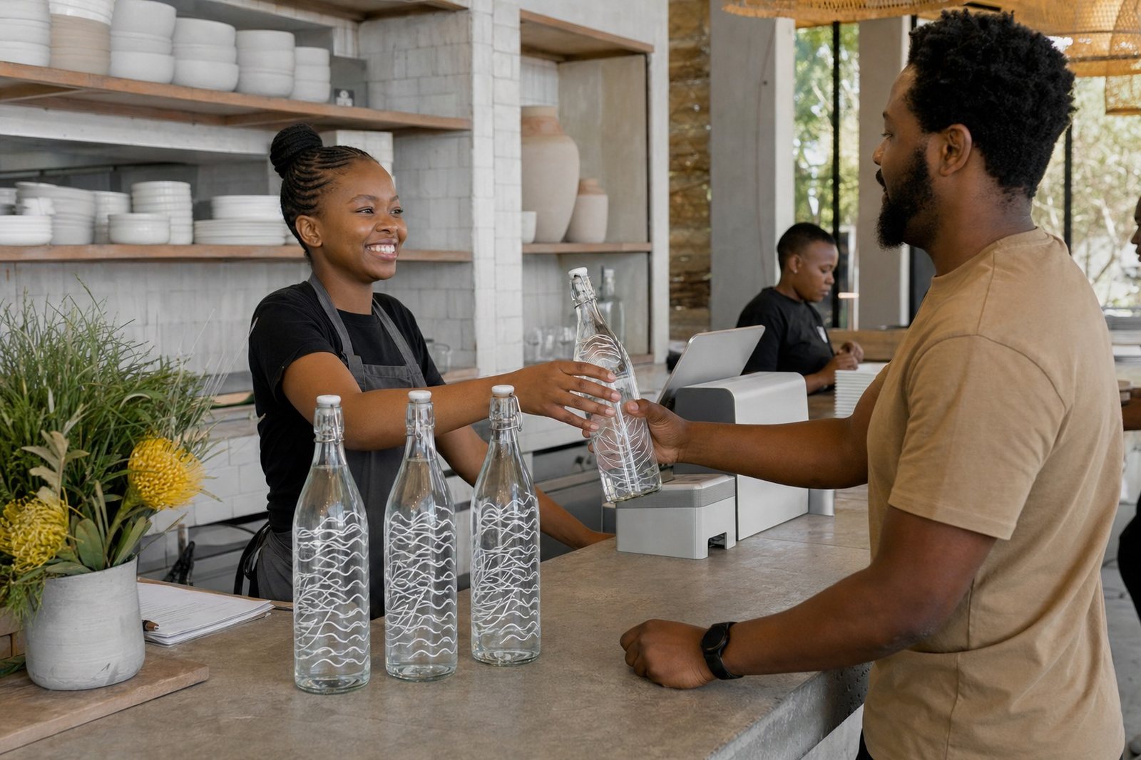
- Water bottles for hospitality, gifting and events
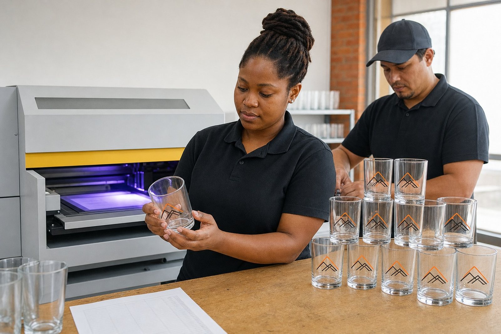
- Stemless glasses, tumblers and other drinkware
Decoration methods used on short runs
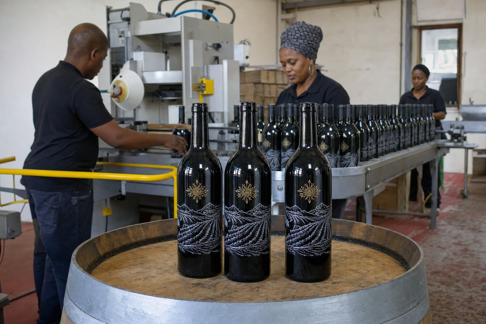
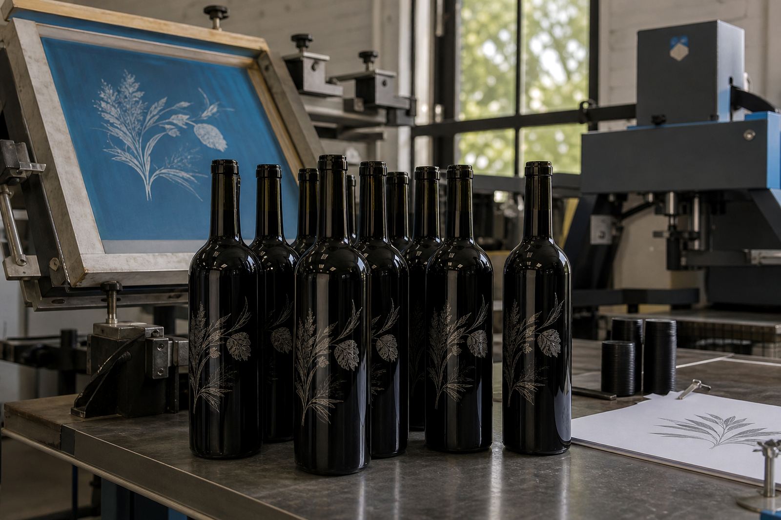
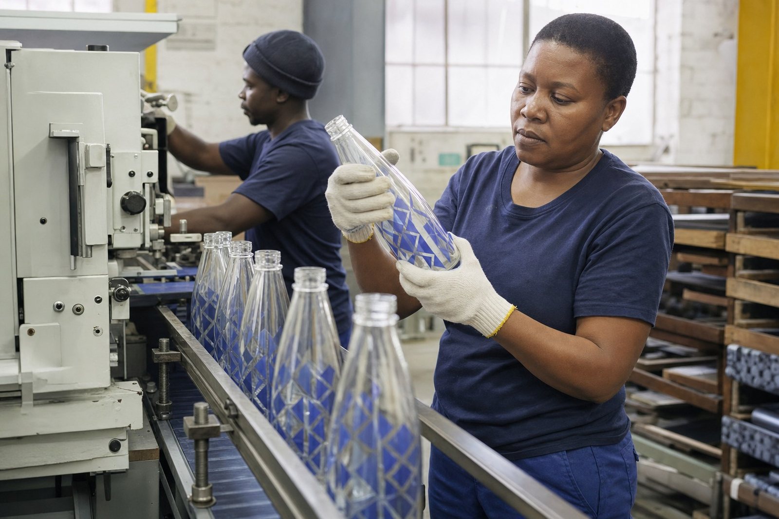
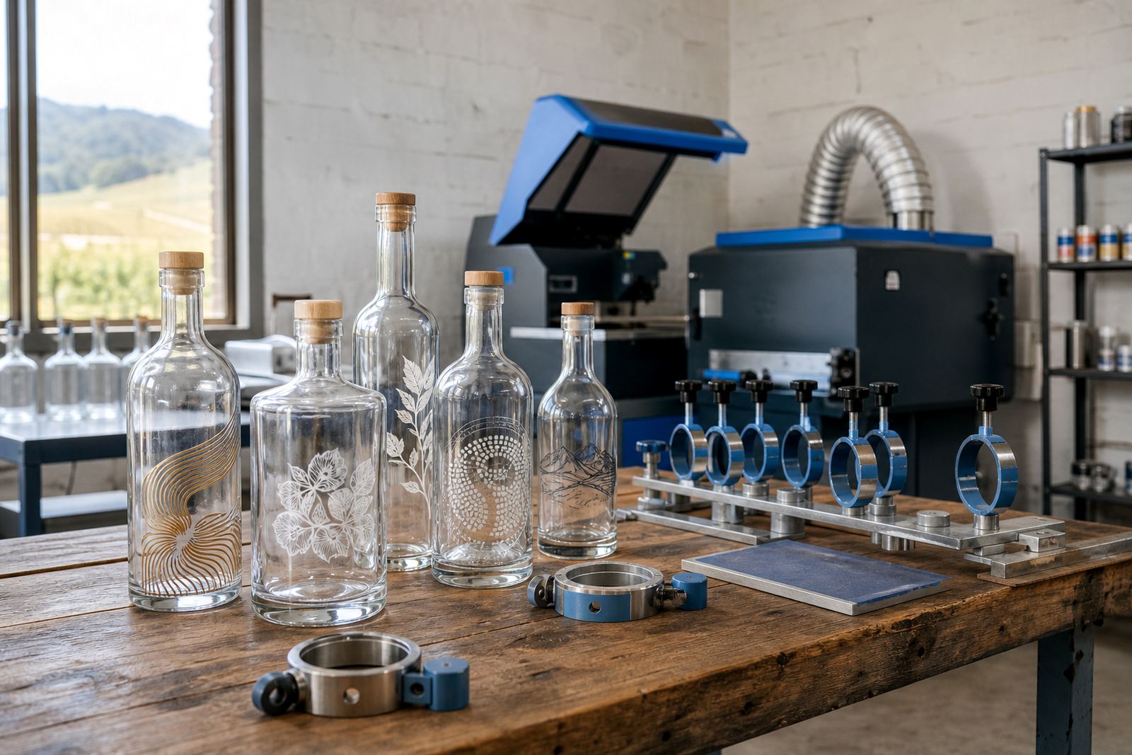
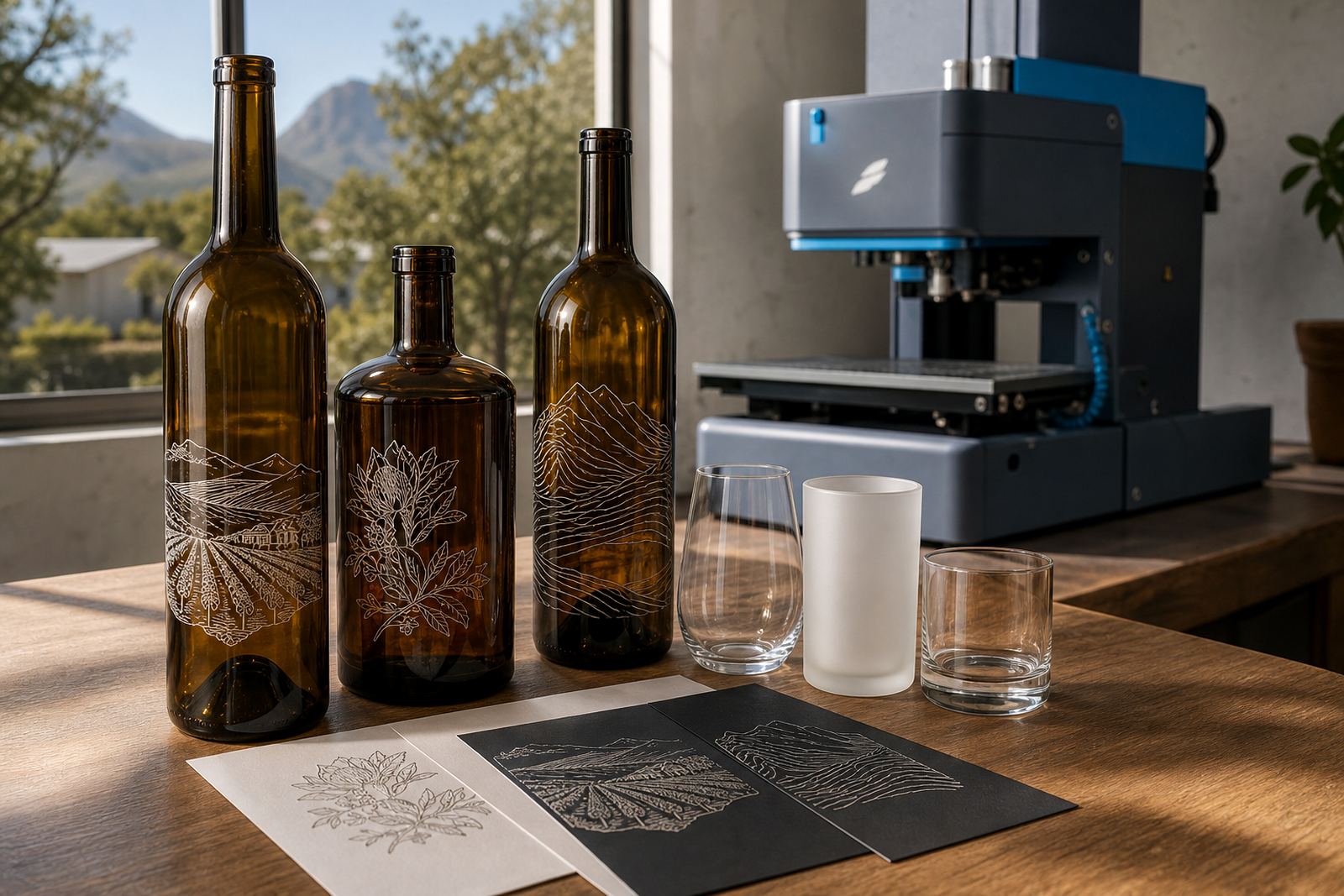
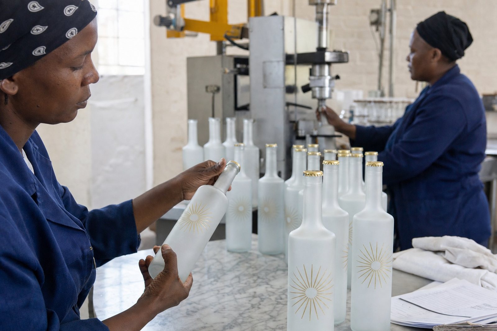
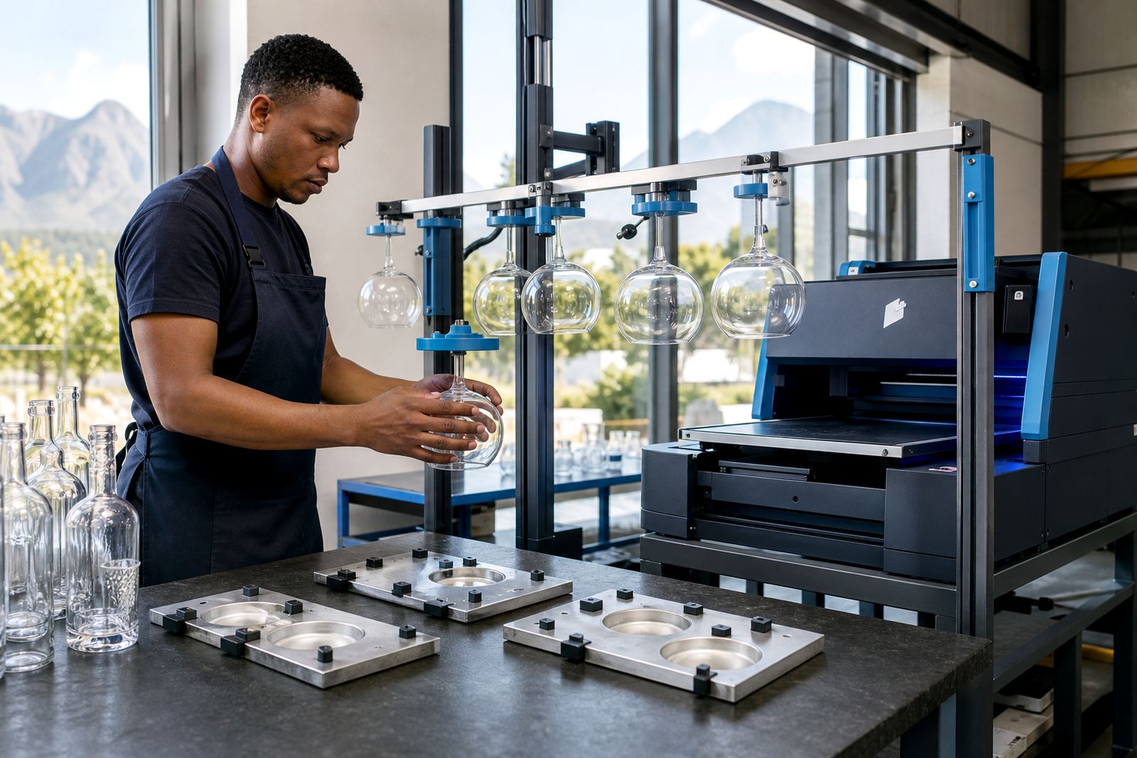
Different jobs call for different finishes. UV direct print is useful where artwork needs to sit directly on glass with crisp detail and controlled colour. Screen printing suits simpler artwork and repeat runs where solid blocks, logos or one or two colours need a strong finish. Ceramic enamel is chosen where a fired or more durable decoration is required on suitable glass. Labels work well where artwork carries more text, smaller elements or a wider colour range.
Each method has its own limits. Very fine lines may hold better on one process than another, and some glass colours need a white base layer to keep the artwork legible. The print area, the bottle curve and the neck diameter all affect what will sit neatly on the vessel.
- UV direct print for sharp artwork on glass
- Screen printing for solid logos and single colour layouts
- Ceramic enamel for a more lasting decorated finish
- Labels for flexible artwork and detailed information
Artwork checks before a run starts
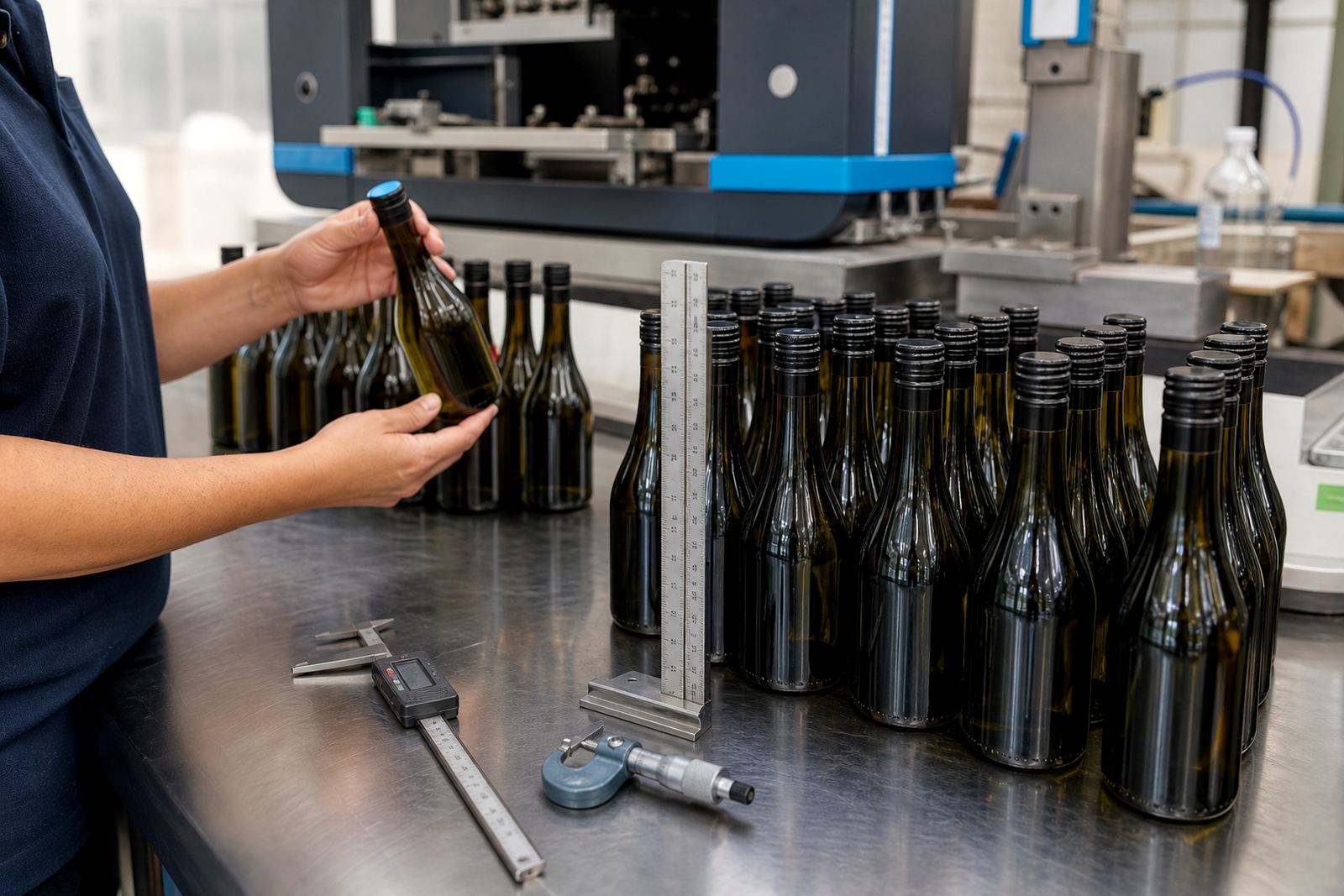
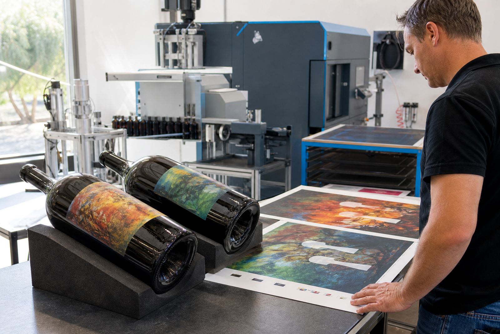
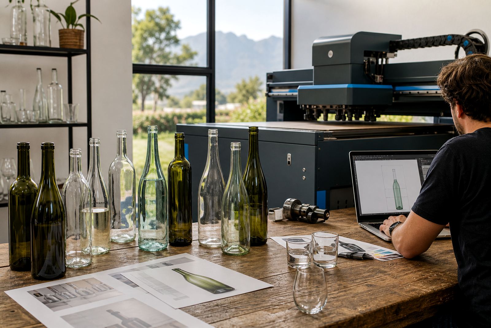
Good artwork setup often decides whether a bottle print run goes smoothly or runs into problems. A logo that looks fine on screen can move too close to a shoulder, wrap awkwardly around a curve or lose clarity on dark glass. The artwork check looks at size, placement, white ink needs, line thickness and whether the layout suits the chosen decoration method.
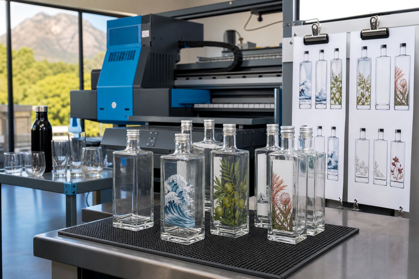
Proofs form part of that stage. They show the planned placement and give a practical check before production begins. For matching bottle sets or mixed vessel ranges, mock-up visuals make it easier to compare options across the line so the final layout stays aligned from one bottle to the next.
Minimum runs and mixed format planning
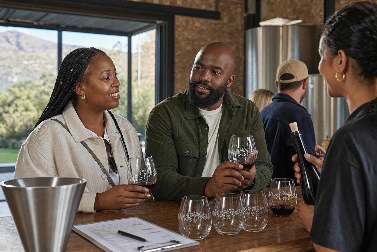
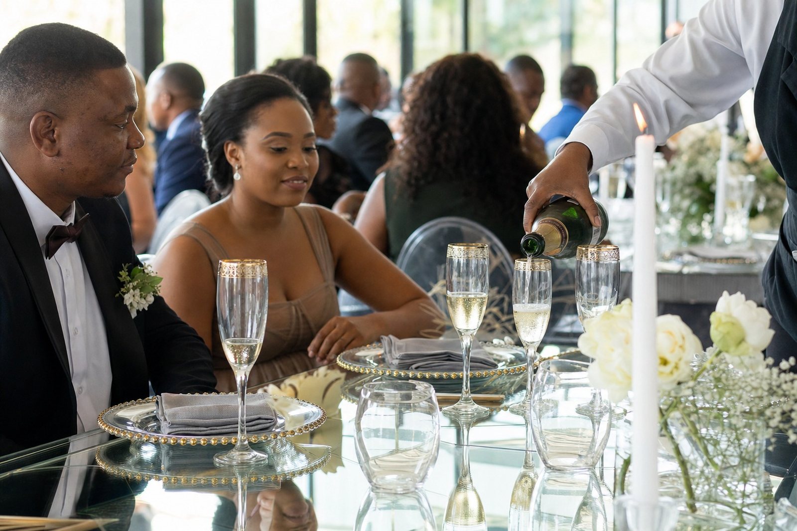
Short runs need a sensible plan from the start. A small batch for tasting rooms, a wedding, a product launch or a corporate hamper may need different quantities per bottle type, and not every format suits every artwork. Minimum runs can vary by vessel, colour count and method, so the order is usually planned around the decoration method and the number of units needed per line item.
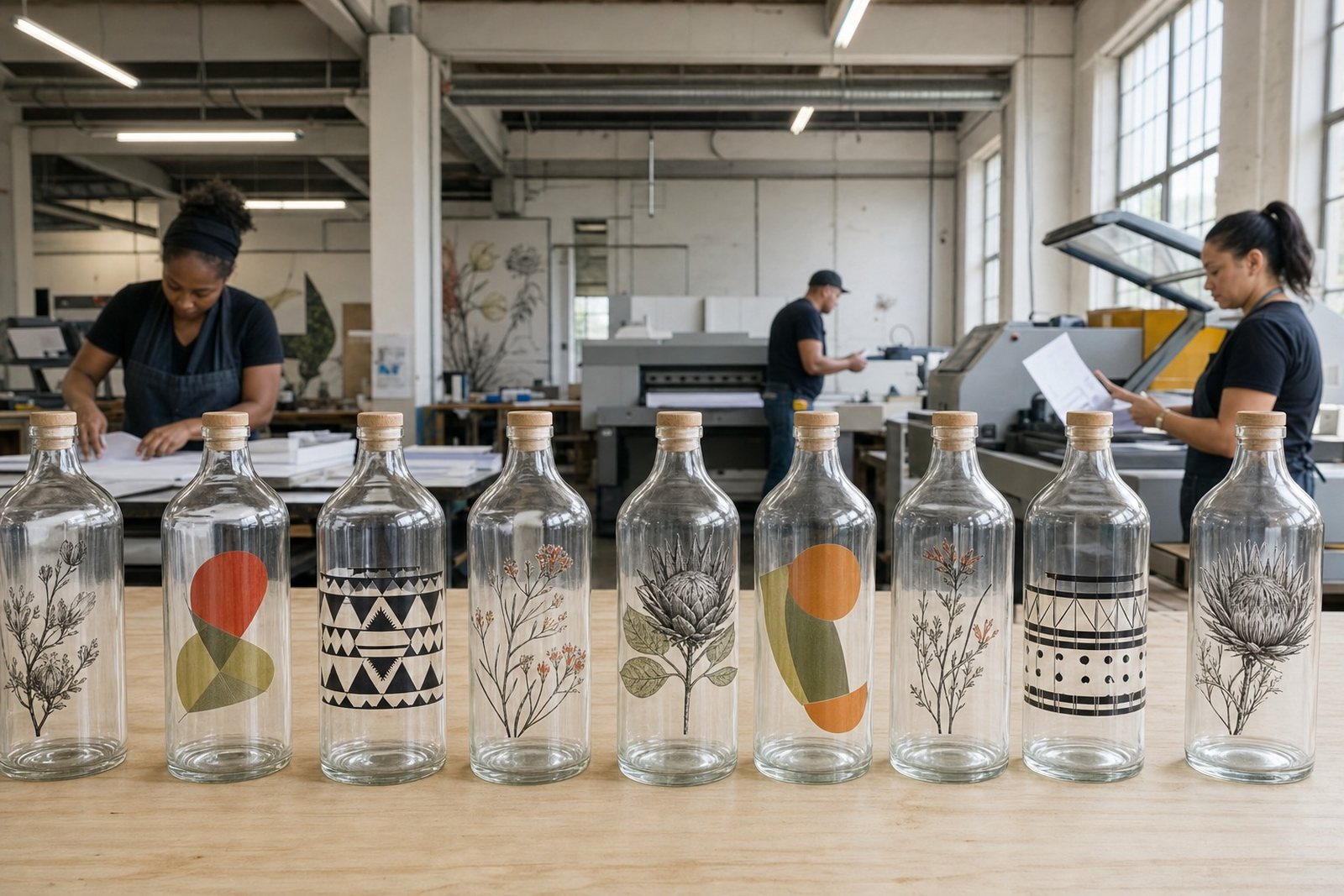
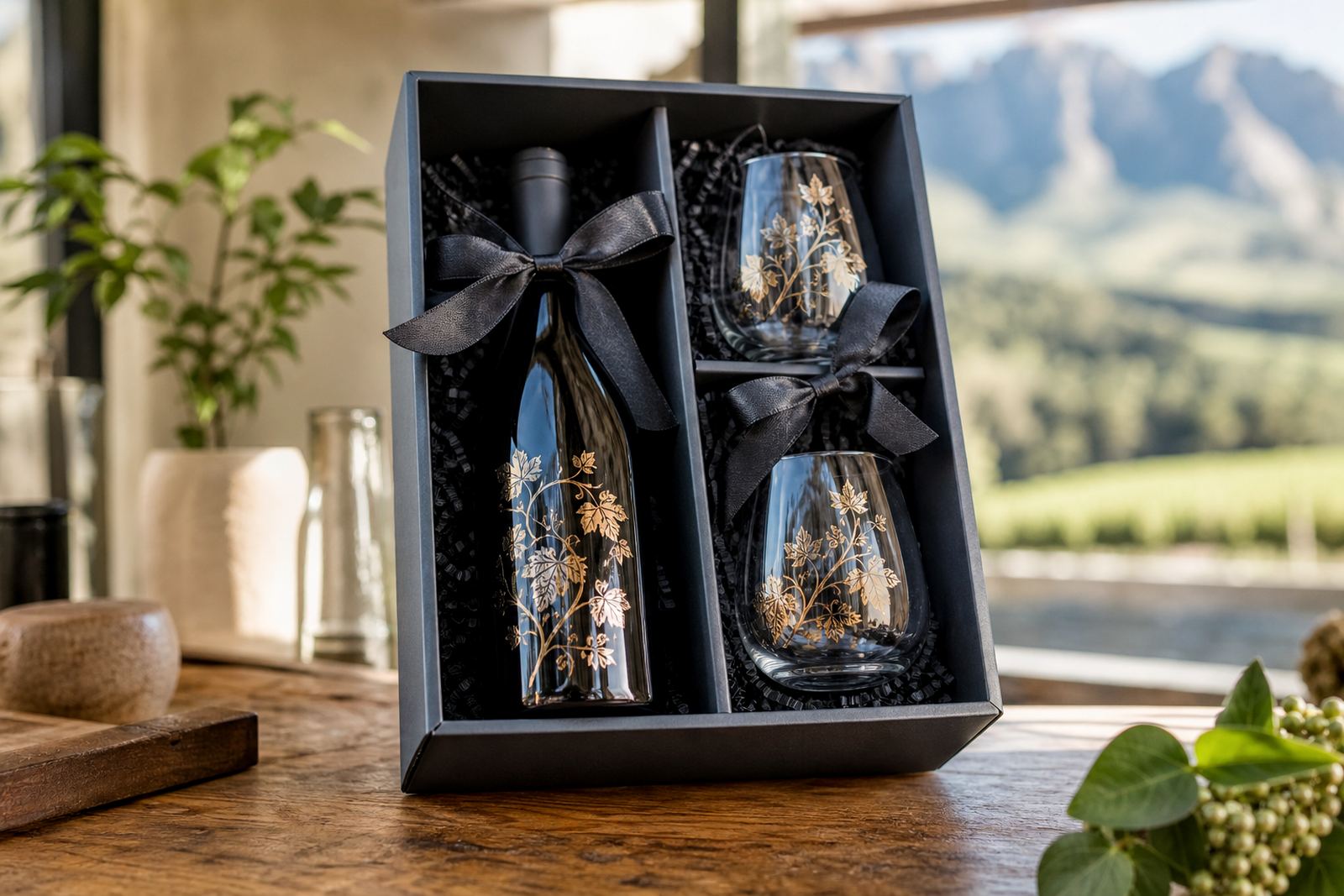
When the range includes both bottles and drinkware, the set-up needs to stay practical. It is often better to keep one artwork family across several items, then adjust the scale and placement for each format. That keeps the run tidy and avoids mismatched pieces in the final pack.
- Single-format runs for one bottle style
- Mixed bottle and drinkware sets
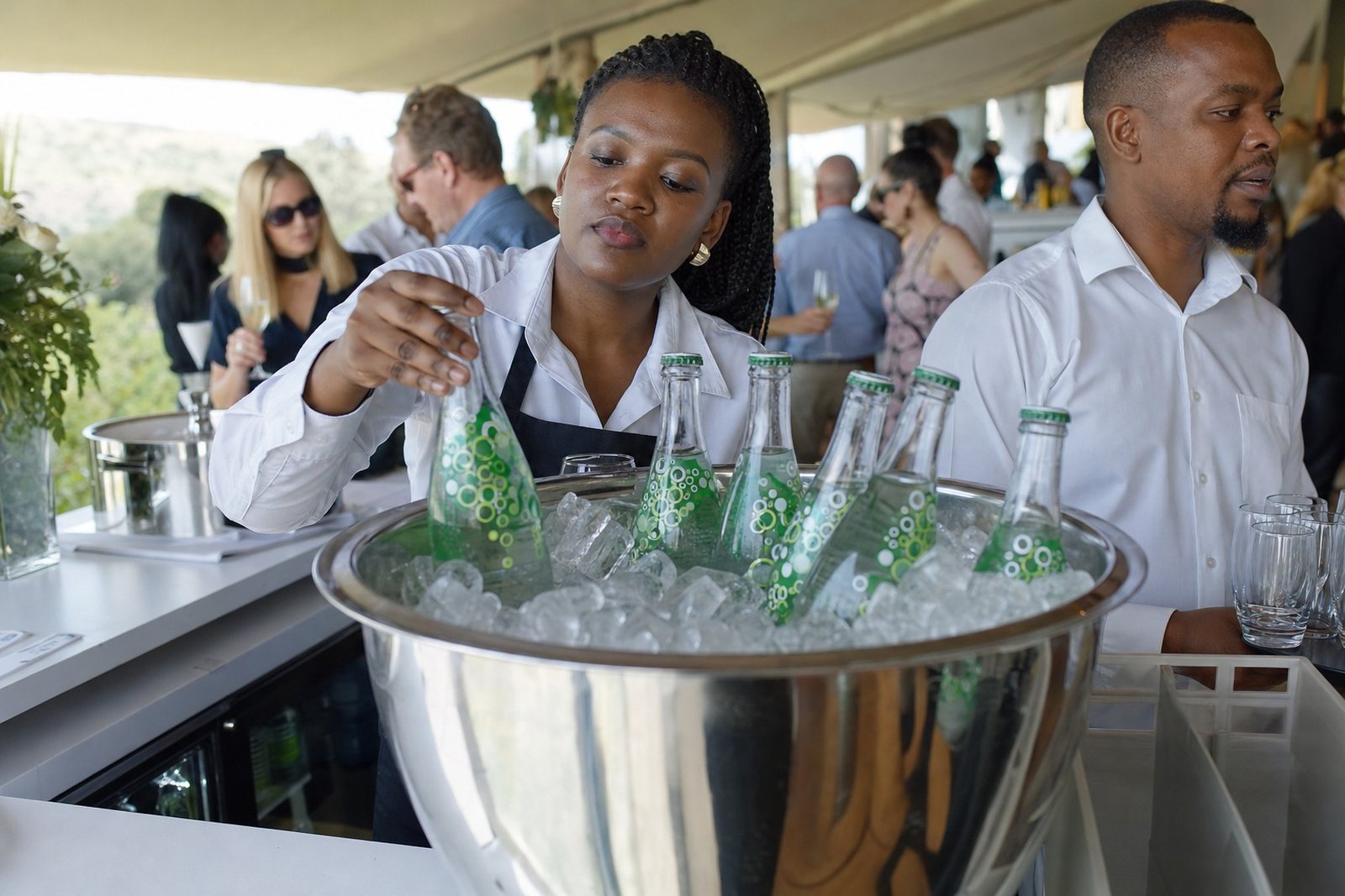
- Short batches for events and gifting
- Repeatable artwork across several vessel sizes
Colour guidance for glass, labels and ink
Colour reads differently on glass compared with paper. Light shades can disappear on clear bottles, while darker glass can mute small type or pale branding. White ink layers often help when the design needs backing, especially on tinted bottles or dark drinkware. Labels can carry finer colour detail, while direct print and screen print reward bolder shapes and stronger contrast.
For wine, gin and water ranges, the look needs to suit the bottle and the setting. A cellar door piece, a corporate gift set and an event bottle may share the same brand, but the print treatment may shift. The aim is to keep the artwork readable and balanced on the vessel, not just printed on it.
Packing, delivery and where the work goes
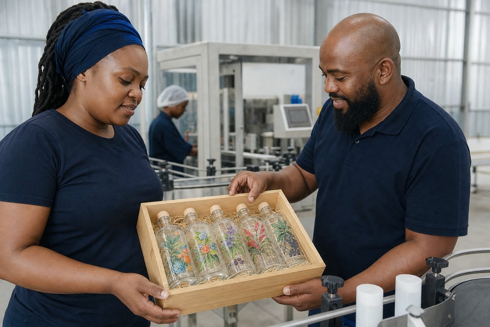
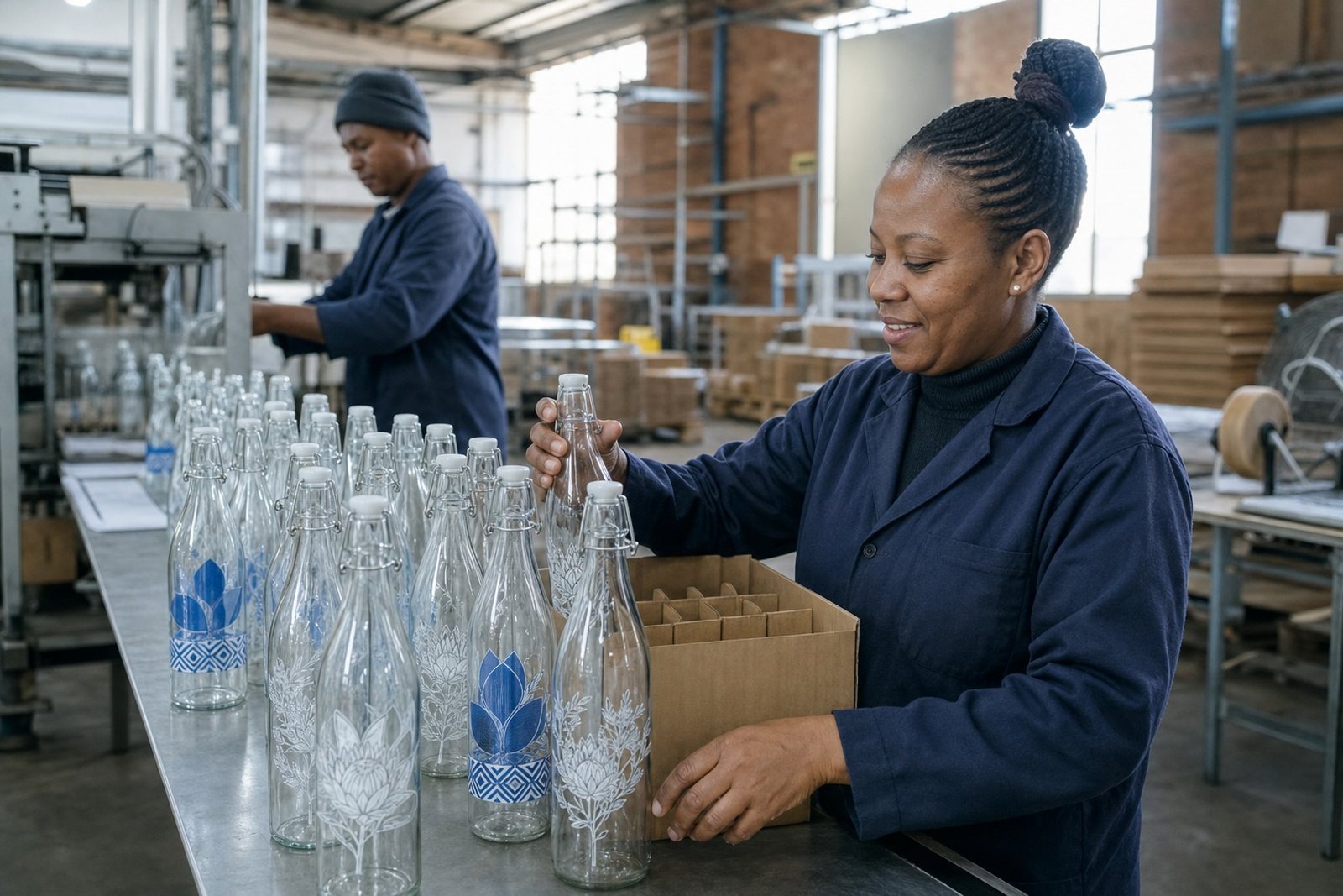
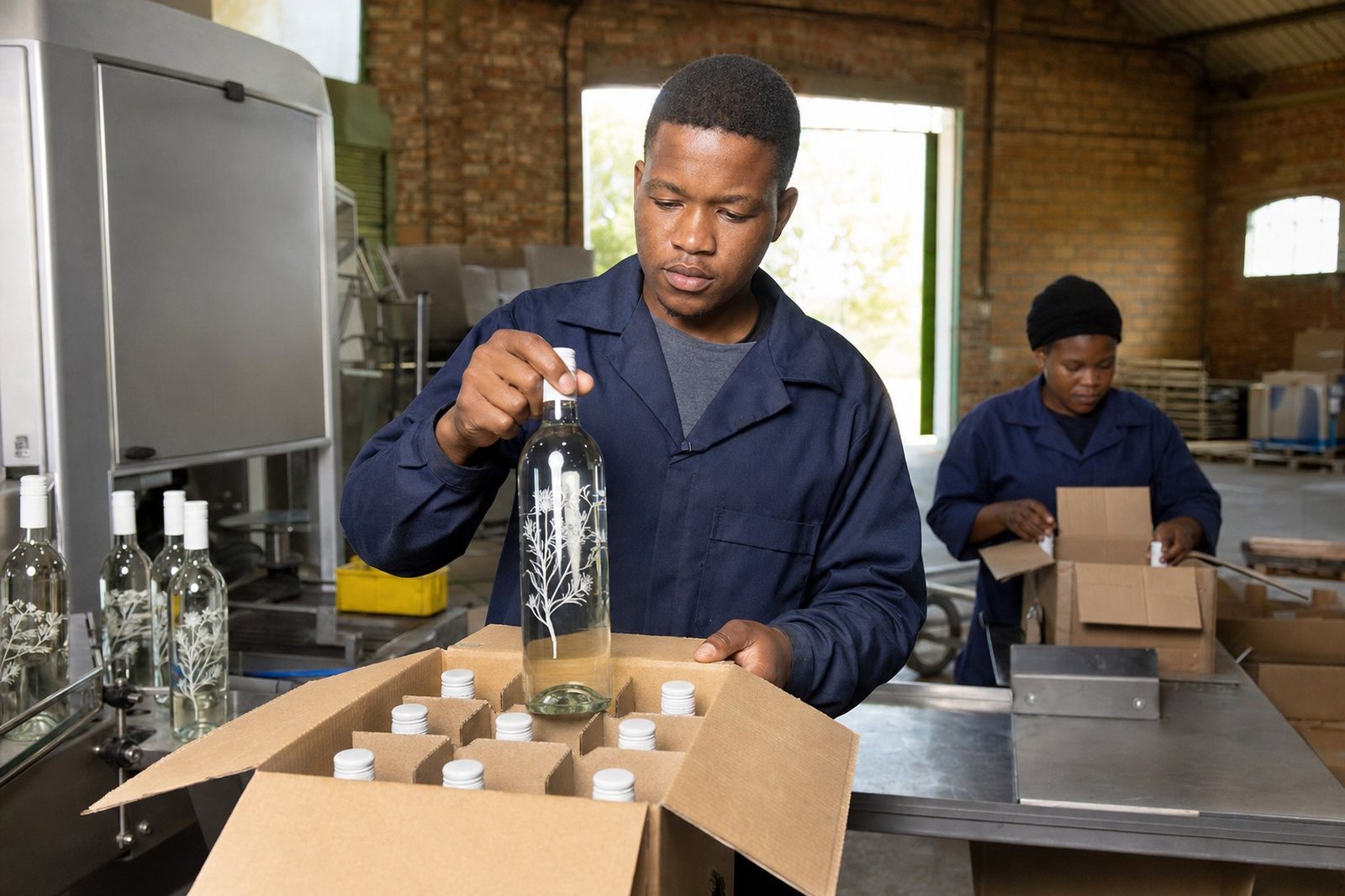
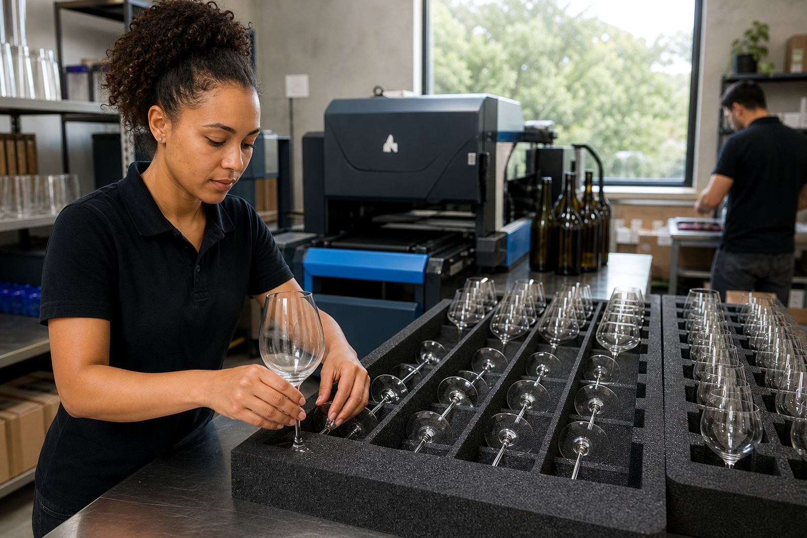
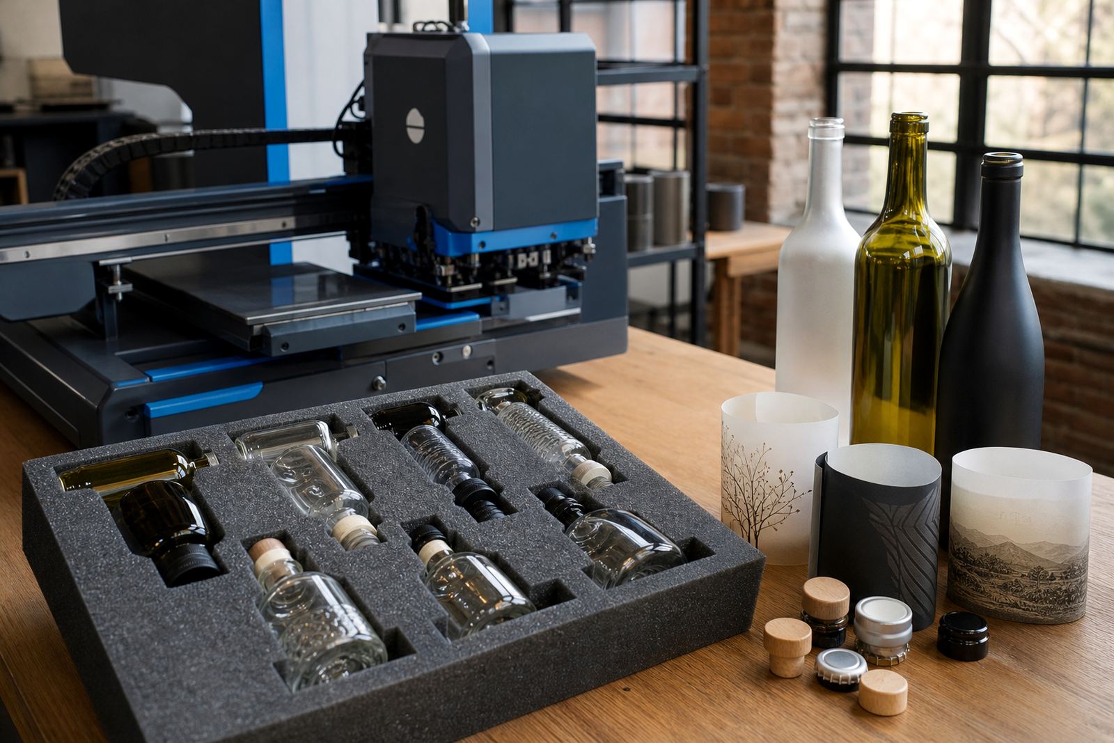
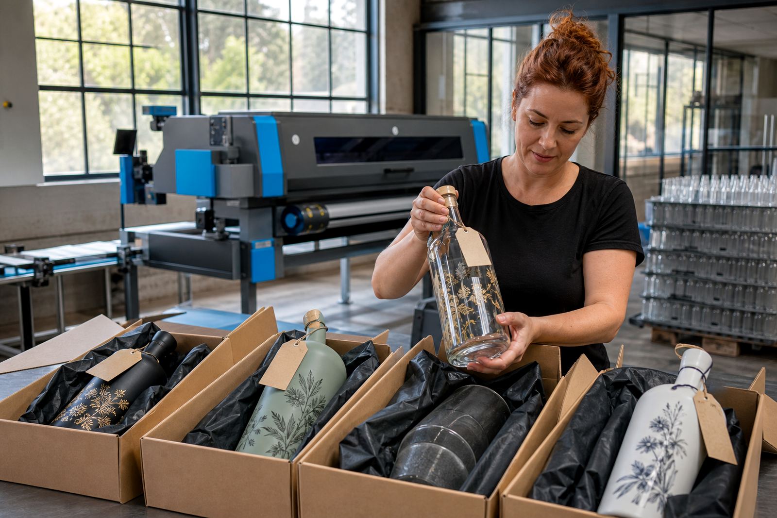
Short-run bottle printing often feeds into tight packing schedules, especially for launches, tastings and event boxes. Bottles need to travel safely, so packing briefs matter as much as the artwork. Sleeving, spacing and carton choice all affect how the finished pieces arrive.
From Paarl, work moves across the Cape Winelands and to major centres including Cape Town, Stellenbosch, Franschhoek, Johannesburg and Durban. Delivery planning also covers Somerset West and Constantia for local distribution. The service is built around the practical side of print, from artwork checks through to the final packed cartons.
- Paarl Delivery
- Cape Town Delivery
- Stellenbosch Delivery
- Franschhoek Delivery
- Johannesburg Delivery
- Durban Delivery
- Somerset West Delivery
- Constantia Delivery