Lettering That Survives the Curve
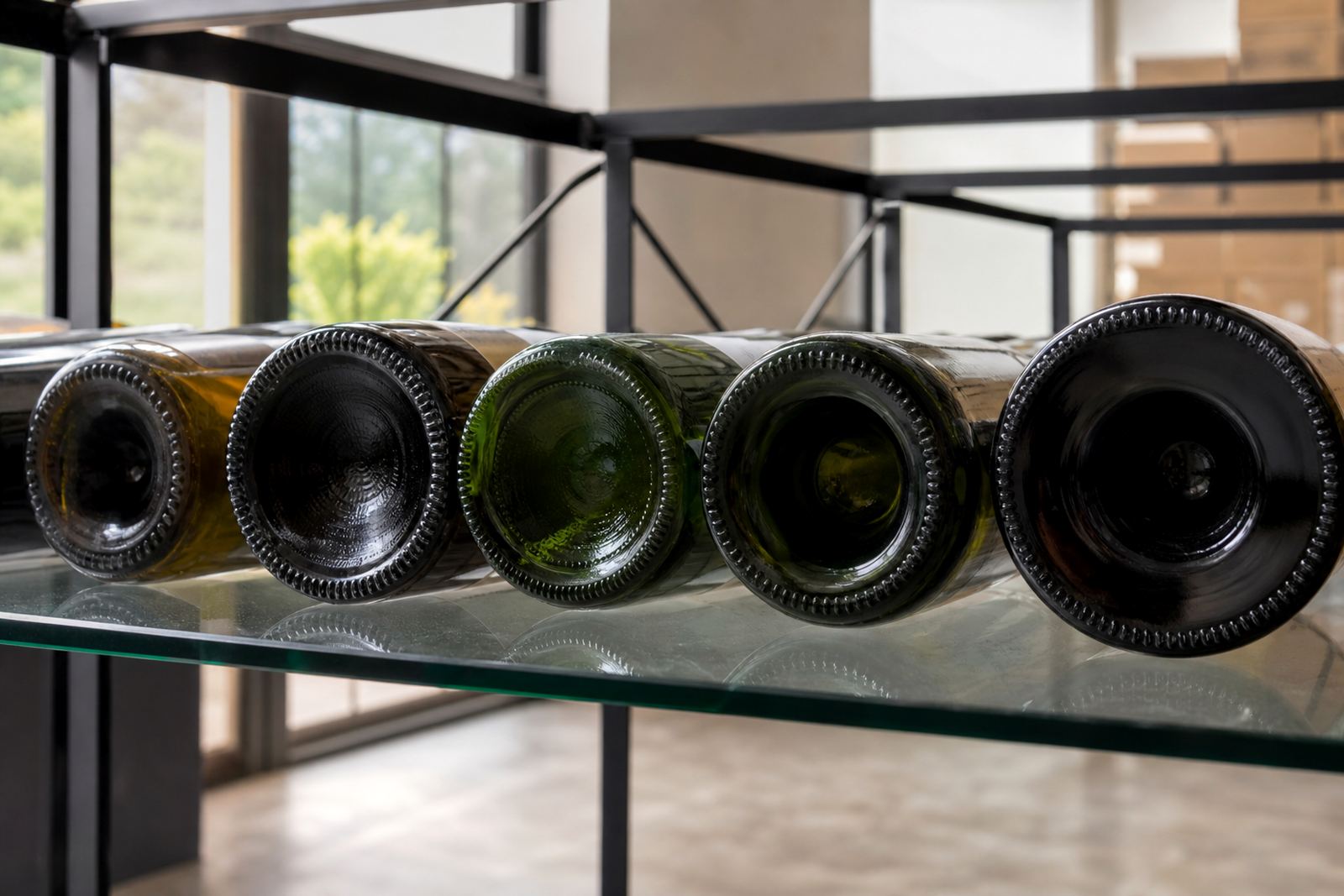
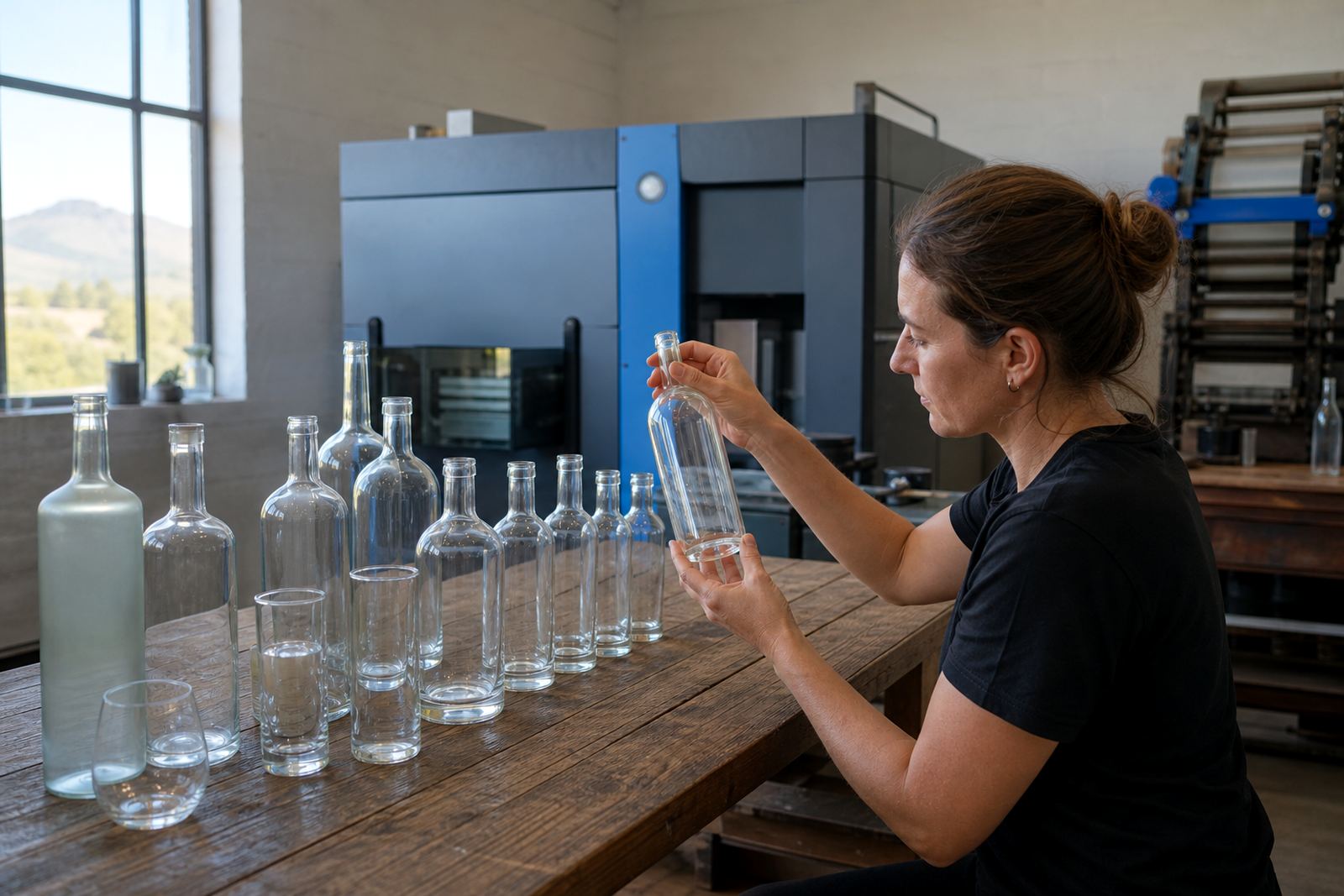
A bottle is not a flat poster, so artwork has to work around curvature, shoulders and taper. Tall stems, narrow necks and heavy bases all change how a label or print sits, especially on wine bottles and gin bottles with different silhouettes.
Small type can look neat in a layout file, then lose clarity once it wraps around glass. Sans serif wording, generous spacing and clean line weights usually hold up better on short runs, particularly where the bottle will be seen quickly on a counter, in a hamper or on a table setting.
- Make the main wording big enough to read from arm’s length.
- Allow extra breathing room near edges and curved shoulders.
- Check whether the front face or side face carries the message.
- Use stronger contrast when the glass itself is dark or tinted.
Where Contrast Does the Heavy Lifting
Legibility depends on contrast as much as font choice. A pale mark on clear glass can disappear in bright Cape Town light, while dark ink on frosted glass may hold better for a wedding table, tasting room or corporate gift set.
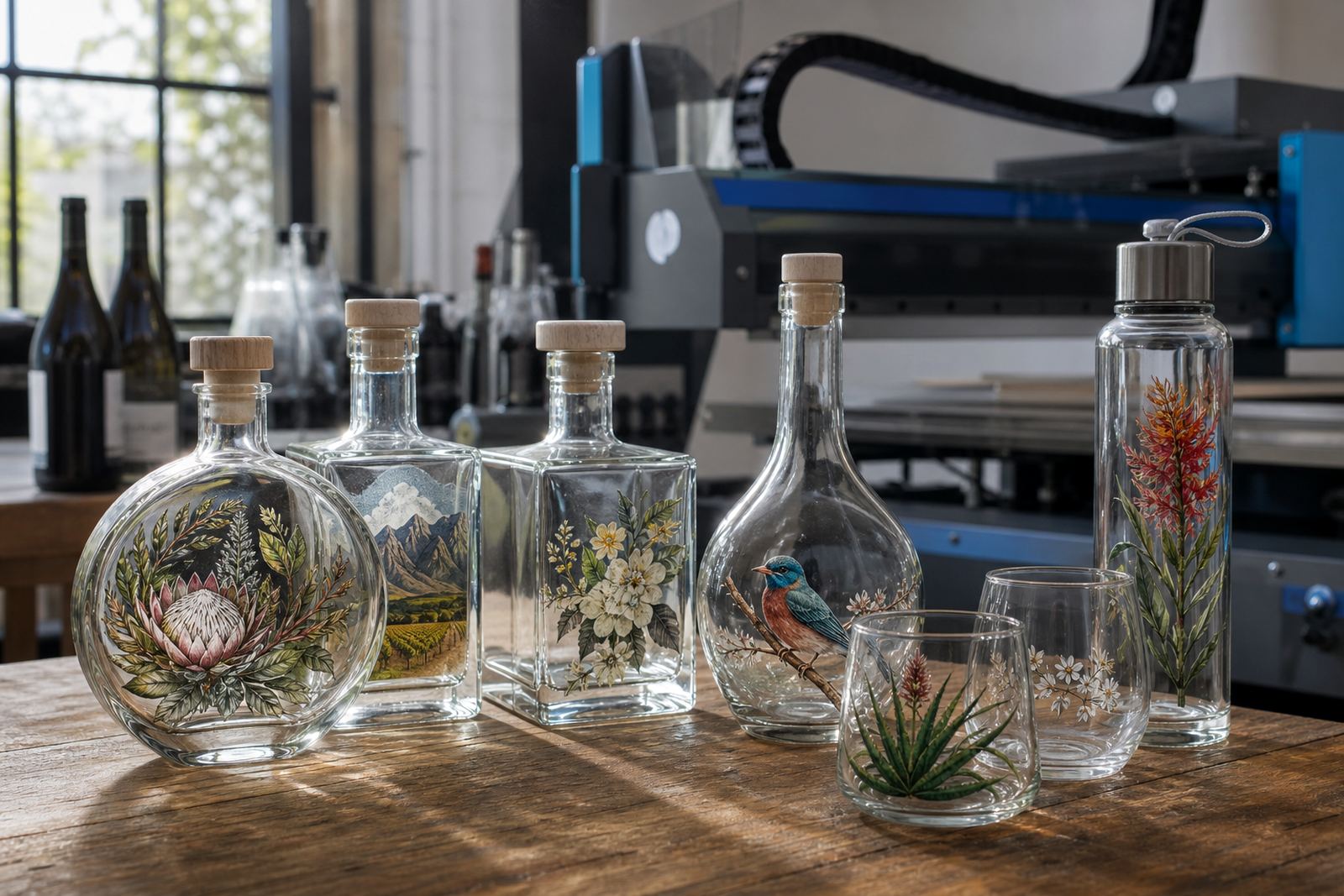
When the background is busy, white ink layers become useful. They give colour artwork a cleaner base on clear bottles, jars and tumblers, especially where transparent glass would otherwise mute the print. That matters on drinkware too, because curved sides and reflective surfaces can flatten soft colours.
- White ink helps colours stand out on clear glass.
- Opaque artwork reads better than thin, washed-out tones.
- Gloss and matte finishes affect how light hits the print.
- Foil and metallic effects need enough shape to stay readable.
Match the Method to the Message
Different decoration methods suit different artwork styles. UV direct print handles colour detail, short wording and small graphics well on many bottle and drinkware surfaces. Screen printing gives a solid ink layer for simpler artwork with bold shapes and stronger coverage. Ceramic enamel is used where a fired finish is needed on suitable glassware, while labels offer flexibility for more detailed layouts, batch changes or multi-language branding.
Artwork needs to be prepared for the method, not forced into it. A fine script that looks elegant on a screen may not survive as a tiny mark on a curved bottle, and a label with too much text can become crowded once folded around a narrow vessel. That is where print area planning matters before the run starts.
- UV direct print suits crisp details and shorter text blocks.
- Screen printing suits bolder artwork and fewer colour changes.
- Ceramic enamel suits durable glass marking where firing is suitable.
- Labels suit artwork that needs more copy or batch flexibility.
Proofs Catch the Problems Before Ink Goes Down
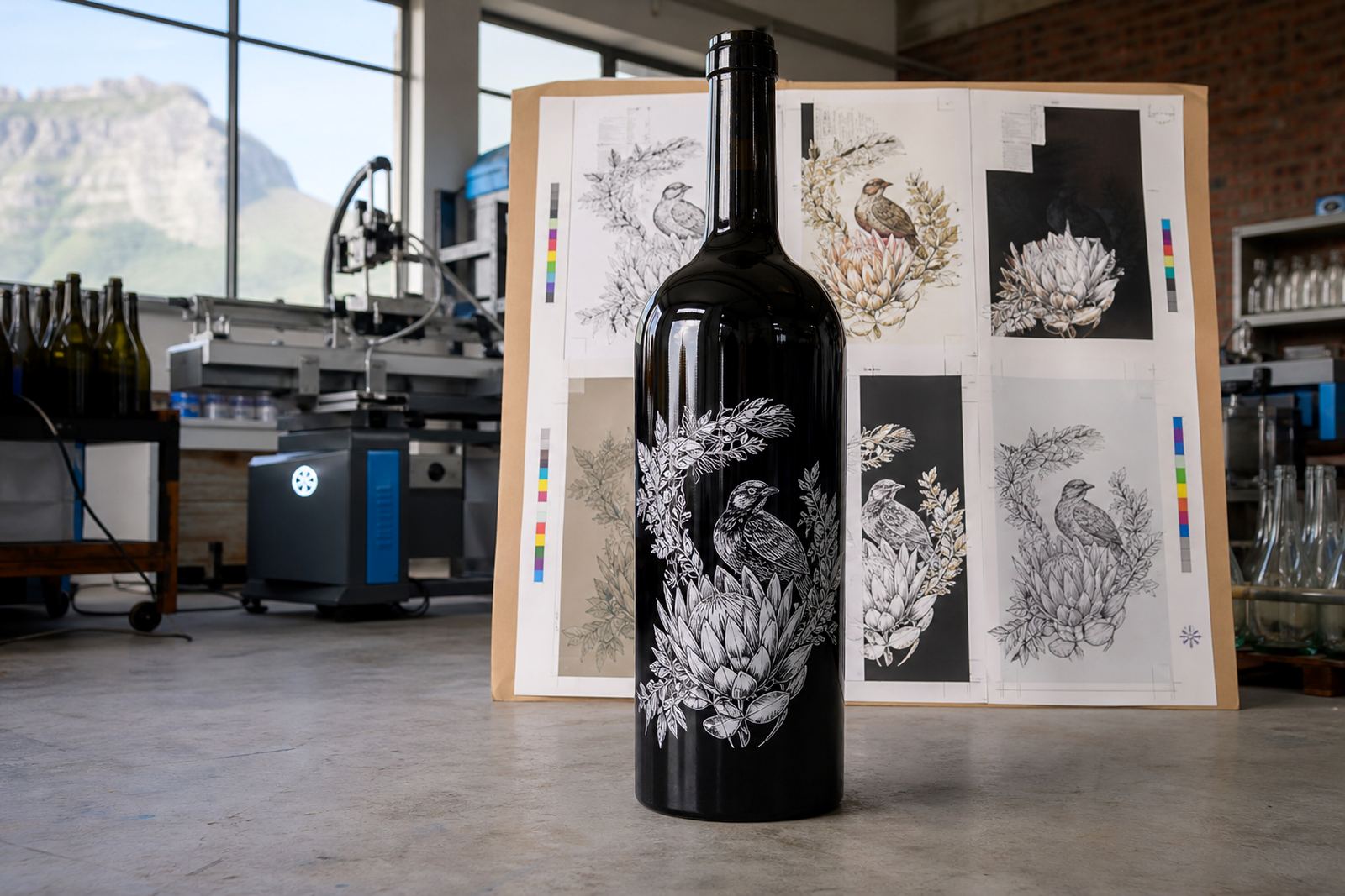
A proof is not just a formality. It shows how the artwork sits in the actual print area, where the safe margins are, and whether text, logos or bar-style graphics remain readable on the chosen bottle shape. That step saves trouble when a design looks fine on a computer but feels cramped on glass.
For short runs, the proof stage also helps with minimum run advice. If the artwork has too many small details, the layout may need simplification so the final result stays legible across the full batch. Proof approvals give everyone a common view before production starts.
- Check spelling, spacing and logo placement on the proof.
- Confirm the print area against the bottle shape.
- Look at contrast on the actual background colour.
- Review any fine lines before the run is approved.
Paarl bottle artwork that reads clearly
A winery sending gift bottles to Franschhoek or Johannesburg might want a clean front mark, not a crowded layout. On a slender white wine bottle, a short line of text, a tasting note or a small emblem often reads better than a dense block of copy. The same idea applies to gin bottles and water bottles for events, where the item is handled quickly and viewed from different angles.
In Paarl and the wider Cape Winelands, sunlight is strong and glass shows reflections easily. If the print is too pale, too small or placed too close to the curve, it can lose presence before the bottle even leaves the box. That is why the artwork has to be set for the actual vessel, not just the artwork file.
Pack the Brief Around Readability, Not Guesswork
A clean brief gives the artwork team the right information before the layout is set up. Bottle type, intended print method, the message hierarchy and the intended viewing distance all affect the final result. Once those parts are clear, it is easier to judge whether the main wording needs enlarging or the logo needs a simpler treatment.
For brands, events and cellar door packs, the most useful artwork usually keeps the message short and direct. A name, a date, a place or a brief line often outperforms a crowded block of copy. On drinkware, especially smaller glasses and tumblers, less text usually reads better and feels more polished.
- State the bottle or drinkware type clearly.
- Give the preferred print method where possible.
- Show the wording hierarchy in the artwork file.
- Allow room for packing and handling marks if needed.