Why amber glass changes the reading of artwork
Amber glass is not a neutral surface. The bottle itself brings warmth into the design, so pale colours can sink into the background and fine lines can lose their edge. A logo that looks crisp on clear glass may read very differently once it sits on amber. That is where print planning earns its place.
For wineries, distilleries and event bottles, the goal is usually a label or direct print that stays legible from arm’s length and still holds detail when someone lifts the bottle. Dark glass can flatter deep reds, blacks and metallic tones, but those same colours need support if the mark is small or the bottle has curves, shoulders or embossing.
We normally look at the artwork, the bottle shape and the final viewing distance together. A tall wine bottle on a tasting table asks for a different treatment from a compact gin bottle or a reusable glass water bottle with a narrow print band. The method matters, but colour contrast decides whether the result reads cleanly.
Print choices that suit amber surfaces
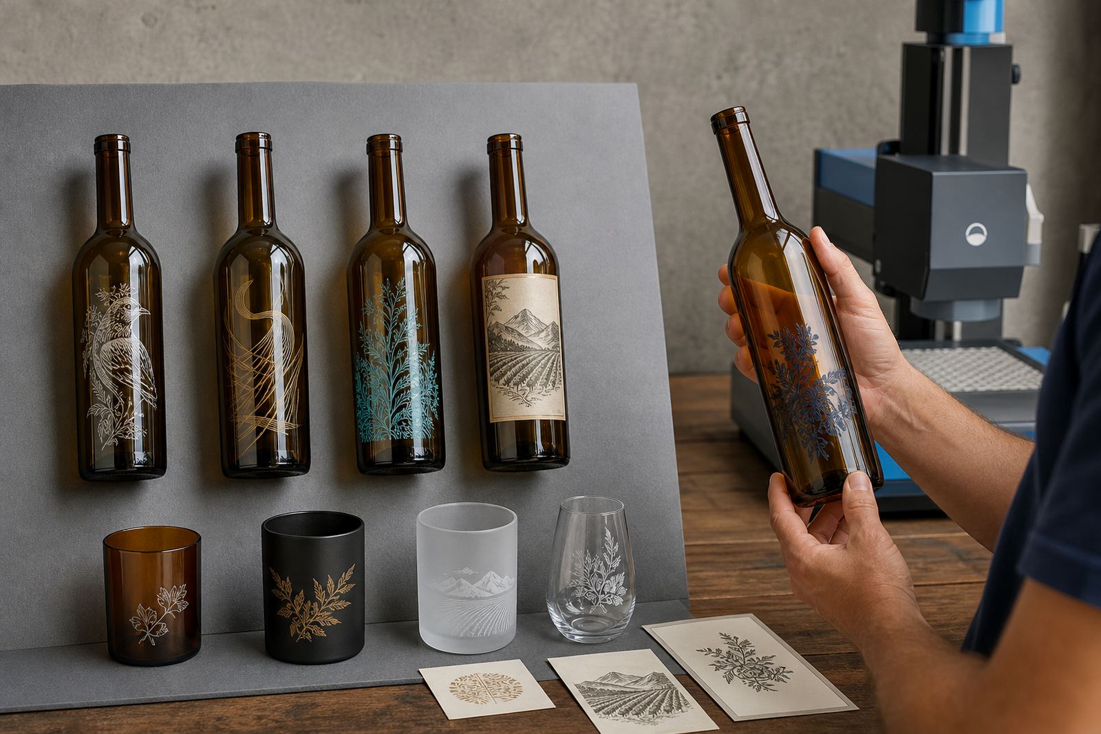
Several decoration methods can work well on amber glass, but each one handles contrast in its own way. UV direct print gives sharp placement and works well for short runs where artwork detail matters. Screen printing suits bold blocks of colour and can hold up on curved glass when the artwork is planned with the print area in mind. Ceramic enamel is a stronger decorative route for bottles that need a fired finish, while labels remain useful when colour flexibility, wording changes or multiple variants are part of the brief.
White ink is often the bridge between the glass and the artwork. It can sit under colour, lift a logo off the amber tone or help smaller text stay readable. Without that underlayer, certain colours may look muted or muddy. That is not a fault in the artwork itself, it is the glass changing the way the colour lands.
- UV direct print for short, detailed artwork on selected bottle shapes
- Screen printing for solid artwork, repeated runs and strong colour fields
- Ceramic enamel for a fired decorative finish on suitable glassware
- Labels for flexible branding, variable wording and mixed product ranges
Design moves that keep amber glass readable
Readable artwork on amber glass starts with contrast, line weight and placement. Thin serif text, pale greys and soft gradients can disappear on the wrong bottle. Stronger type, cleaner spacing and bolder icon shapes usually hold up better, especially on smaller surfaces such as mini bottles, tasting pourers or short cylindrical drinkware.
Not every brand needs a loud look. Sometimes a restrained label with generous white space gives the amber tone room to work. Other projects need a dark print panel with white type, or a clear area that lets the glass show through. Build the amber tone into the design, with print, spacing and clear areas planned around it from the start.
- Use higher contrast between text and glass tone
- Keep fine detail out of the tightest curves
- Allow more space around logos and bottle neck transitions
- Test small wording at the actual print size, not only on a screen
A local wine release in the Cape Winelands may need the brand mark to sit on a shoulder with a small flat area, while a gin bottle for a Johannesburg launch might need the artwork centred lower to avoid distortion from the glass curve. That sort of adjustment can mean the gap between a neat finish and a label that feels cramped.
Proofs, mock-ups and colour guidance before the run
Amber glass leaves little room for guesswork. A proof shows how the artwork sits on the bottle size, where the print lands and how the colours interact with the glass tone. Mock-up visuals help with proportion before production begins, while colour guidance can flag where a shade may need more support, or where a white layer will improve clarity.
Artwork checks are useful for more than spelling. They help confirm line thickness, knockouts, overprints, barcode placement where relevant and whether the file will hold on the selected decoration method. If a logo has a pale gold element, for example, it may need a different treatment on amber than on clear glass. The proof stage is where those calls get made in a practical way.
For short runs, this matters even more. You do not get the luxury of large test batches and casual adjustments. A clean proof process protects the run, keeps the packing brief aligned and reduces the risk of discovering a problem after the first bottles are already printed.
Short runs for wineries, distilleries and events
Short runs suit launches, seasonal bottlings, corporate gifting and event service where quantities are smaller and the deadline is tied to a specific date. Amber glass is often chosen for products that need a warmer, more premium presence. It works well for wine, gin and some premium water applications when the branding is planned with the bottle in mind.
Minimum run advice is part of the planning because each method carries its own setup. A label run may suit a different quantity range from a direct print or ceramic enamel job. The right number depends on the bottle type, the artwork coverage and whether the same design is going onto one item or across a small range of drinkware.
- Wine bottles for releases, tastings and cellar door sales
- Gin bottles for branded gifting or distillery display
- Water bottles for hospitality settings and event tables
- Drinkware for paired sets, hampers and client packs
Paarl, Stellenbosch and Franschhoek often bring briefs that need a polished finish for tasting rooms and local functions. Johannesburg and Durban can add distribution pressure, so packing and dispatch have to suit the route as well as the print. Amber glass travels best when the print plan and the packing brief match the bottle shape.
A practical reading of one amber bottle brief
Picture a short run of amber wine bottles for a corporate tasting in Cape Town. The client wants the label to feel refined, but the logo includes fine script and a pale accent colour. On amber glass, that script may need stronger spacing and the pale accent may need a white base or a darker outline to stay legible. A mock-up can show whether the badge should move higher, whether the wording needs to grow slightly, and whether the label shape should soften the shoulder curve.
In another brief, a distillery might want amber glass gin bottles with a direct print and a small crest. The crest can work well if the white underlayer is balanced carefully, while the wording below it may need a thicker stroke to survive the bottle curve. That is the sort of detail that protects the final look without changing the whole brand language.
Amber glass offers depth, but it asks for discipline. If the colour story is planned properly, the bottle looks intentional and not crowded. If it is left to chance, the artwork can vanish into the glass. The best results usually sit somewhere in the middle, with enough contrast to read cleanly and enough restraint to let the amber do its part.