

Narrowing the brief
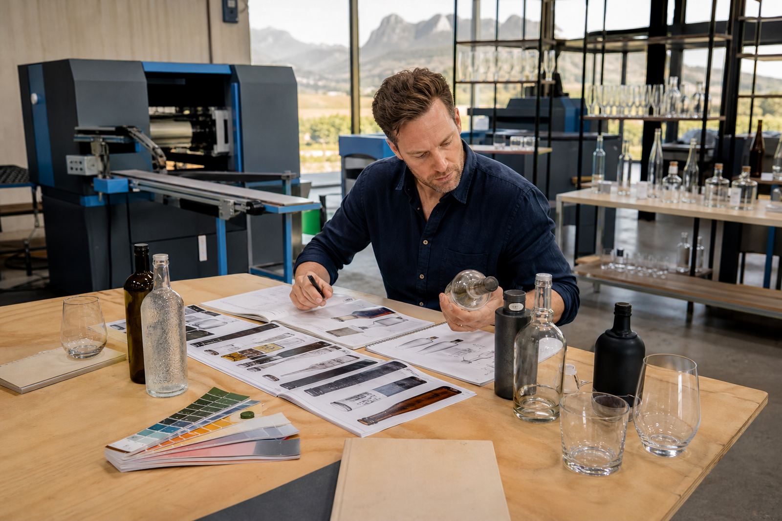
Most decorated bottle and drinkware jobs come down to the same decisions, from surface type to print method: whether a label can sit neatly on a curved bottle, or whether a direct print will hold its position around a small wine or gin run.
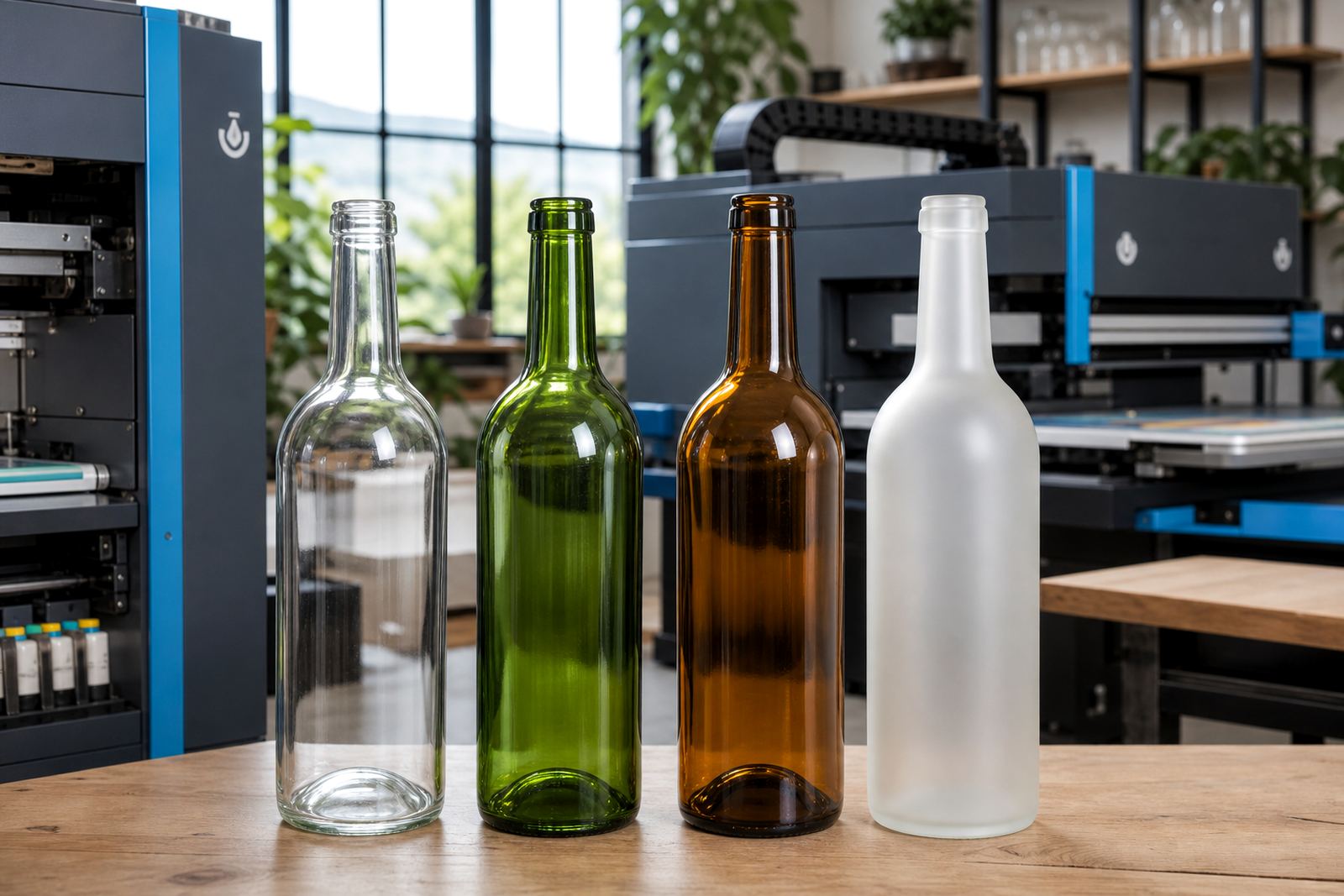
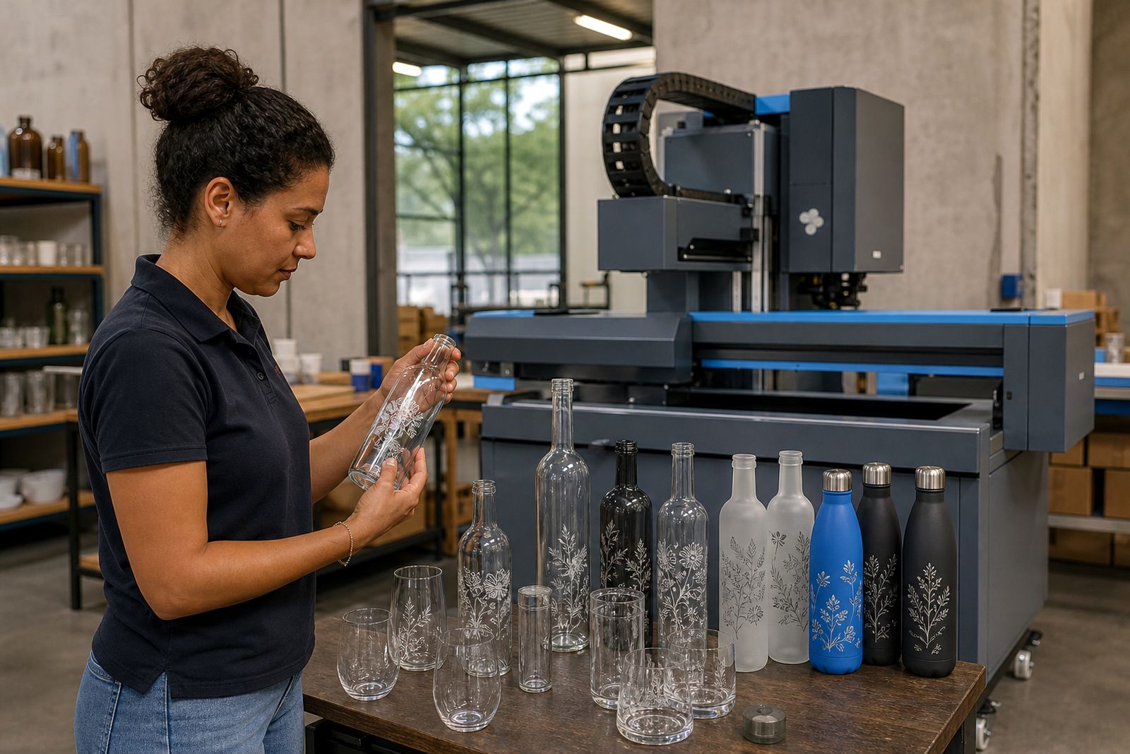
Plain glass, tinted glass, smaller spirit bottles, water bottles and reusable drinkware each change the artwork, finish and packing.
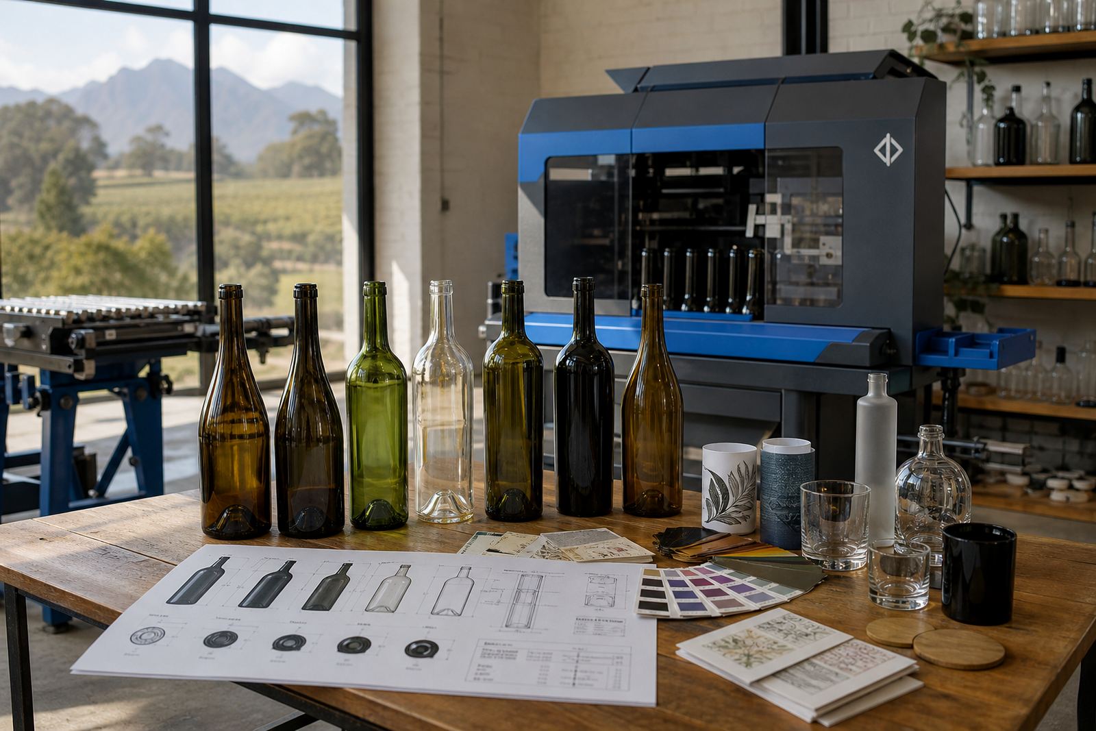
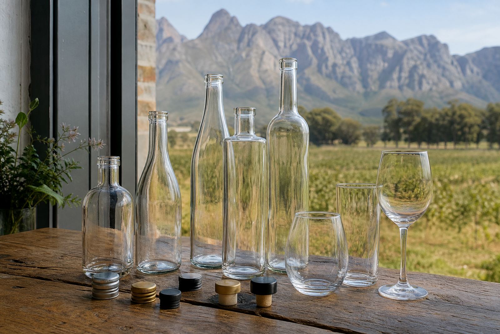
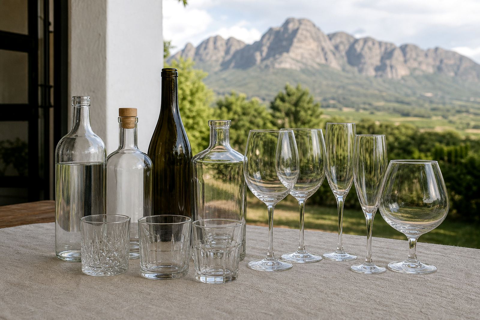
Bottle surfaces and drinkware shapes that show up often
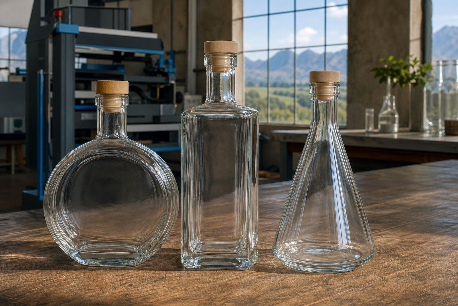
Different containers call for different handling, especially when the neck is narrow or the shoulder curves sharply. Clear glass, frosted glass and coloured glass all behave differently under light, and that changes how text, logos and fine detail read once printed.
- Wine bottles for table service, gifting and cellar sales packs
- Gin and spirit bottles with heavier shoulders and taller panels
- Water bottles for events, hospitality trays and branded coolers
- Glassware and tumblers for tasting rooms, launches and staff packs
- Reusable drinkware where durability matters more than decoration density
Print methods set out in plain terms
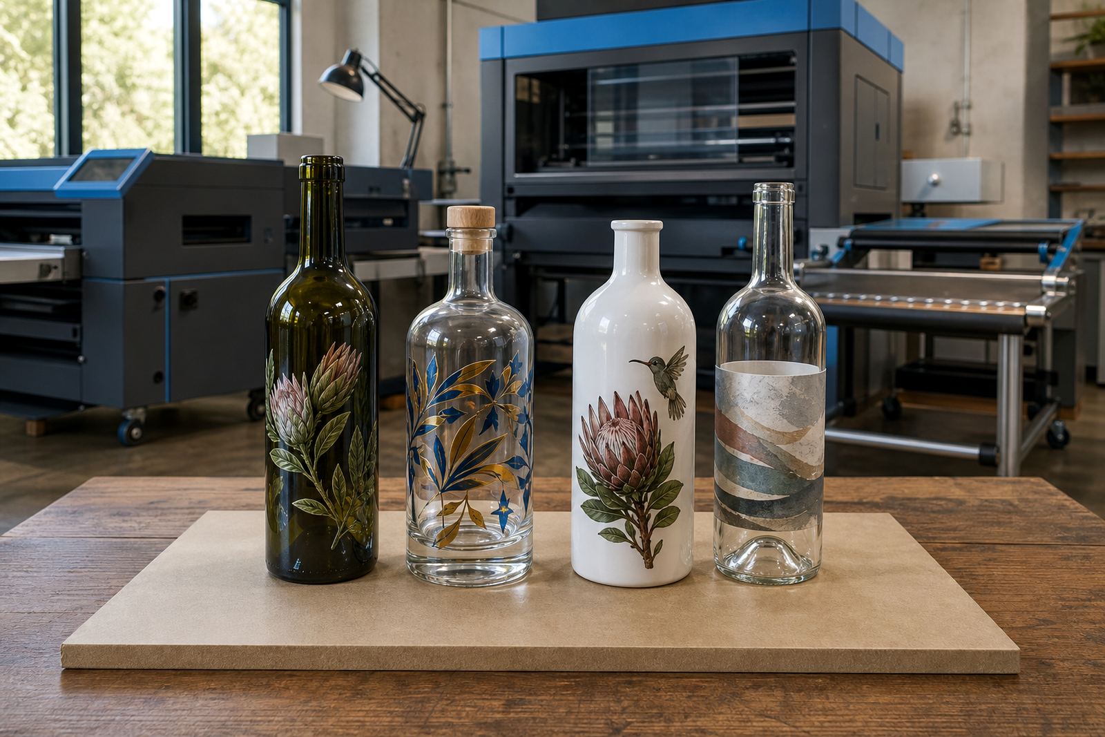
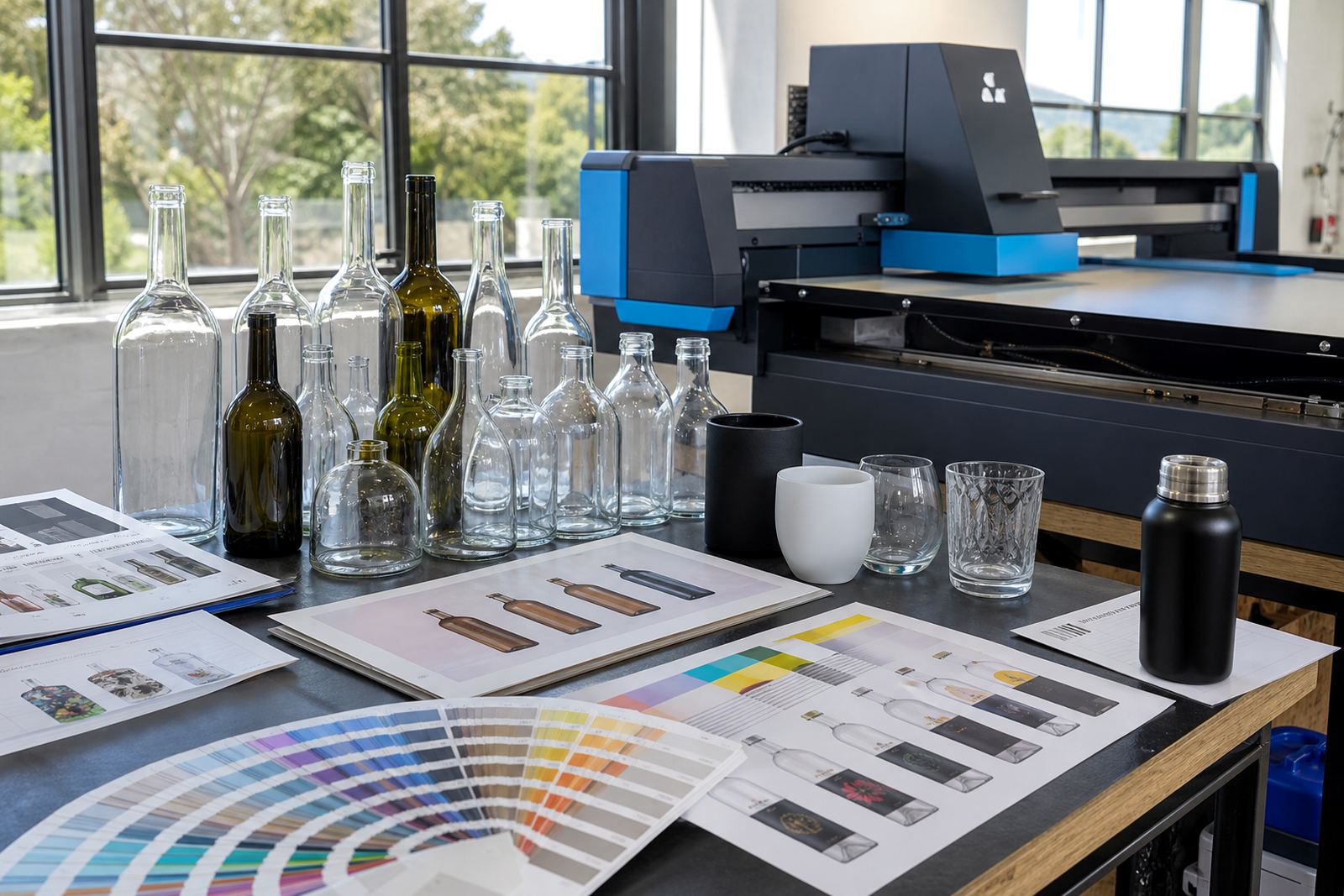
UV direct print suits short runs where sharp text, solid colour blocks and neat placement matter on glass or coated drinkware. Screen printing is useful when a single colour or a few spot colours need a strong, even finish across a run.
Ceramic enamel works for glass that must take a fired finish, while labels remain useful when artwork changes often or bottle shapes vary from batch to batch. White ink layers can support darker bottles, and they are often needed when the artwork has pale tones or fine detail.
Artwork checks before a proof is approved
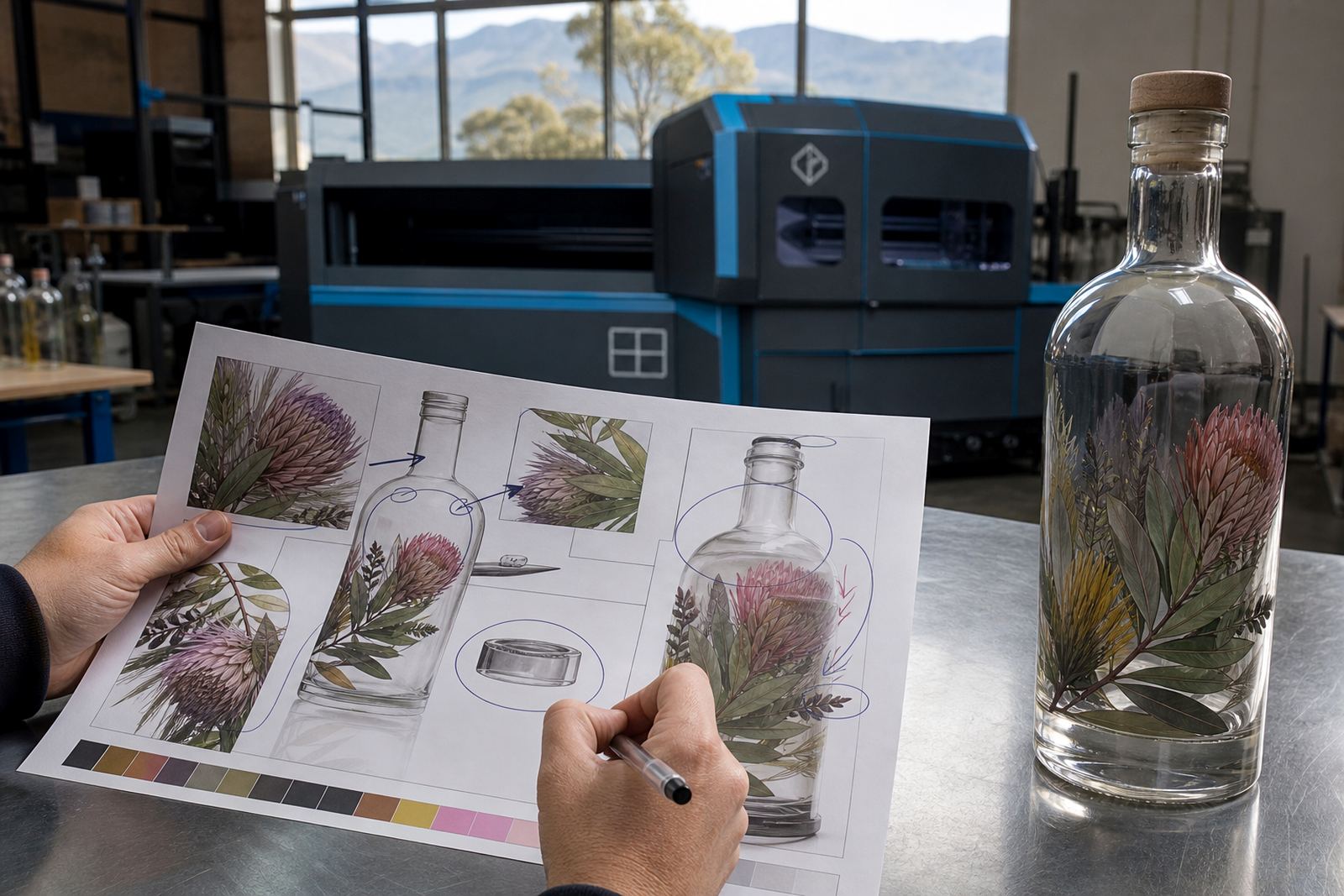
A clean proof depends on the artwork being set to the actual print area, with text kept clear of curves, seams and shoulder breaks. Small details can disappear on curved glass, so line weight, reverse text and colour contrast need practical attention before production starts.
- Vector files help with logos and crisp line work
- Fonts need enough weight for small print areas
- White ink may be needed under pale artwork
- Label layouts should allow for wrap and trim space
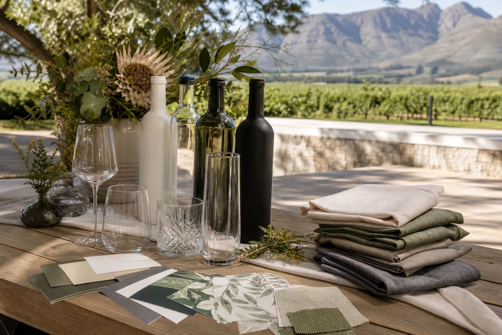
- Mock-up visuals help show placement on the bottle
Minimum runs and short-batch planning
Short runs suit launches, seasonal gifting and event packs where the quantity is limited but the finish still needs care. Minimums can differ by method, bottle type and number of colours, so the run needs to be matched to the method rather than forced into the other way around.
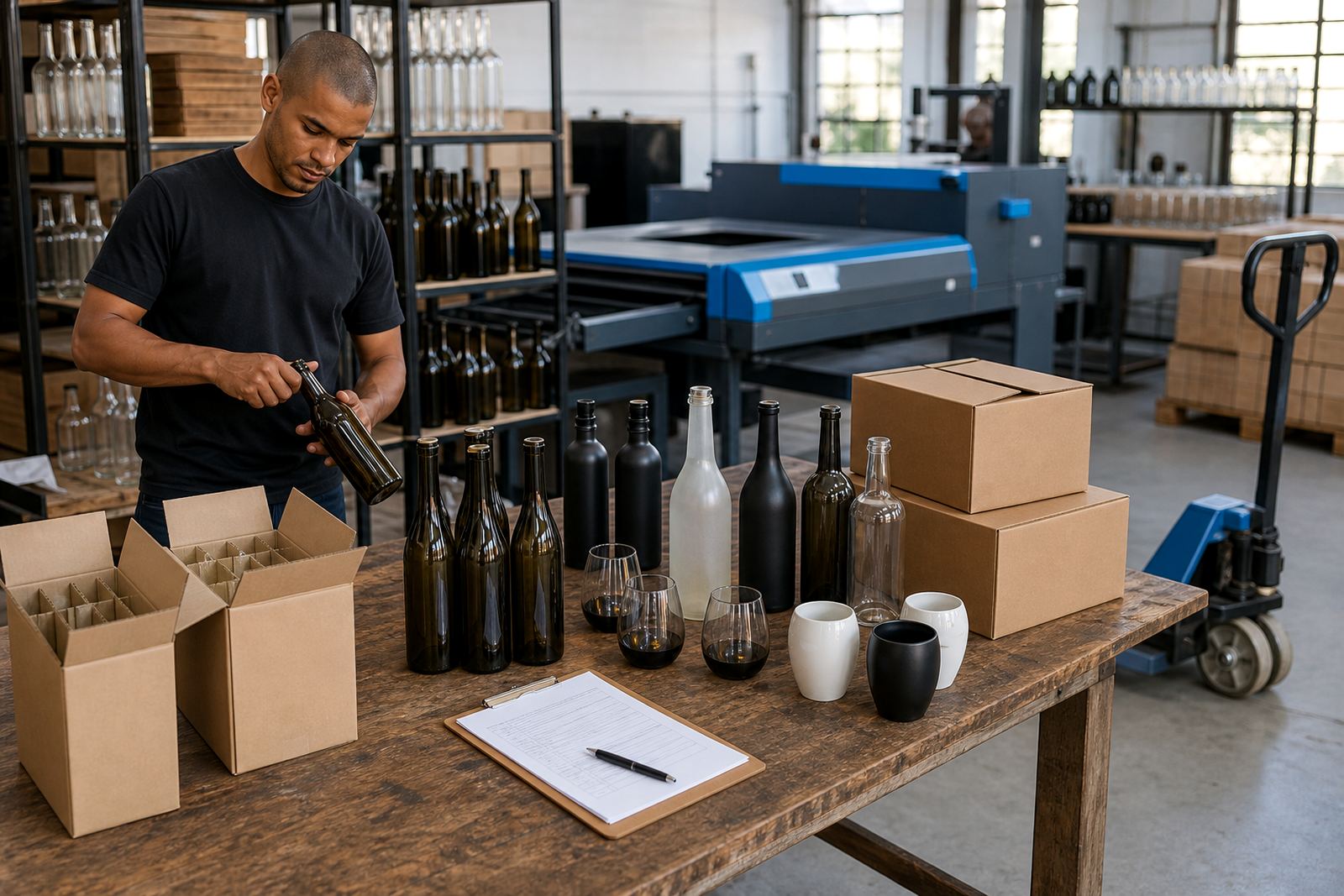
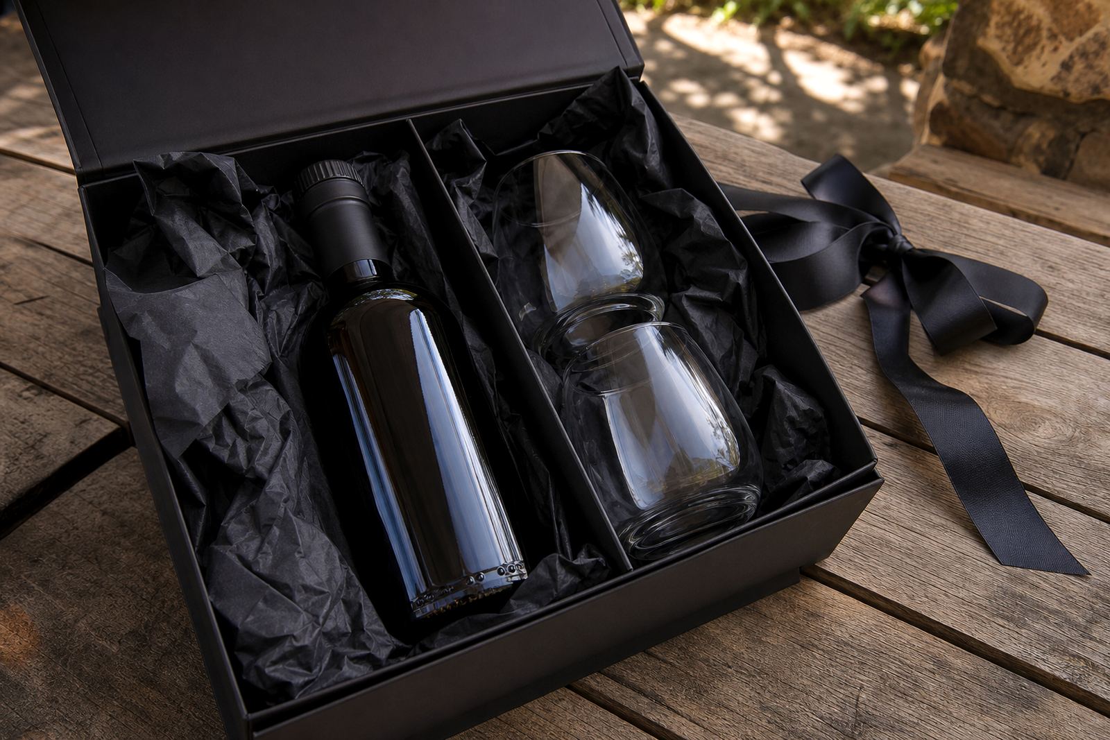
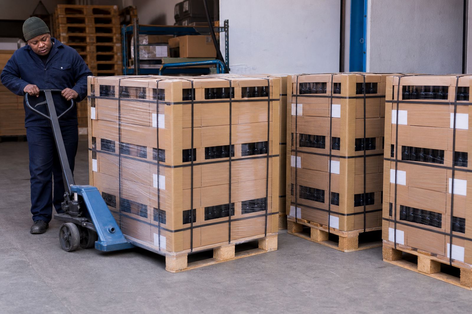
For smaller quantities, labels may be the better path, while direct print methods can suit repeat runs with stable artwork. Packing briefs also matter, because bottles and drinkware need safe handling, carton space and the right sequence for dispatch.
Delivery notes for Paarl and wider South Africa
Our work is rooted in the Cape Winelands, with deliveries arranged for Paarl, Cape Town, Stellenbosch, Franschhoek, Somerset West and Constantia, plus Johannesburg and Durban. That matters when orders move between cellar doors, event venues and corporate gifting teams in different provinces.
Coastal humidity can affect how cartons are sealed and stored, while inland deliveries may need different timing around venue receiving rules. Planning for both keeps decorated bottles and drinkware arriving without surprises, even on a small order.