Why Green Glass Changes the Read on Bottle Surfaces
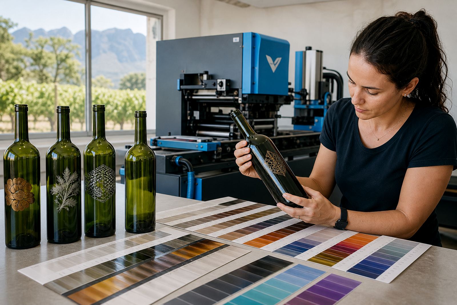
Green glass is not a neutral base. It carries its own colour into the finished piece, so ink that looks bright on clear glass can read darker, flatter or more muted once it sits on a green bottle. That matters on wine bottles, gin bottles and water bottles, where the label area may be small and the branding has to work from a shelf distance or across a table.
On darker green glass, fine text and pale brand marks often need extra planning. White ink layers can help, and so can a careful choice between direct print and labels. A strong artwork file is useful, but the print method still decides how much contrast survives on the bottle.
Print Methods That Suit Green Glass
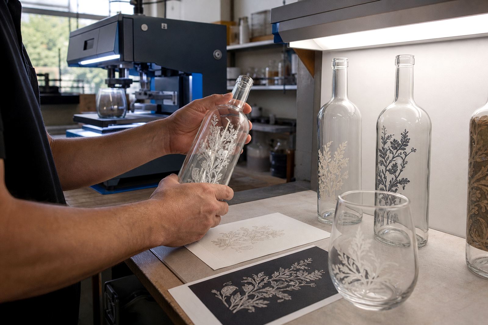
UV direct print can work well when the artwork needs sharp edges and a clean finish on glass. On green bottles, a white underlayer is often used where the artwork must sit bright and readable. Screen printing is useful for simpler artwork with solid areas of colour, especially where a repeat run needs steady placement and a consistent feel.
Ceramic enamel suits bottles that need a fired finish and a more permanent result. It is often considered for premium bottles, where the artwork sits close to the glass rather than on a separate label. Labels stay useful too, particularly where the design carries more detail, gradients or fine type that may lose clarity when printed directly.
- UV direct print for crisp logos and controlled short runs
- Screen printing for solid colour blocks and fewer ink changes
- Ceramic enamel for a more lasting decorative finish
- Labels for artwork with detail, texture or multiple brand elements
Light Ink, Opaque Ink and White Backing
On green glass, light colours need help. Pale grey, soft gold, cream and light blue can disappear unless the artwork is built with opacity in mind. White ink layers are often the difference between a logo that stands out and one that slips into the bottle colour. That is especially true on smaller bottle neck marks and compact gin bottle designs.
Opaque inks block more of the base colour and are useful when the brand must read cleanly on a dark green surface. They can also hold linework better than translucent inks. If the brief includes metallics or pale tints, the artwork should be tested against the actual bottle shade, not only a screen preview.
- Light inks need a stable backing layer on darker glass
- Opaque inks improve legibility on small print areas
- White ink can support colour accuracy and contrast
- Testing on the real bottle shade avoids surprises in production
Artwork Proofs Before a Short Run Starts
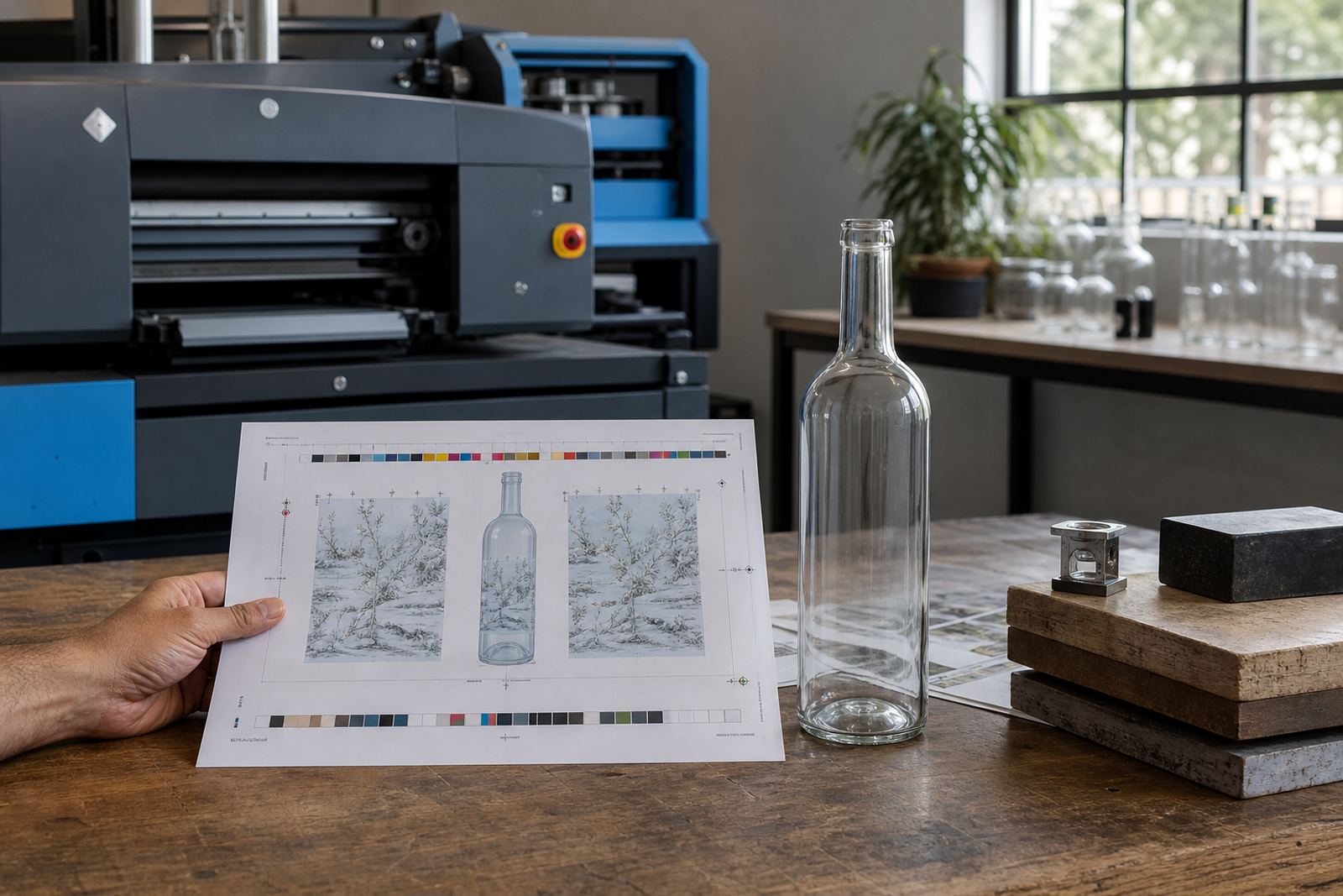
Short runs leave less room for guesswork. That is where artwork checks and proof approvals matter. A proof shows placement, scale, colour balance and the way the print area sits on the bottle curve. It also helps with label artwork setup, where the neck, shoulder and front panel need separate consideration.
For green glass, proofs should show how the design behaves against the actual bottle colour. A mock-up visual can reveal whether a white logo needs a heavier base, or whether a label needs a cleaner border so the green glass does not crowd the artwork. Print area planning is useful when the same range includes wine bottles, gin bottles and water bottles with different body shapes.
- Check logo size against the bottle shoulder and body curve
- Review colour notes against the actual green glass shade
- Confirm the safe area before plate or print setup
- Use proof approval to lock placement and finish details
Planning green glass bottles across a range
A cellar door in the Cape Winelands may want one design to carry across a green wine bottle, a gin bottle and a water bottle for tasting events. The same logo can work across the range, but the print method may change from one bottle type to the next. A wine bottle might suit a simple two-colour screen print, while a water bottle with a slimmer shape may need a label to keep the text easy to read.
That sort of job needs practical planning, not just artwork. If the bottles are heading to Stellenbosch or Franschhoek for an event, packing brief details matter too, so the bottles arrive sorted by design and count. For deliveries to Cape Town, Johannesburg or Durban, the same care helps keep the short run tidy from dispatch to handover.
Minimum Runs and Set-Up Choices That Save Trouble
Minimum run advice is worth discussing early, because decoration method changes the set-up burden. Screen printing and ceramic enamel can suit repeat groups, while labels may be more flexible for mixed bottle sizes or smaller quantities. UV direct print can also be a strong fit when the order needs variety without a large label commitment.
The best method is usually the one that matches the bottle, the artwork and the final use. If the bottles are for a launch, a corporate gift pack or a tasting table, the same green glass can be handled in different ways depending on the print area and the level of contrast the client wants. Clear guidance on the front end keeps the finished pack readable and neatly finished, not washed out by the bottle colour.
- Choose the method that matches the bottle shape and artwork detail
- Use labels when the design needs more room to breathe
- Use direct print where the glass and artwork work well together
- Keep the minimum run in line with the decoration method
Packing, Dispatch and Delivery Across South Africa
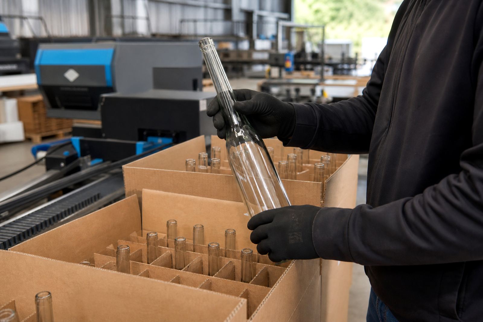
Green glass jobs are often part of wider gift or event packs, so packing needs to respect both the bottle and the decoration. Printed glass can scratch if it is packed too tightly, especially when the finish includes white ink or ceramic enamel. A clear packing brief helps with separators, cartons and load grouping for the trip out of Paarl.
Delivery runs often go to Cape Town, Stellenbosch, Somerset West and Constantia for tastings, functions and gifting work, with longer routes to Johannesburg and Durban when the order has to travel further. Once the print choice is settled, the practical side is about keeping the bottles secure and the artwork intact all the way through the handover.