The bottle shape has to fit the moment
Room bottles, conference bottles and tableside service bottles all work differently, so the shape matters before the print does. A short, stable bottle suits minibars and guest rooms, while a taller format gives more label space for restaurant tables or events where the bottle sits in view for longer.
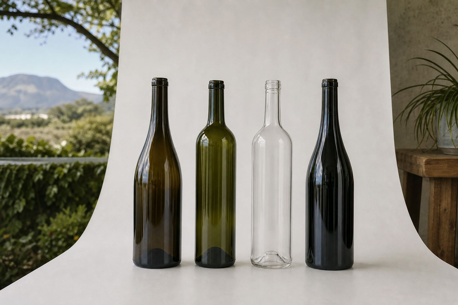
In the Cape Winelands, many venues favour a clean glass bottle with a quiet look for water service, then use the artwork to carry the message. Clear glass suits plain mineral or still water, while frosted glass can soften the look for premium gifting. If the bottle is going into chilled service, the neck and shoulder should still be easy to grip when condensation builds up.
- Compact bottles suit guest rooms and meeting packs.
- Taller bottles give more space for branding and product notes.
- Clear glass works well for still or sparkling water.
- Frosted glass gives a softer finish for premium settings.
Where print method meets the bottle surface
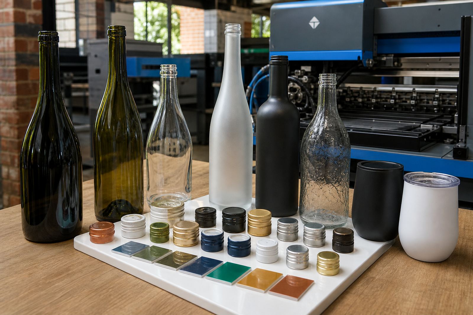
Not every bottle takes decoration the same way. UV direct print works well on smooth glass and gives a crisp finish for shorter runs where the artwork carries fine detail or strong blocks of colour. Screen printing suits repeat jobs with solid areas of ink and a more tactile finish. Ceramic enamel is useful when a tougher fired finish is needed for bottles that will be washed and handled often.
Labels still have a place, especially where the bottle changes often or the client wants more room for ingredients, barcode details or a longer note. Label stock can be set up for wrap labels, front labels or smaller neck labels, depending on the bottle profile. The best method depends on the curve, the colour beneath the artwork and the final use after delivery.
- UV direct print suits clean artwork and short runs.
- Screen printing works well with solid brand colours.
- Ceramic enamel is useful for a more durable fired finish.
- Labels help when details need more room or flexibility.
Room service bottles are usually smaller and calmer
A room bottle should not shout. It needs to sit neatly on a tray, beside glasses or in a fridge door, with enough branding to be useful and not so much that it feels busy. Smaller formats are often chosen for hotels, guest houses and conference rooms because they store easily and pour without crowding the table.
For these bottles, artwork usually works best when the logo is clear and the wording is short. A white ink layer can lift artwork on dark glass, while a soft one-colour print keeps the bottle quiet and practical. If the water is part of a welcome pack, the decoration should match the rest of the guest experience rather than compete with it.
- Keep room bottle artwork clear and easy to read.
- Use fewer colours if the bottle is small.
- White ink helps on darker glass.
- Shorter formats pack and chill more easily.
Tableside bottles need to hold their own visually
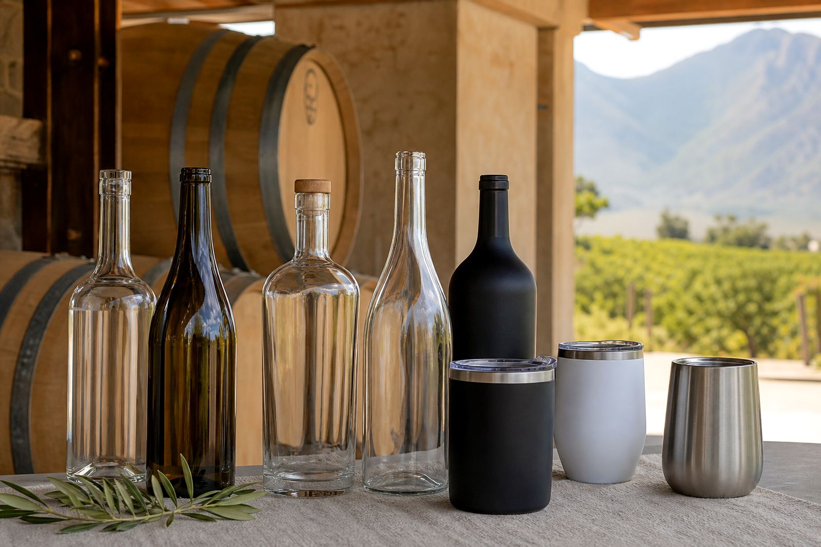
Tableside service changes the brief. The bottle sits in front of guests, so the profile, print position and label layout need to stay readable from a slight distance. Taller bottles can give a more formal feel, especially in wineries, tasting rooms and event settings where the bottle forms part of the table presentation.
For restaurants and event organisers, a clean neck area can help the bottle look ordered when it is in an ice bucket or on a tray. A centred logo or a long label panel can work well if the bottle has enough straight wall for print. The safest route is to plan the decoration around the widest usable area, then let the shape do the rest.
- Tableside bottles need visible branding from across the table.
- Taller formats often suit tasting rooms and event tables.
- Neck space should stay tidy when the bottle is chilled.
- Print placement must follow the straightest part of the glass.
Artwork checks save trouble before bottles move to print
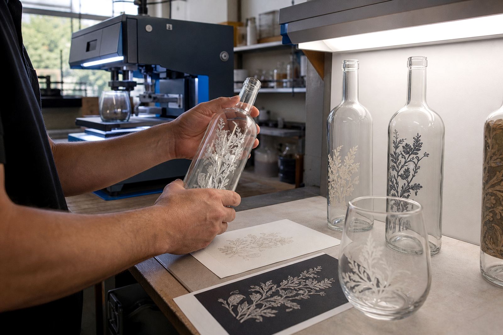
Artwork for bottles has its own constraints. Curved surfaces distort type, dark glass can swallow pale colours and fine lines can disappear if the print area is too small. That is why a proof matters before every run. It shows the print position, colour build, white ink layers where needed and the final size on the chosen bottle style.
When the bottle is for corporate gifting or a hospitality launch, the artwork should be checked against the actual container rather than a flat page. Text should not sit too close to the shoulder, and logos should not wrap into the seam area without a plan. A good proof makes those issues visible before the bottles move into production.
- Check artwork on the actual bottle shape, not only on a flat layout.
- Proofs show colour placement and print area limits.
- White ink may be needed under pale artwork on dark glass.
- Text needs safe space away from the shoulder and seams.
Short runs work best when the minimum is planned properly
Short runs are common for events, seasonal ranges and smaller hospitality orders. The minimum run depends on the decoration method, the number of colours and whether the bottle needs special handling in packing. A short run can still look polished, but it needs a sensible setup so the print stays consistent from the first bottle to the last.
For a Paarl tasting room sending water bottles to a Franschhoek dinner, the order might include a compact room bottle, a taller tableside bottle and a matching drinkware piece for the bar. That mix can work well if the print area, label size and packing brief are all aligned before production starts. Delivery into Cape Town, Stellenbosch, Johannesburg or Durban then becomes a logistics question, not a guess.
- Short runs suit events, launches and hospitality trials.
- Minimums change with method and colour count.
- Mixed bottle styles need one clear packing brief.
- Delivery planning matters when orders move between provinces.