Shoulders, bodies and punts change the print plan
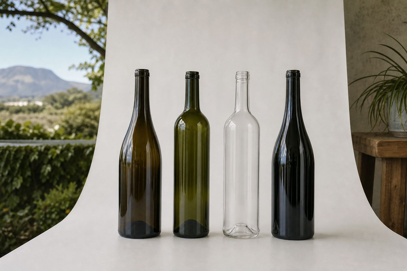
A bottle can look almost plain on a shelf, then show its shape clearly once the label, print and fill level are in place. A steep shoulder gives a different reading to a soft curve, and a tall narrow body asks for a tighter layout than a broad Bordeaux style profile.
The punt matters too. A deep punt can shift the visual centre of the bottle and change where a front label feels balanced. On some shapes the label wants to sit lower, while on others the shoulder line leaves less room than the artwork team first expected. Shape checks need to happen before we start a production run.
- Steeper shoulders can crowd tall labels near the neck
- A wider body gives more room for wrap labels and larger marks
- A deep punt changes how the bottle stands in case packs and on shelf
- Curved glass can distort fine text if the print area is not planned properly
Common bottle forms used for wine, gin and water
Wine, gin and water bottles each bring their own geometry. Wine bottles often need a front label with enough height for legal text, vintage details or a brand crest. Gin bottles can be taller or more sculpted, with thick glass, heavier bases and sharper shoulders that suit direct print or label panels. Water bottles are often simpler in profile, but the glass wall and finish still affect how ink or adhesive behaves.
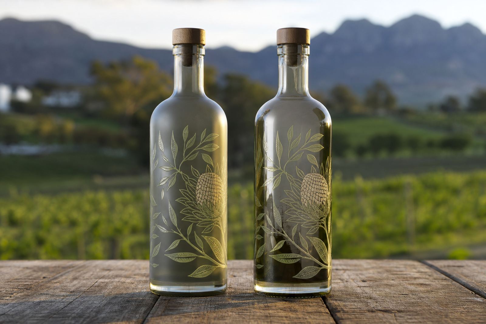
In Paarl and Stellenbosch, we often see wineries moving between classic Bordeaux, Burgundy and slimmer sparkling bottle shapes. Each one takes artwork a little differently. A broad bottle can carry a strong label panel, while a narrow bottle needs better control over margins and the edge wrap. Clear glass shows whatever sits behind the print, so a white underlayer usually goes into the artwork on the first draft.
- Bordeaux style bottles usually suit firm label blocks and centred marks
- Burgundy style bottles need careful shoulder clearance
- Gin bottles often allow more scope for side panels and direct print
- Water bottles may need smaller artwork areas to avoid crowding the curve
How shape affects labels, direct print and enamel work
Labels are often the easiest route on shaped glass, especially where the body curve is pronounced. A label can bridge slight changes in contour, but the face size still has to suit the bottle. If the label is too wide, it can wrinkle near the shoulder or lift at the edge. If it is too small, the brand can look lost against the glass.
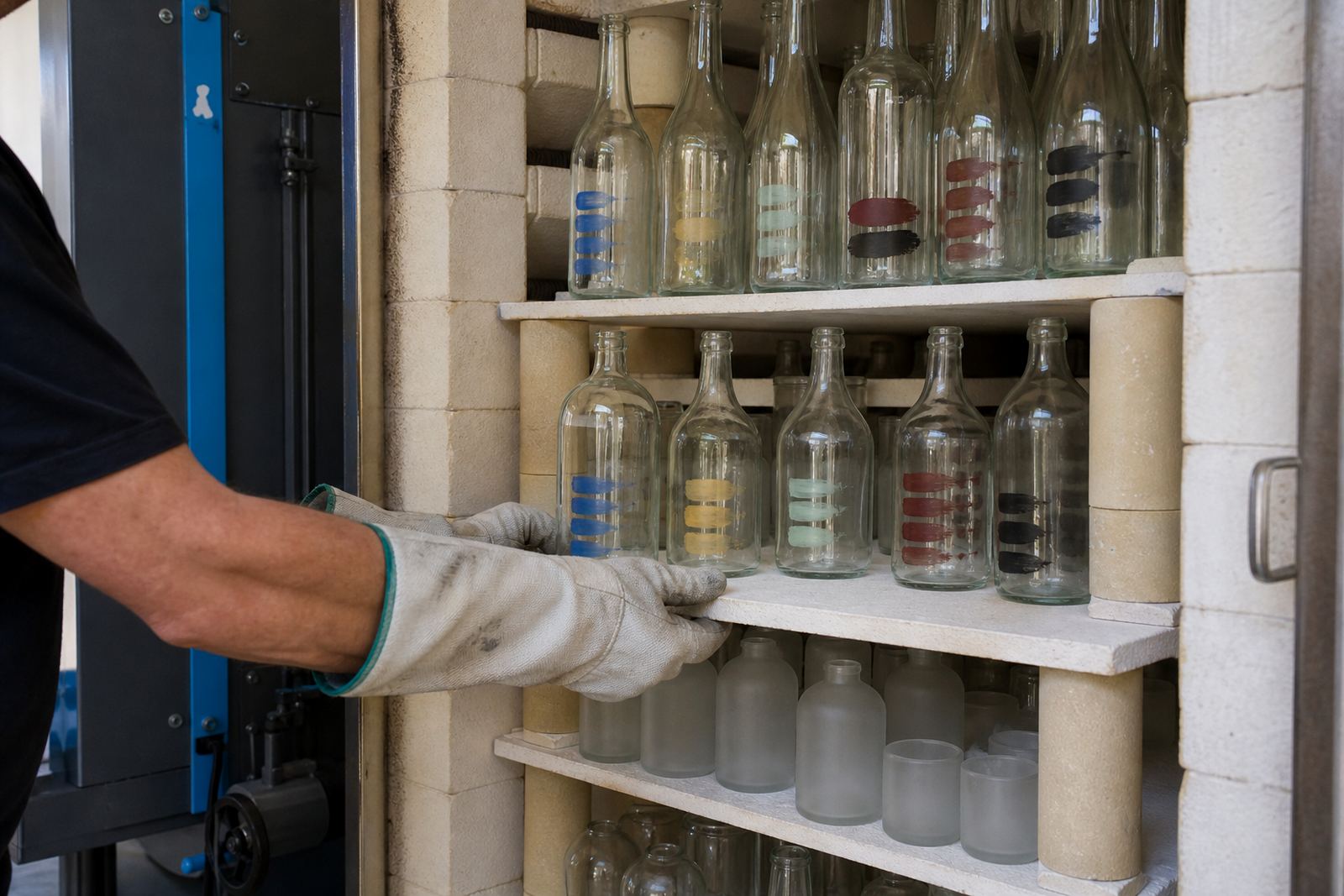
UV direct print works well when the artwork must sit directly on the bottle surface with a crisp look. It is useful for shorter runs and for shapes where the printed area is clean and flat enough. Screen printing suits stronger colour coverage and repeat work, while ceramic enamel is chosen where a fired finish is needed on suitable glass. Each method reacts differently to shape, glass thickness and any taper through the body.
One bottle might take white ink under colour, while another needs a label instead because the curve is too strong. That is not a flaw in the artwork. It is simply the bottle doing its own thing.
Artwork proofs catch the shape problems early
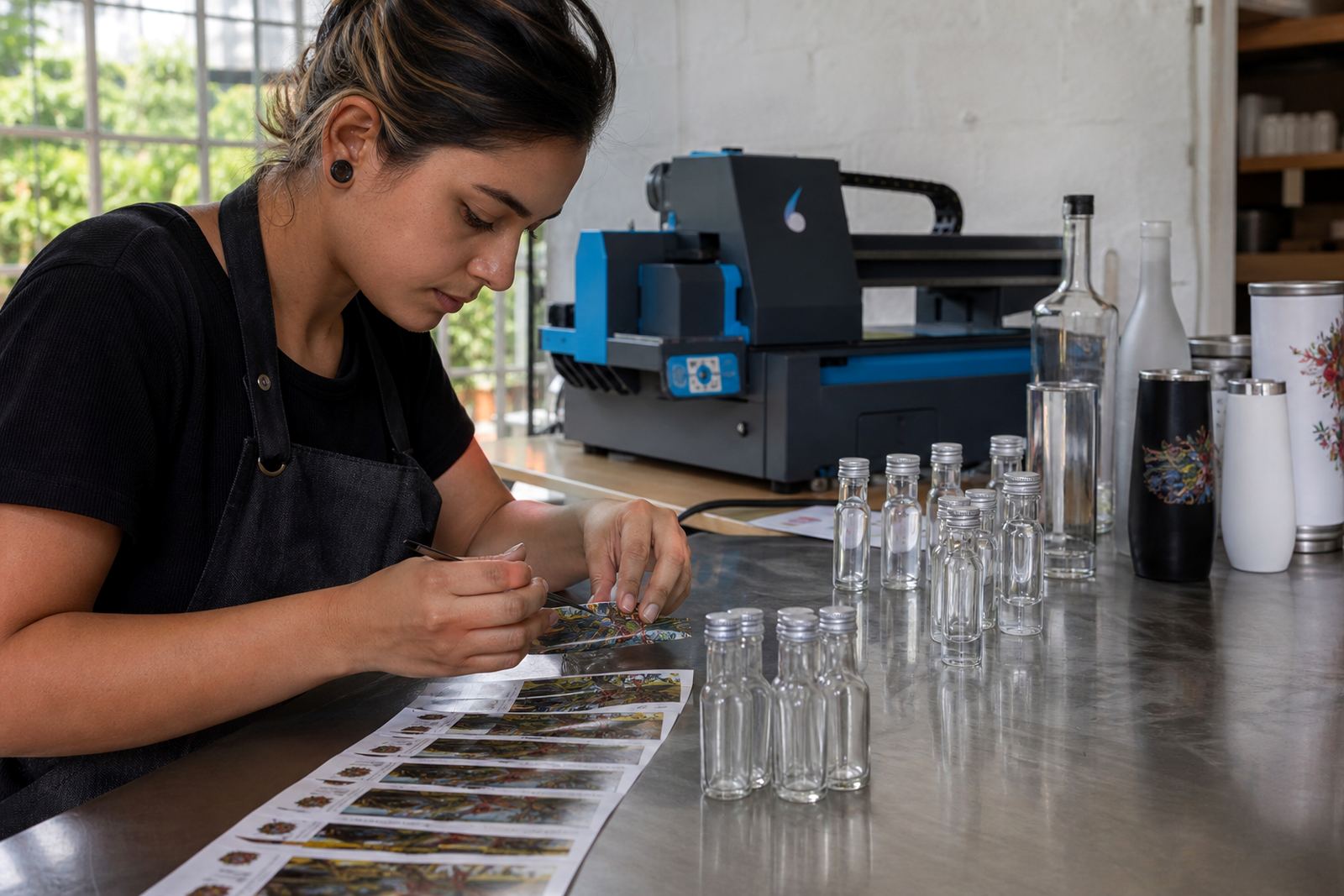
A proof is more than a visual approval sheet. It is where the label edge, print height and alignment are checked against the actual bottle profile. At that stage, artwork can still be nudged so text does not disappear into a shoulder or land too close to a punt transition.
For short runs, this step matters even more because there is less room to absorb a mistake. We look at line weight, white ink layers, colour shifts on clear glass and how much of the bottle face is truly usable. A round bottle and a tapered bottle may carry the same logo, but they do not need the same frame around it.
- Check the print height against the straightest part of the body
- Keep small type away from heavy curvature
- Use a proof to confirm label size on the real bottle shape
- Allow space for the punt and for shoulder movement
Short runs need tighter minimum run thinking
Short runs suit launches, tasting room stock, gifting sets and event bottles where the quantity does not justify a large production line. The bottle shape still affects what the minimum run can sensibly be. A simple cylindrical bottle can be easier to set up than a highly contoured one, while a complex form may need more careful print area planning and packing checks.
For wineries and distilleries in the Cape Winelands, the practical question is often not just how many bottles, but which bottle shape will carry the artwork cleanly. A smaller run on a difficult shape can still work well if the artwork is built around the glass rather than forced onto it. That is where proofing, mock-up visuals and print area planning earn their place.
When a client in Franschhoek wants a compact gift run for two bottle styles, the layout may shift between them even if the label copy stays the same. The bottle does the heavy lifting there, not the design software.
Packing, delivery and local handling across South Africa
Shape also affects packing. Slim bottles, heavy bases and odd shoulders all need different handling so labels stay clean and printed faces do not rub during transit. That matters on deliveries from Paarl to Cape Town, Johannesburg or Durban, where cartons may travel a long way before the bottles are unpacked.
On coastal routes such as Cape Town and Durban, humidity can affect labels and outer packing if the bottle finish and carton choice are not matched properly. In dry inland areas like Johannesburg, the concern shifts more toward movement in transit and surface scuffing. We include a clear packing brief with the order so the bottles, labels and cartons are matched to the route, handling and bottle shape.
For wineries, event organisers and gifting teams, the bottle shape should be settled before the decoration method is locked in. That keeps the artwork honest, the proof useful and the finished bottle true to the glass it sits on.