When metallic is print and when it is label
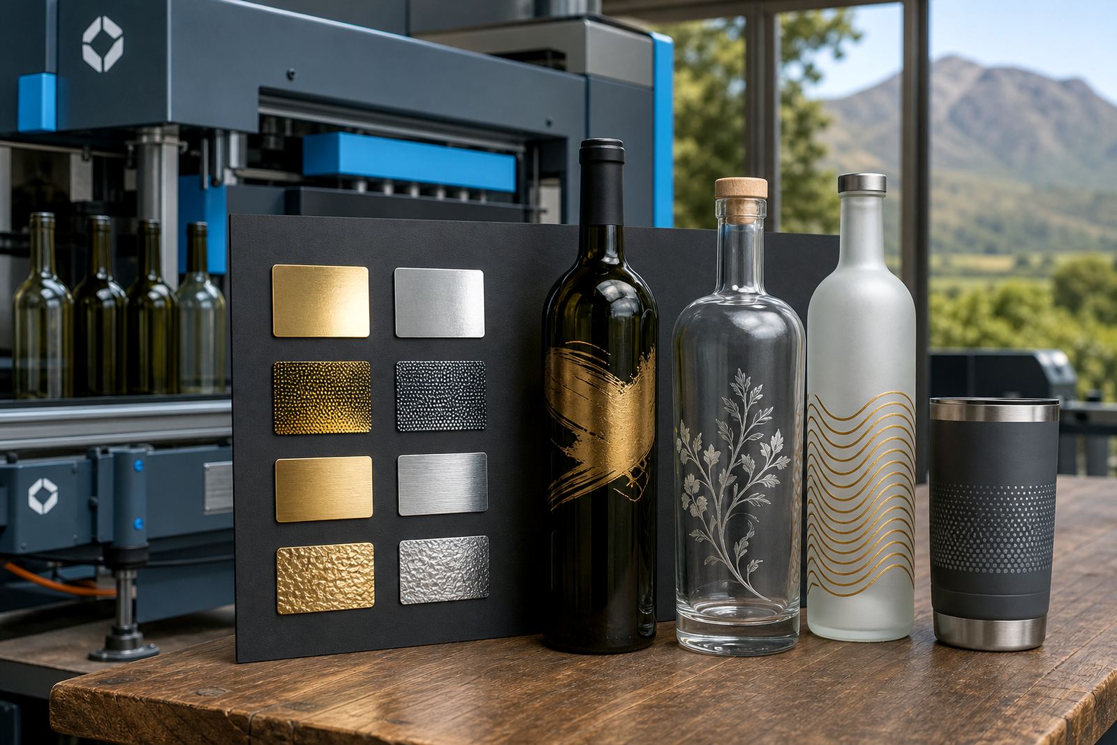
Metallic decoration is not one fixed look. On some bottles, the effect comes from metallic ink or foil style detail built into a label. On others, it comes from printing directly onto glass with a silver or gold layer, then adding colour over it or leaving parts open so the glass catches the light.
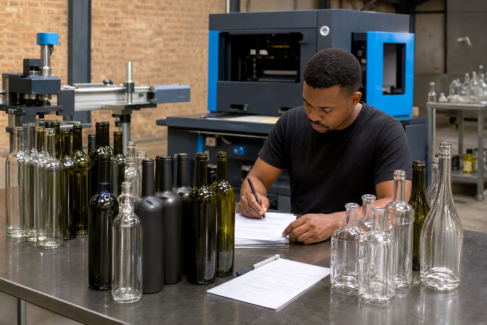
For short runs, the bottle shape matters just as much as the artwork. A straight sided wine bottle gives a different result from a shoulder heavy gin bottle or a slim water bottle. Curves, panel depth and neck size all affect where the metallic sits and how clean the edges stay.
For Paarl wineries and distilleries, the best result usually starts with the bottle itself. If the glass is tinted, frosted or heavily curved, a label may hold a metallic look more reliably than direct print. If the bottle has a smooth print panel, direct methods can give a cleaner premium finish.
UV direct print, screen print and ceramic enamel compared
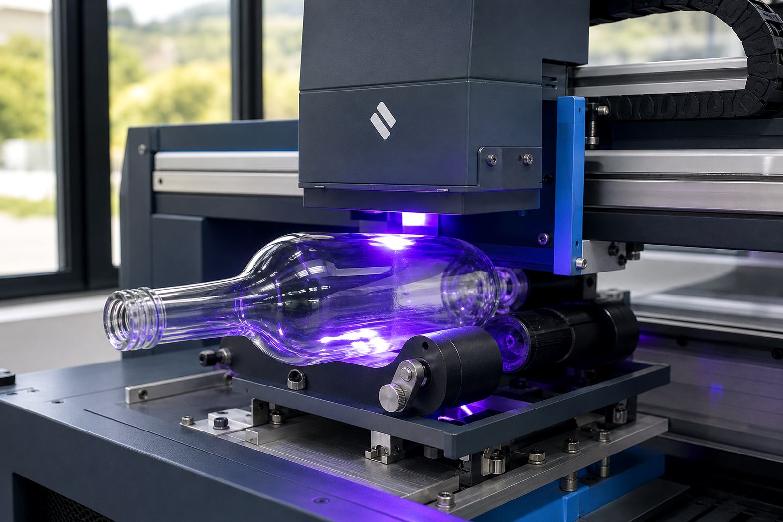
UV direct print suits short runs where artwork changes often or where the design needs fine detail. It can place metallic looking elements into the artwork, though the final shine depends on the ink set and the bottle surface. It works well on small batches of wine bottles, gin bottles and some drinkware pieces.
Screen printing is slower to set up but useful when the same design repeats across a run. It handles solid areas well and can support white underlayers, which matter when a metallic effect needs contrast. Ceramic enamel is the more durable route for bottles that will be washed, handled and stored for longer periods.
Labels are the most flexible option when the surface is awkward or the decoration needs more space. A metallic label can carry detailed artwork, colour blocks and fine text, while keeping the bottle itself untouched.
- UV direct print suits shorter runs and detailed artwork
- Screen print suits repeated artwork with solid coverage
- Ceramic enamel suits tougher handling and repeated washing
- Labels suit complex bottle shapes and larger artwork areas
What metallic needs on glass and drinkware
Not every surface behaves the same way. Clear glass, frosted glass, amber glass and ceramic mugs each absorb light differently. A metallic look that reads cleanly on a white ceramic tumbler may look dull on dark glass unless the artwork includes a white base or a label with enough contrast.
Drinkware adds another layer of planning because curved surfaces can distort fine lines. Glass tumblers, stemless wine glasses, insulated cups and ceramic mugs all need artwork adjusted to the print area. Metallic detail that sits too close to a lip or handle can look crowded once the piece is filled or held.
On water bottles, the goal is often a clean, reflective accent rather than full coverage. On gin and wine bottles, metallic touches work best when they support the label layout instead of fighting it. A small silver crest, a foil toned border or a metallic name block can carry enough presence without overloading the bottle.
- Clear glass shows metallic detail differently from frosted glass
- Dark bottles often need white ink layers for legibility
- Curved drinkware needs artwork kept within the safe print zone
- Metallic accents should support, not crowd, the main label
Proofs save the finish from guesswork
Before any run, artwork proofs show where the metallic effect will sit, which areas will print in colour and which parts will stay open. That step matters because metallic is one of those finishes that can shift quickly from polished to muddy if the colour balance is wrong.
Proofs also help with font size, line thickness and bottle placement. Thin lines can break on textured surfaces and small text can disappear on a tinted bottle. If the job includes labels, the proof must show trim, bleed and the label edge so the metallic border lands where it should.
Mock-up visuals are useful when a client is weighing up direct print against a label route. The bottle, the artwork and the finish can be reviewed together before production starts, which avoids surprise on the finished shelf sample.
Minimum runs and the real value of short batches
Short runs make sense for launches, tasting room specials, wedding sets and corporate gifting. Metallic decoration is often used when the quantity is smaller but the presentation still needs to look considered. The run size will depend on the print method, the bottle type and how many colour changes or setup stages are involved.
For a small batch, labels can be more practical if the artwork will change between flavours, gift tiers or event dates. Direct print is often better when the same bottle will be repeated across the run and the artwork stays fixed. The decision is usually less about what looks flashier and more about what keeps the finish clean across every bottle.
In practice, a Paarl winery preparing a limited release for tastings in Stellenbosch and Franschhoek may use a metallic label on the bottle and a plain printed mark on the gift pack. A distillery sending bottles to Johannesburg for a corporate function may lean toward a direct print with a silver accent, because the bottle has to stay tidy through packing and travel.
Packing and delivery for bottles with metallic detail
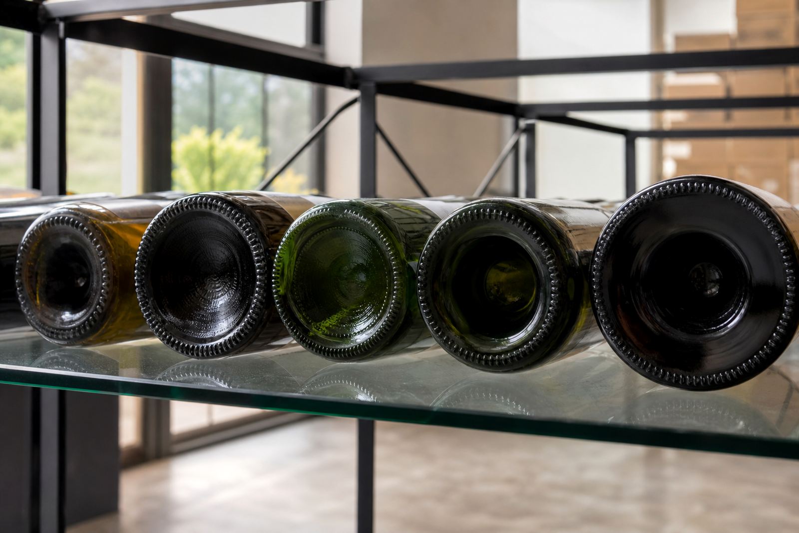
Metallic finishes need careful packing because scratches show quickly on reflective surfaces. Bottles should be separated properly, boxed with enough protection and kept from rubbing hard against each other. Labels also need clean handling so the edges do not lift during transit.
For delivery across South Africa, the route matters less than the packing brief. Cape Town, Somerset West, Constantia, Stellenbosch, Franschhoek, Johannesburg and Durban all bring different handling conditions, but the bottles still need the same attention at the point of packing. Glass should be protected from movement and printed faces should not be pressed flat against rough material.
Where the job includes mixed bottle types, the packing notes should distinguish between wine bottles, gin bottles, water bottles and drinkware. That keeps the metallic pieces together and makes receiving easier when a shipment contains several artwork variants.
- Separate reflective bottles so they do not scuff each other
- Keep label edges and printed panels protected in transit
- Mark mixed bottle types clearly on the packing brief
- Group artwork variants so receiving stays orderly
A metallic finish that suits the bottle, not the trend
Metallic decoration works best when it fits the bottle shape, the drinkware surface and the purpose of the run. A strong result is usually quiet rather than loud. It uses the shine where it helps the artwork read, and leaves the rest of the bottle to do its own work.
For short runs in the Cape Winelands, the practical question is not whether metallic is possible. It is whether the bottle, the method and the artwork can support one another without losing clarity. That is where proofs, colour guidance and print area planning pay off.
When the finish is mapped properly, metallic detail can make a tasting bottle, event bottle or gift bottle feel considered without pushing the artwork too far. The result is a bottle that looks right in hand and still holds up once it reaches the table.