Small bottles need fewer distractions
A mini bottle is not a full-size label shrunk down and expected to behave the same way. The viewing distance is closer, the panel space is tighter and the curved surface gives less forgiveness for fine detail. On 50 ml and 100 ml bottles, a logo that looks balanced on a mock-up can lose legibility once it sits on glass.
That is why the first pass is usually about reduction. Long taglines, crowded crests and thin script often need to go. Clear lettering, a solid mark and one or two supporting lines usually hold up better. If the bottle will be used for tastings, gifting or table settings, the artwork must read quickly and still look composed from a few metres away.
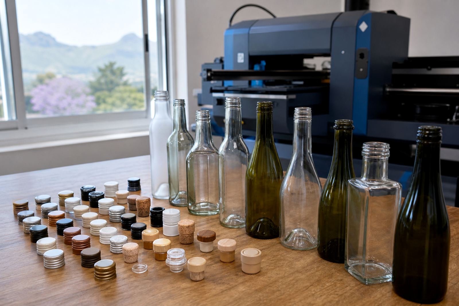
Mini bottle branding also needs practical thinking around bottle necks, closures and the shape of the shoulder. A label that sits too high can fight the curve, while a printed area that sits too low may be interrupted by handling or packaging. We plan around the glass, not only the artwork.
Print methods that behave on glass and drinkware
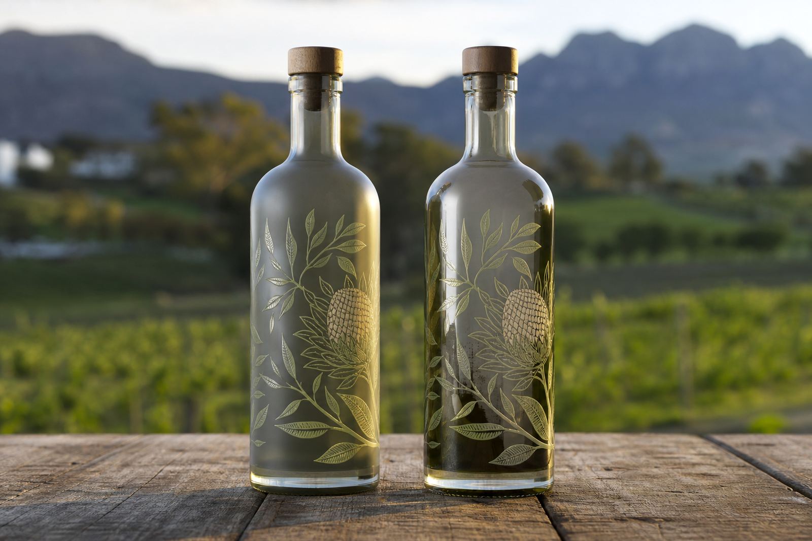
The right decoration method depends on the bottle type, the finish and the number of units. For short runs, UV direct print is often used where crisp detail, solid colour blocks and small text need a clean surface. It can work well on glass bottles and certain drinkware pieces where the print area is controlled and the artwork is prepared carefully.
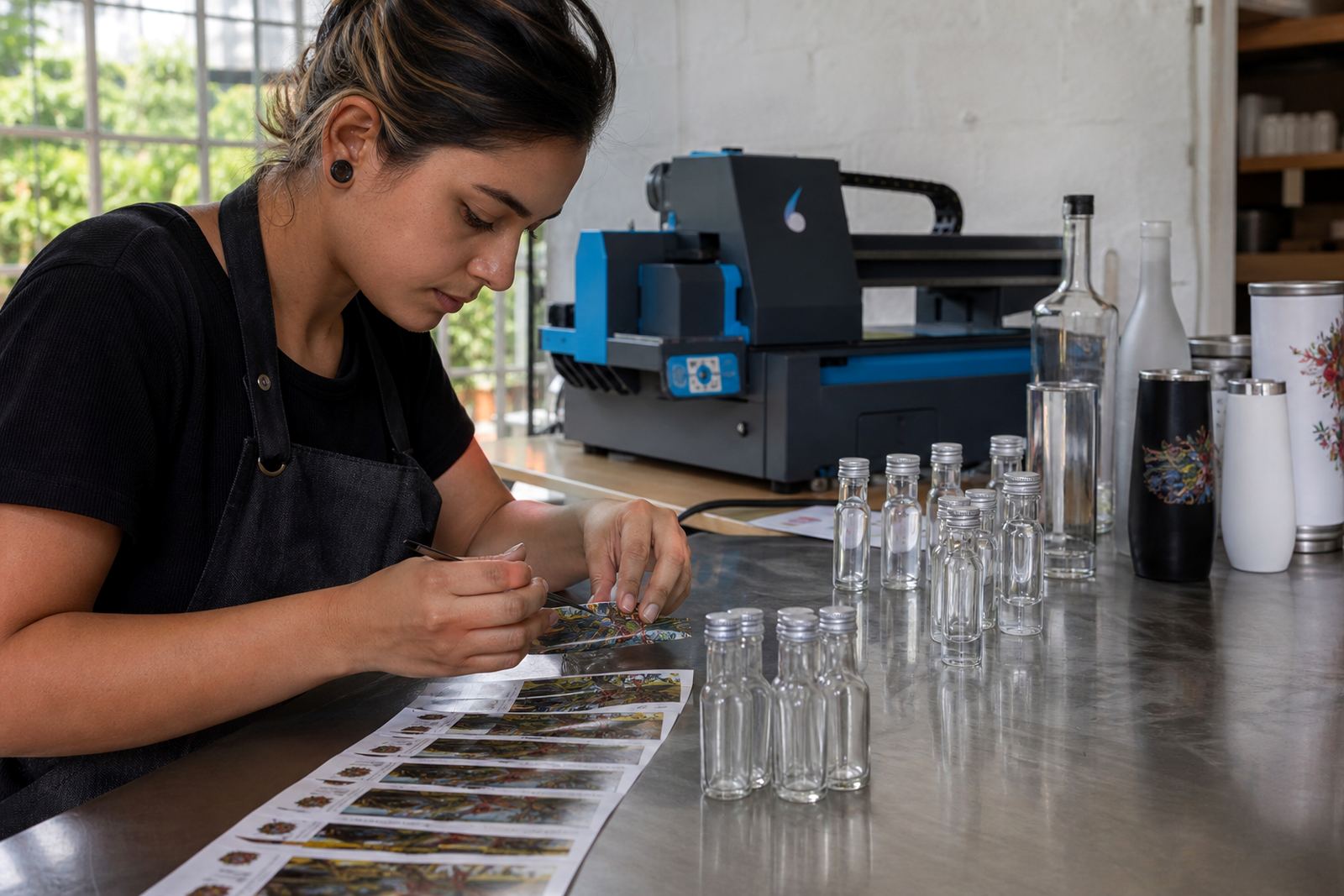
Screen printing suits bolder artwork and larger repeated elements. It is a good option when the design uses one or a few colours and the client wants a direct, durable finish on the bottle surface. Ceramic enamel is used where a fired finish is needed on suitable glassware, especially for items that need a more permanent decorative layer. Labels remain useful when the artwork changes often, when a more detailed label layout is required, or when the bottle shape makes direct printing less practical.
- UV direct print for tight detail and shorter decoration runs
- Screen printing for stronger solids and simpler artwork
- Ceramic enamel for glassware that suits a fired finish
- Labels for fuller artwork, variable batches or added texture
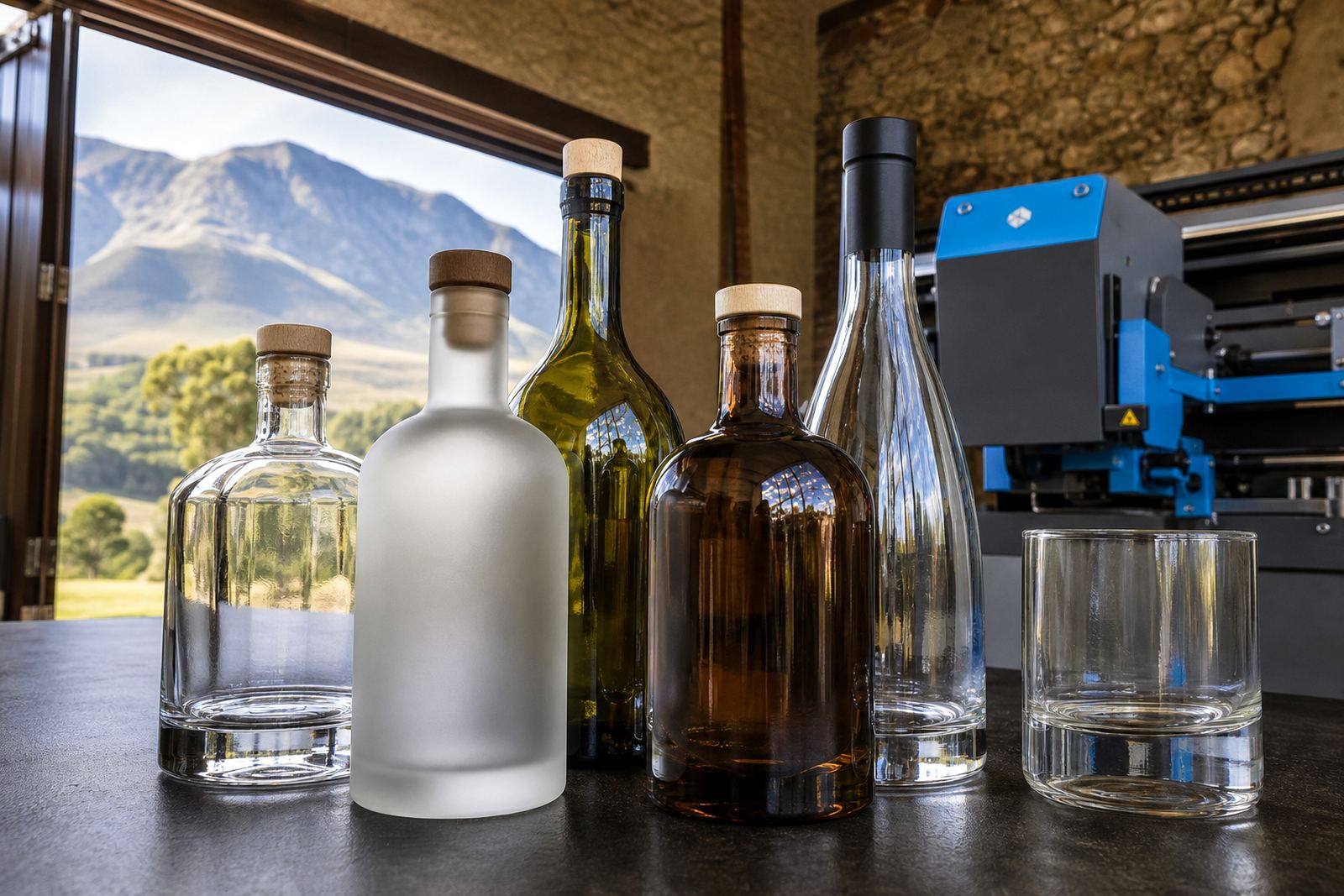
Each method needs its own setup. White ink layers may be needed on darker glass, while certain translucent bottles need more careful colour planning to keep the artwork visible and balanced.
Artwork that still reads at mini size
At small scale, artwork needs to be pared back with a steady hand. Fine borders, tiny legal text and weak contrast are common trouble spots. A logo that looks elegant on a computer screen can become busy on a 50 ml bottle if every line is kept at the same weight.
Artwork checks are not only about spelling. We look at line thickness, space between letters, alignment on the bottle body and how colour will sit against clear, frosted or tinted glass. For branded water bottles, the design often needs a cleaner layout than a wine or gin bottle because the final use is usually more general and the bottle may be handled more often.
Good mini bottle artwork usually keeps to the essentials:
- a clear brand mark or product name
- one short support line if needed
- strong contrast between print and glass
- simple positioning around the curve of the bottle
- space for any required regulatory or product details
A busy artwork file can still be rescued, but it often needs a round of print area planning before it lands on the bottle properly.
Proofs, mock-ups and the value of a dry run on paper
Mini bottle work benefits from proofing because small errors show up fast. A word that is too close to the edge, a logo that sits off-centre or a colour that fades into the glass can all be hard to forgive once production has started. A proof lets everyone see the layout before the run is set in motion.
Mock-up visuals help with scale and placement, especially when the order includes more than one bottle size or drinkware shape. A gin mini and a water mini can share the same artwork family, but the print area, neck profile and bottle curvature may differ enough to need separate adjustments. Proof approvals keep the artwork specific to the item, not just the idea.
For short runs, that process matters even more. Smaller quantities leave less room for waste, so the artwork setup has to be settled before printing begins. Minimum run advice is part of that conversation, along with label artwork setup or UV print prep if the bottle calls for it.
Mini bottle branding for a Cape Winelands counter
A small batch for a tasting counter in the Cape Winelands might call for mini wine bottles with a neat front mark, followed by a simple back panel for product details. The same order may include a few branded water bottles for service tables and glassware for a launch evening. The artwork family stays linked, but each item needs its own print plan.
In that kind of job, the first task is usually to settle the bottle sizes and the decoration method. If the bottles are going to a venue in Stellenbosch or Franschhoek, the finish may need to hold up under display lights and repeated handling. If the order is travelling to Johannesburg or Durban, packing brief details matter too, because the bottles need to arrive clean, upright and clearly separated.
Short runs suit events, product launches and gifting sets, but they still need the same discipline as larger jobs. The bottle shape, print area and artwork scale all have to line up properly before anything goes out the door.
Packing for short runs that travel well
Mini bottle orders are often packed in mixed quantities, which makes carton planning important. Glass needs separation, labels need protection from scuffing and printed surfaces need clean handling after production. If a client is ordering for delivery across South Africa, the packing brief should match the route and the destination.
We consider how the bottles will be used once they arrive. Some orders are for corporate gifting, others for tasting rooms, and some are for events where the bottles are set out in rows and handled one by one. The packing approach should suit the way the bottles will be stored, unpacked and displayed. A tight pack can save space, but it must not mark the print or crush the label edges.
For mini bottle branding, logistics matter as much as decoration. A clean finish on the bottle is only half the job if the cartons do not support it properly on the way to the site.
- keep bottles separated where print faces could rub
- protect labels from edge lift and corner damage
- match carton size to the bottle shape
- mark mixed orders clearly for unpacking