The top of the bottle sets the first reading
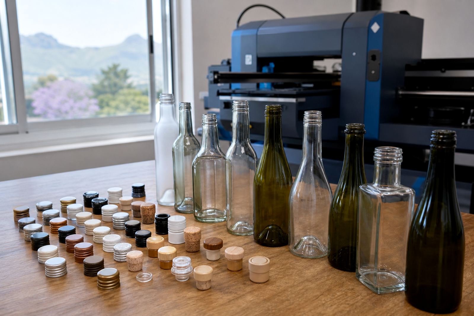
When a bottle carries a brand mark, the closure is part of the visual job. A screwcap gives a neat, modern line and leaves a clean shoulder area for labels or direct print. Cork finishes feel more traditional and usually work well where the bottle shape and label size need a softer, more classic look. Bar top closures bring their own shape into the design, so the neck area needs careful planning before artwork is approved.
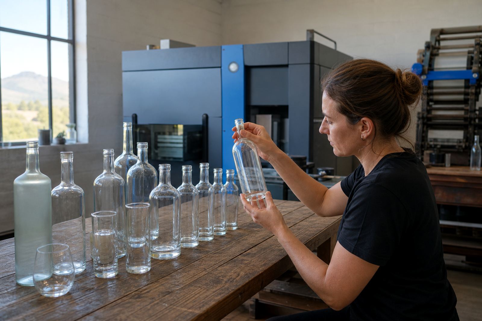
For wineries, distilleries, corporate gifting and events, the closure has to sit in step with the bottle body. A tall bottle with a narrow neck takes a different label layout from a round gin bottle or a slim water bottle. If the closure has colour, foil, wax, wood or shrink wrap, that detail changes the balance too. The label should not fight the top, it should work with it.
Screwcap, cork or bar top, each one asks for different artwork
Screwcap bottles usually suit clean front labels, back labels and neck labels when there is room. Cork bottles often carry a more premium or traditional impression, so the print layout can lean into fine detail and clear typography. Bar top bottles need space around the closure because the neck hardware becomes part of the bottle silhouette.
- Screwcap: good for efficient packing and tidy label lines
- Cork: useful where a classic presentation is wanted
- Bar top: stronger neck presence, so spacing matters
- Colour coded tops: useful for range separation across variants
- Textured closures: need proof checks against the rest of the bottle
In practice, the artwork has to respect the closure height and the taper of the neck. A label that looks balanced on a straight cylinder can crowd the shoulder on a shaped wine bottle. Proofs help catch that before any run goes through print.
Decoration methods behave differently around the neck
Closure style also affects the decoration method. UV direct print works well where the print area is flat enough and the bottle finish supports a crisp image. Screen printing suits solid colour blocks and durable branding on glass or drinkware. Ceramic enamel is used where a fired finish is needed on glass, with a more permanent feel and a different visual depth. Labels remain the most flexible choice when the closure and neck area leave limited room for direct decoration.
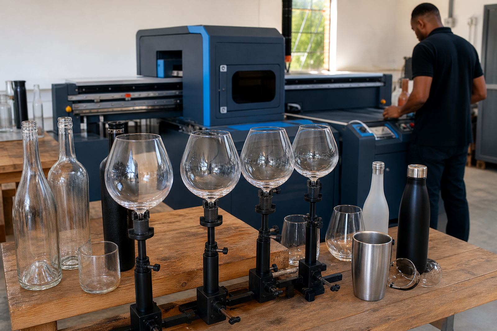
On wine bottles, a cork finish may leave more space for a label wrap and neck collar. On gin bottles, bar top shapes and shoulders can force the artwork lower or make a slim neck label the better choice. Water bottles and drinkware bring their own constraints because lids, handles and curves can interrupt the print area. That is where print area planning matters just as much as the artwork itself.
Closure first, then material and finish
Glass colour, surface texture and closure finish need to sit together. Clear glass with a bright screwcap can take a cleaner label system, while amber or green glass may need stronger contrast in the print. Frosted glass, matte coating and embossed shapes can all change how the closure reads once the bottle is filled and packed.
For drinkware, the lid or closure often becomes the main visual point. A tumbler with a press-on lid and a branded print panel needs different spacing from a handled bottle or insulated cup. Ceramic enamel, screen print and label artwork all need proof checks to make sure the closure does not hide the mark or cut into the text. Small proof-stage changes prevent issues later.
- Clear glass often shows fine artwork cleanly
- Dark glass needs stronger contrast and simpler type
- Frosted finishes soften the edge of a closure detail
- Textured bottles need tighter print planning
- Drinkware lids can change the visible artwork zone
Minimum runs work best when the closure choice is final early
Short runs are common for gifting, tasting room packs and event supply, but the closure should be settled before artwork approval. If the bottle shifts from cork to screwcap, the top line, neck label size and packing layout may all change. The same applies when a range includes different bottle shapes for wine, gin and water.
Minimum run advice is most useful when the bottle, closure and decoration method are considered together. A small run of branded bottles can still look tidy if the label size, white ink layers and colour guidance are checked against the closure finish. Proof approvals matter here because a narrow neck or tall top can alter the balance of the whole pack.
For Paarl and the Cape Winelands, that often means handling mixed bottle formats for local tastings and event packs. A winery may need cork bottles for one range and screwcap bottles for another. A corporate gift set may use one bottle shape for branded water and a different one for gin or sparkling mixers. The closure is what ties those pieces together or throws them off.
A Paarl run can look simple until the cap line shifts
A recent local brief involved a mixed run for a Cape Winelands launch, with one bottle shape for still water and another for gin-style gifting. The closure styles were different, so the artwork had to sit lower on one bottle and tighter on the other. Proofs were checked for neck space, label edge alignment and packing orientation before print prep was locked in.
That sort of job is typical in the region. Vineyards, tasting rooms and event teams often need a practical mix of bottle sizes, closures and decoration methods without turning the range into a patchwork. When we design the closure with the bottle, the finished pack feels planned and consistent. It is a small detail, but people notice it when the bottle is held in hand or lined up on a table.
- Check the closure type before fixing label dimensions
- Allow neck space for cork, bar top or foil details
- Use proofs to test visibility from shelf height
- Keep the print method in step with the bottle finish
- Choose the closure for how the bottle will be used, with appearance as one factor, not the only one.
For branded bottles, the top matters as much as the panel. Get that part right and the rest of the pack has room to work.