Where a proof stops small artwork mistakes from becoming a full run
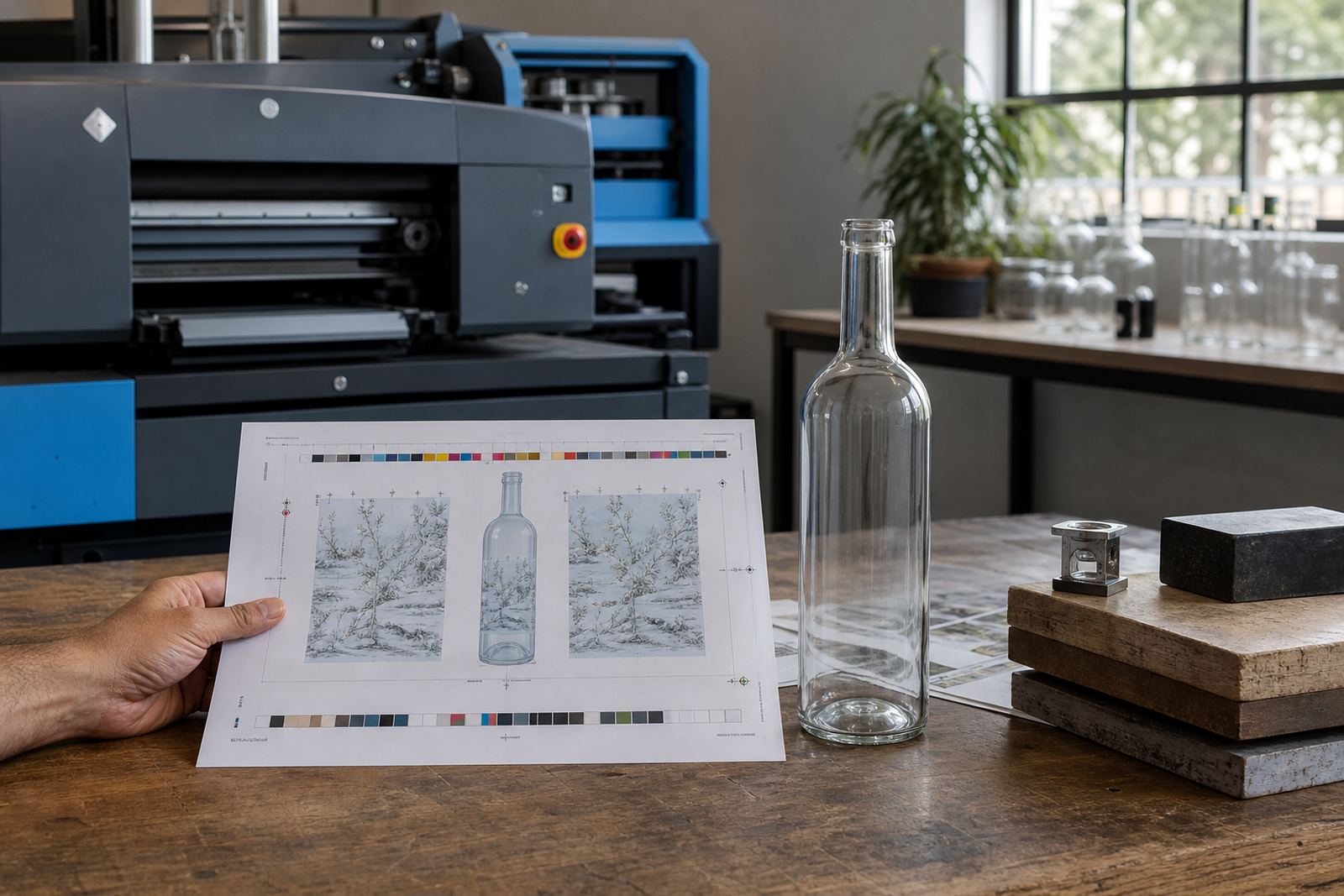
A bottle proof is not just a picture of the design on a screen. It is the point where the artwork, the print area and the decoration method are checked together so the finished pieces match the brief as closely as possible. That matters on curved glass, narrow necks, stepped shoulders and mugs with handles, because small shifts can change the final look more than people expect.
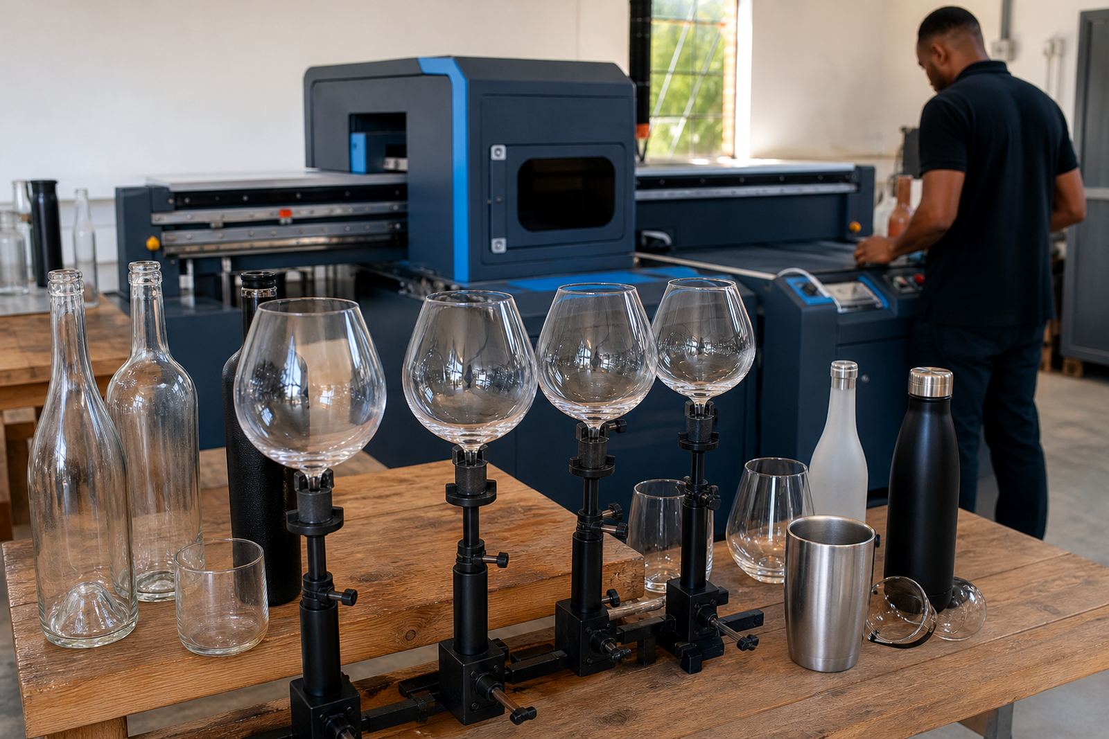
For wine bottles, gin bottles, water bottles and drinkware, the proof helps confirm the readable area, any wraparound section, the clearance from the base or shoulder and how logos behave on a curve. It also shows if a fine line will hold up in white ink, if a dark bottle needs underprint, or if a label needs to be resized so it does not sit too close to a seam. A good proof keeps these details visible before production begins.
- Position is checked against the actual container shape.
- Scale is shown before artwork is committed to print.
- Colour placement can be reviewed against the chosen method.
- Small text, fine lines and white ink are checked for legibility.
What gets checked on UV direct print, screen print, enamel and labels
Different decoration methods behave differently, so the proof needs to reflect that method rather than a generic mock image. UV direct print suits short runs and detailed artwork on many bottle and drinkware surfaces, while screen printing can suit bolder solids and repeat work with a tighter setup. Ceramic enamel has its own look and curing process, and labels need careful attention to shape, finish and placement so they sit cleanly on the glass.
The proof usually covers the print area, artwork orientation, colour guidance and any white ink layer needed under darker glass. On clear bottles, a pale design can disappear if the underprint is not planned properly. On frosted or coloured bottles, the same artwork may need stronger contrast or a simpler layout. If the job includes premium drinkware for corporate gifting or events, the proof also checks how the design sits near the curve of the vessel and how the logo reads when held in the hand.
- UV direct print: confirm detail, white ink and placement.
- Screen print: check solid areas, line strength and spacing.
- Ceramic enamel: confirm artwork flow and firing suitable artwork.
- Labels: confirm trim, bleed, shape and final position.
Good-looking artwork on screen can still fail in print
Screen files and print files are not the same thing. A logo that looks balanced on a laptop may sit too high on a long-neck bottle, or feel crowded on a small tasting bottle. Proofs help catch those issues before plates, screens or print settings are finalised. They also make it easier to spot fonts that are too thin, colours that need stronger contrast, and artwork that needs a clearer edge for curved surfaces.
For branded drinkware, scale matters just as much as colour. A wide logo can look elegant on a tumbler and cramped on a stemless glass. A vertical mark might fit a gin bottle better than a landscape layout. The proof gives room to check these decisions before any stock is decorated, which keeps the finished set consistent from the first piece to the last.
- Font weight and small text get a proper review.
- Artwork proportions are checked against the actual container.
- Logo orientation can be adjusted for better visibility.
- Colours are guided toward what the method can hold.
That extra review matters when the run is short and there is little room for waste. A small correction on paper is easier to manage than a reprint of 48 bottles that do not sit right on the shelf.
Short runs need tighter proof control, not looser standards
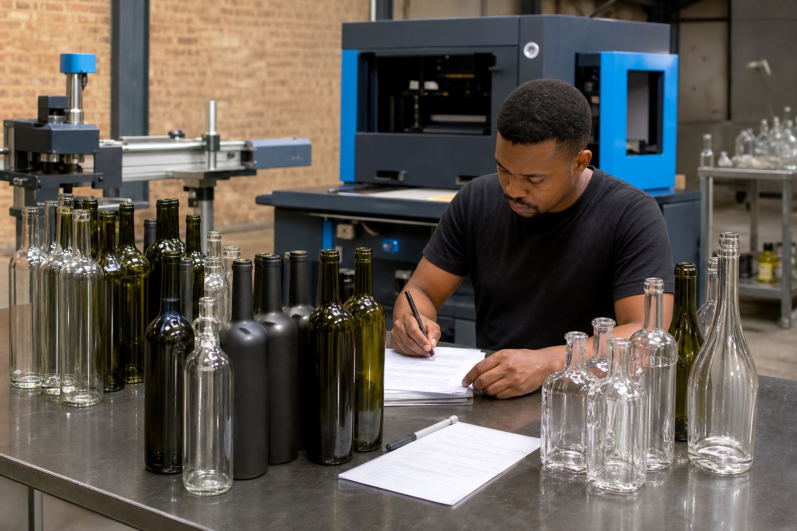
Short-run bottle printing is often chosen for launches, weddings, gifting, cellar door stock, tasting room merchandise and event packs. Because the quantities are smaller, the proof carries more weight. It sets the standard for the whole job and gives everyone a common reference before printing starts. That is especially useful when different bottle shapes are mixed in one order, or when drinkware and bottles need matching artwork.
Minimum run advice is part of this stage too. Some artwork suits a compact run on one bottle type, while other artwork works better when split into separate groups by size or method. A proof helps show where those lines fall. It is also useful for packing briefs, because the final printed pieces may need to be packed by artwork version, delivery point or event batch.
In Paarl and the wider Cape Winelands, the bottles often need to travel far after printing, so the proof stage also helps with practical packing decisions. That matters when a batch is headed for Cape Town, Stellenbosch, Franschhoek, Johannesburg or Durban and needs to stay clean, organised and ready for handover.
- Short runs benefit from tighter artwork control.
- Mixed bottle shapes need separate proof checks.
- Packing and labelling can be planned off the proof set.
- Artwork version control avoids mix-ups across batches.
One label idea across three bottles
Take a Cape Winelands order that includes a wine bottle for a tasting room, a gin bottle for corporate gifting and a water bottle for an event pack. The artwork may begin as one shared identity, but the proof process shows where each vessel needs its own adjustment. The wine bottle may allow a wider label panel, the gin bottle may need a narrower print zone near the neck, and the water bottle may need a stronger contrast so the design is still clear in daylight.
In a job like this, the proof does more than show the logo. It helps the team check the print area, confirm the visual balance and mark where the labels or direct print should sit. If a white ink layer is needed under part of the design, that gets flagged too. If the bottle glass is tinted, frosted or highly reflective, the proof shows how the artwork reads before any stock is committed to the run. Small decisions here save trouble later.
That is the practical value of proofs before printing. They turn an idea into a checked production plan, and they make sure the finish is aligned with the bottle or drinkware in front of it, not just the file on screen.
Proof approvals work best when the brief is specific
A detailed brief gives us a more accurate proof. It helps to know the bottle type, the drinkware shape, the decoration method and the size of the print area. If there is a preferred position for a logo or a note about what should stay visible on the front face, that belongs in the proof review too. When artwork moves between UV print, screen print, ceramic enamel or labels, the production notes need to travel with it.
Clients in wineries, distilleries and event work often send a mix of artwork files, brand notes and packing instructions. That is normal. The proof stage is where those details get sorted into one clear plan. It also gives space to check whether the artwork needs a mock-up visual, label artwork setup or a smaller test adjustment before the full run is approved.
- State the bottle or glass type clearly.
- Note any preferred logo position or facing.
- Flag special colours, white ink or label finishes.
- Keep packing notes with the approval set.
Once the proof is signed off, the print team can move with the right artwork and the right method for the job. The result is not about guesswork or fixing issues after the fact. It is about checking the detail before the first bottle is decorated.