A cork finish changes the first read of the bottle
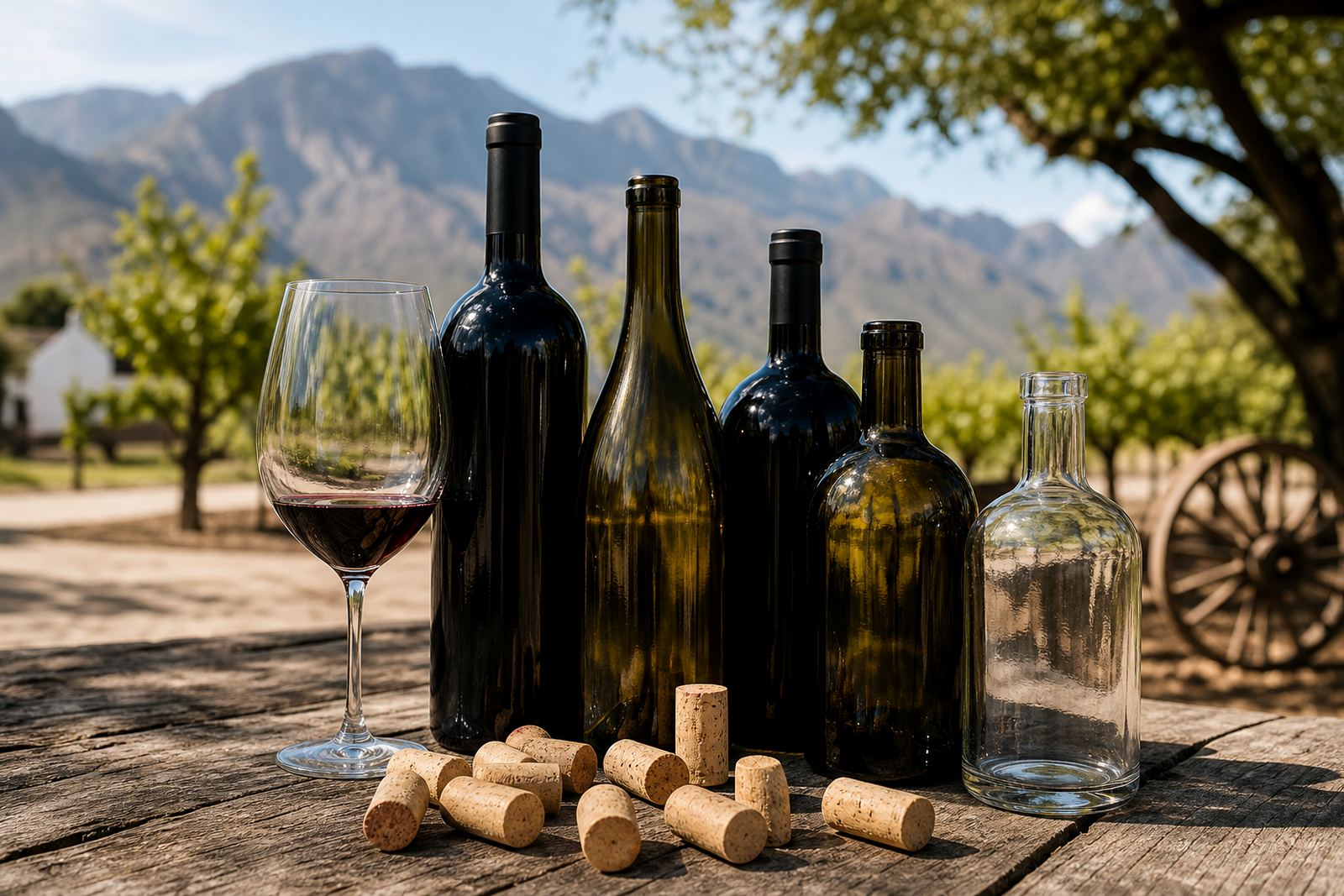
A cork top does more than close the bottle. It shapes the way the whole pack is read, especially where the bottle is meant for cellar door sales, tasting room gifts or a corporate hamper. The silhouette feels familiar and steady, which is useful when the artwork leans toward heritage, restrained typography or a label with a crest, monogram or line illustration.
For wineries, distilleries and event teams in Paarl, Stellenbosch or Franschhoek, that look often works best when the bottle itself does not fight the label. Dark glass, clean shoulders and a neat closure help the decoration carry the message. On water bottles and drinkware, the same idea applies in a more minimal way, with a cork-finish cap or stopper reading as considered rather than busy.
That presentation also helps when the run is small and the order has several variants. A cork look keeps the range coherent, even where one bottle carries a wine label, another a gin label and a third a simple branded crest for a launch or staff function.
Decoration methods that sit neatly with a traditional bottle
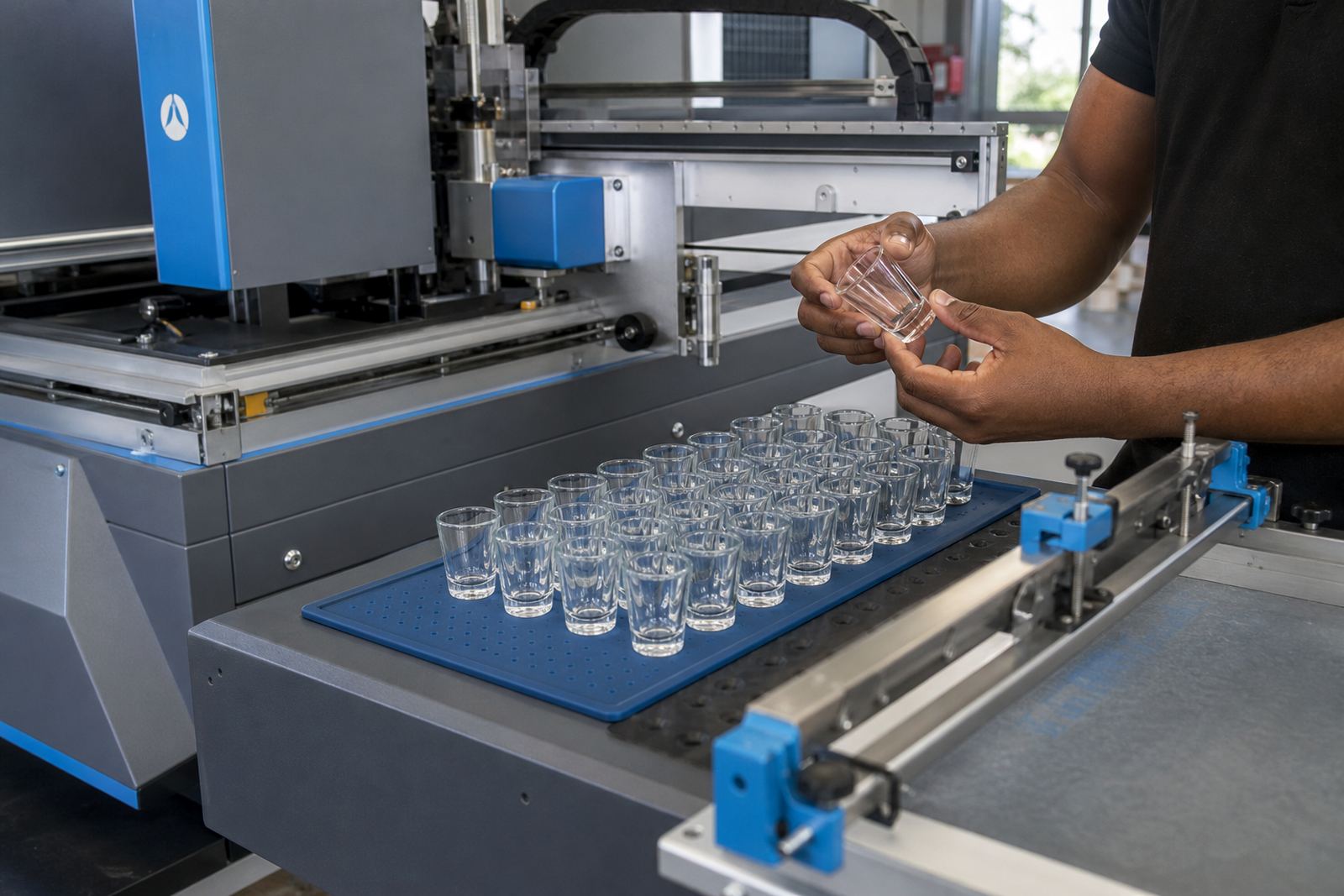
Different decoration methods suit cork-finish bottles in different ways. The choice depends on the shape, glass colour, label space and the detail in the artwork. A classic bottle with a cork finish can take a very restrained label, but it can also carry direct print work if the surface and bottle body allow it.
- UV direct print suits short runs where the bottle body carries the branding directly, with sharp detail and a clean colour laydown.
- Screen printing works well where a bold logo or limited colour range needs a solid finish on glass or drinkware.
- Ceramic enamel is useful where the brief asks for a fired, long-wearing mark on suitable glassware.
- Labels remain the most flexible option for mixed artwork, variable text or bottle shapes with limited print area.
At Bottle Printing Co. in Paarl, the print route is matched to the bottle and the use. A wine bottle for a cellar release may call for a different finish from a gin bottle going into a gifting box. The same applies to tumblers, water bottles and flasks where the cork-finish look adds to presentation, with the closure serving its own function.
What works on wine, gin and water bottles
Traditional labels are often the strongest choice for wine bottles with cork finishes, especially when the artwork needs room for a vintage, cultivar, tasting notes or a heritage-style badge. On gin bottles, the label can be paired with a secondary neck label or a small front mark to keep the bottle balanced. For still water in glass bottles, a simple label or direct print keeps the finish neat and professional.
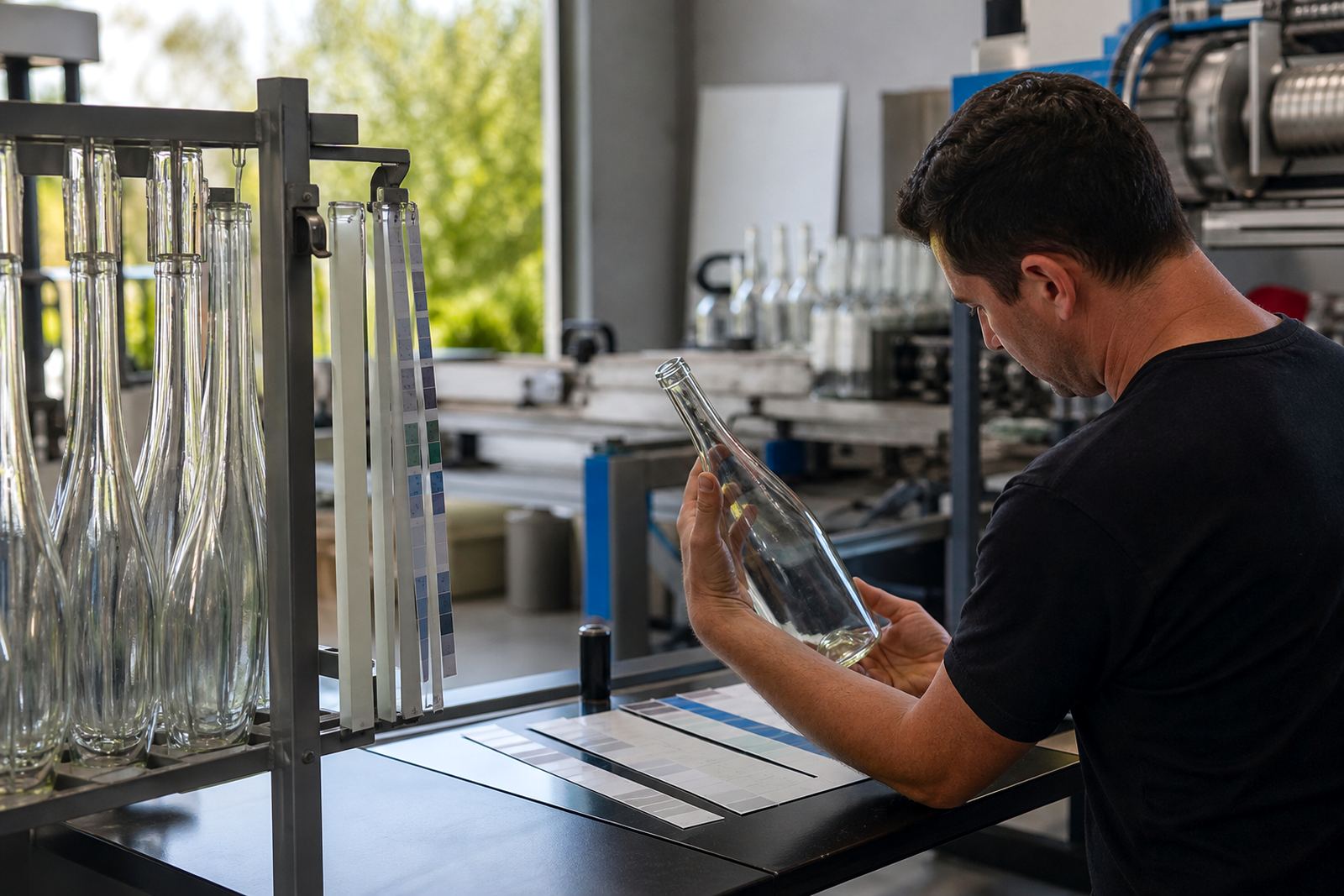
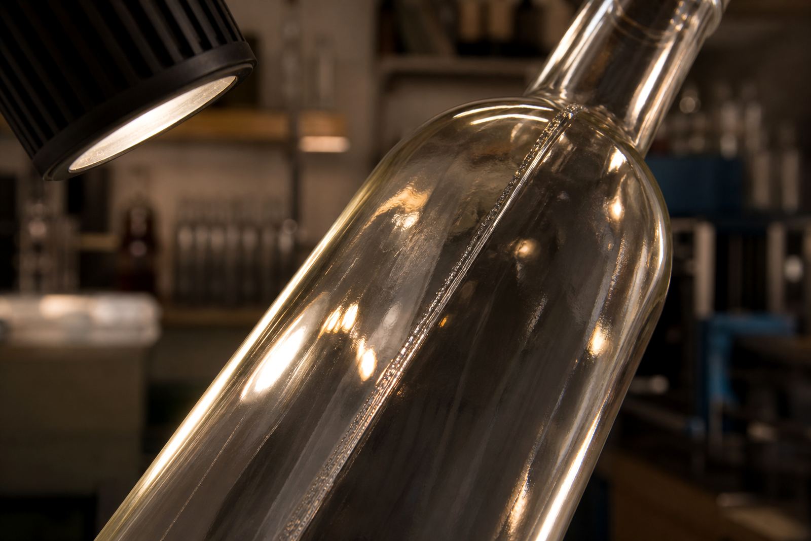
Glass thickness, shoulder shape and body height all matter. A long label can look elegant on a tall claret-style bottle, while a squat bottle may need a wider mark set lower on the body. If the glass is green, amber or clear, the colour guidance changes too. White ink layers may be needed for some print jobs so the artwork holds its colour instead of sinking into the glass tone.
Local climate can matter with storage and handling, especially for event stock held in coastal humidity near Cape Town or Durban. Labels need to sit flat and the print method has to suit the bottle surface, otherwise the finish starts looking tired before the event even starts.
Artwork proofing keeps the finish under control
Cork-finish bottles tend to look straightforward, yet the details can shift the whole result. That is why artwork checks and proof approvals matter before every run. Small changes in text spacing, bottle wrap area, neck height or label border can make the difference between a bottle that reads well and one that feels cramped.
For a short run, proofing is especially useful when the same artwork must be adapted across wine, gin and water bottles. One label may need a wider safe area, while another needs the logo lifted slightly so it sits clear of a shoulder curve. Mock-up visuals help with that planning by showing how the bottle shape affects layout, spacing and logo position on the finished design.
- Check the print area against the actual bottle size and shoulder line.
- Keep fine lines and small type readable at the final viewing distance.
- Confirm the label finish, especially where matte and gloss elements meet.
- Allow for white ink or backing where glass colour affects legibility.
- Use the proof to settle spelling, spacing and placement before production.
Minimum runs and packing for short bottle orders
Short runs need practical planning. The minimum run depends on the print method, bottle type and whether the job uses labels, direct print or a fired decoration route. A small order for a private tasting event does not behave the same way as a corporate gifting batch or a winery release with several bottle sizes in the same set.
Packing briefs also matter. Bottles with cork-style closures need handling that protects the neck, label edge and closure line. If the order moves to Johannesburg, Durban, Somerset West or Constantia, the pack should suit the journey and the event date. That includes clear marking for mixed cases, fragile items and separate artwork variants where needed.
In practice, a good pack plan keeps the bottles readable when they arrive. The closure stays neat, the label remains clean and the presentation box or carton does not hide the part of the bottle that carries the brand.
Paarl cellar door release bottle
A local cellar door in the Cape Winelands might ask for a small release bottle with a cork finish, a soft cream label and a dark green glass body. The same brief could later need a second bottle for a gin gift pack and a plain water bottle for tasting table service. In that case, the artwork needs to stay related across the range while still fitting each bottle shape properly.
That is where print area planning and colour guidance earn their place. The wine bottle may carry a small crest and a restrained serif title. The gin bottle might need a stronger line mark and a white backing layer. The water bottle could use a simpler one-colour layout so the set feels coordinated rather than crowded.
For a job like that, Bottle Printing Co. works through the proof, the bottle type and the packing note before the run moves forward. Willem Februarie oversees the overall production line, while Leanne Gamieldien, Anika Louw and Sibusiso Adonis handle the print checks and artwork side with Morne September and Zanele Padayachee keeping the logistics and client coordination in step.