The base shape that changes the first impression
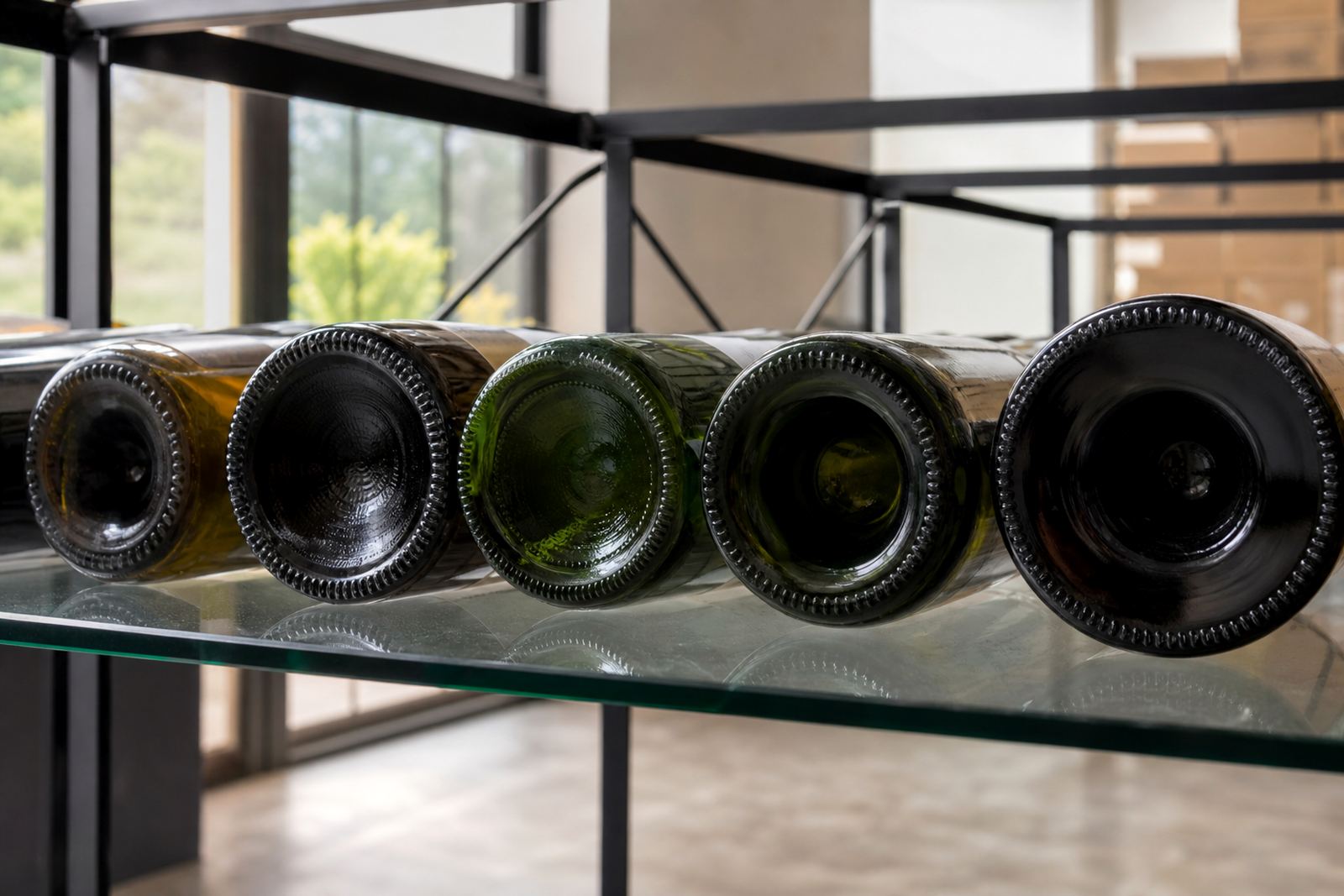
The punt is the push-in at the base of a bottle. On wine bottles it often appears as a deep hollow, while some gin and water bottles use a shallower form or none at all. That shape changes the stance of the bottle, the way it picks up light and how much of the glass remains visible once a label or print is applied.
For branded packs, punt depth matters because the base is part of the viewing angle. A bottle that stands tall and narrow can look more formal, while a deeper punt can make the profile feel heavier and more cellar-ready. In gift sets the base line also helps the bottle sit neatly beside a carton, sleeve or tasting glass.
Where punt depth shows up in print planning
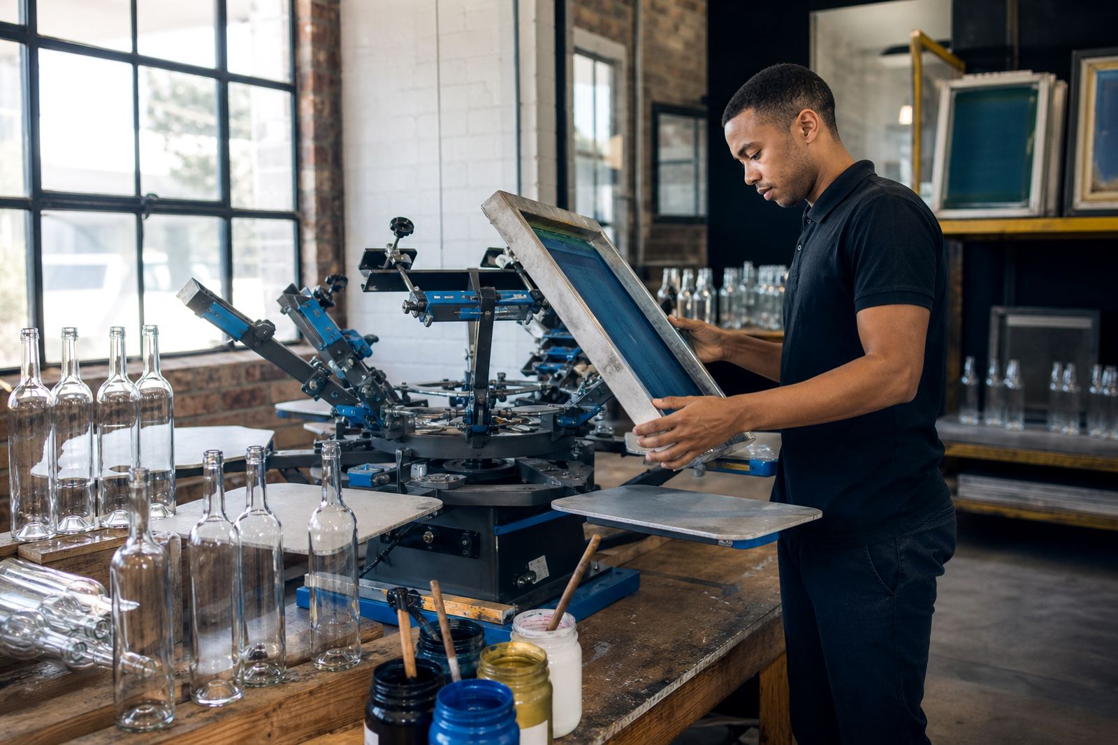
Decoration on curved glass needs careful placement. A deep punt reduces the usable lower area on the bottle, so artwork often has to sit higher than people expect. That affects bottle labels, direct UV print, screen print and ceramic enamel work, especially when the design carries text, fine lines or a crest.
- Deep punts can reduce label height near the base.
- Clear glass leaves more room for print to show through.
- Frosted glass can soften contrast and needs stronger colour planning.
- White ink layers help artwork stay legible on dark or tinted glass.
When a bottle is for gifting or event use, the footprint matters too. A deep punt can make the bottle feel secure in a box insert but it can also leave less space for a wrap-around label if the curve tightens lower down.
Bottle types that need different handling
Wine bottles, gin bottles and water bottles do not behave the same way on the print line. Long-neck wine formats often carry a deeper punt and a longer shoulder, while some gin bottles use broad shoulders and thick bases that suit more visual weight. Water bottles are usually judged more by clarity and cleanliness of print than by a traditional cellar look.
The bottle shape affects artwork checks before a run starts. A label that works on one glass format can sit awkwardly on another if the punt pulls the eye downward. For that reason, we plan the print area before production begins.
- Wine bottles usually need more attention to label height and curvature.
- Gin bottles often suit stronger contrast and bolder placement.
- Water bottles need clean placement that reads well from a distance.
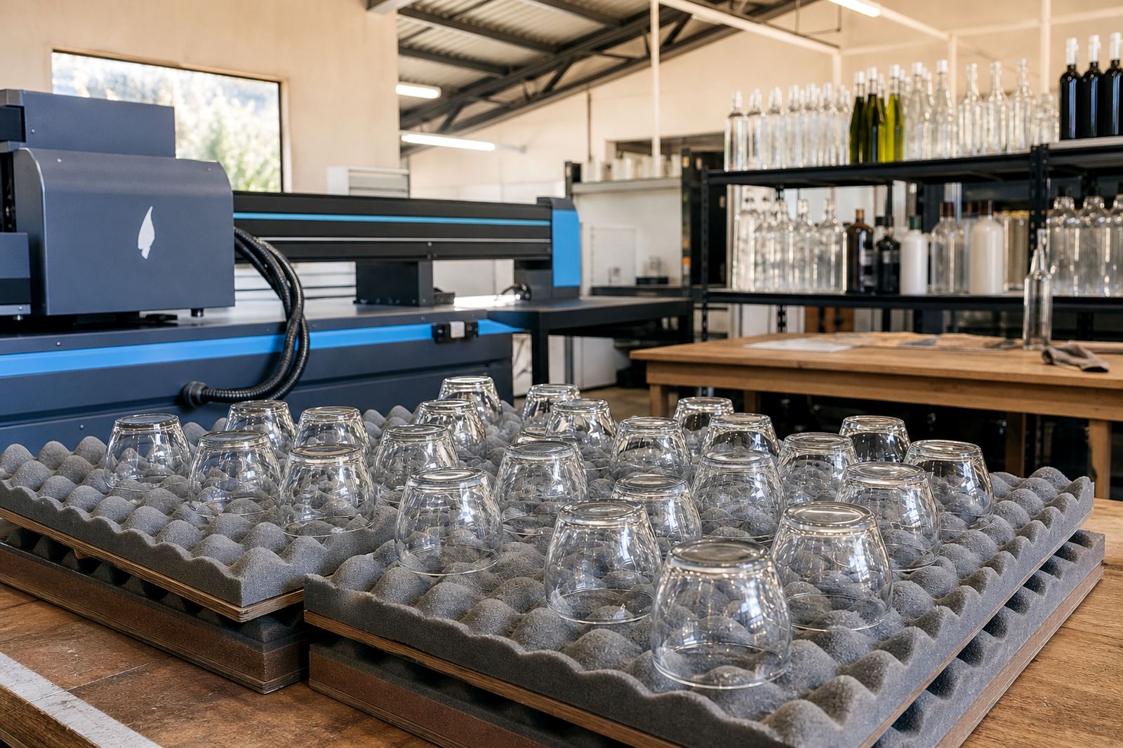
- Drinkware such as tumblers and stemmed glasses call for different artwork spacing.
Paarl bottles from shelf to tasting tray
In the Cape Winelands, a bottle may move from cellar shelf to tasting room to a packed gift hamper in one day. On a run for local hospitality use, a deeper punt can help a wine bottle feel balanced beside branded drinkware, but it also means the label cannot crowd the bottom curve. That balance becomes even more important when the same bottle must look neat in Cape Town, Stellenbosch, Franschhoek, Johannesburg or Durban deliveries.
Coastal humidity and warm handling conditions can affect how labels lie on glass and how inks settle during packing. For that reason, mock-up visuals and proof approvals are not just paperwork. They show where the design meets the bottle shape, and where the punt changes the visual line.
Design checks before a run goes to press
Artwork help becomes useful when the bottle shape is part of the brief. A label may need trimming, a print may need white underlay, or a logo may need to move higher to avoid the lowest curve. On short runs, those small changes protect the final look and save rework later.
Useful checks usually include the following:
- Confirm the bottle finish, volume and neck profile.
- Check whether the punt is deep, moderate or shallow.
- Decide if the decoration method suits the glass type.
- Review colour against clear, tinted or frosted surfaces.
- Approve a proof before the run is set up.
That process helps with minimum run advice as well. Some bottle shapes suit smaller batches better than others because of setup and alignment demands.
Why the base matters in gift sets and event packs
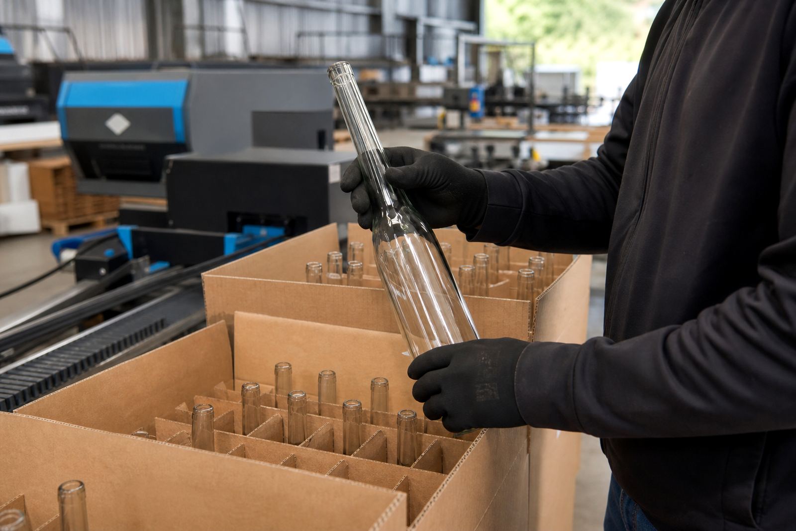
Gift sets need bottles that sit well beside other items. A deep punt can add presence, especially when the bottle is shown upright in a hamper or on a bar tray. It also affects the way the bottle sits in foam or carton inserts, which matters when packs move through packing and delivery.
For events, the base shape can change how a bottle feels in hand and how it lines up in a display. A neat stance looks better when the bottle is photographed, handed over or placed beside branded glassware. The punt is not decoration on its own, but it shapes the whole presentation.
At Bottle Printing Co. in Paarl, the work usually starts with the bottle itself, then the print method, then the proof. That order keeps the design tied to the real shape of the glass, not just to the artwork file.
Short-run printing where shape still has to behave
Short runs need the same care as larger ones, only with less room to hide a mistake. Whether the job uses UV direct print, screen printing, ceramic enamel or labels, the bottle base still affects the final look. A deep punt can shift the visual centre, while a shallow base can make the bottle feel lighter and more open.
For wineries, distilleries, corporate gifting and event organisers, the useful question is not only how the artwork looks on screen. It is how the bottle stands, where the eye lands, and how the decorated glass reads once it is packed, displayed or gifted.