Finish choices start with where the bottle will sit
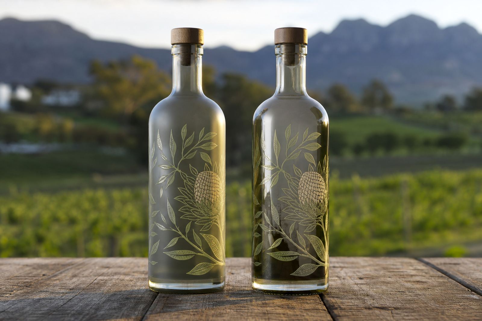
Matte and gloss are not just surface preferences. They change how light moves across a bottle, how colours read under cellar lighting, and how a label behaves when it is handled during packing, chilling or serving. A gloss finish throws back more light and gives artwork a brighter edge. Matte softens reflection and can make fine details feel more restrained and tactile.
That matters for short runs because the finish must suit the bottle shape, the glass colour, and the route the bottle takes after printing. A gift bottle on a tasting counter in Franschhoek is read differently from a case packed for a corporate launch in Johannesburg. Clear glass, amber glass and frosted glass all take finish differently, and the same artwork can look heavier or lighter depending on the surface under it.
We look at the decoration method as well. UV direct print, screen printing, ceramic enamel and labels each carry matte or gloss in a different way. On glass, a gloss overprint can sharpen the logo edge, while a matte label stock can quieten a bright illustration. With drinkware, the curve of the surface often matters as much as the finish itself.
When gloss earns its place on the shelf
Gloss suits brands that want colour to lift off the bottle. It works well on strong blocks of colour, metallic detail, and artwork that needs a bit more shine under tasting room lights or event lighting. For gin bottles and premium water bottles, gloss can make the product feel more polished and more visible from across a table.
On UV direct print, gloss often supports crisp contrast and a brighter appearance. On screen printing, it can help bold marks hold their place on a dark or coloured glass bottle. Ceramic enamel finishes can also carry gloss well, especially where a durable, fired surface is needed for repeat handling. The result feels deliberate, though not every bottle benefits from that extra reflectiveness.
- Use gloss when the design depends on bright colour or strong contrast.
- Choose it for event bottles that must read quickly on tables or bars.
- Consider gloss on shorter bottles where light can travel evenly across the face.
- Pair it with clear proofing so highlights do not obscure fine copy.
Why matte often suits wine and gifting work
Matte gives a quieter surface. It reduces glare, which helps labels read more steadily in photographs, on display shelves and in daylight. Many wineries prefer that softer look when the brief leans toward reserve, heritage or restrained presentation. Corporate gifting jobs often use matte for the same reason, because it tends to feel calmer and less commercial.
With labels, matte stock can hold type well and keep colour blocks from looking too loud. On frosted glass, the finish can feel especially balanced because the bottle already diffuses light. On a water bottle or drinkware item, matte can hide small handling marks better than a high-shine surface, which helps when the pack-out is busy and the items move through several hands.
A matte finish does ask for careful artwork setup. Small text can disappear if the colour contrast is too low, and pale tones need checking before production. White ink layers often matter here, especially on darker glass or when the base colour would otherwise mute the printed artwork.
Matching finish to the bottle shape and decoration method
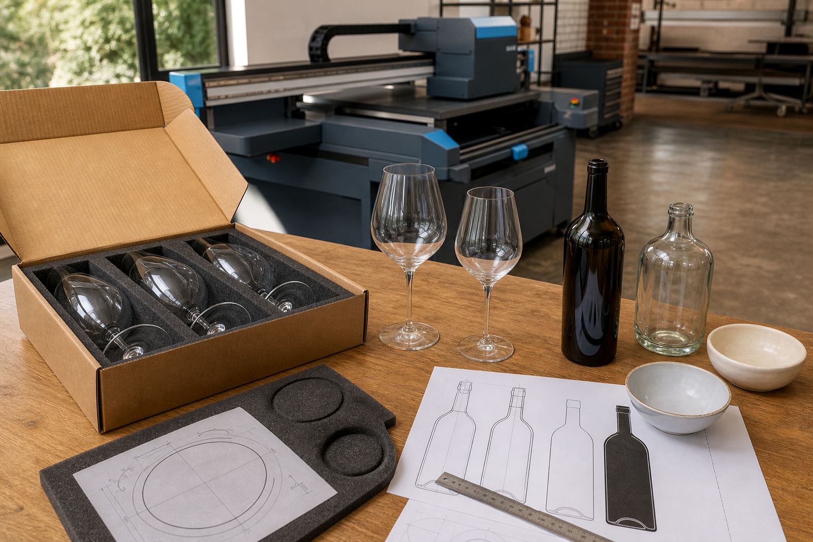
Different surfaces can change how each finish looks and performs. A long neck wine bottle gives a different visual field from a squat gin bottle or a straight-sided water bottle. Curves, shoulders and embossed details all affect how matte and gloss land once the decoration is applied. Choose a finish that suits the bottle shape instead of working against it.
Labels are often the most flexible option when a range needs several finish styles in one batch. A gloss label with matte lettering can create contrast without changing the bottle itself. Screen printing and UV direct print give more direct surface control, while ceramic enamel suits projects that need a hard-wearing printed layer on glass. For drinkware, the decoration area is smaller and more exposed, so the finish must be chosen with grip, cleaning and handling in mind.
- Clear glass usually carries gloss with more sparkle, while frosted glass softens it.
- Amber and dark glass can need white underlayers to hold colour.
- Curved bottles need print area planning so the finish sits evenly.
- Small labels can look crowded if gloss is used without enough negative space.
Proofs prevent finish surprises before the run starts
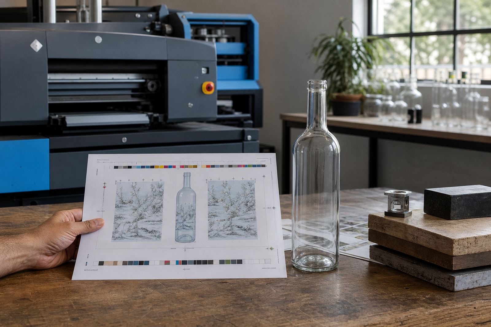
A proof is where the finish decision becomes practical. Artwork may look perfect on a screen and still read differently once it sits on bottle glass or label stock. That is why proof approvals matter before a short run starts. A matte proof can hide a detail that looks fine in a mock-up, while gloss can lift a colour that seemed flat in digital artwork.
Artwork checks help with overprint areas, fine lines, white ink layers and label alignment. A mock-up visual can show whether the bottle needs a stronger border, a darker keyline or a different finish balance. If the brief includes several bottle sizes, proofing helps keep the same brand feel across the range instead of letting each item drift apart.
For short runs, this is especially useful because there is less room to recover from a mistake. A printed bottle that lands too shiny or too flat can throw off the rest of the packing brief, and replacing a run is rarely practical. A careful proof stage keeps the finish decision tied to the actual bottle, not just the concept.
Finish choices from tasting room to delivery
In Paarl and the wider Cape Winelands, finish choices often change with the job. A wine release for a tasting room may call for matte labels so the range feels composed on shelf. A small gin batch for a launch in Cape Town may need gloss so the artwork catches light in photographs. A water bottle set for a corporate event in Stellenbosch may sit somewhere between the two, depending on the room lighting and the drinkware style.
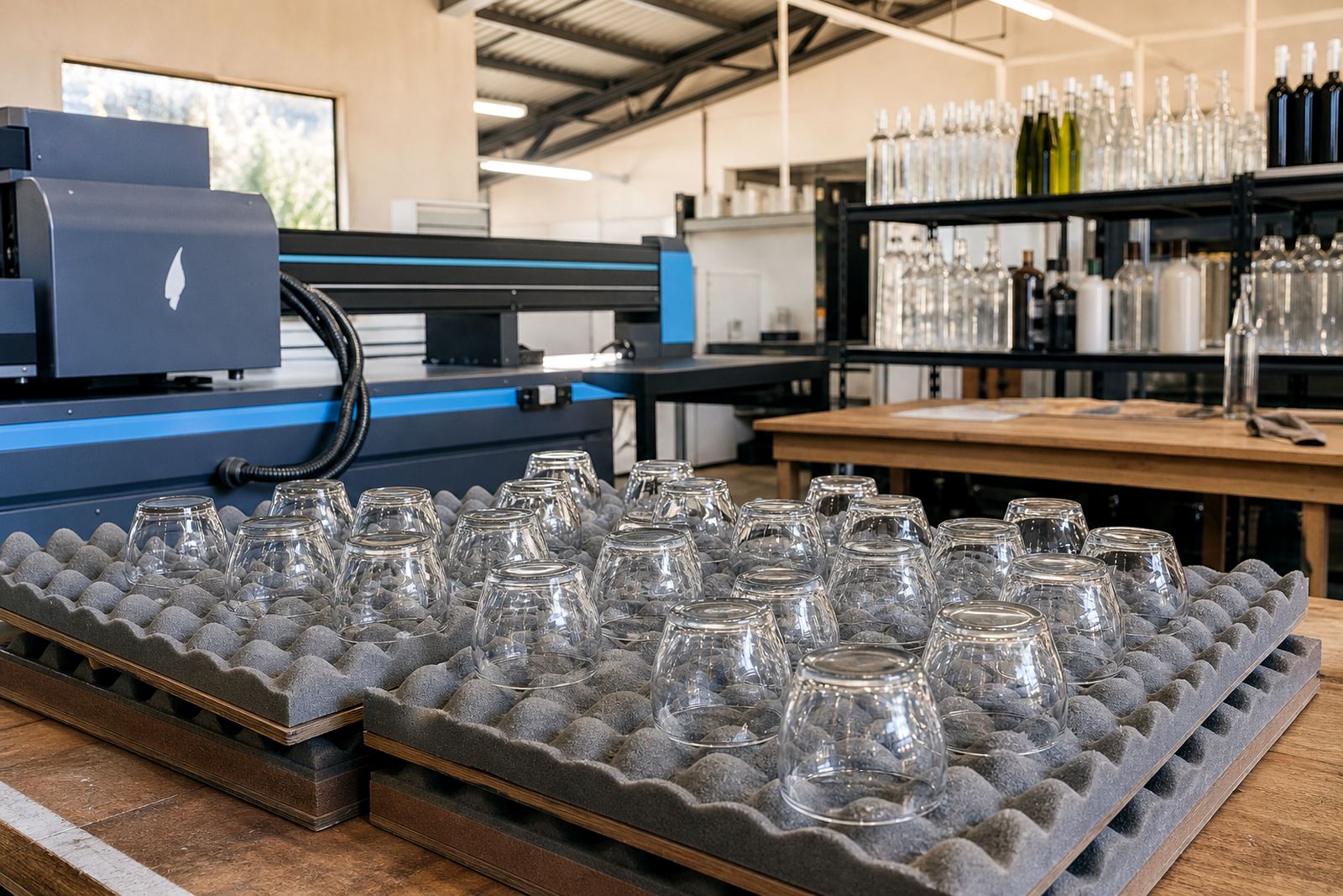
Delivery routes also shape the practical side. Bottles heading to Franschhoek or Constantia for an event should be packed so the finish stays clean and unmarked. Long-distance runs to Johannesburg or Durban need the same attention to pack-out because scuffing can flatten a gloss surface or leave a mark on a matte label before the bottles are even opened.
When the finish is chosen carefully, the bottle does more than carry a logo. It supports the mood of the pour, the table setting and the way the range is introduced to guests. That is where the small detail pays off.