Why flute shapes need tighter artwork planning
A flute is tall, slim and unforgiving. The print zone is narrow, the curve changes as the glass tapers, and the stem leaves less room for loose artwork than a tumbler or stemless glass.
That means logos usually need to be simplified for width, with text kept short and placed where fingers will not cover it. Vertical alignment matters too, because a logo that sits too high can feel unbalanced, while one that sits too low can disappear into the hand during use.
In practice, we look at the full drinkware profile first. A flute for sparkling wine service behaves differently from a gift flute or an event glass, and the print area has to respect the rim, bowl and stem proportions. A layout that suits one shape may look cramped on another, even when the nominal size is similar.
Decoration methods that suit flutes
Different flute materials call for different decoration methods. Clear glass, frosted glass and coated drinkware all behave differently under ink or transfer systems, so the method has to match the surface and the run size.
- UV direct print works well for short runs and fine detail on suitable glass and coated drinkware.
- Screen printing suits cleaner shapes, solid colour areas and repeat work where the same artwork is used across a batch.
- Ceramic enamel is useful where a fired finish is needed for long wear and repeated washing.
- Labels are practical when the flute shape, print area or artwork detail makes direct decoration less suitable.
For flutes, white ink layers often matter because clear glass can swallow pale artwork. A logo that looks strong on paper may fade into the glass if the underlayer is not planned properly. The proof stage shows this clearly before the run moves ahead.
Artwork that holds its place on a narrow glass
Flute printing is less about filling space and more about using space well. Tall logos, small event marks and short messages usually work better than wide crests or long lines of text. Fine serif lettering can look elegant, but it needs enough size to stay readable once the glass is curved.
We check artwork for stroke thickness, colour separation and spacing around the edge of the print zone. If the graphic is too busy, the detail can crowd the glass and the finish feels untidy. If the art is too light, it can vanish against the clear surface.
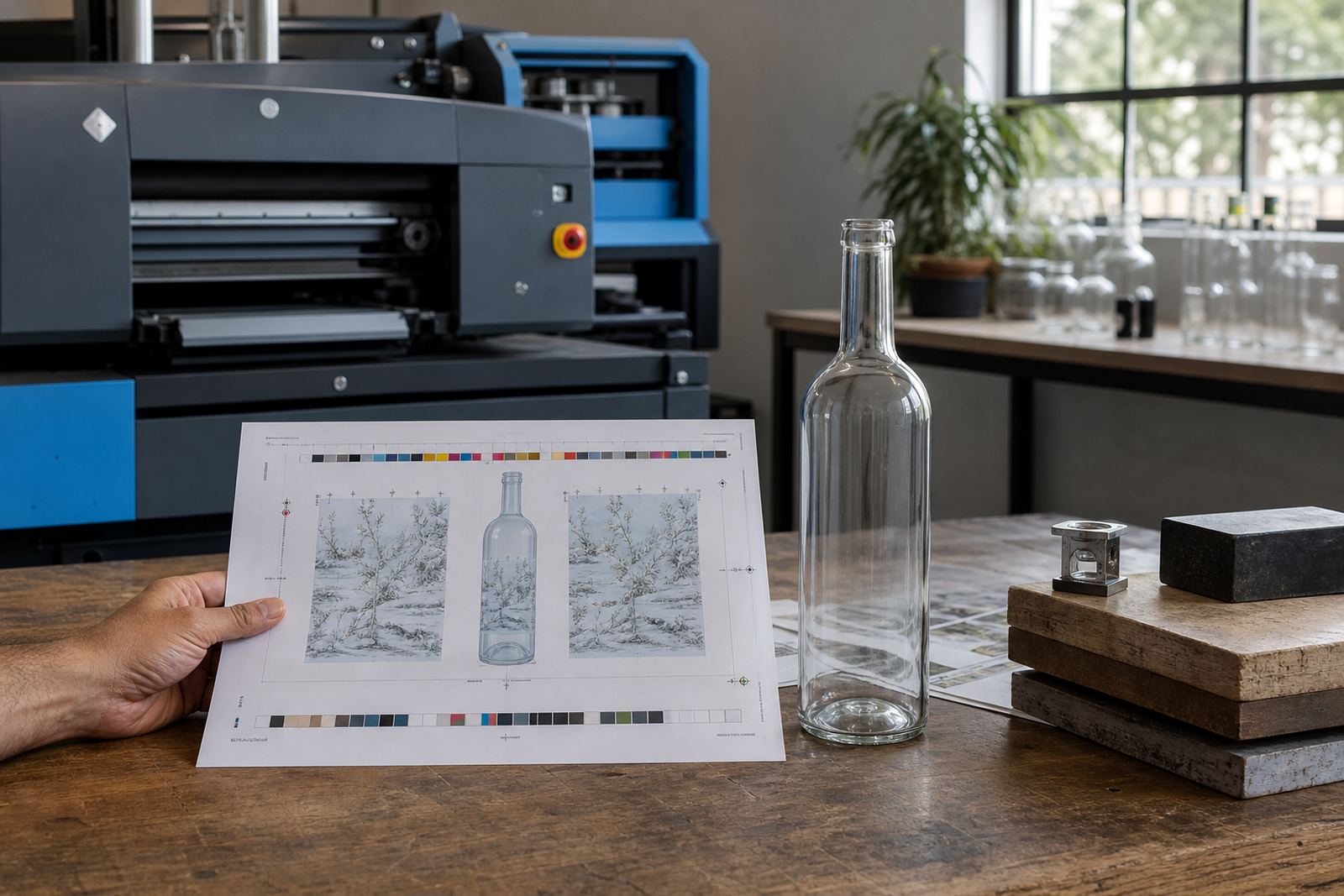
Practical files save time in the proof stage. Clean vectors, named colours and a clear layout reference help us prepare a mock-up that shows where the image will sit on the flute, not just what the image looks like on screen.
Proofs, mock-ups and minimum runs
Short run flute work still needs proper checks. Before any run goes ahead, the artwork is reviewed against the glass shape, the chosen method and the print area so the final look is clear. That proof step matters on slender glass, because even a small shift can alter the whole balance.
- Proof approvals confirm placement, wording and colour direction before production starts.
- Mock-up visuals show how the decoration sits on the flute body or stem area.
- Minimum run advice helps align the quantity with the method and artwork setup.
- Label artwork setup is useful when the project needs a wrap or neck label instead of direct print.
For event organisers, a small batch can be enough for a tasting table, VIP dinner or corporate gift pack. For wineries and distilleries, the same artwork may need to sit across flute sets, bottle gifts and drinkware, so the proof has to account for each item in the range.
Paarl cellar launch glassware set
A Paarl cellar team planning a summer launch may need flutes for a sparkling pour, plus matching water glasses for the table setting. The flute artwork could be a small mark near the bowl, while the water glass uses a wider panel and a stronger white layer. That keeps the set linked without forcing one layout onto every item.
From our base in the Cape Winelands, work moves across Cape Town, Stellenbosch, Franschhoek, Somerset West, Constantia, Johannesburg and Durban. Flute orders often travel with event stock, and packing notes matter because slender glass can chip if the cartons are too loose or the separators are not suited to the shape.
The same order may include branded wine bottles, gin bottles and matching drinkware. When that happens, the flute art must still stand on its own, even if the bottle label carries a different layout. The result should feel related, not copied word for word.
What helps a flute run finish cleanly
Good flute printing depends on a few plain habits. The artwork needs enough breathing room, the colour needs to suit the glass, and the print method must match the surface. Small slips show up quickly on narrow glass, so the setup has to be tidy from the start.
- Keep text short and readable at drinking distance.
- Avoid heavy detail right at the edge of the curve.
- Use white ink where clear glass would mute the colour.
- Allow for the hand position, especially on stemmed flute sets.
- Match the finish to washing, gifting or event use.
For a short run, the difference often comes down to placement and preparation. A neat flute carries a logo well, but it does not forgive lazy spacing or unclear files. That is why the proof and the print plan matter just as much as the decoration itself.
How short runs fit wineries, distilleries and events
Short run flute printing suits launches, tasting room use, staff gifts and branded event glassware. It also works for occasions where the order size is modest, but the finish still needs to look professional on the table.
Because flute decoration usually relies on narrow artwork zones and careful vertical placement, the process rewards clear decisions. Once the method, shape and artwork are aligned, the glass feels deliberate rather than rushed, even on a small quantity.
For South African projects, that practical approach helps when stock is moving between venues and delivery points. A flute set heading to Franschhoek for a tasting dinner may need a different packing brief from a batch going to Durban for a corporate function, and both need the print to stay consistent.