When the bottle shape does half the selling
A gin bottle can look calm and formal, or lean modern and sharp, before a label is even applied. Tall cylindrical bottles give more room for narrow artwork, while broad shoulders and faceted glass create stronger shelf presence but ask for cleaner placement. The trick is to match the decoration method to the surface, not force one layout onto every bottle.
For a Paarl bottling line that needs short runs for tastings or gifting, the shape also affects handling. Slippery glass, curved necks and uneven panels can make a label sit off centre or let a print drift towards a shoulder. That is why artwork checks matter early, especially where the bottle has a seam or a heavy taper.
- Straight-sided bottles suit labels and direct print well.
- Curved shoulders need careful print area planning.
- Heavy glass can hide small registration movement better than thin glass.
Where front branding lands on curved glass
Bold front branding works best when the print zone is chosen with the bottle form in mind. On a round gin bottle, the main mark often sits on the widest visible face, while the back panel carries legal details or a secondary design. If the neck narrows too fast, a label can wrinkle or lift at the top edge, and that spoils the finish.
We usually look at three things before a run: the usable width, the visible height, and whether the glass turns away from the viewer too quickly. For short runs, a clean mock-up helps to show where the logo will land on the finished bottle, and what parts of the design may need simplification. The artwork is not just about beauty, it has to print properly on the actual shape.
- Wide front panels suit stacked logos and tasting notes.
- Thinner bottles often need narrower artwork blocks.
- Strong contrast helps on dark green or amber glass.
Choosing between UV direct print, labels and enamel
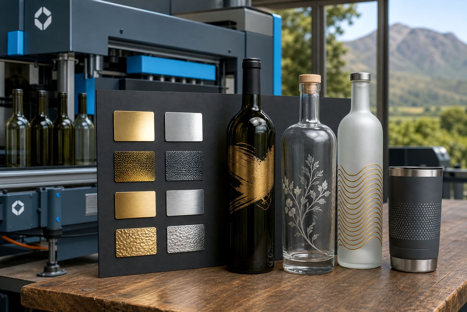
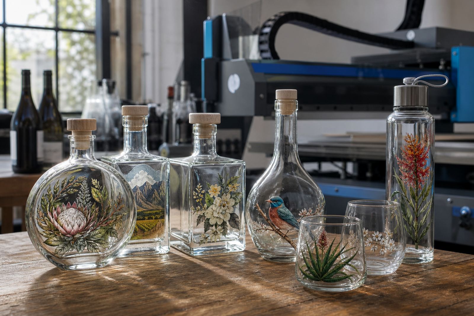
Different bottle shapes favour different decoration methods. UV direct print is useful where the bottle has a firm print area and the design needs crisp edges, especially on short runs with colour changes. Screen printing can suit simpler layouts on larger flat zones, while ceramic enamel is often chosen when a more permanent fired finish is needed on suitable glass. Labels still matter where the bottle shape is unusual or the design needs more detail.
Each method has its own tolerance for curve, texture and glass finish. A label can bridge a small change in diameter, but it also needs enough space to sit flat. Direct print can look very neat on a premium bottle, yet it needs honest print area planning or the edge of the artwork may tuck too close to a shoulder. That is the bit many people skip, then wonder why the sample looks off.
- UV direct print suits crisp short-run branding.
- For bold, straightforward artwork, screen printing is often a good fit.
- Ceramic enamel gives a durable fired decoration on suitable bottles.
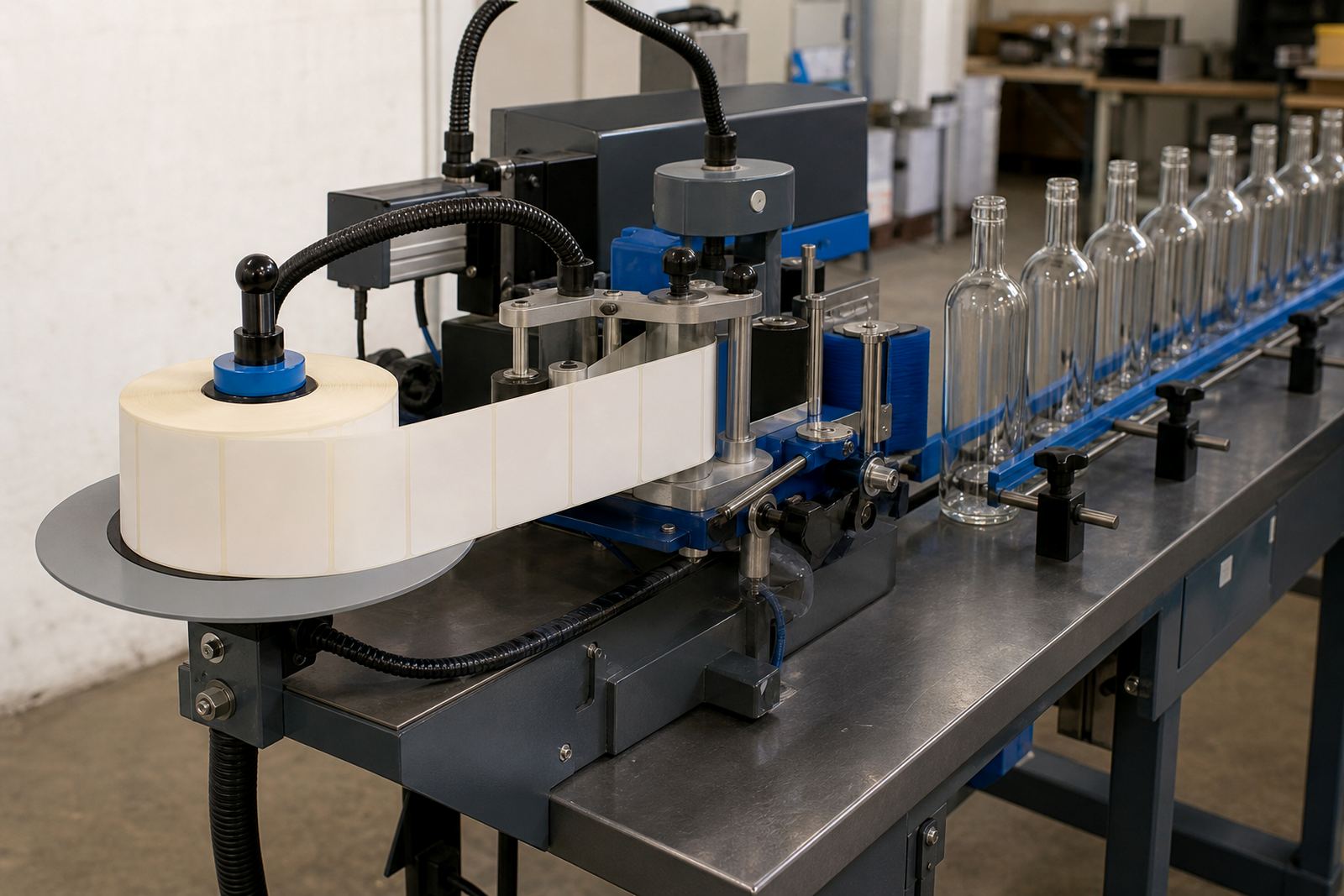
- Labels are useful for complex copy, batch variation or awkward curves.
Gin bottles, water bottles and drinkware do not read the same
Gin bottles are usually judged from a slightly longer distance and a more decorative angle. Water bottles and drinkware get handled more often, so the print has to survive rubbing, stacking and repeated use. That changes the size of the logo, the amount of detail, and even the ink or label finish that makes sense.
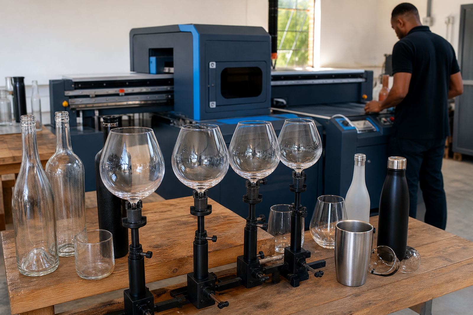
Glass tumblers, stemless glasses and reusable water bottles each create their own print challenge. A tumbler gives a tidy band for a small logo, while a tall bottle may need a vertical mark or a wrap label. For a corporate gifting run in Johannesburg or Durban, the safest route is often a proof that shows the logo on the actual item family, not on one generic bottle shape.
Artwork checks before the bottle goes into production
Artwork checks do more than catch spelling mistakes. They confirm line thickness, bleed allowance, logo size and the relationship between the artwork and the bottle profile. If white ink layers are needed under a coloured print, that also needs planning because glass colour can change how the final artwork reads. On clear bottles, the same logo can look sharp one moment and too faint the next.
Proof approvals help everyone agree on placement before the print run starts. A good proof should show the panel, the scale and any label edge or print boundary. For a short run, that step saves trouble when the bottle shape is not a standard one, and it keeps the finish consistent across the batch. It sounds small, but on glass it is often the part that matters most.
- Check logo scale against the real bottle height.
- Allow room for seam lines and curves.
- Confirm the proof on the exact bottle type, not a similar one.
Cape Winelands short runs with tight packing
A small run for a Cape Winelands gin launch often needs a mix of bottle shapes, label sizes and packing notes. One bottle may be for tasting pours, another for gift packs, and a third for retail shelves. That means the same artwork cannot simply be dropped onto every item. The print area changes, the neck changes, and the packout changes too.
For local deliveries into Paarl, Cape Town, Stellenbosch or Franschhoek, packing needs to hold the bottles firmly so the decoration stays clean. If the run is headed to Johannesburg or Durban, the cartons and inserts matter just as much as the print. Glass does not forgive sloppy packing, and a label that looked perfect on the table can arrive marked if the brief was too loose. That is not a design problem, it is a packaging one.
Minimum runs that fit the job instead of the other way round
Minimum runs should suit the bottle shape and the decoration method, not force a client into more stock than needed. Short runs make sense for seasonal gin releases, small event batches and branded gifts where the artwork changes often. The right quantity depends on how many bottle types are in play, whether labels or direct print are being used, and how much variation the brief allows.
For unusual glass, it helps to think in terms of repeatability. A simple shape with one colour print is easier to keep steady across a smaller run than a faceted bottle with multiple decoration zones. If the bottle has a strong curve or narrow front face, a leaner artwork layout is usually the smarter route. That keeps the print legible and the product looking intentional rather than cramped.