

Files that are ready for bottle work
We handle artwork for wine bottles, gin bottles, water bottles and drinkware in the formats used for print production. That includes logos, label artwork, line work, solid colour blocks and text that must stay legible on curved surfaces. Files are checked for image quality, font handling and the space needed around caps, shoulders and labels, because a flat layout often needs a different approach once it wraps a glass bottle.
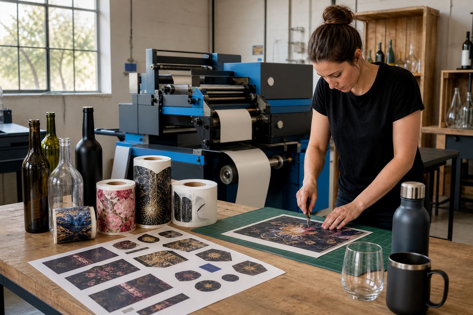
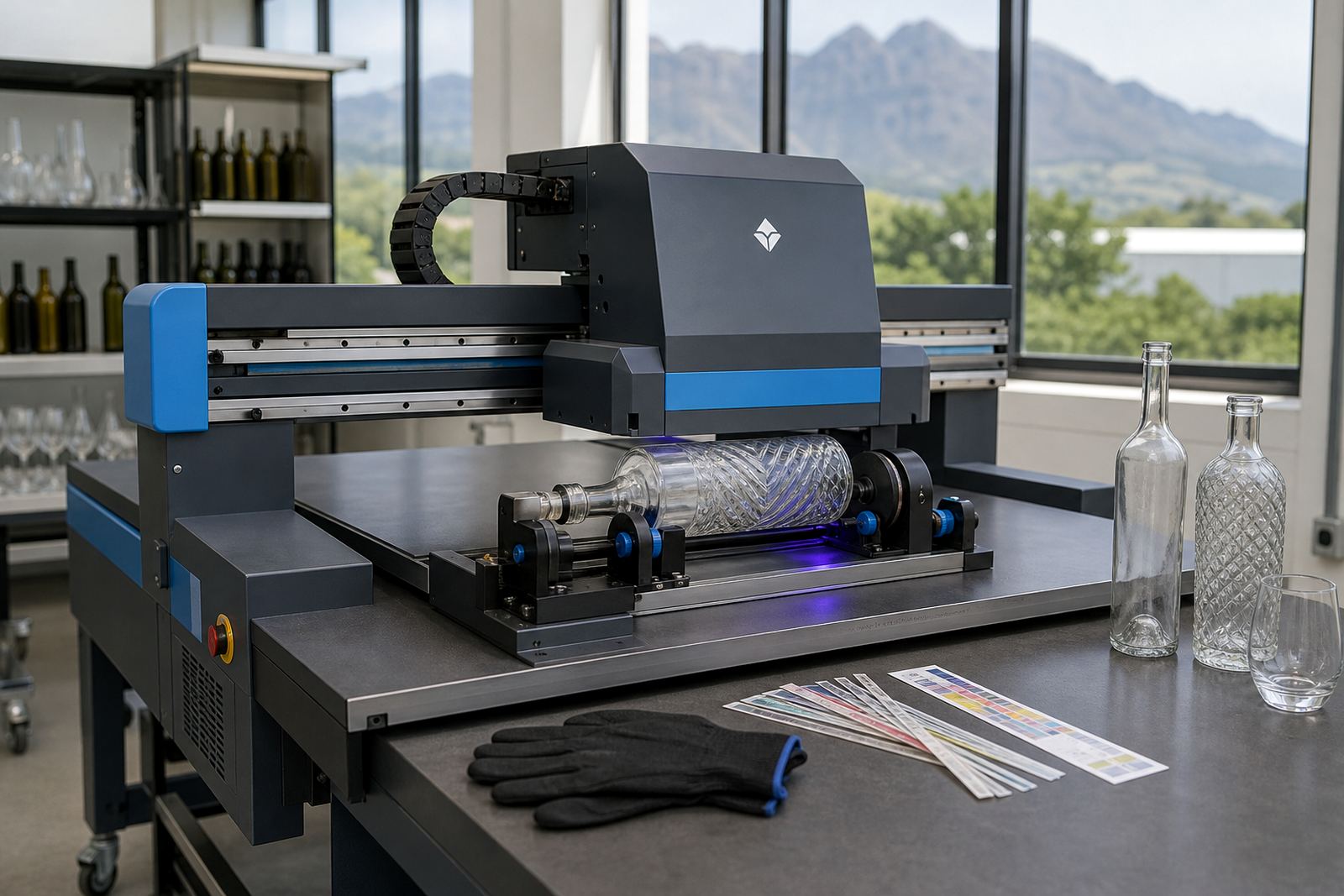
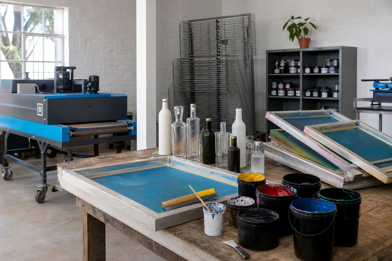
Where artwork arrives as a rough layout or a scanned logo, we set it up for the chosen decoration method. UV direct print needs clean placement and correct white ink underlays in some cases. Screen printing needs colour separation and sensible coverage. Ceramic enamel needs strong vector artwork and careful line thickness. Labels need trim, bleed and fold-safe layout so the finish stays neat after application.
Method notes for UV print, screen print and labels
Different decoration methods ask for different artwork prep. A bottle with a clear glass body may need white ink behind bright artwork, while a dark or tinted vessel may need more careful colour planning. Labels on wine and gin bottles usually carry more detail than direct print, which makes type size and spacing important. For drinkware, the print area can be smaller than people expect, especially on curved tumblers or handled mugs.
- UV direct print for crisp logos, names and short text on glass or coated drinkware
- Screen printing for strong colour blocks and repeat runs with consistent placement
- Ceramic enamel for decorated items that will face regular washing and service use
- Labels for full artwork, ingredient notes or event branding where more detail is needed
Proofs that show the real print area
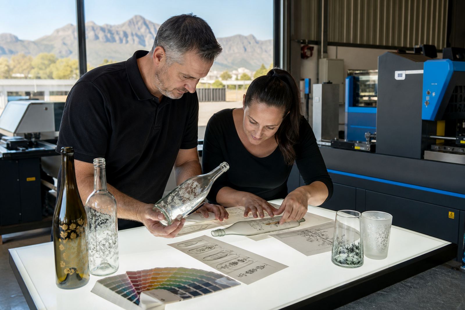
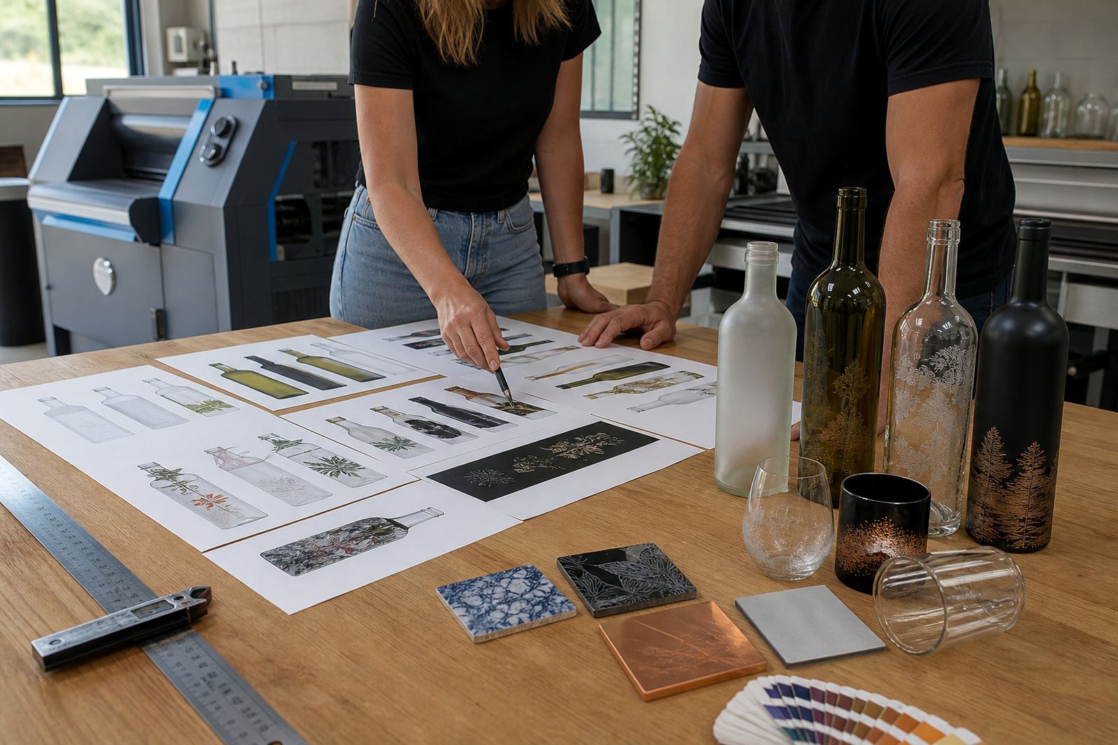
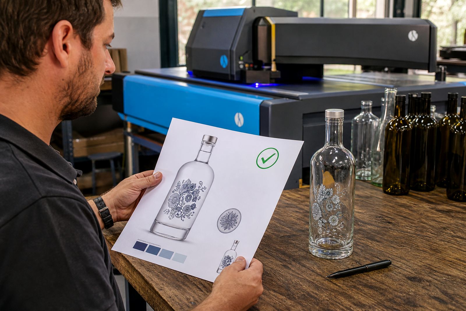
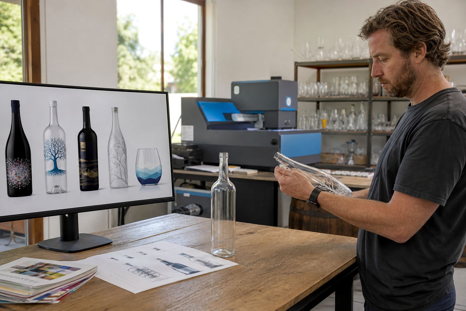
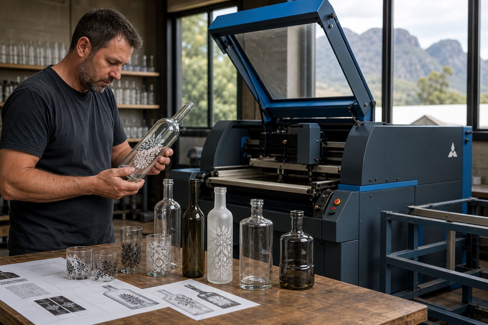
Proofing is there to show how the artwork sits on the item before production starts. We check placement on the bottle body, label panel or drinkware face, then show the parts that may move slightly around curves or shoulders. That step matters on wine bottles with long necks, on gin bottles with thicker glass and on small water bottles where space is tight.
Mock-up visuals help before the run is locked in. They show position, scale and the relationship between text, logo marks and any border detail. If a design reads well on a screen but sits too close to the edge in print, the proof makes that clear. Small changes at proof stage save material and keep the finished pack looking tidy.
Minimum runs and practical quantity advice
Short runs can work well for event bottles, corporate gifting and smaller release batches. Minimum quantities depend on the decoration method, the bottle shape and the number of colours involved. A label-led run can often suit a different quantity band from direct print, and ceramic enamel usually needs a more considered setup because the artwork and firing process are less forgiving.
- Short runs suit launches, tastings, staff gifts and event stock
- Repeat artwork across several bottle sizes needs a fresh layout check
- Mixed items in one order need separate print areas and proof notes
- Heavier glass and curved drinkware may call for adjusted artwork scale
Colour guidance for glass, ceramic and coated surfaces
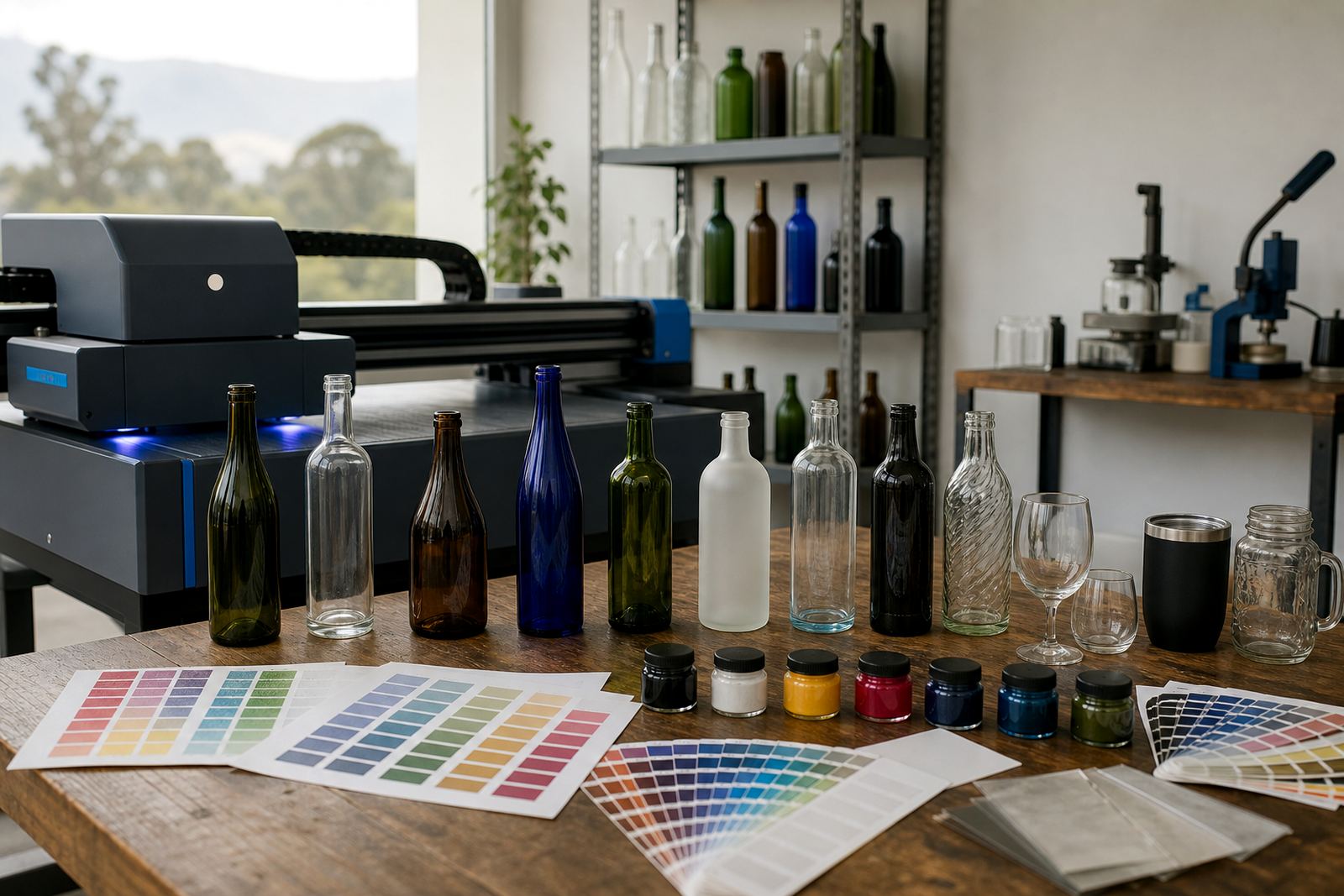
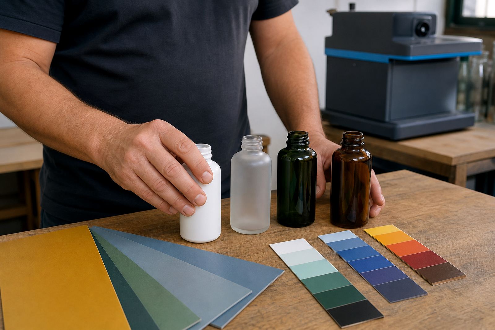
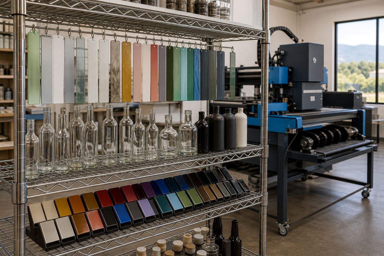
Colour behaves differently on clear glass, frosted glass, ceramic mugs and coated drinkware. A pale colour can disappear on a light bottle, while a deep tone may need backing or white ink to hold its shape. We look at the actual substrate, not just the artwork file, so the final result stays readable and balanced.
Some logos work neatly in one or two colours, while others need a simplified version for bottle printing. That is common with fine lines, gradients and small type. A proof helps show where a cleaner version will print better than the original file. On busy event artwork, the best result is often the one with fewer parts and stronger contrast.
What gets checked before production
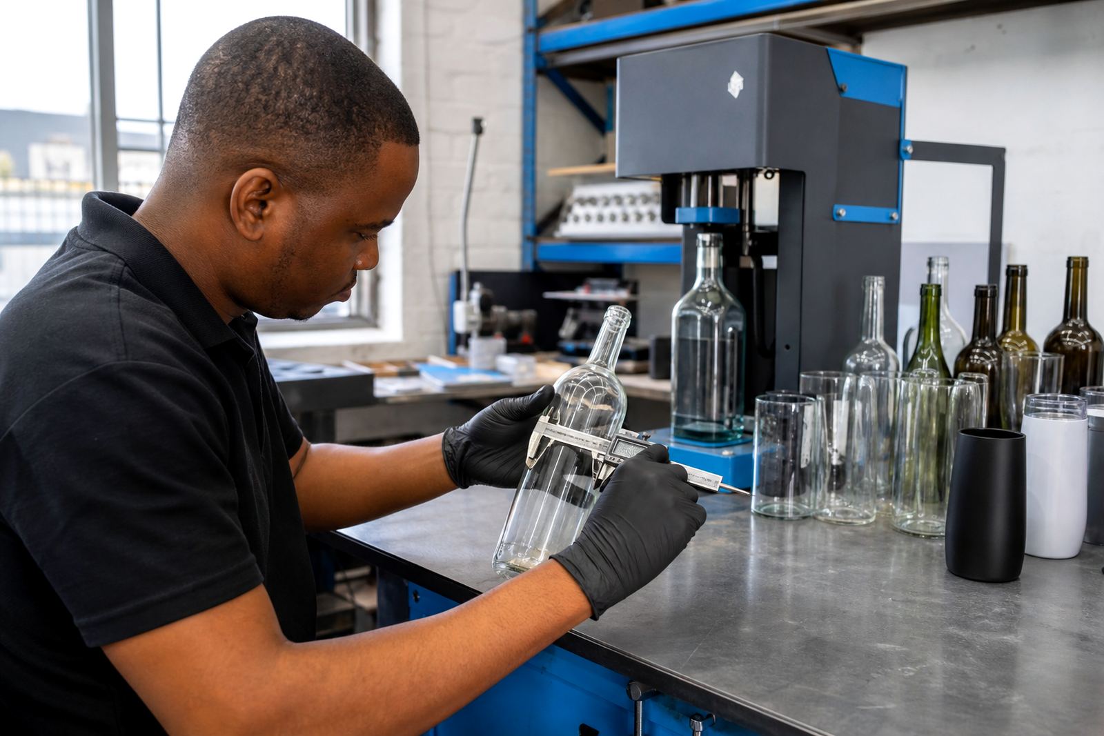
Before a run moves forward, the artwork is checked against the item, the quantity and the print method. The goal is not only correct spelling and layout, but also printability on the chosen bottle or cup. A label may need a different bleed from a direct print, and a white layer may need to sit behind the main colour block. Those details are handled before production starts.
- Artwork scale, placement and safe margins
- Font legibility at the final print size
- Colour use for the chosen surface and method
- Proof sign-off before the press run begins
For Paarl, Cape Town, Stellenbosch, Franschhoek, Johannesburg and Durban orders, the same proof logic applies. The item, the method and the run size decide the setup, not the town. That keeps the artwork consistent across delivery areas and across different bottle formats.