When a white underbase earns its place
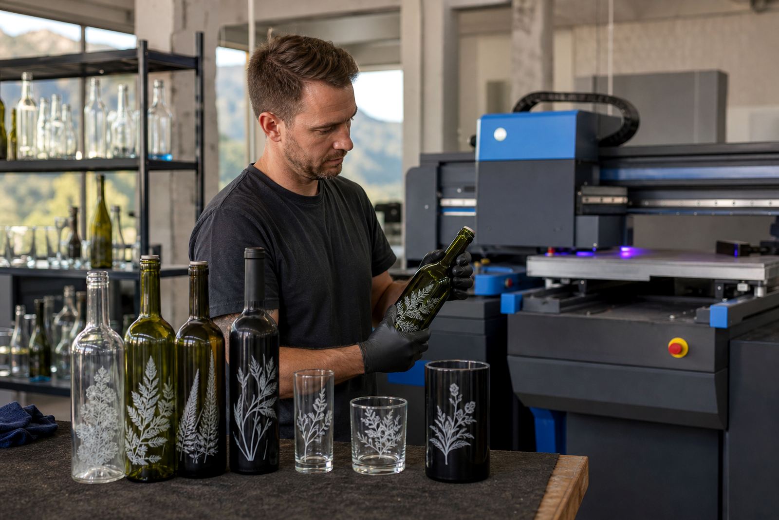
A white underbase is a solid white layer printed before the colour layers. On green, amber or smoked glass, it helps bright artwork hold its shape instead of sinking into the bottle colour. On clear drinkware, it also gives artwork a more solid look where the item itself would otherwise show through.
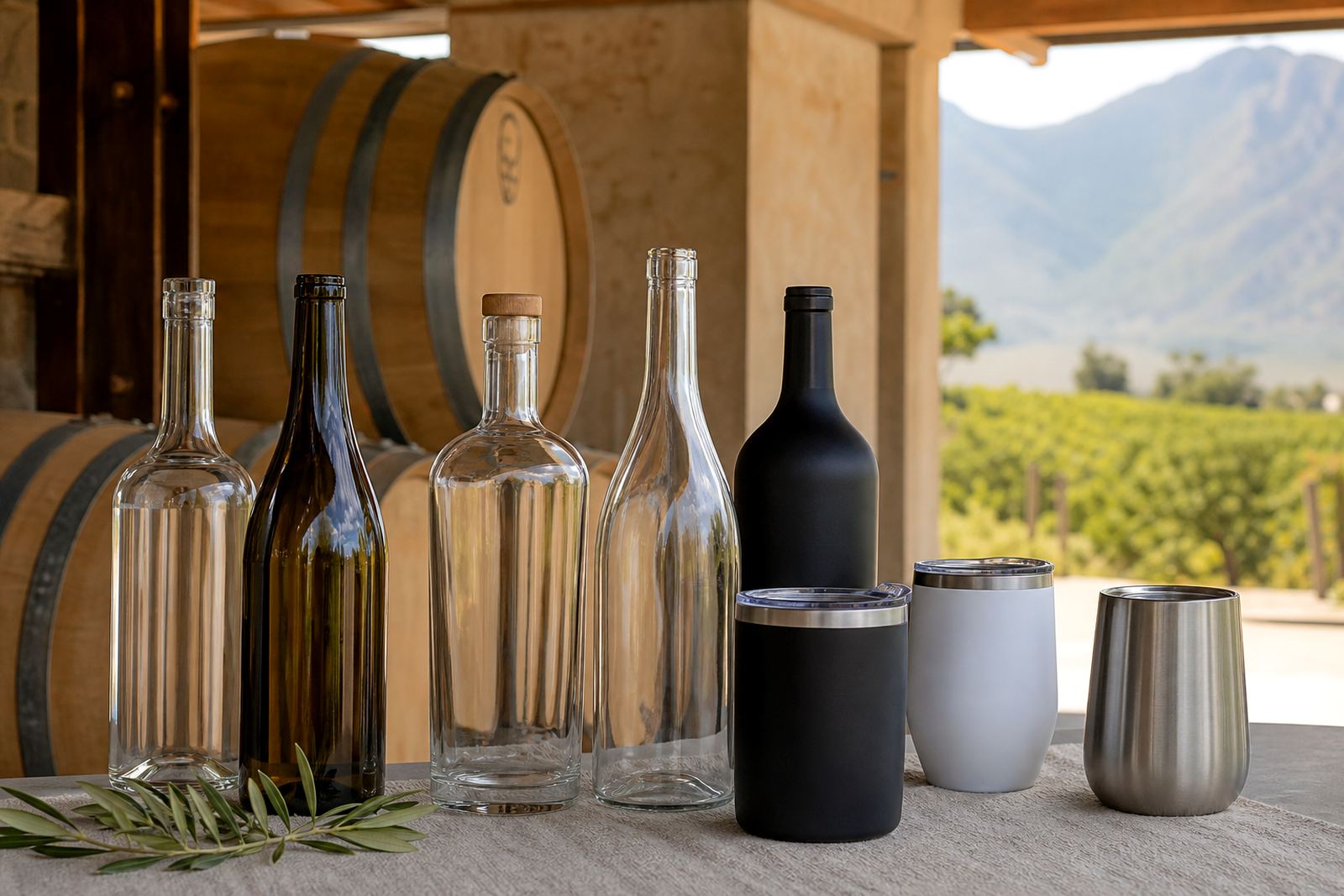
That matters on wine bottles, gin bottles, water bottles and handled drinkware where the glass tone can change the final look. A pale logo on dark glass may need the extra base to keep the lettering sharp, while a strong black or red mark can often stand on its own. The decision is not about adding white everywhere, it is about reading the bottle and the artwork together.
How the white layer behaves on different bottle types
Glass finish changes everything. Tinted wine bottles can mute pastel shades and make small type harder to read. Clear bottles often show the liquid or contents behind the print, which can make a label or logo look thinner than it did on screen. Frosted or coated drinkware can behave differently again, with some surfaces taking colour well and others needing a cleaner base.
- Green or amber wine bottles: white underbase lifts pale artwork and helps lettering hold.
- Clear gin bottles: useful where the bottle view sits behind the artwork and colour needs extra body.
- Water bottles and tumblers: helps logos keep their edge on curved surfaces.
- Dark glass: often needs the white layer for full colour fidelity, especially on short runs.
Artwork checks before the print run leaves Paarl
Before any run, the artwork has to be checked for line weight, knockouts, overprint settings and the size of the white underbase. Thin strokes can disappear if the white is too narrow, while heavy fills can show a halo if the base is pushed too far past the colour shape. That is where proofing matters, because a bottle proof shows how the layers sit together before production starts.
For short runs, these checks save awkward surprises on the packing table. A proof can show whether a soft cream logo needs a stronger white field, or whether a dark navy mark can sit directly on clear glass with less support. In the Cape Winelands, where bottle formats shift from tasting room stock to gifting sets and event parcels, the print area has to be planned with care.
Where white underbase helps most in South African work
Wineries, distilleries and event organisers often use mixed bottle types in one order. A gift pack may include a wine bottle, a gin bottle and a matching tumbler, each with a slightly different surface. White underbase keeps the brand look more even across those pieces, especially when the artwork has fine detail or pale brand colours.
- Short-run gifting sets where the same artwork needs to work on several substrates.
- Branded water bottles for conferences, tastings and hospitality packs.
- Gift drinkware with curved walls and limited print space.
- Clear bottles where the product inside would otherwise compete with the mark.
It is especially useful when the job needs tidy colour control, not just a visible logo. A lighter base can also make proof approval easier, because the final look is closer to the artwork file rather than the colour of the bottle itself. That is handy when a client wants the brand to feel consistent across mixed packaging.
Choosing between UV print, screen print and labels
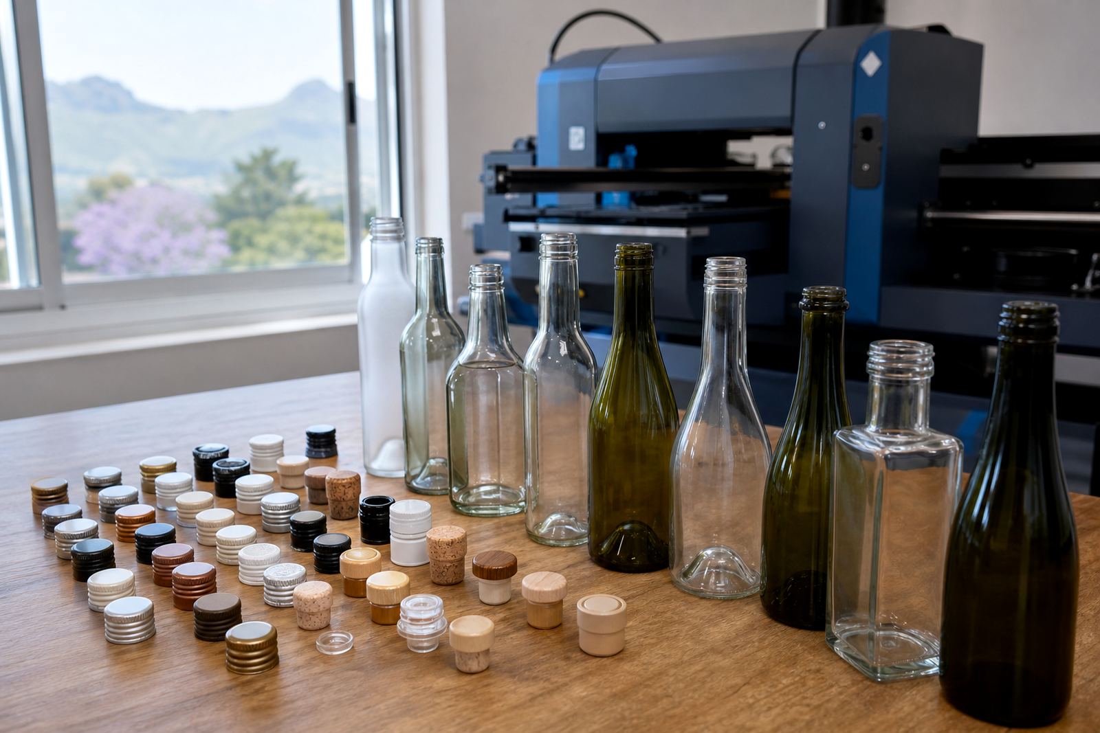
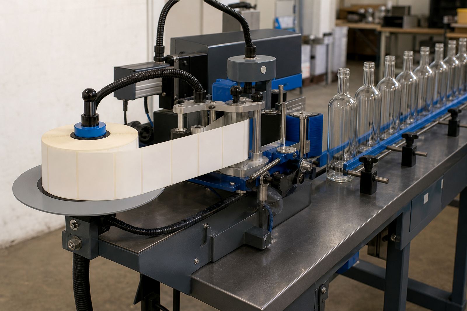
White underbase can sit inside different decoration methods. In UV direct print, the white layer is often used first and the colour is built on top. Screen printing can use a white base for denser coverage, especially on dark glass or curved drinkware. Ceramic enamel work may also need careful white planning where the artwork must survive repeated use and washing. Labels can include white areas in the design too, although that works differently from direct print because the substrate is not being printed on itself.
The right method depends on the bottle shape, the artwork size and how much of the glass must show through. A clean label can suit a quick campaign, while direct print suits a more permanent mark on the bottle. For short runs in Paarl, the job often comes down to how much colour certainty the client wants, and how much of the bottle surface should stay visible.
Clear bottles and tinted glass in the Cape Winelands
A seasonal gifting order might include clear gin bottles, dark wine bottles and branded tumblers in one pack. Without a white underbase, the pale parts of the logo can disappear into the darker glass and the clear pieces can look washed out once the bottles are filled. With the white layer planned properly, the same brand mark can hold across all three items and the pack reads as one set.
That is where practical print planning matters more than a fancy finish. The artwork coordinator checks the file, the technician sets the print area, and the proof shows how the white base sits under the colour. The packing brief then keeps the pieces grouped for delivery to Cape Town, Stellenbosch, Franschhoek, Johannesburg or Durban as needed.
For wineries around Paarl and the broader Cape Winelands, the point is not to make every bottle look identical. It is to keep the brand visible on the glass it was printed on, even when the surface colour changes from one item to the next.