How frost changes the way artwork reads
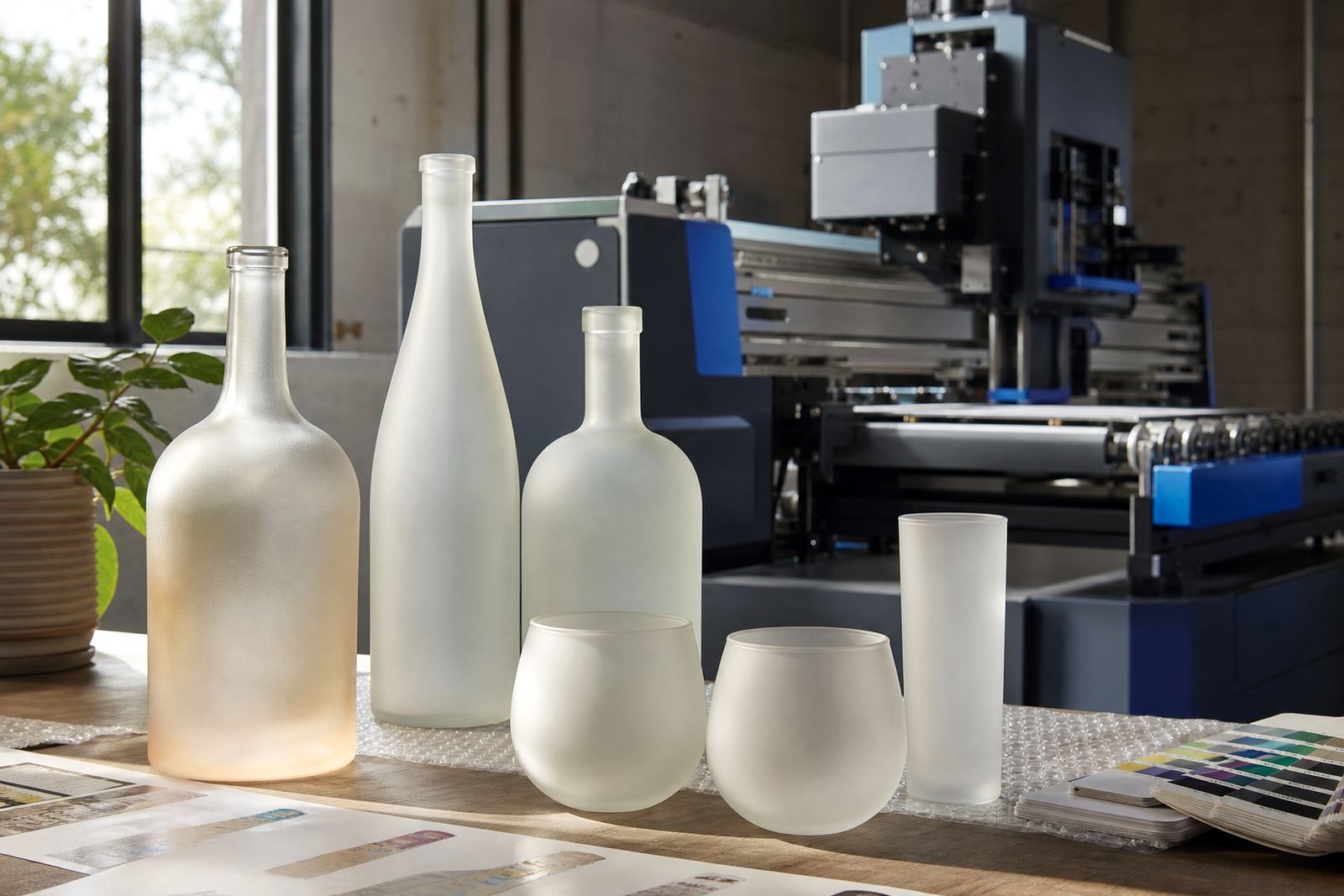
Frosted glass scatters light instead of throwing a hard reflection back at the eye, so logos and copy often feel quieter and more premium. That effect suits wine bottles, gin bottles, carafes and glasses where the shape should still do some of the talking.
On clear glass, a fine line or pale tint can disappear once the bottle is on a counter or in a gift box. On a frosted surface, the same artwork may hold better, but it can also soften around the edges and lose contrast if the colour choice is too light. A proof shows that shift before the run starts, which matters when the final piece must sit neatly in a hamper or tasting room set.
- Dark artwork usually reads more firmly on frosted glass.
- White ink needs correct film build and clean artwork edges.
- Fine text often needs more space than it would on clear glass.
- Small logos can lose detail if the frost is heavy and uneven.
Decoration methods that suit frosted glass
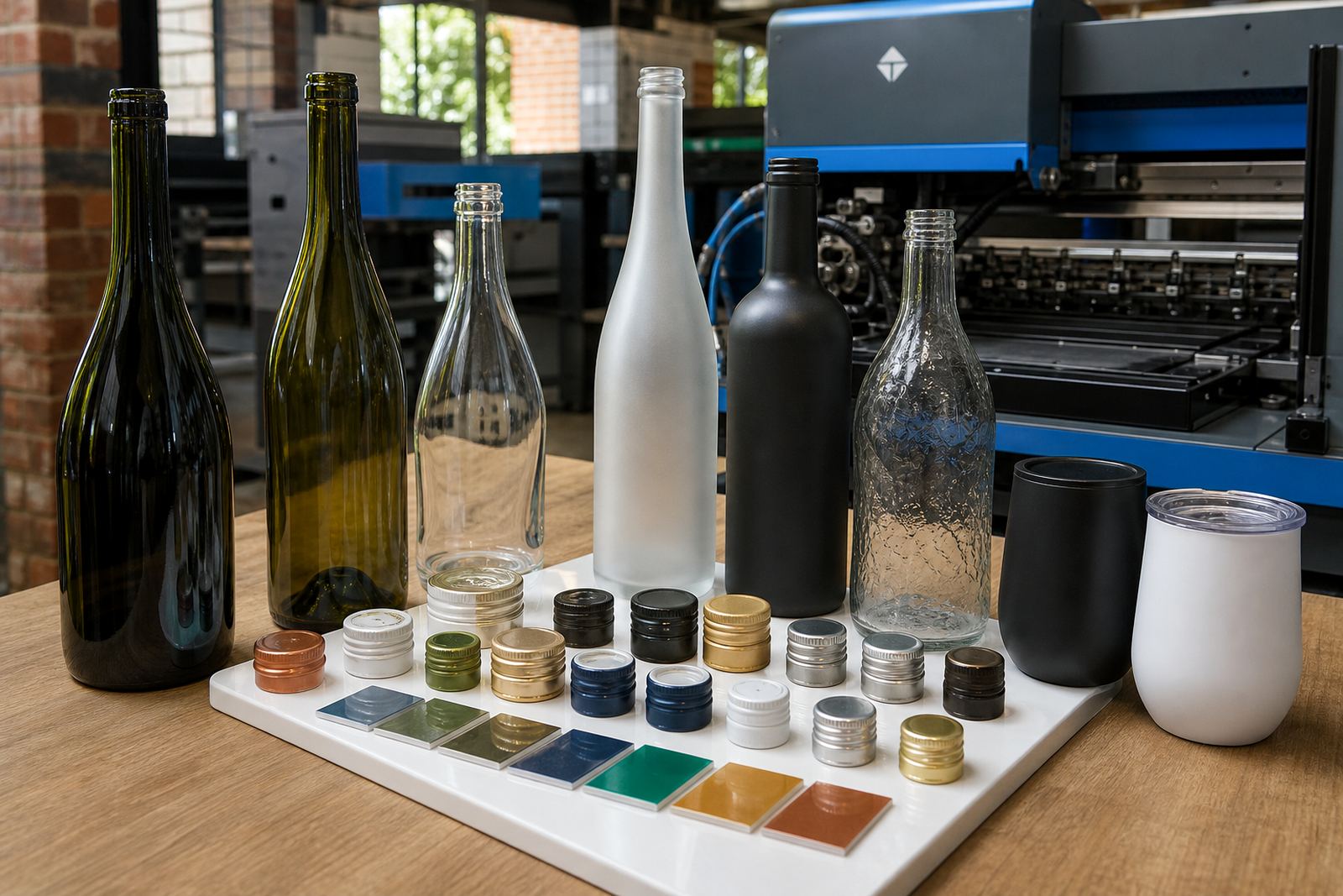
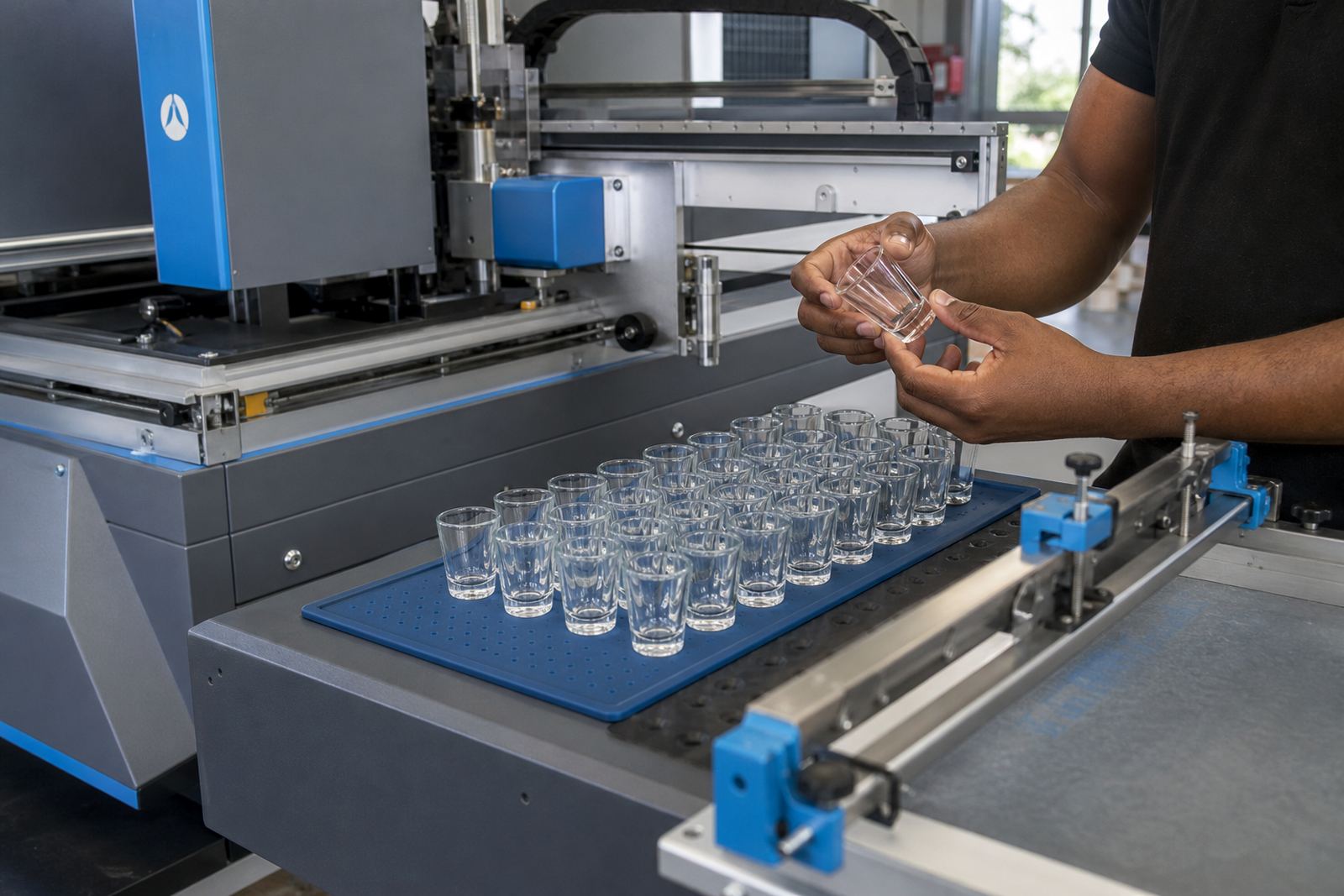
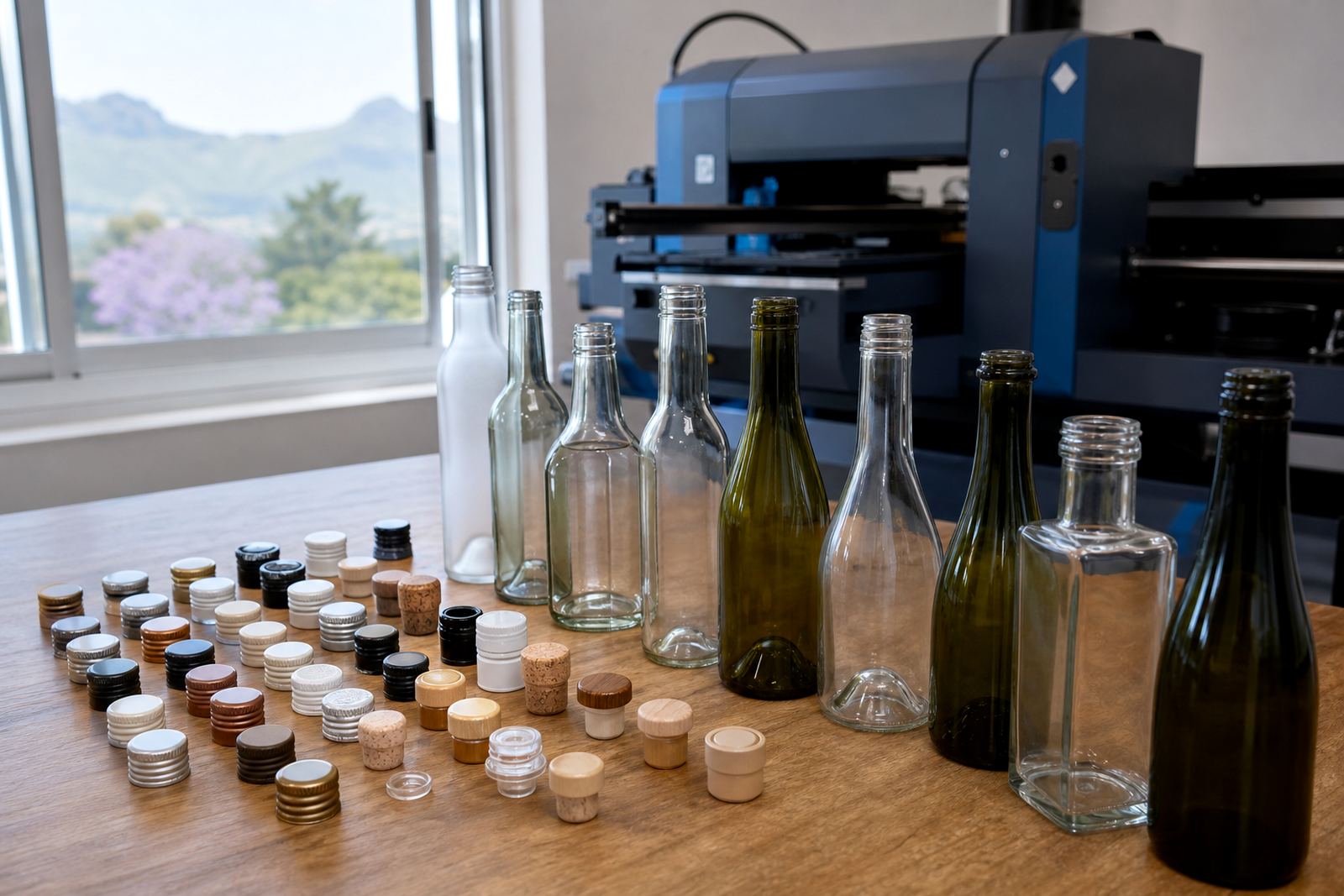
Different decoration methods behave differently on frosted glass. UV direct print can place colour and white ink directly on the surface, which helps for short runs and varied bottle shapes. Screen printing is well suited to repeat runs with solid colour blocks and strong brand marks. Ceramic enamel works where a fired finish is needed and the glass form supports that process. Labels can also work well, especially when the frosted effect should stay visible across most of the bottle.
For drinkware, the method depends on the surface area, the curve of the item and how much handling it will get. A cocktail tumbler for gifting may need a different build from a water bottle headed for a conference pack. The right method depends on print area, artwork detail and the level of opacity needed to keep the design legible against the frost.
- UV direct print suits compact runs and mixed bottle styles.
- For strong logo marks and repeat bottle runs, screen printing is often the better fit.
- Ceramic enamel suits decorated glass that must feel permanent.
- Labels suit designs with fine text or more colour variation.
Choosing colour for a matte surface
Colour on frosted glass behaves differently from colour on glossy glass. Deep navy, black, burgundy and metallic tones tend to feel steady. Pale greys, soft golds and thin linework can look elegant, but they need a proof because the frost can mute them more than expected.
White ink is often part of the discussion on frosted bottles and glassware. It can act as a base under colour or as the main print tone on its own. Without a white layer, some colours appear thin. With too much white, the artwork can look heavy. That balance is sorted during artwork checks and proof approvals, not after bottles are already moving through production.
For a Cape Winelands gifting set, a small logo on a frosted 750 ml wine bottle may need a slightly thicker stroke than the same logo on a plain clear bottle. The same goes for a 500 ml gin bottle or a stemless glass set for a corporate launch.
Artwork checks before the first run starts
Frosted finishes are not forgiving of loose artwork. Thin fonts, tiny registration marks and faint gradients need proper review before printing begins. Artwork checks help confirm line weight, placement, safe space and whether the file will hold up on the actual bottle shape.
Print area planning matters just as much. A label that looks balanced on a flat mock-up can sit too close to the shoulder of a bottle once wrapped around glass. The same is true for direct print on curved drinkware. Proofs and mock-up visuals show where the design will land and how the frost changes the feel of the final piece.
- Check logo size against the curved print area.
- Keep fine type away from tight edges.
- Plan for the bottle shoulder, neck and base curves.
- Confirm whether a white layer is needed under colour.
Short runs for gifting and events
Short runs suit frost beautifully because the finish already carries a premium look, even on modest quantities. That makes it a useful option for weddings, tasting room gifts, staff awards, product launches and event packs where the presentation matters but the order does not need to be large.
Minimum runs depend on the item, decoration method and the number of colours in the artwork. A small batch of frosted water bottles for a corporate function may be planned differently from a mixed set of frosted gin bottles and glasses for a distillery gift pack. Minimum run advice is part of the quoting stage, along with packing briefs if the bottles need to travel to more than one delivery point.
For organisers working across Paarl, Stellenbosch, Franschhoek or Cape Town, frosted glass can tie together different pieces without making the set look crowded. That matters when the same design must sit on bottles, tumblers and a few add-on items with different shapes.
Paarl frosted gift pack set
In the Cape Winelands, frosted glass often suits wine and gin gifting because it matches the calm, cool look many brands want for tasting-room pieces. A local order might include frosted 750 ml wine bottles with a restrained front mark, plus frosted glasses for a gift box sent to Johannesburg or Durban. The artwork on each piece needs to read as one set across the bottles, glasses and other items, with each design linked clearly to the others.
That is where colour guidance and packing briefs matter. A pale design that looks fine on a screen can disappear once printed on frost, while a strong black or white mark can feel too harsh if it is not balanced with the rest of the pack. The final look is usually best when the logo, bottle shape and finish are planned together from the start.
When the presentation is right, frosted glass gives the bottle a quieter presence and lets the brand feel deliberate. It works especially well where the item is meant to be opened later, displayed first and handled with care.