When a pressure label makes more sense than direct print
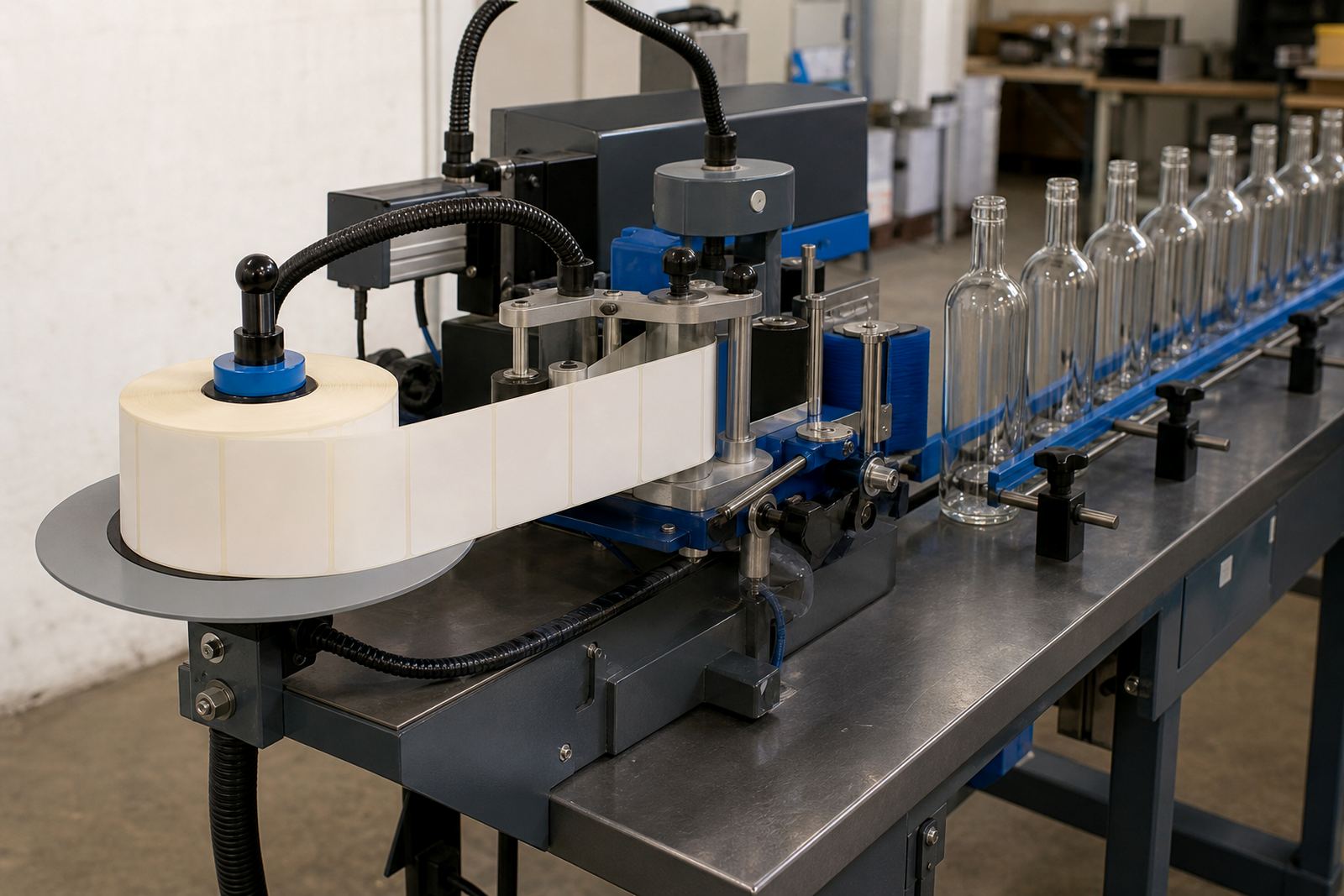
A pressure-sensitive label is a self-adhesive label applied to a bottle, jar or drinkware surface after the artwork is approved and the stock is prepared. It is often the better route when you need smaller quantities, several flavours or variants, or a shape that changes between bottle sizes. On curved glass, the label can carry fine type, logos, product notes and compliance text without forcing the entire container into one print method.
For short runs, labels also let you test a range of looks before settling on a final layout. That suits a Paarl cellar with a seasonal bottling, a distillery releasing a limited batch, or a company ordering gifts for an end-of-year function. The label becomes part of the presentation but it stays separate from the container, which helps when the same bottle format may be used for more than one brand line.
- Useful for short production quantities
- Works across many glass and drinkware shapes
- Allows mixed versions within one order
- Can carry detailed text and barcoding
Bottle shapes, surface finishes and where labels hold up best
Not every bottle surface behaves the same. Clear glass, frosted glass, coloured glass and coated drinkware all take labels a little differently, especially where condensation, handling and chilled storage are part of normal use. A straight-sided wine bottle gives a generous panel, while a gin bottle with shoulders or a tapered neck needs tighter planning so the label does not crease or lift at the edges.
On water bottles and reusable drinkware, the label size and adhesive choice matter just as much as the print. If the surface is slick or slightly textured, the label needs enough bite to stay neat through packing and transport. In coastal places such as Cape Town or Durban, humidity can affect how labels sit during storage, so the material and adhesive need to be matched to the job, not guessed.
- Clear and coloured glass bottles
- Frosted bottles and decorative containers
- Reusable drinkware and presentation items
- Curved surfaces that need careful label sizing
Artwork that stays readable on a small label face
Pressure labels reward clean artwork. Fine lines, small type and busy backgrounds can all become hard to read once they are reduced to fit a bottle front. We look at the label face, bottle diameter and the message that must be read first, then set up the artwork so the hierarchy is clear. That means the brand name, product name and key details all have room to breathe.
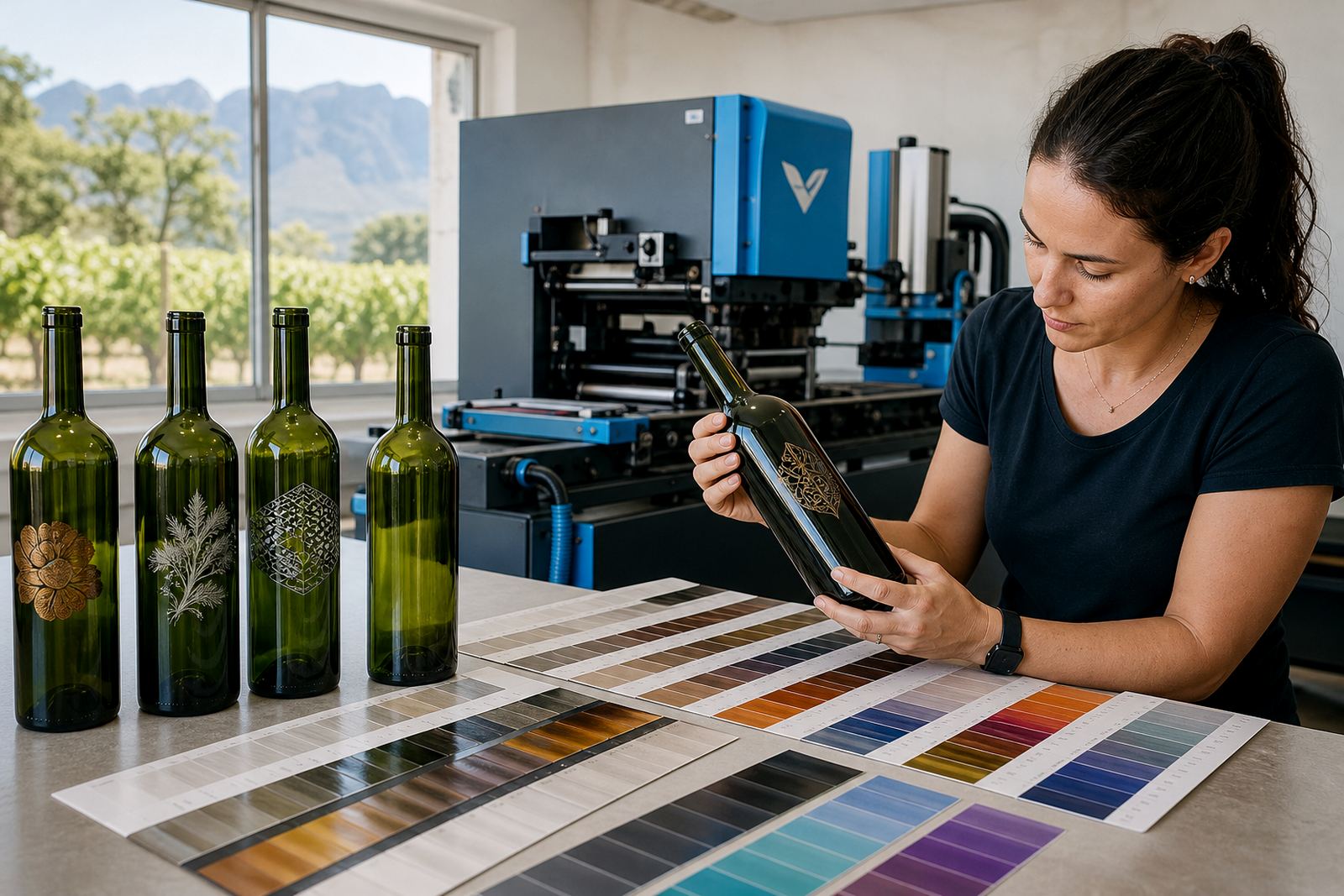
Colour guidance matters too. Some label stocks handle bold colour well, while others need a white base or a softer palette to stop the print looking dull. If a label is going onto dark glass or a tinted drinkware item, the background and print layers must be planned together. The goal is not to crowd the label with every possible detail, but to make the useful parts legible on the finished bottle.
- Clear hierarchy for brand and product text
- White backing where colour needs lift
- Safe margins around folds and edges
- Artwork checked against bottle size before print
Proofs, mock-ups and the part they play before print
Before a label run goes ahead, the artwork is checked and presented as a proof. That proof shows the shape, placement and key text so any spacing issue or wording change can be sorted out before material is cut. For short runs, that step matters because there is less room to absorb a mistake when the quantities are modest and the bottles are already allocated to a launch or event.
A mock-up view is useful where the label wraps around a bottle shoulder or needs to sit below a cap line. It helps a client see whether a logo sits too high, whether a compliance panel is crowded, or whether the label should be shortened to avoid an awkward seam. The proof stage is also where print area planning and minimum run advice are handled, so the order matches the bottles being used.
In practice, a label for a limited Cape Winelands gin release might need a narrow front panel, a back panel for batch details and a finish that does not smear when handled chilled. The proof reveals those issues before print starts, which saves time and avoids a bottle leaving the pack table with a label that looks out of place.
Label finishes that suit bottle gifting and retail presentation
The look of a pressure label depends on both the stock and the finish. A matte label gives a calm, paper-like feel, while gloss can sharpen colour and make artwork pop under lights. Clear labels are sometimes used where the bottle colour should remain visible, while textured label stocks can give a warmer presentation for premium gifting. The right finish depends on the bottle, the drinkware and the setting where it will be handed over.
For events, labels often need to read well from a distance and still look tidy in hand. For retail bottles, the detail has to hold up on a shelf among other products. If the label needs to carry a tasting note, QR code or producer details, the material must print cleanly and stay flat through packing. A neat label on a small run can do a lot of heavy lifting for the presentation without turning the bottle into a busy surface.
- Matte for a softer presentation
- Gloss where colour needs more lift
- Clear stock for a lighter visual effect
- Textured papers for a more tactile finish
Short-run planning for Paarl, the Cape and beyond
Short-run label work is often driven by deadlines that sit close to bottling, dispatch or event delivery. In Paarl and the wider Cape Winelands, that can mean a cellar release, a winery function, a distillery gift pack or a corporate hamper going out to several provinces. The order needs practical planning from the start, including the bottle count, label size, pack sequence and how the finished items will travel.
Pressure-sensitive labels also make sense when a client needs delivery into Cape Town, Stellenbosch, Franschhoek, Johannesburg or Durban. The bottles may be packed in mixed cartons, or the labels may be applied after delivery depending on the job. For that reason, packing brief notes matter just as much as the artwork, especially when the order includes different bottle types or several drinkware sizes in one batch. One minor typo in a product name can be caught early, before the labels are cut and packed.
For wineries and distilleries working with seasonal product lines, labels can provide a flexible way to keep the packaging aligned to the drink inside. When the order is set up carefully, the result is a bottle that reads clearly, handles well and fits the occasion without wasteful over-ordering.