What the seam changes on a wrapped bottle
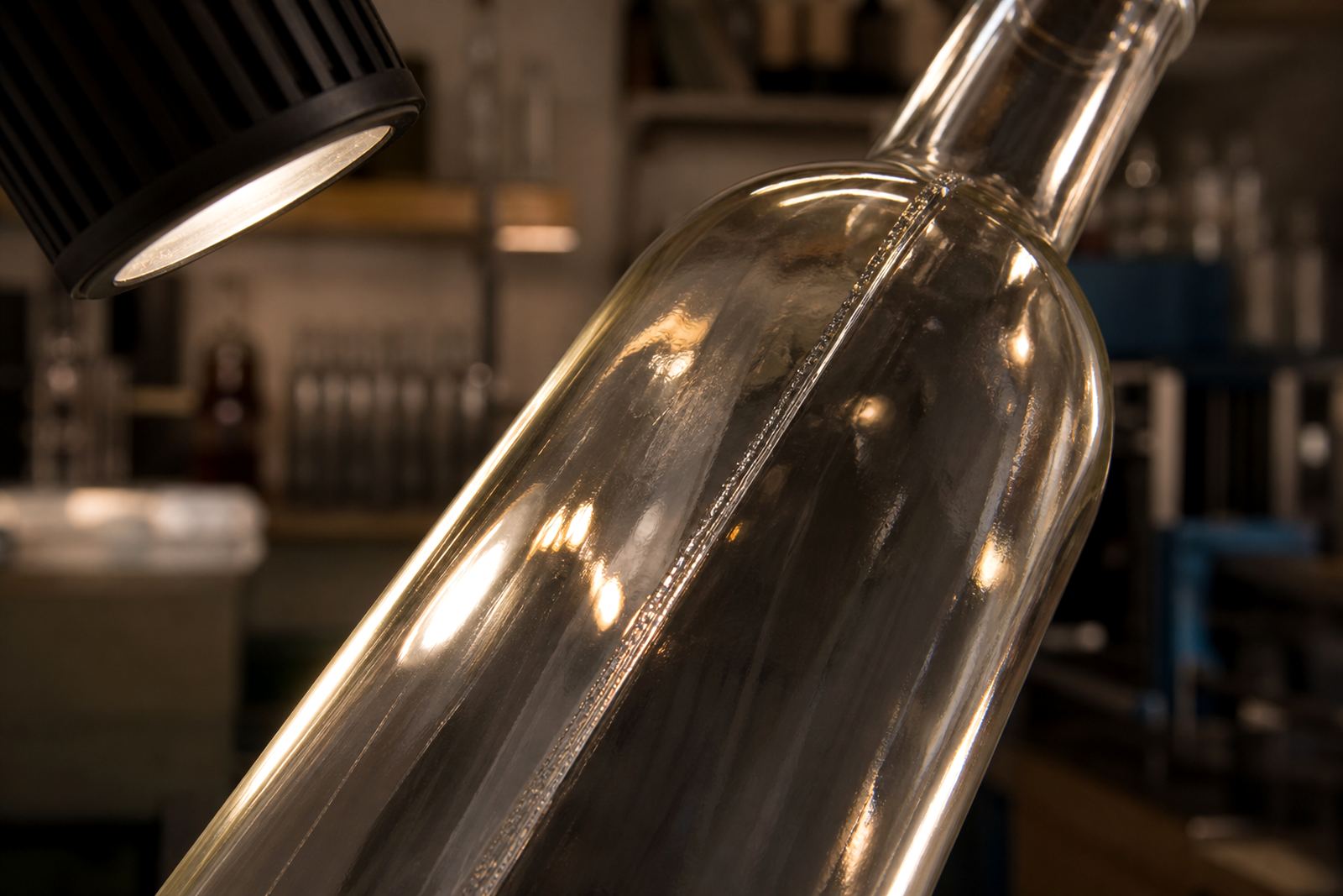
A bottle seam is the vertical line left by the glass mould. On some bottles it is faint, on others it catches the eye the moment the bottle turns under light. That line matters because it can interrupt a logo, break a narrow text block, or sit right where the artwork was meant to read cleanly.
For wine, gin and water bottles, the seam also affects orientation. A front label, back label or direct print panel may need to sit a few millimetres off the seam so the bottle reads properly when it stands on shelf or on a tasting table. With short runs, there is less room for trial and error, so the first layout needs to respect the bottle shape from the start.
- Seam position can disturb fine lines and small text.
- Clear glass shows seam lines more easily under venue lighting.
- Curved shoulders can push artwork out of square if ignored.
Choosing the right print zone on glass
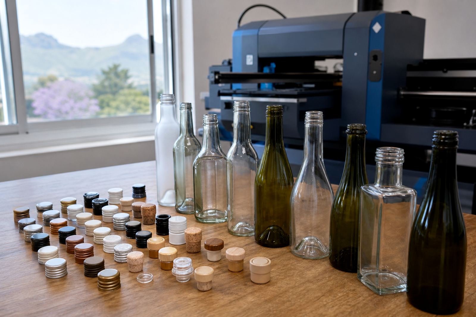
Not every bottle gives the same safe space. Straight-sided bottles usually offer a cleaner print area than bottles with deep curves, shoulders or tapering necks. A gin bottle with broad shoulders may take a front mark well, while a slim water bottle may need a smaller print field and more careful alignment.
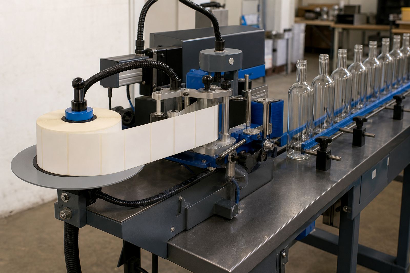
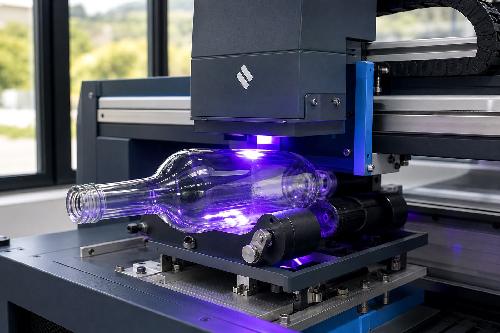
When we plan a job, the seam, the mould marks and the bottle curve are checked together. That helps decide whether UV direct print, screen printing, ceramic enamel or labels will sit best. UV direct print can work neatly on many glass bottles when the artwork is placed with the bottle geometry in mind. For areas of flat colour, screen printing is often the better option. Ceramic enamel suits firing processes for certain glassware, while labels allow more freedom where the seam or curve makes direct print awkward.
- Round bottles need more careful rotation marks.
- Heavy base bottles can shift how the seam reads.
- Wide labels can hide a seam better than small marks.
Artwork that behaves well near a seam
Artwork near a seam needs practical handling. Thin borders, tight typography and centred icons can all look out of place if the seam lands through the middle of the composition. A safer approach is to build some breathing room into the layout, then decide what can cross the seam and what should stay clear of it.
That is where artwork checks and proof approvals do useful work. A proof shows how the print area relates to the bottle and whether the seam is likely to interfere with the message. If the design uses white ink layers, the background can stay bright on amber, green or tinted glass. That matters on dark wine bottles and on coloured drinkware where a pale logo could lose clarity.
- Place fine print clear of the bottle seam.
- Let bold shapes carry across curved areas where needed.
- Use the proof to check the bottle turn and viewing angle.
Local bottle lines in Paarl and the Cape Winelands
In Paarl and across the Cape Winelands, many short runs are built around winery functions, tasting rooms, product launches and corporate gifting. A bottle for a Franschhoek event may need a cleaner front panel than a bottle used for a cellar door handout, where the brand can sit lower and the seam is less noticeable. The same applies to bottled water at conferences in Cape Town or drinkware for a summer function in Stellenbosch.
Local packing and delivery also shape the final result. Bottles need to travel without scuffing the print area, so packing briefs matter. The print itself may be perfect, but if the seam is not accounted for in the orientation marks the cartons can arrive with bottles facing different ways. That makes display work harder than it should.
- Paarl deliveries often need careful carton orientation.
- Cape Town events may need fast visual consistency across trays.
- Winelands venues often want the same face on every bottle.
Short runs need tighter seam control
Short runs leave little room to hide a mistake. For a 24 bottle or 48 bottle event run, we need to set seam placement at the start so bottle orientation stays consistent through packing and display. With smaller quantities, each bottle needs the same orientation, the same print position and the same packing logic so the set looks intentional.
Minimum run advice is useful here because some methods suit certain quantities better than others. Labels can be practical for very small runs, while direct print methods may suit a more fixed layout. Either way, the seam still matters. It can shift where the clean panel begins, and that affects the width of the artwork, the placement of logos and the spacing around the edge of the design.
Clear front faces for Paarl bottles
A local event organiser in the Cape Winelands might want branded water bottles for a long table setting and a few gin bottles for a private tasting. On the water bottles, the seam may be tucked to the back so the front face reads cleanly in photographs. On the gin bottles, the seam may sit just off-centre to keep the main mark away from the line while still leaving space for legal and product details where needed.
The same job could include ceramic drinkware for the welcome area and a separate label setup for wine bottles in mixed shapes. In that kind of order, print area planning is doing real work. It is not only about looks. It is about how the bottle turns in the hand, how it stands in a row and how the finished set reads when people pick it up.
At Bottle Printing Co., seam-aware planning is folded into artwork checks, mock-up visuals, proof approvals and the chosen print method. That keeps the artwork honest to the bottle, not just to the screen. Whether the order is bound for Paarl, Stellenbosch, Franschhoek, Cape Town, Johannesburg or Durban, we mark the seam on the sample first and place the artwork around it.