

Artwork Checks Before Print Prep
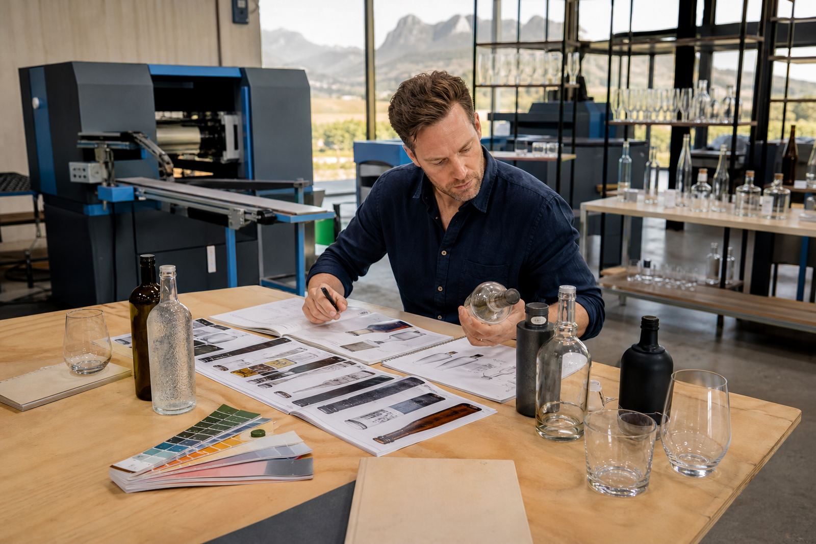
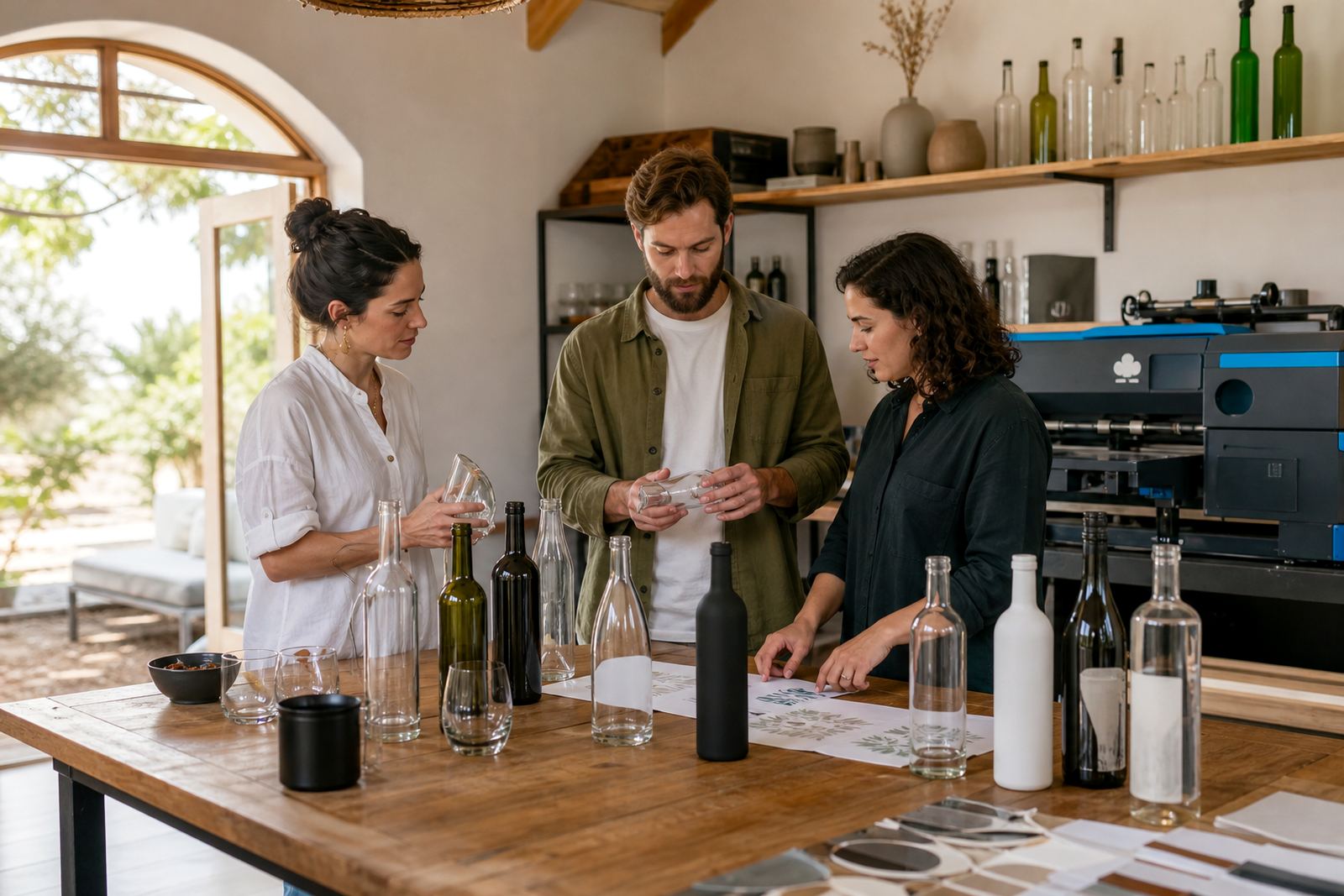
Artwork usually needs a proper once-over before anything moves into print prep. That includes file size, bleed, line thickness, font choice and how much of the bottle surface the artwork can cover without crowding the shape. On curved glass and on smaller drinkware, details that look fine on screen can shift when they wrap around the item.
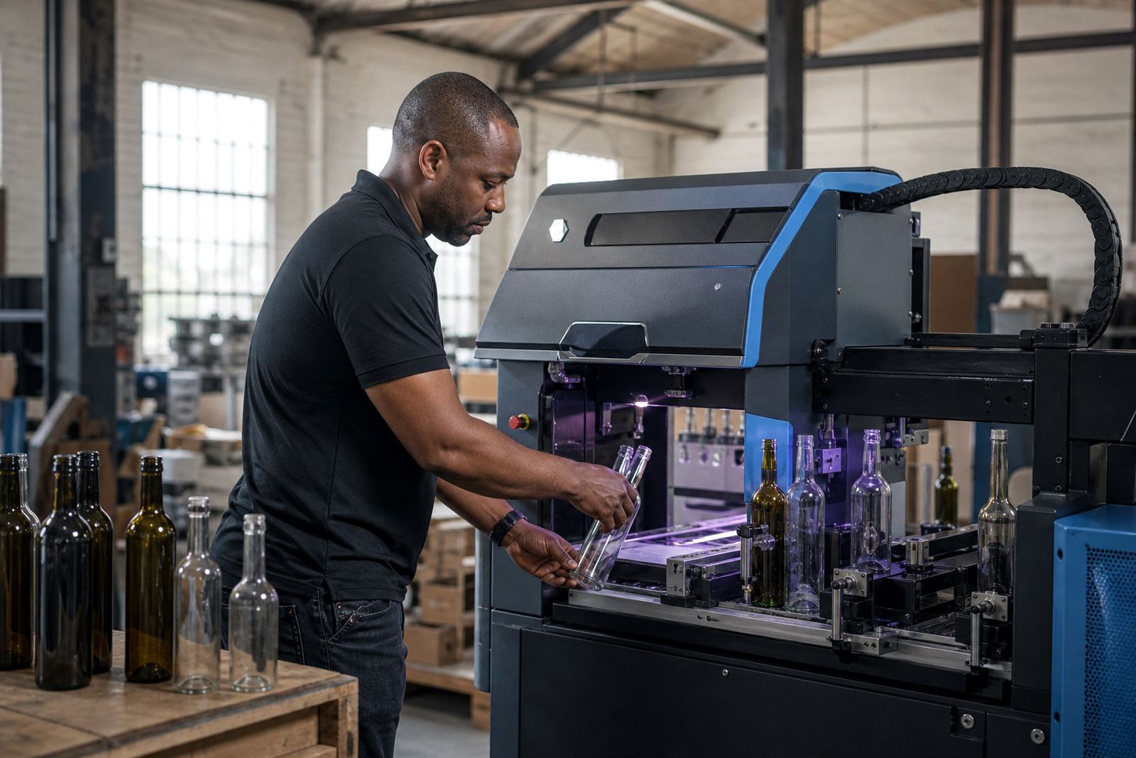
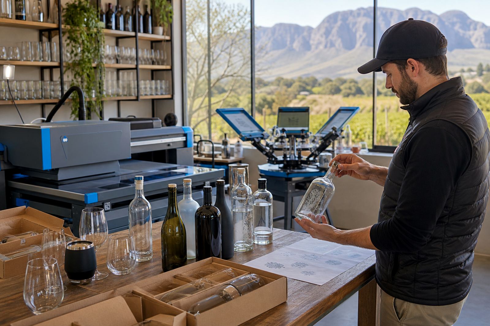
We check if the decoration process matches your artwork. UV direct print holds fine detail well on glass and coated drinkware, while screen printing needs artwork that can separate cleanly into colours. Ceramic enamel suits hard-wearing marks on glass, and labels need enough space for text, barcodes or small compliance details.
Proofs, Mock-ups and Sign-off Points
Every run should be approved from a proof, and for many jobs a mock-up helps the layout make sense on the actual bottle or glass. That is where placement, colour balance and spacing are confirmed before production. A proof can show how the artwork sits on a wine bottle, a gin bottle or a tumbler, and it helps reduce awkward surprises on shaped surfaces.
- Artwork placement on the visible panel
- Colour notes for dark or clear glass
- White ink layers where opacity matters
- Label size and cut line checks
- Notes for special finishes on small runs
Decoration Methods for Glass and Drinkware
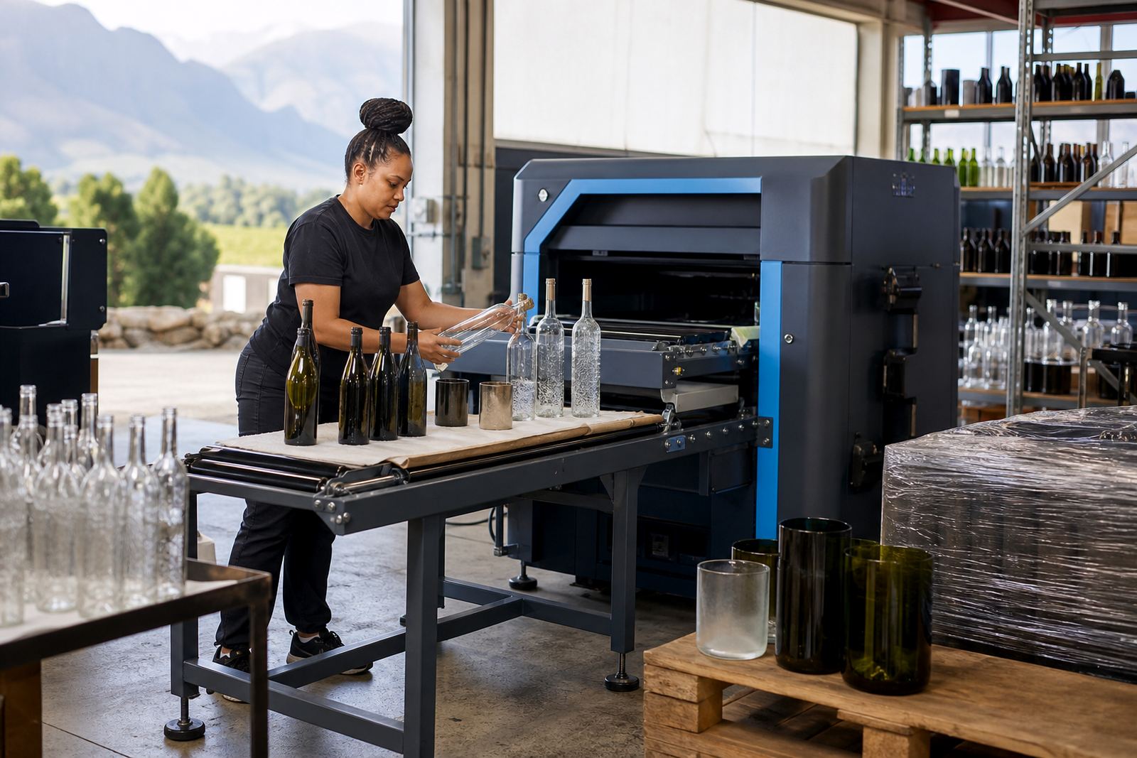
Different projects suit different finishing methods. UV direct print works well for short runs where clean detail and local colour control matter. Screen printing is often used where solid blocks of colour and repeatable placement are needed. Ceramic enamel is chosen when a fired finish is required for a more durable mark on glass items. Labels suit seasonal promotions, changing content or projects where the artwork needs to carry more written detail.
We help match the method to the bottle shape and the intended use. Straight-sided bottles, shoulder curves and narrow necks all affect how a logo or message sits. Drinkware such as tumblers, stemless glasses and water bottles can each need a different setup, especially where the print area is tight.
Minimum Runs and Short-Run Guidance
Short runs need careful planning so the setup makes sense for the quantity. Minimum run advice depends on the method, the number of colours and the bottle type. A label job may suit a smaller quantity than a multi-colour screen print. For mixed bottle shapes or several artwork versions, the run planning becomes more important, because each change can affect setup and packing.
- Single artwork or multiple versions
- Clear glass, coloured glass or coated surfaces
- One print position or several positions
- Matching caps, closures or pack inserts
- Loose bottles, boxed sets or gift packs
Packing Briefs and Delivery Notes
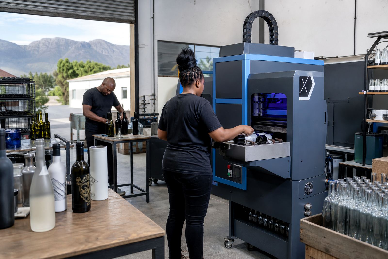
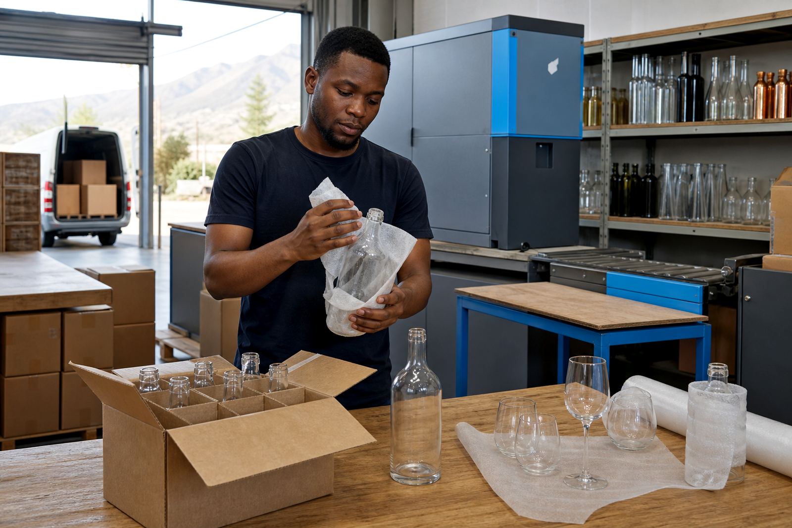
Packing matters when printed bottles are moving to tasting rooms, event venues or corporate gift dispatch points. We can follow packing briefs for cartons, sleeve notes and separation between breakable items. If a job is moving to Cape Town, Stellenbosch, Franschhoek, Johannesburg or Durban, the packing format should suit the route and the handover point.
For mixed batches, the labels on cartons need to stay clear and consistent. That helps teams on receiving side sort by flavour, event date or recipient group without opening every box. Where a project includes both bottles and drinkware, separating the cartons often makes unpacking cleaner and safer.
Artwork Help for Wines, Spirits and Water Bottles
Some projects arrive with finished artwork, while others need practical shaping before print. That may include tightening the label layout, adjusting the logo for a curved panel or setting up white ink layers for dark glass. We also help with bottle decoration methods that suit wine, gin and still water bottles, plus drinkware for tasting rooms, corporate packs and venue gifting.
If the job needs a specific message, batch naming or event detail, the layout should leave enough room for the text to breathe. Crowded artwork tends to lose clarity once it lands on glass. The final setup should feel deliberate, not squeezed in.
Regional Support from Paarl
Based in Paarl, the support process is built around local print jobs with delivery across the Cape Winelands and further afield. That includes Cape Town, Somerset West, Constantia, Stellenbosch and Franschhoek, plus larger dispatches to Johannesburg and Durban. The team works through the practical details of print area planning, colour guidance, white ink layers, proof approvals and packing briefs, so the job moves with fewer surprises.
For clients handling gifting, cellar door stock or event supply, it helps to have the artwork, packing and decoration method set out in one place. That keeps the run easier to manage from the first proof to the final carton.