Start with the service moment, not the artwork first
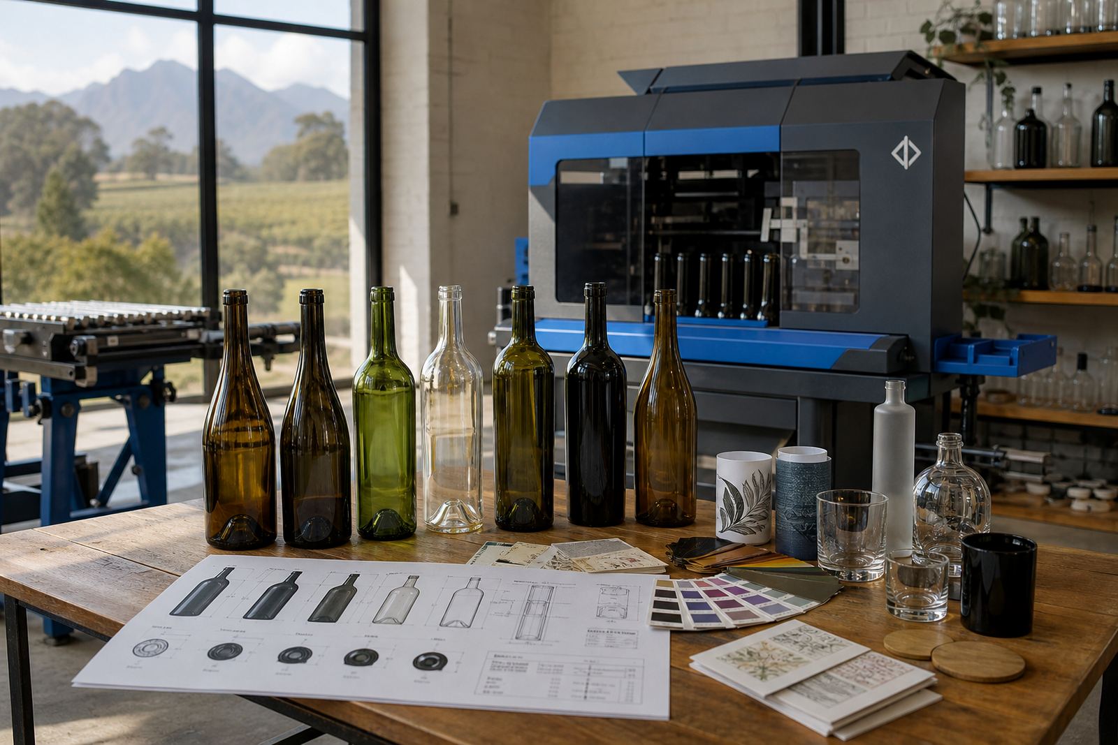
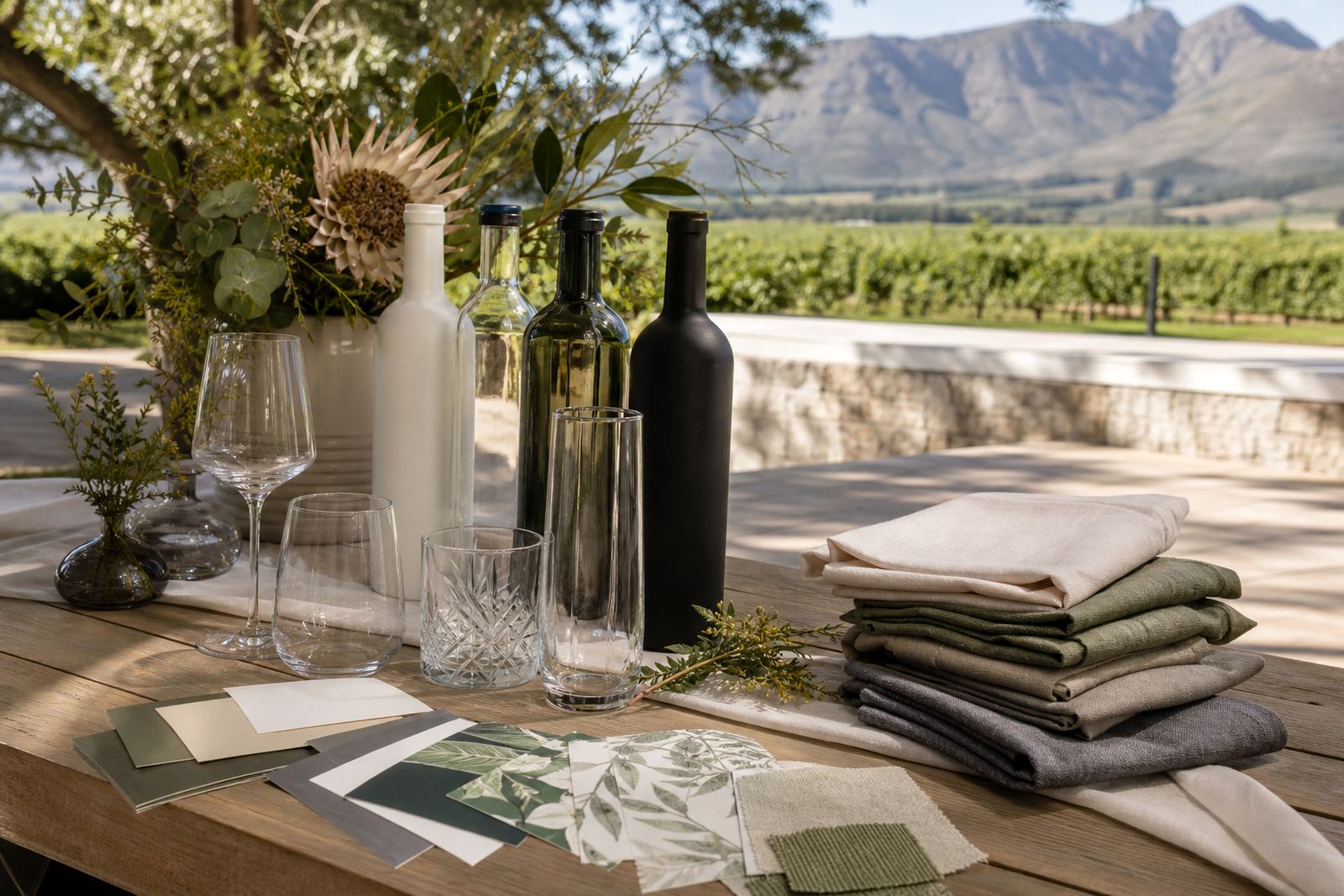
Before any print detail is locked in, look at how the bottle will be used on the day. A plated dinner, a casual tasting table, a welcome gift and a bar counter all ask for different bottle shapes, label sizes and finish choices. Narrow neck bottles, rounded gin bottles and straight-sided water bottles each carry artwork in a different way, so the vessel should suit the setting before the artwork is finalised.
For weddings and private functions, the same bottle can serve as table dressing, a send-off gift or a pour bottle behind the bar. For corporate events, the bottle may need to carry a logo, event name and date without crowding the surface. We plan for the visible panel, the back panel and the grip points, because a full bottle wrap is not always the best answer.
- Match the bottle shape to the table size and service method.
- Allow space for the neck, shoulder and base curve.
- Keep the copy short when the bottle will be handled often.
- Set aside room for mandatory bar or product details where needed.
Decoration methods that suit short runs
Different decoration methods suit different bottle materials and event quantities. UV direct print is useful where colour detail, sharp text and faster turnaround in production matter on glass or coated drinkware. Screen printing gives strong colour blocks and works well when the artwork stays simple. Ceramic enamel suits a fired finish on suitable glass pieces and is often chosen for premium presentation where the bottle stays in use after the event. Labels remain practical for flexible artwork, variable text and smaller runs where the same bottle shape is used across more than one event.
The right method depends on the glass type, the colour count and how the bottle will be handled. Frosted glass, clear glass, amber glass and painted surfaces all behave differently under light, so the print method must be checked against the final bottle finish. For drinkware, the wall thickness and curve also affect how a logo sits once it wraps the surface.
- UV direct print suits detailed logos and short runs.
- Screen printing suits bold single-colour or low-colour artwork.
- Ceramic enamel suits durable fired decoration on suitable pieces.
- Labels suit variable information and mixed bottle sets.
Artwork checks that prevent avoidable rework
Artwork is easier to approve when it has already been checked against the print area. That means measuring the flat space available on the bottle, checking the curve around the shoulder and confirming the safe margin near the base. A logo that looks tidy on screen can sit too high on a curved bottle, or fall into a mould line that breaks the finish.
We prepare proofs before every run so the layout can be reviewed before production begins. Mock-up visuals help show how the bottle will read from a distance, while print area planning shows what can fit without crowding. Colour guidance matters too, especially for white ink layers on dark glass or translucent bottles. If the artwork uses fine type, thin lines or small icons, the proof should show where detail may need strengthening.
- Send logo files in a usable vector format where possible.
- Check spelling, dates and event names before sign-off.
- Confirm whether the artwork must read from one side or all round.
- Allow white underprint where colour needs stronger visibility on dark glass.
Minimum runs and quantity planning for events
Short runs work best when the quantity matches the function, not just the guest list. A small tasting might only need a few dozen bottles, while a launch, staff function or hospitality package may need enough stock for welcome drinks, table placement and a handful of spare pieces. Minimum runs depend on the bottle type, the decoration method and the amount of setup involved.
Ordering too few bottles can leave a gap on the day, while ordering far too many may leave unused stock after the event. For mixed functions, it can make sense to split quantities between wine bottles, gin bottles and water bottles, or to use the same decoration across different drinkware items for a consistent look. We also look at packing format so the finished bottles travel safely to the venue or to a staging point for the event team.
- Count guest numbers, staff bottles and reserve pieces separately.
- Allow extras for breakage, last-minute seating changes and display use.
- Keep bottle types consistent when the artwork must match exactly.
- Check whether the run needs one artwork version or several variants.
Bottle types, drinkware choices and finish details
Wine bottles, gin bottles and water bottles each call for different treatment, even when the event branding stays the same. A wine bottle may need a larger label area or a cleaner front panel for a cellar door table. A gin bottle often carries a taller profile and more shoulder space, which changes where the logo can sit. Water bottles are often slimmer and may need a simpler mark that reads clearly from a distance.
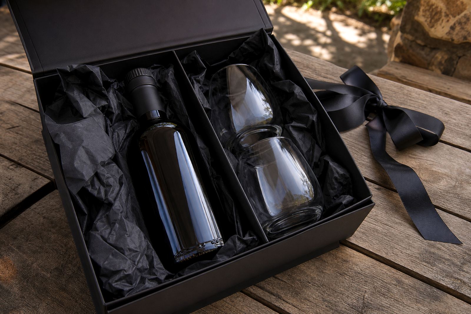
Drinkware adds another layer. Glass tumblers, stemmed glasses and reusable serveware all need artwork placed where fingers, condensation and stacking will not spoil the finish. If the bottle is meant for gifting, the surface finish should suit the box or outer wrap as well. A matte bottle with a gloss print can look clean, while a fully clear bottle may need stronger colour guidance to hold its presence under venue lighting.
Coastal humidity, cellar conditions and chilled service can all affect labels, especially if bottles will stand in ice or on wet surfaces. For that reason, the decoration method and adhesive choice must suit the setting, not just the artwork.
Packing, delivery and event-day handling
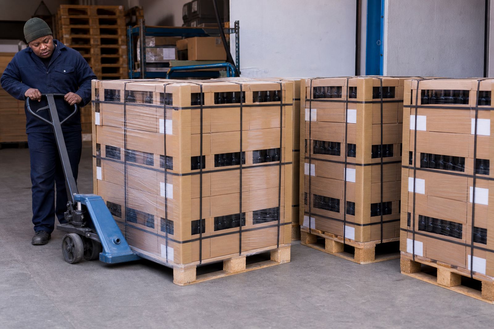
Once the print is approved, we plan the packing straight away so the bottles travel safely and the decorated surface stays protected until delivery. Bottles need separation that protects the print surface and reduces rub marks in transport. If the order is heading to Cape Town, Stellenbosch, Franschhoek, Johannesburg or Durban, the carton build and pallet pattern matter because long-distance movement can shift bottles if they are not packed properly.
Event teams also need a simple handling brief. That includes how the bottles should be unpacked, where to store them before service and whether chilled stock should be dried before display. For venues in the Cape Winelands, especially where service starts early and the air stays cool, the surface finish should hold up during cold handling and condensation. Where bottles are used as gifts, the outer presentation should protect the print and keep the label edges neat.
- Keep printed faces separated with suitable packing protection.
- Store finished bottles upright where the label or print needs care.
- Dry chilled bottles before placing them on display.
- Confirm delivery address access for venue loading bays and security checks.
A clean project order for the event team
A strong bottle brief gives the production team enough detail to plan print area, finish and packing without guesswork. The most useful notes are usually the bottle type, quantity, decoration method, event date, venue town and whether the bottles are for serving, gifting or display. If the job needs white ink layers, colour matching or label artwork setup, that should be noted early in the brief so the proof reflects the real production path.
For planners in Paarl and the wider Cape Winelands, it helps to think of the bottle as part of the venue layout. The right bottle supports the room, the table setting and the service pace. When the print method, artwork and packaging all line up, the bottles arrive ready for the function instead of needing extra handling on site.
Event briefs can include the bottle size, intended use and delivery town from the start.