Start with the bottle, not the artwork
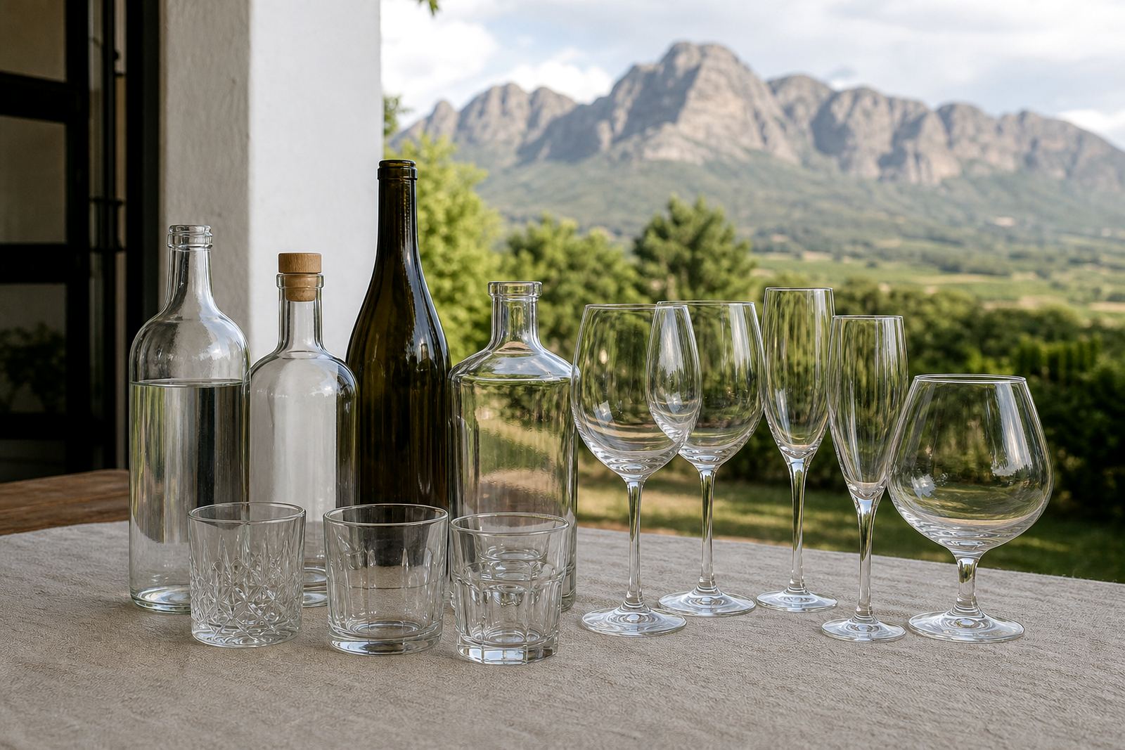
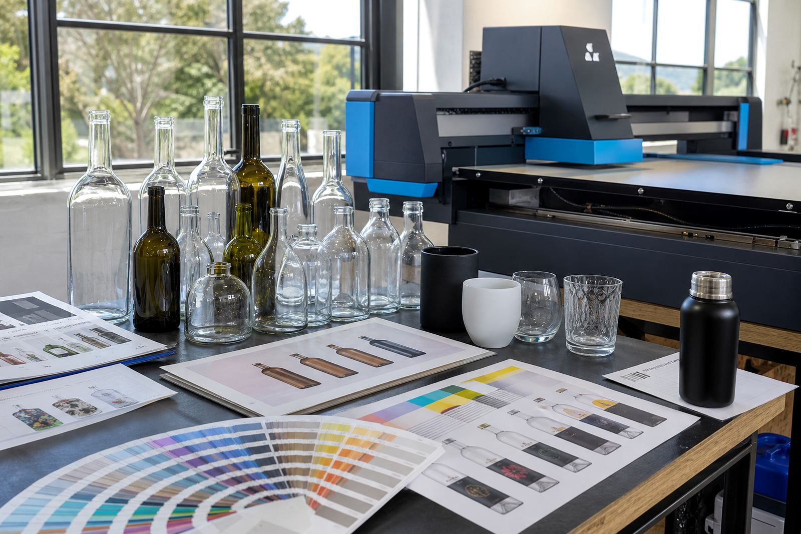
Before a method gets chosen, the bottle itself needs a look. Glass colour, shoulder shape, label panel size and neck width all affect what can be printed cleanly. A straight-sided water bottle asks for a different setup to a curvier wine bottle or a tall gin bottle with a narrow print area.
Short runs need careful planning because the artwork has to sit well on the actual bottle, not only on screen. Clear glass shows colour differently from amber or green glass, while frosted glass can soften fine detail. For drinkware, the wall thickness and curvature matter just as much as the shape.
- Check the print area on the exact bottle shape.
- Work out whether the artwork wraps or sits front-facing only.
- Allow room for necks, curves, seams and closures.
- Match the method to the quantity, finish and use.
UV direct print for full-colour detail and short runs
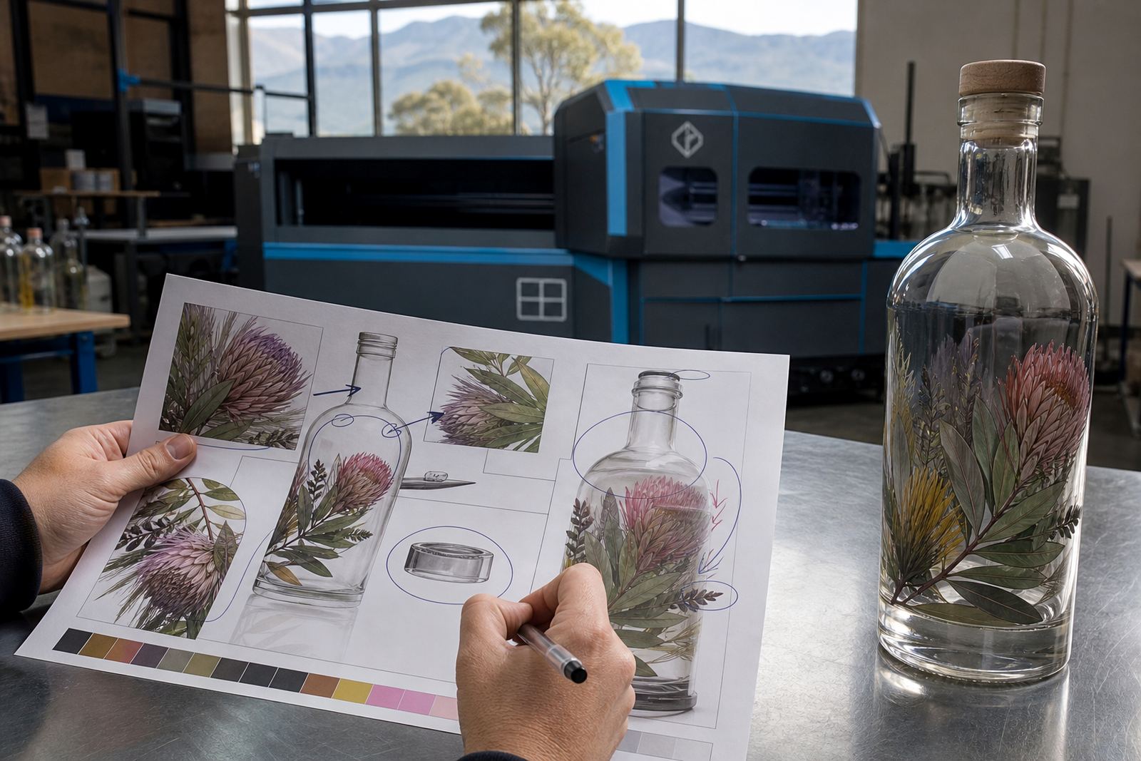
UV direct print suits short-run work where a crisp, full-colour image must sit directly on glass or coated drinkware. It handles fine text, gradients and artwork with more colour variation than a single screen can manage. White ink layers can be added under translucent colours so logos do not disappear on dark bottles.
This method is useful for wine bottles, gin bottles, water bottles and selected glassware when the design needs a neat, modern finish. It works well for corporate gifting, limited event ranges and smaller batches that need different names, dates or artwork versions. The surface feel is flatter than a label and it avoids adhesive edges.
Artwork still needs clean preparation. Small type can close up on a curved bottle, and very dark glass may need stronger white underprint. Proofs show placement, colour build and the print area before production begins.
Screen printing when one colour must sit solidly
Screen printing is a strong option when a design uses one or two solid colours and the brief calls for an even, printed finish. It suits repeat logos, clean text blocks and longer-looking runs where the same artwork sits on a large batch of bottles or drinkware. The colour can feel bold and stable on glass when the design is prepared properly.
For short runs, screen printing still makes sense where the artwork is simple and the bottle shape is friendly to the method. It can work on wine bottles, spirit bottles and some glass tumblers, but the print area should be checked carefully. Curves, embossing and tapering can affect registration, so the artwork must be planned with the bottle in hand.
- Best for solid logos and limited colour work.
- Useful when consistency across many pieces matters.
- Needs careful placement on curved or tapered glass.
- Less suited to very detailed artwork or complex shading.
Ceramic enamel for a fired finish on glassware
Ceramic enamel is chosen when the finish must feel permanent and is meant for glass that can take a firing process. The print is applied as enamel inks and then cured so it bonds more firmly to the surface. This method is often used on premium drinkware, reusable glasses and certain bottles where a tougher decorative finish is needed.
It is a good match for marks that should hold their shape over repeated handling. The colour palette is usually more controlled than UV or labels, and the artwork needs to be prepared with that in mind. Fine detail, small reversed text and delicate tonal work are possible in some cases, but the method rewards clean artwork and thoughtful simplification.
For short runs, ceramic enamel is worth considering when the client wants a more enduring decorative result and the item itself suits the process. Not every bottle or tumbler will be suitable, so the shape and the intended use must be checked before the method is locked in.
Labels when flexibility matters most
Labels are the most flexible option when artwork needs more room, when different variations are needed, or when the bottle shape does not favour direct print. They suit wine bottles, gin bottles and water bottles where the design needs full-colour imagery, legal text, barcodes or separate versions for different fills. A label can also handle textured, metallic or clear stock depending on the brief.
For shorter runs, labels often give the widest room for change without reworking the bottle itself. They can be cut to shape, wrapped partially or applied as front and back sets. The finish depends on the stock chosen, and the label artwork must still respect the curve of the bottle so the edges sit neatly.
- Useful for mixed artwork versions in one run.
- Good when more text needs to fit on pack.
- Handy for bottles that do not suit direct print.
- Works well for limited editions and event batches.
A practical way to choose the method
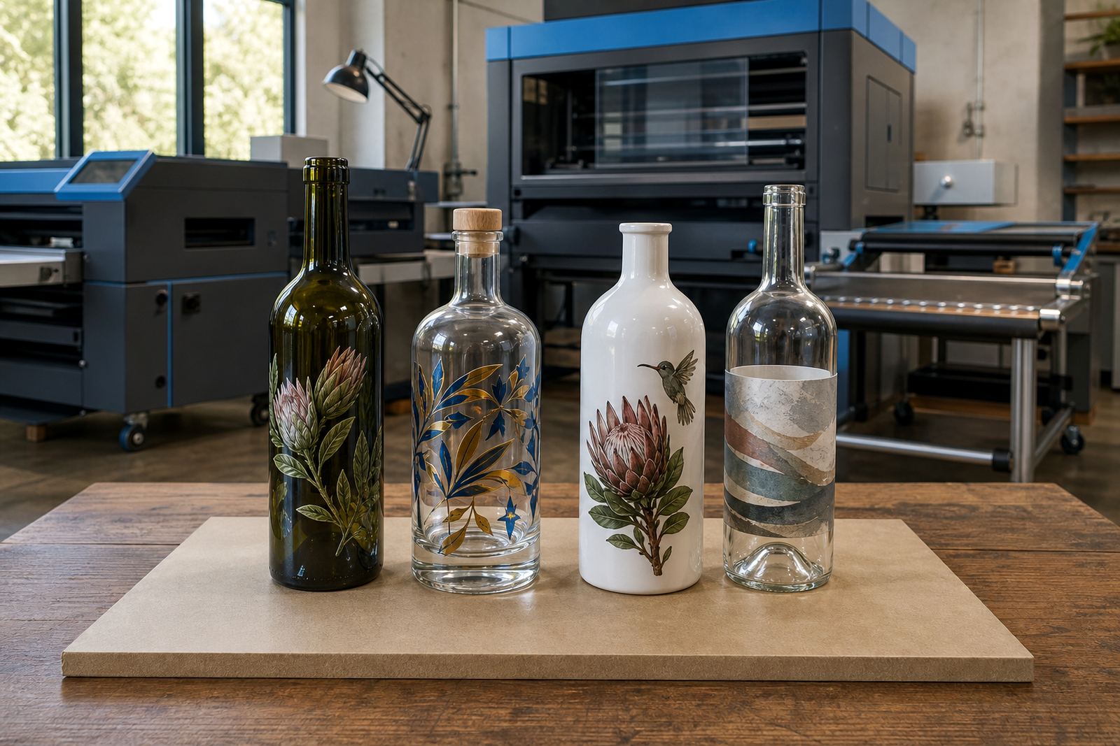
Choosing the best method usually starts with four key questions. What is the bottle or glass made from, how many pieces are needed, how much colour is in the design, and how permanent should the decoration feel? A simple logo on clear glass may suit screen printing, while a full-colour image on a small run may sit better as UV direct print or a label.
Where a client needs artwork support, the setup should include print area planning, colour guidance and proof approvals before any run is released. Mock-up visuals help to show where the design sits on the vessel, while label artwork setup is different to UV print prep or ceramic enamel prep. The right method is often the one that gives the cleanest result with the least compromise to the bottle shape.
- Check the bottle material and curve.
- Match the method to colour count and detail.
- Decide whether the finish needs durability or flexibility.
- Approve the proof against the actual print area.
What to send for a proper print check
Good artwork speeds up the review process, but the file alone is not enough. The bottle type, finish, capacity, quantity and intended use all affect method choice. If the brief includes multiple bottle sizes or different decoration zones, each version needs its own setup note so the print plan stays clear.
Include any colour references, wording that must stay exact and the placement you want for logos or text. For labels, note whether the artwork is front-only, wraparound or a set with more than one panel. For direct print, mention any white ink layer needs, because that changes how the design is built and how it reads on the glass.
In practice, the best results come from matching the decoration method to the bottle, not forcing one method onto every item. That is especially true for short runs, where a neat result matters more than using the same approach for each vessel.