Start with the bottle that suits the liquid and the setting
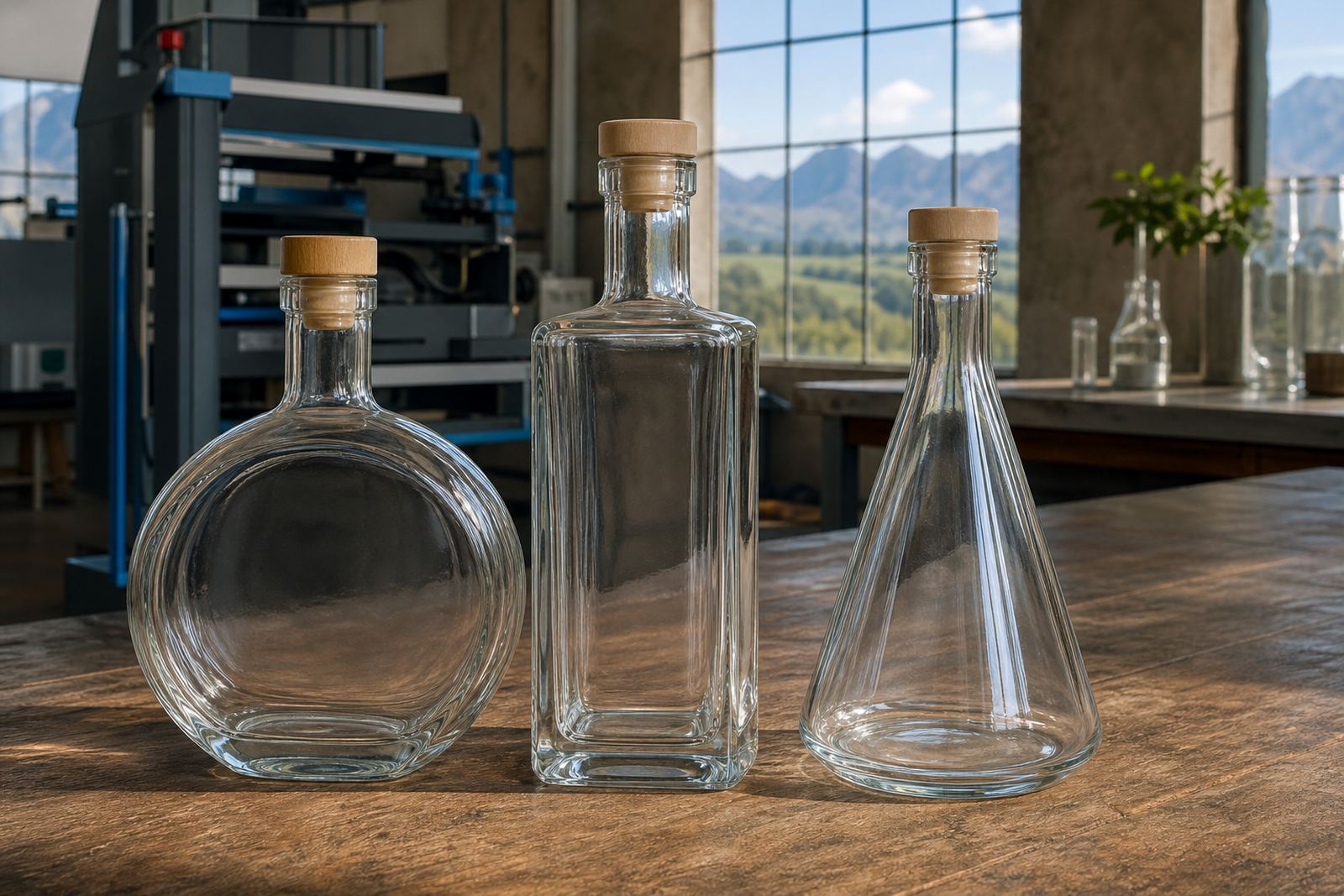
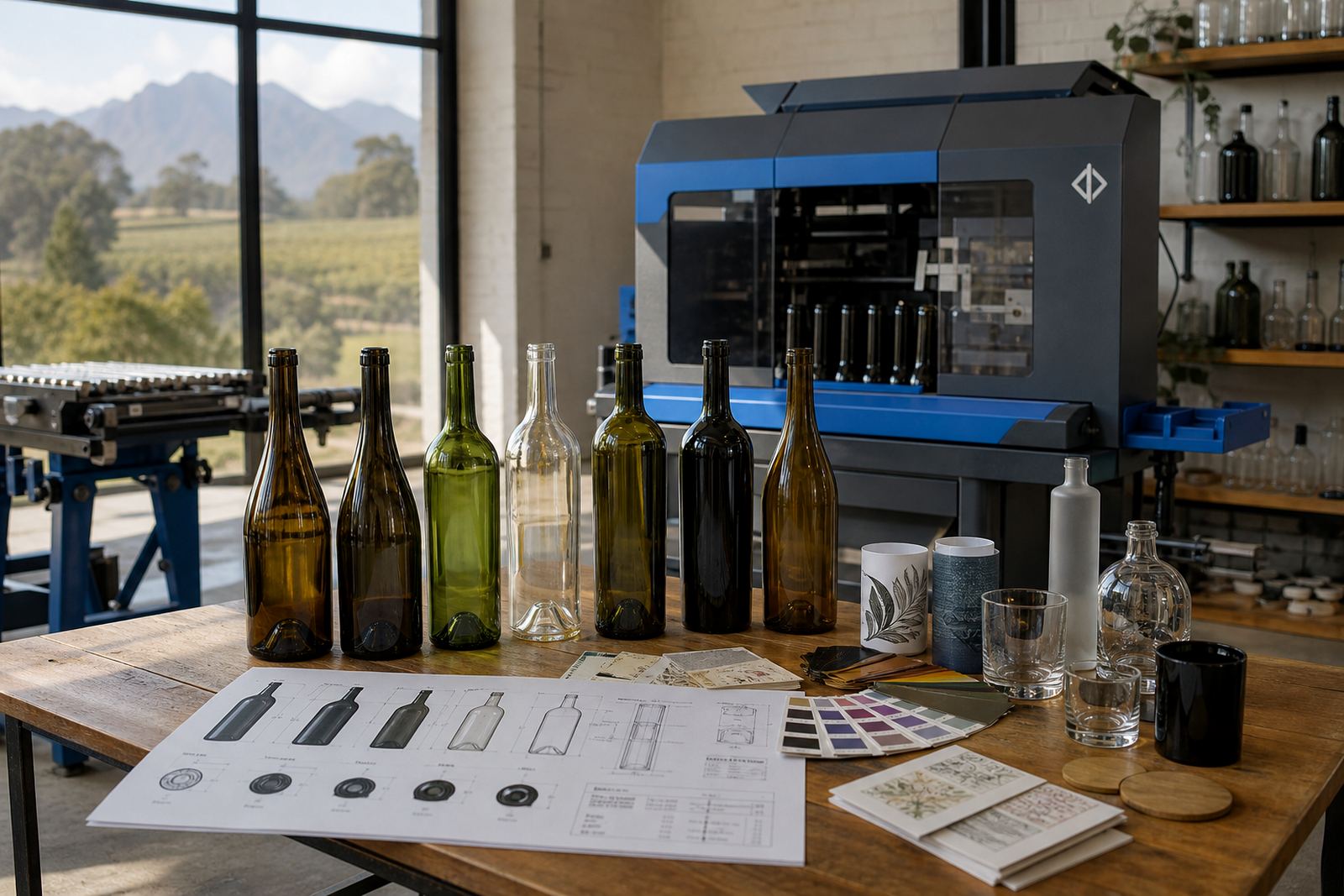
Wine bottles are not all judged the same way. A slim Bordeaux shape carries a different feel to a heavier Burgundy profile, and both read differently once artwork is applied. Clear glass can suit water, rosé or a light event pour, while green or amber glass often works better where the bottle itself must do more of the visual work.
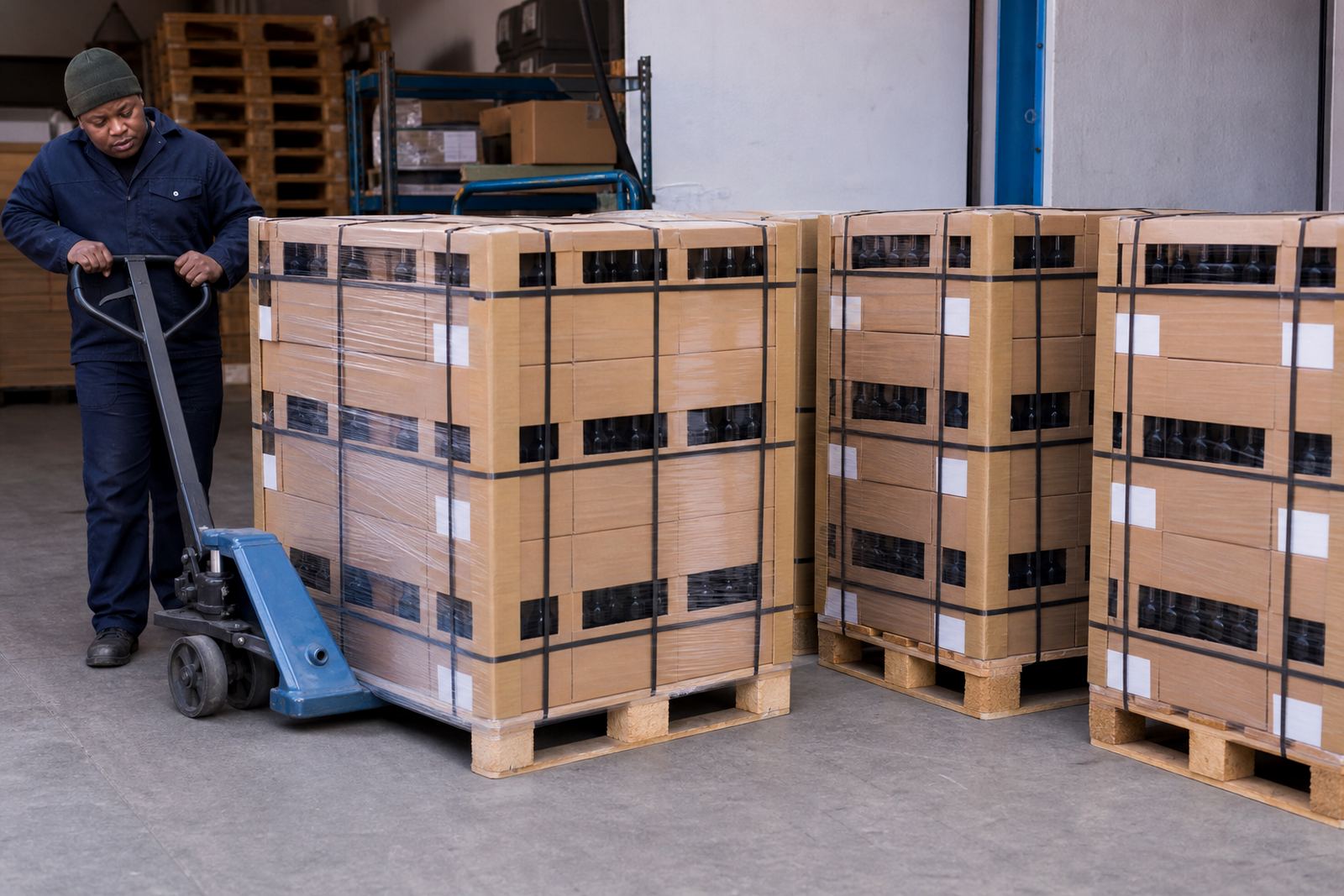
For wineries and distilleries in Paarl, Stellenbosch and Franschhoek, the first check is always how the bottle will be used. A cellar door bottle, a gifting bottle and a function bottle do not need the same finish. If the bottle is moving through a hamper, tasting room or courier carton, the shape should allow for clean label placement and practical packing.
- Choose a bottle shape that suits both the pour and how the product needs to present.
- Check shoulder room for labels or direct print panels.
- Allow space for mandatory text, barcodes or batch details if needed.
- Think about carton fit if the bottle is shipping to Johannesburg or Durban.
Decoration methods that work on glass and drinkware
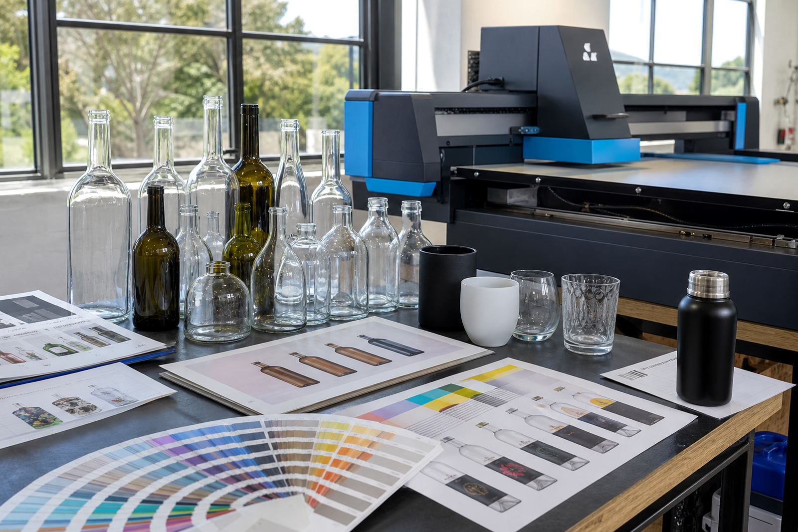
Different decoration methods suit different bottle surfaces. UV direct print is useful where a crisp logo, a solid colour block or fine linework needs to sit directly on glass or coated drinkware. Screen printing works well for bold branding and repeated runs, especially on bottles with a steady print area. Ceramic enamel is often chosen for a more permanent finish on glass that will be washed and handled often. Labels remain the most flexible option when artwork needs more detail, more colours or changing text across short runs.
Each method asks for its own artwork prep. White ink layers can matter on dark glass or tinted surfaces, and clear glass may need careful handling of transparencies so the logo does not look thin or washed out. For short runs, the choice usually comes down to how much of the bottle must be printed, how the bottle will be used, and how much variation sits in the design file.
- UV direct print for sharp artwork and shorter runs.
- Screen printing for strong, repeatable branding.
- Ceramic enamel for a tougher fired finish on suitable glass.
- Labels for variable text, fuller artwork or quick design changes.
Choose the finish before you approve the artwork
The finish changes how a design should be drawn. A matte label on a clear bottle gives a different look to a gloss label on green glass, and a printed logo on frosted glass needs another kind of contrast. If a bottle has embossing, curves or a deep punt, the print area may need trimming so the artwork sits flat and legible. A small adjustment at the artwork stage saves wasted material later.
Proofs matter here. A good proof shows where the image lands on the bottle, how much white ink is needed, and whether the print area keeps clear of seams, shoulders or curves. Mock-up visuals help teams see the bottle in context before a run is approved, which is handy when the bottle will be used for gifting, tasting counters or launch events.
- Check how the finish changes colour and contrast.
- Watch for curves, seams and embossing near the print zone.
- Approve a proof before the run starts.
- Use mock-up visuals when the bottle is part of a branded set.
Minimum runs and short-run planning without guesswork
Short runs make sense when a business needs a limited event batch, a seasonal release or a controlled gifting allocation. Minimum quantities depend on the bottle type, the print method and the number of artwork versions in the job. A one-off label version may suit a smaller count, while a direct print setup can call for more bottles to make the process practical.
It helps to plan the bottle count around real use, not wishful usage. A winery in the Cape Winelands may need a modest release for a tasting week, while a distillery or corporate client may need a neat stack of branded bottles for a launch or awards evening. If the job is split across Paarl, Cape Town and Somerset West delivery points, the packing brief should be set early so the cartons travel neatly.
- Confirm the run size against the method and bottle type.
- Allow for spares if the job has multiple delivery points.
- Keep one artwork version per bottle style where possible.
- Ask for minimum run advice before final sign-off.
What to send with the artwork brief
Good bottle work starts with a tidy brief. The artwork needs to show the logo, any text that must stay fixed, the print size, and whether the bottle is clear, green, amber or frosted. If the bottle carries legal text or mandatory markings, those details should be flagged before layout begins. That keeps the print area realistic and avoids last-minute reshuffles.
For labels, the key issue is often panel size and bottle curvature. For direct print, the main concern is the exact area that can hold ink cleanly. A rough sketch is useful, but a proper file gives cleaner proofs and less back-and-forth across the setup. Also note if the run is for wine, gin, still water or drinkware, because the bottle style can change the usable space quite a bit.
- Logo artwork in a usable file format.
- Exact bottle type and colour.
- Print area or label size, if known.
- Text, batch details or legal copy that must appear.
- Colour references where brand colours matter.
A practical check before the bottles move to production
Before production starts, the best check is a plain one: does the bottle suit the branding, the use and the packing plan? If the answer is yes, the run can move ahead with less stress. If not, it may be worth changing the finish, shrinking the artwork, or switching from direct print to labels. That small decision can keep the final result neat and usable.
In practical terms, bottle choice is about surface, shape and purpose. The right bottle gives the artwork enough room to read properly, keeps the finish consistent, and makes handling easier for cellar staff, event teams or gifting coordinators. When those pieces line up, the bottle feels considered rather than improvised.
- Does the bottle shape support the label or print area?
- Will the finish suit the setting and the product?
- Is the chosen method realistic for the run size?
- Have proofs, mock-ups and packing notes been checked?