Start with the shape the artwork has to live on
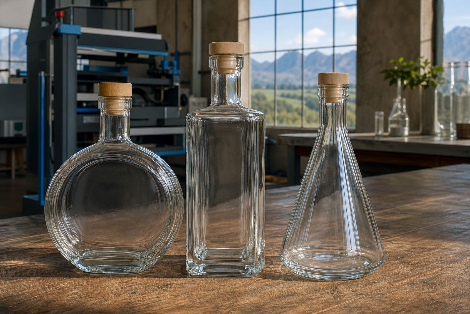
A proof is not just a picture. It is a working layout on the actual bottle or glass shape, so the first check is always fit. Look at the neck, shoulders, curve and base line, then compare that with where the artwork sits. A tall wine bottle gives a different print field to a slim gin bottle or a straight-sided water bottle, and drinkware has its own limits too.
On curved glass, a design can look neat on screen but feel crowded once it wraps around the body. Keep an eye on where the front panel ends, where the side seam falls, and whether the mark still reads clearly when the bottle is held in hand. If the proof shows a label, check that the size follows the panel without lifting over edges or traffic in the artwork.
- Check the bottle type against the artwork shape.
- Look for any text too close to curves or edges.
- Confirm the print position from front view and side view.
- Make sure the visible area suits the run size.
Read the method notes before you look at colour
Different decoration methods behave differently on glass and coated drinkware. UV direct print is useful where crisp detail and fast set-up matter, while screen printing suits bolder blocks of colour and repeated runs. Ceramic enamel needs its own colour handling and curing setup, and labels bring their own paper or film finish, adhesive choice and edge placement. The proof should show which method is being used so you can judge the result properly.
Colour on clear glass often looks brighter when white ink is added underneath. Without a white layer, transparent areas can sink into the bottle colour or the liquid behind it. On dark glass, metallic tones and pale colours may need extra planning. A proof should make that plain, because the same artwork can print very differently on a frosted bottle, a clear gin bottle or a heavy base water bottle.
- Check whether a white ink layer is part of the print.
- Look at colour strength on clear, frosted or dark glass.
- Confirm if the method is direct print, label or enamel.
- Ask whether the finish will be gloss, matt or a mix.
Read every word, not only the artwork
Text is where many proofs go wrong. Names, vintage details, tasting notes, batch wording and event details all need a slow read. Check spelling, spacing, punctuation and capital letters. A line break in the wrong place can change the feel of the whole bottle, and a missing letter is very easy to miss when the layout looks polished.
Small text on curved glass can lose legibility if it is too light or too close together. Dates, quantity notes and legal wording should be checked as carefully as the main logo. If the design includes a multilingual line or a short message for a corporate gift, read it aloud and line by line. That extra minute saves a costly reprint later.
- Read names, dates and product wording letter by letter.
- Check spacing around apostrophes, hyphens and initials.
- Make sure small print stays legible on the bottle size chosen.
- Confirm no line breaks cut through important phrases.
Use the proof to test placement and run consistency
Short runs still need consistency. A proof should show where the print sits on the first item and how that placement repeats across the order. For event bottles, a small shift can make the set look untidy on a table. For winery or distillery ranges, the print position should match the bottle family so the line looks deliberate rather than patched together.
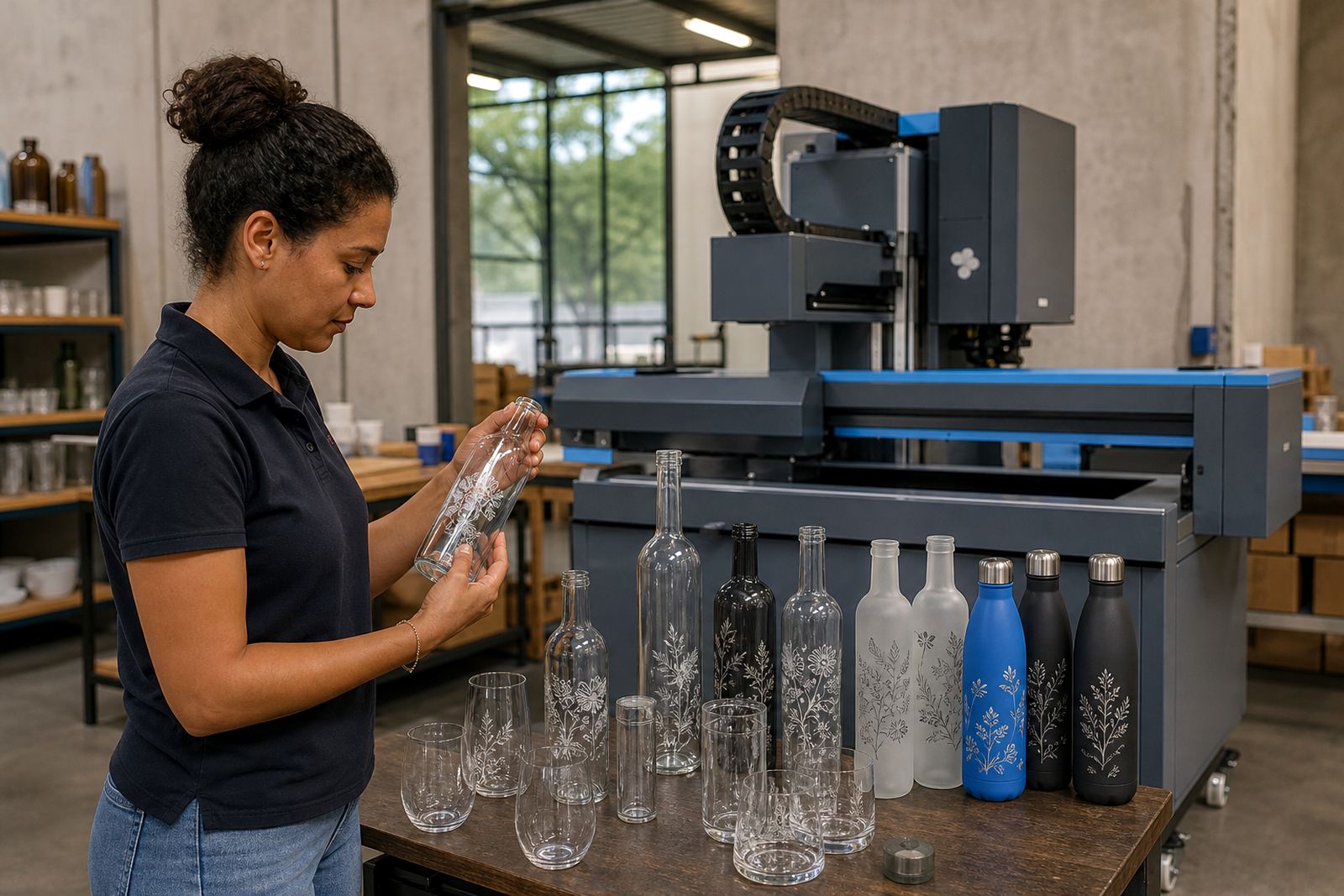
If your order mixes bottle sizes or drinkware types, each item should have its own proof or its own marked layout. A stemless glass, a handled mug and a straight tumbler do not carry artwork the same way. Check the repeat height, the spacing from the base, and whether the decoration sits level when the bottle is full and standing upright.
When a proof includes packing notes, that is worth reading too. A bottle that is printed correctly can still arrive awkwardly if the carton count, wrap or pallet note is unclear. The proof is the place to catch that before production starts.
Treat mock-up visuals as a real check, not a decoration
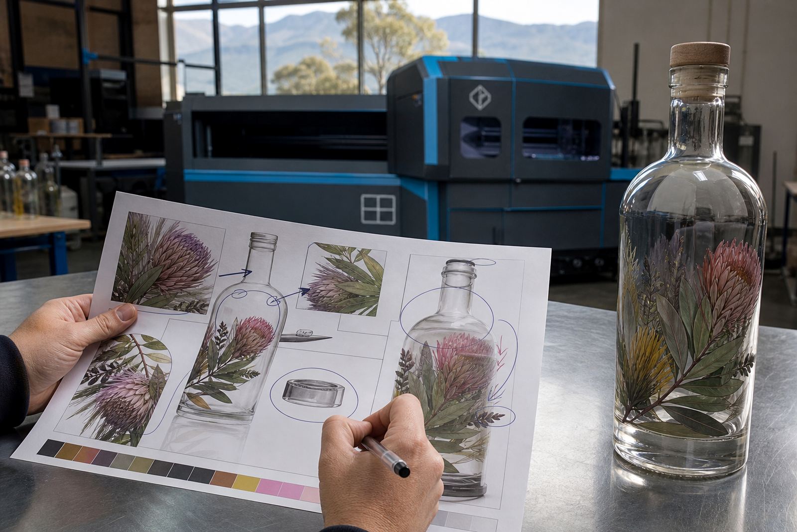
Mock-up visuals help you see the full bottle or glass with artwork in place, but they are only useful if you study them properly. Look at the size of the logo in relation to the bottle body, the contrast against the glass colour, and the way the label or print sits from the front. If the mock-up shows multiple views, compare them one by one instead of stopping at the first view that looks neat.
For bottle printing, the most useful checks are often the plainest ones. Is the mark too high? Is the label too wide? Does the white ink cover enough behind the colour? Is the print area realistic for the method chosen? Those questions matter more than how polished the visual appears on a screen.
- Compare front, side and close-up views.
- Check that the artwork size matches the bottle body.
- Confirm the print area suits the decoration method.
- Look for colour contrast on the chosen glass or drinkware.
Approve only when the practical details line up
A proof is ready when the artwork, method and bottle all make sense together. Before approval, check the minimum run advice, the pack count, the print area, the colour notes and the delivery details. If something feels off, it is better to pause and adjust the proof than to push ahead with a layout that will annoy you later. That applies to wine bottles, gin bottles, water bottles and branded drinkware.
For short runs, the strongest proof is often the one that answers simple questions cleanly: what is being printed, where it sits, how it will be finished and how it will be packed. With those points settled, sign-off is usually simple. If a label needs artwork setup, or a direct print needs a white layer or extra colour control, the proof should spell that out in plain terms.
Clients in Paarl, Cape Town, Stellenbosch, Franschhoek, Johannesburg and Durban often use the proof stage to lock down the final look before bottles move into print. That habit keeps the run tidy and helps the finished pieces look like they belong together.