Start with the bottle shape, not the artwork first
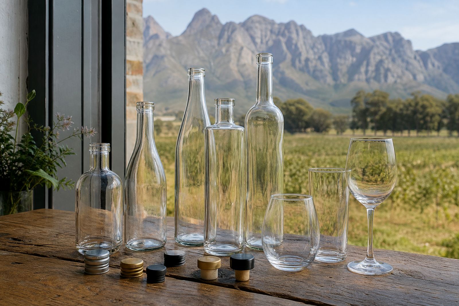
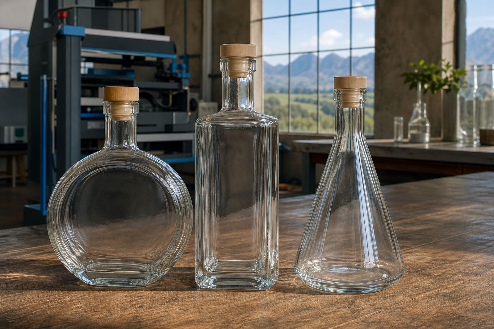
Glass shape affects how the finished pack looks and how much print space you have for a logo, message or event detail. Tall wine bottles suit front and back labels, slim gin bottles can carry a centred mark, and shorter water bottles often need a cleaner layout with more breathing room around the print area. If the gift is meant for a tasting room, boardroom hamper or event table, the vessel should match the setting before artwork gets locked in.
For glass drinkware, the finish matters just as much as the form. Clear glass shows colour and fill level well, while frosted or tinted glass changes the read of a logo under indoor lighting. When a pack includes a bottle and a glass item together, we normally check the pair as one unit so the print feels related instead of crowded.
Pick the decoration method that suits the use
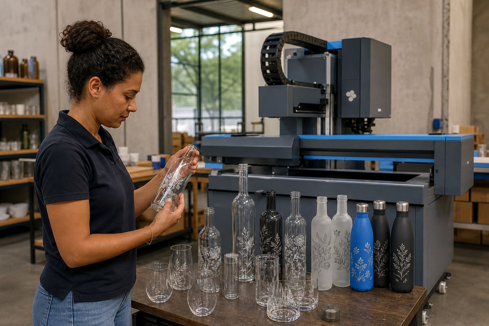
Each print method behaves differently on glass and drinkware, so the best choice depends on the shape, the artwork and the run size. UV direct print suits short runs and can carry fine detail on smooth surfaces. Screen printing gives a solid, direct finish on simpler artwork. Ceramic enamel suits items that need a fired finish on suitable glass or drinkware. Labels work well when the bottle shape is tricky or the artwork needs more detail and small text.
- UV direct print for short runs with sharp text and colour blocks
- Screen printing suits strong logo designs and repeat pack runs
- Ceramic enamel for a more permanent printed feel on suitable items
- Labels for variable bottles, special editions or complex layouts
Some packs use a mix, for example a printed bottle with a labelled stopper box or a matching glass held in a sleeve. That keeps the set practical when quantities are low and the artwork differs across items.
Build the artwork around the pack size
Artwork planning starts with the available print area and the viewing distance. A gift set seen in a hamper box needs more contrast and less clutter than a bottle placed on its own. We normally check logo size, font weight, white ink layers where needed, and whether the label or print should sit high, low or centred on the vessel. Small shifts in placement can change the whole read of the pack.
For short runs, it helps to keep the artwork simple and intentional. One strong mark, a short line of text, and a clean finish usually travel better than a design packed with too much detail. If the pack includes several items, the same colour family should run through all of them so the set feels planned rather than patched together.
- Confirm the exact wording on every item
- Check the logo size against the bottle curve
- Decide where white ink is needed
- Keep fine text large enough to print cleanly
- Use one visual thread across bottle, box and insert
Proofs, mock-ups and the last checks before production
Artwork proofs help show how the final item will sit on the bottle or glass before the run moves ahead. A mock-up visual is useful when you need to compare a dark bottle against a light label, or when the branding must line up across several pack components. This stage also helps with wording placement, spelling, colour balance and whether the logo still reads well on curved glass.
Minimum runs matter as well, because different methods suit different order sizes. Short runs can work well for launch packs, staff gifts and event keepsakes, while larger runs suit ongoing corporate gifting or winery retail packs. The order should be set around the decoration method and the number of identical pieces needed, not only around the bottle itself.
- Check spelling, dates and pack wording carefully
- Approve the proof against the actual bottle shape
- Confirm whether labels or direct print are being used
- Match the quantity to the method and the pack purpose
Protective presentation that still looks polished
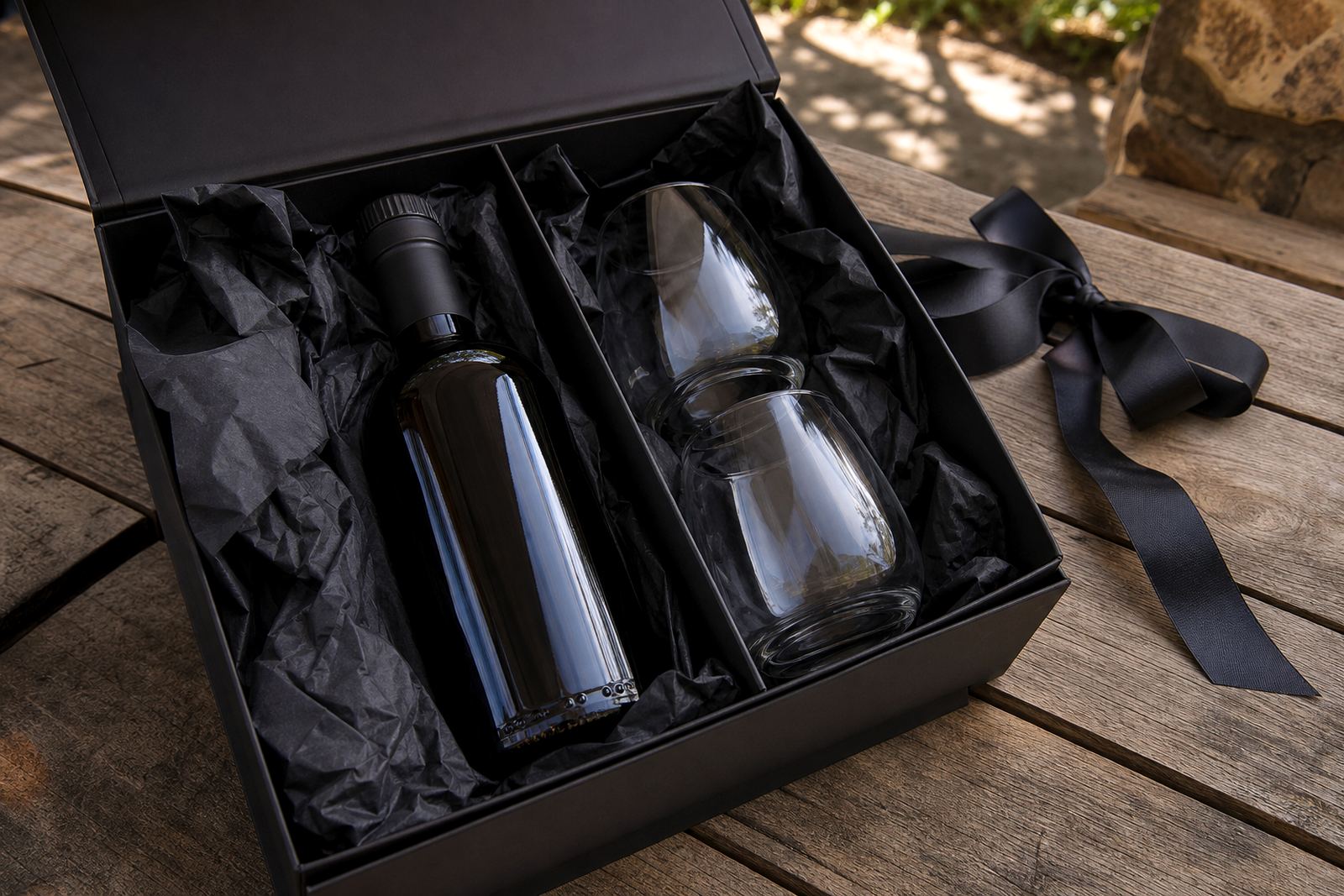
A gifting set needs to travel well without looking overpacked. Protective presentation can include inserts, sleeves, cardboard dividers, tissue, kraft wrap or a rigid box, depending on the event and the destination. A bottle sent to Cape Town or Johannesburg needs different handling from a handover at a tasting room in the Cape Winelands, especially where glass must stay tight in transit.
For mixed sets with bottle and drinkware, use a layout that stops items knocking together. The pack should open neatly, hold its shape, and still allow the branding to remain visible when the set is opened. If the gift is for a corporate brief, the presentation should leave space for a card or insert without making the box bulky.
A practical packing checklist for winery, gin and water sets
The cleanest packs usually come from a simple working checklist. Start with the bottle type, add the decoration method, then finish with the protective presentation and delivery route. That sequence reduces rework and keeps the set consistent across short runs, repeat events or mixed destination drops.
- Bottle or drinkware type confirmed
- Decoration method matched to the surface
- Artwork proof checked and approved
- White ink or label backing confirmed where needed
- Pack insert or box size measured against the item
- Destination noted for delivery in South Africa
- Final count checked against the brief
For deliveries into Paarl, Stellenbosch, Franschhoek, Somerset West, Constantia, Cape Town, Johannesburg and Durban, the pack should be prepared to hold its shape through transport. A good gifting set feels considered in the hand and still looks crisp when it reaches the table or shelf.