Start with the exact item, not a generic bottle
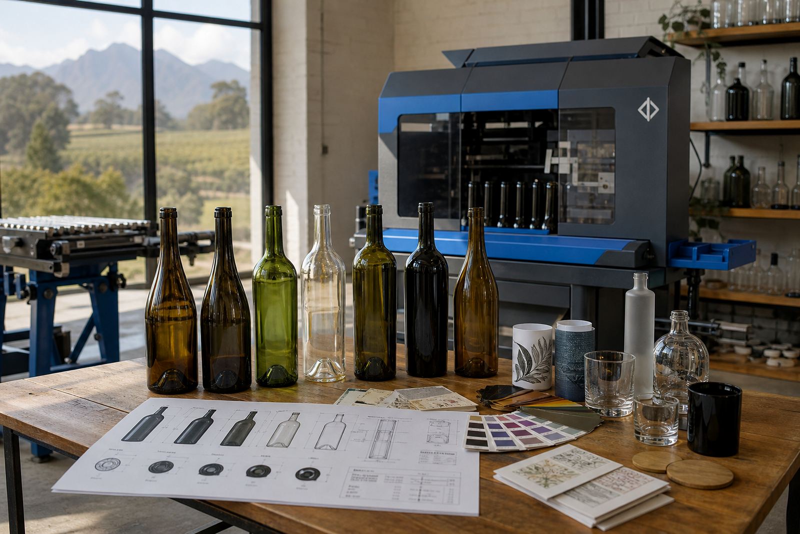
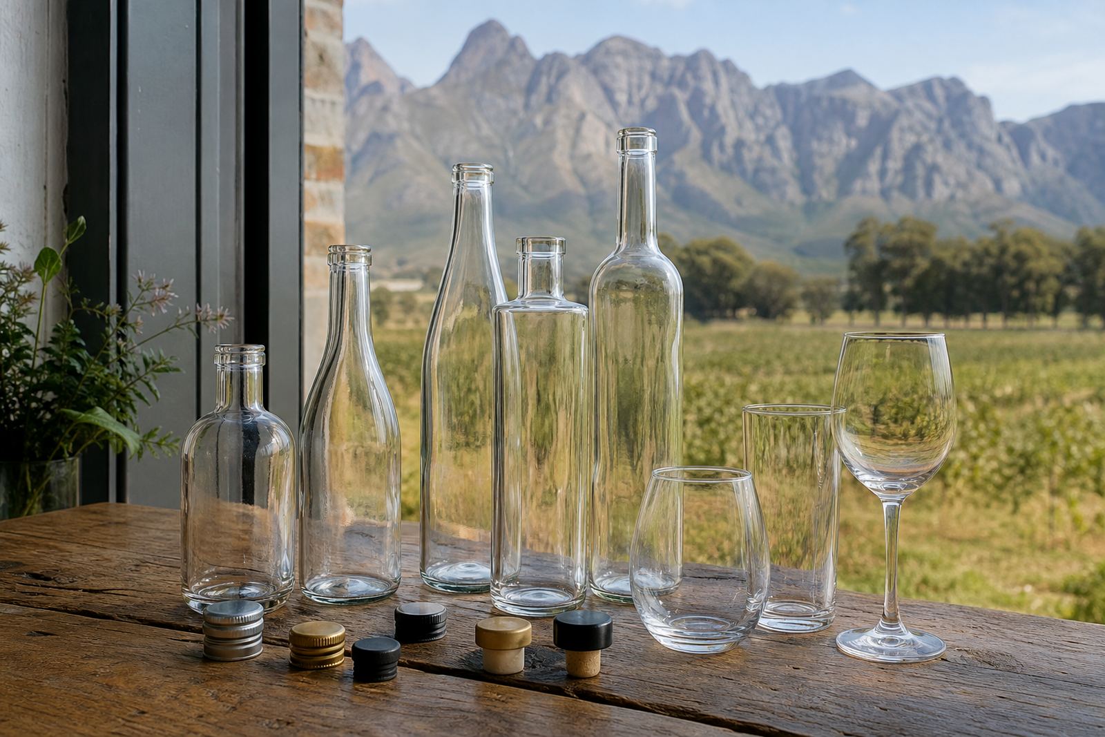
Artwork for a wine bottle is not the same as artwork for a gin bottle, water bottle or tumbler. Neck shape, shoulder curve, label panel and print height all affect what fits neatly, so the first step is matching the design to the actual item and the decoration method.
Glass bottles with a long straight panel can take a different layout to a curved bottle with a short front face. Drinkware such as stemless glasses, tumblers and mugs also needs a different approach because the image wraps, bends or sits closer to the rim. A good layout leaves enough room for the hand, the fill line and any legal text where that applies.
- Confirm the item type and capacity.
- Note the print area width and height.
- Check whether the design sits on one face or wraps around.
- Allow space for the curve of the bottle or glass.
Build the artwork for the method that will carry it
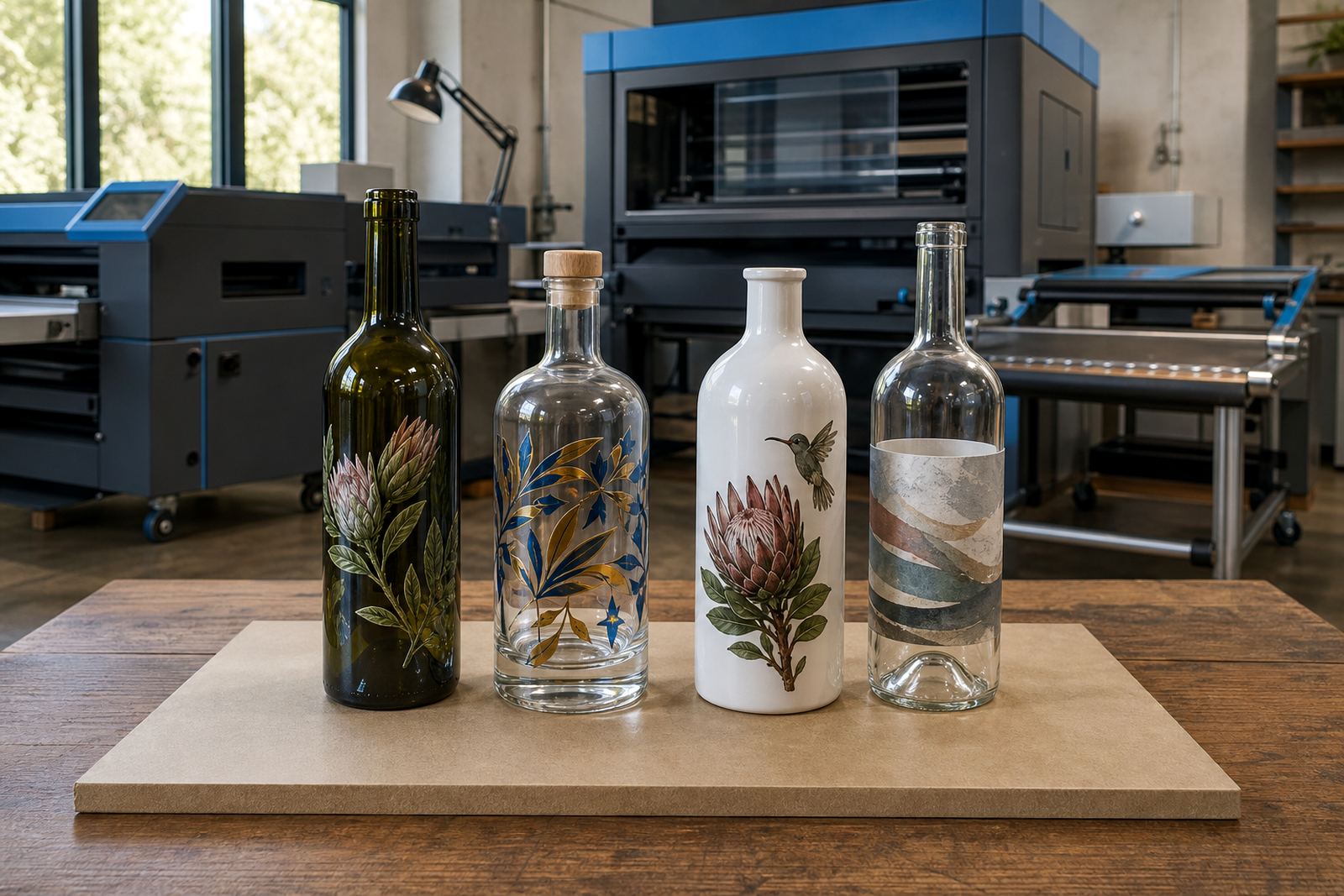
UV direct print, screen printing, ceramic enamel and labels all handle colour and detail in different ways. Fine text can disappear on a dark bottle if the contrast is weak, while a solid logo may print well in one method but need adjusting in another. Artwork that is prepared with the decoration method in mind usually needs less correction later.
UV direct print suits sharp branding with detailed marks, small copy and white ink layers on glass or coated drinkware. Screen printing handles strong spot colour and simple shapes well, especially on repeat runs where colour consistency matters. Ceramic enamel is used where a fired finish is needed and the artwork must be prepared with the final surface in mind. Labels need clean margins, readable small type and a layout that still works once wrapped onto curved glass.
- Where you can, supply logos and line detail as vector artwork.
- Keep thin lines and tiny text under control.
- Allow for white ink where colour needs lift.
- Prepare separate versions if different methods are being compared.
Set contrast early so text does not vanish
Dark glass, tinted bottles and some clear drinkware can swallow low-contrast artwork. Pale ink on a pale bottle can look tidy on a screen and weak on the finished item. Strong contrast, clear spacing and a sensible choice of colours keep the brand visible from a short distance and also at a table setting or gift box opening.
Small wording such as a vintage note, tasting line or event name needs extra care. If the wording is cramped, it may blur when printed or look crowded beside a logo. It helps to test the design at actual size and not rely on a zoomed-in file on its own.
- Use strong light-on-dark or dark-on-light contrast.
- Keep small copy to the minimum needed.
- Avoid pale text over patterned backgrounds.
- Review the artwork at its actual size before you approve it.
Leave breathing room around the curve and the label edge
Curved surfaces change how a layout reads. A round bottle can pull the eye off centre, while a narrow neck can make the top line feel tighter than expected. Artwork that sits too close to the edge may wrap awkwardly, especially on short runs where each item must look deliberate rather than crowded.
For labels, margins matter just as much as the central image. The cut line, adhesive edge and any seam should be planned into the layout. If the design includes a border, it needs enough space to stay even after trimming and application. That is especially useful on smaller bottles where a heavy border can look too dominant.
- Position key wording well clear of the cut edge.
- Allow extra margin on curved glass.
- Centre the visual weight rather than only the logo.
- Plan for the visible seam on wrap labels.
Proofs are where mistakes get caught early
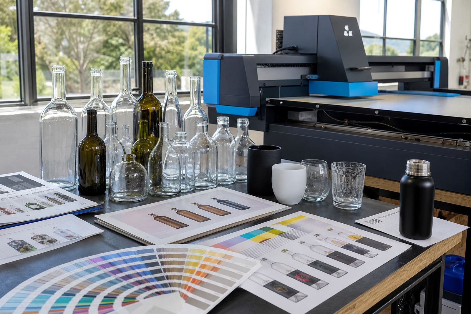
A proof shows how the artwork is being set up for the print area, not just how it looks as a flat image. This is the stage to check spelling, spacing, colour placement, white ink layers and the position of any label details. Proofs also help spot problems where a logo sits too high, too low or too close to a handle or shoulder.
For short runs, a proof matters even more because there is less room to absorb a mistake. Once a run is approved, the setup follows that version. If something feels off on the proof, it is better to correct it before printing starts. That includes awkward line breaks, weak contrast and artwork that overfills the available space.
- Check every word, number and special character.
- Review the layout on the exact bottle or glass shape.
- Look at colour placement and white ink treatment.
- Approve only after the spacing feels balanced.
Minimum runs and file handover for short production batches
Short runs need artwork that is tidy from the start because there is less room for trial and error. Minimum quantities can vary by method, bottle type and setup requirements, so the artwork should be prepared with the intended batch size in mind. A clean file helps the production line move without unnecessary adjustments.
When sending artwork, it helps to include the logo file, the wording to be used and any notes on colour preference or placement. If the design needs artwork support, the starting point can be a rough concept, but the final file still needs to carry the correct dimensions and clean spacing. For bottles and drinkware headed to different branches or events, keep each version clearly named so nothing gets mixed.
- Supply the logo in a clear editable format if possible.
- Include the required wording exactly as it must print.
- Note the preferred print position on the item.
- Separate versions for wine, gin, water and drinkware.
A final check before the proof is signed off
Before approval, read the artwork at actual size and check whether the design suits the bottle or glass in front of you, not only the screen. The same logo can feel bold on a wide label and tight on a small shoulder panel. This is also the point to confirm that the layout supports the print method, the surface and the use of the item.
If the job is for gifting, hospitality or an event table, the artwork should stay legible at arm’s length and still feel neat up close. A well-prepared file helps the final product look considered, whether it is a single bottle style or a mixed range of bottles and drinkware.