Start with the bottle shape and the number needed
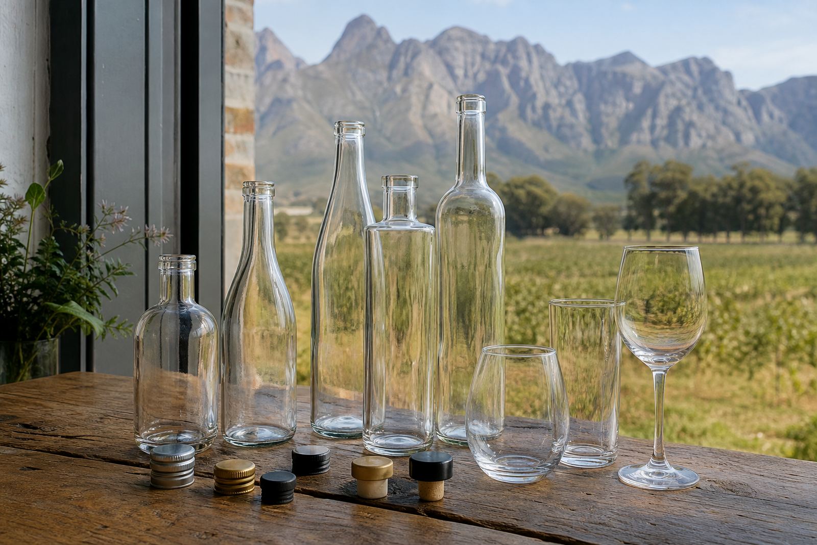
Short runs work best when the bottle shape is known early. Straight sided glass, shoulder curves, neck length and base weight all affect the print area, the label layout, and whether a design sits cleanly on the bottle. Drinkware brings its own details too, from stemless glasses to tumblers, flutes and ceramic mugs.
For planning, count the finished pieces needed after breakage allowance, tasting room use, event spares and packing losses. A smaller run can suit a seasonal release or corporate gift order, while larger mixed orders often need separate counts for each bottle size. That count is the anchor for the rest of the job.
Match the decoration method to the bottle and artwork
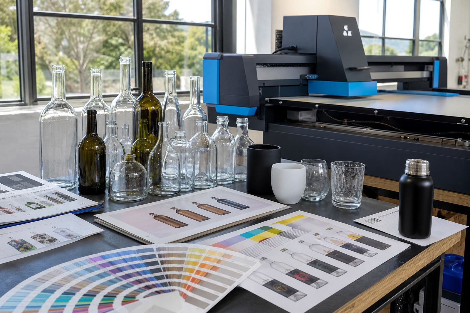
Different decoration methods suit different finishes. UV direct print is often used for crisp colour on glass and coated drinkware, while screen printing suits solid spot colours and repeat layouts. Ceramic enamel is suited to items that need a fired finish, and labels are useful when the bottle shape or artwork changes from one version to the next.
White ink layers matter on dark glass, tinted bottles and clear bottles where a lighter artwork needs body. Thin linework, small type and fine detail need careful preparation before print. If the artwork carries gradients, metallic effects or small legal text, the print area has to be checked before approval.
- UV direct print for detailed artwork and short runs
- Screen printing for strong spot colours and repeated layouts
- Ceramic enamel for fired decoration on suitable items
- Labels for flexible artwork or mixed bottle shapes
Artwork checks before any proof is approved
Good planning starts with clean artwork files and the correct print size. Text should stay within the safe area, logos need to fit the bottle curve, and colours need checking against glass colour or a label stock. If the design wraps around the bottle, the seam point needs attention too.
A proof is where the layout gets checked before production. That proof should show placement, size, orientation and any white underbase or colour limits. It is also the point to confirm whether the artwork needs a version for each bottle shape or drinkware type. A small shift on paper can look larger once it wraps a curved surface.
- Provide artwork files in a usable format wherever possible
- Confirm bottle size, capacity and finish
- Check spelling on names, tasting notes and event wording
- Review the proof for placement, size and colour balance
Minimum runs and mixed orders without waste
Short runs need the minimum quantity lined up with the print method. Some methods favour tighter batches, while others work better when the order is split across the same shape and decoration style. Mixed orders can be practical, but each item still needs its own artwork check and print setup.
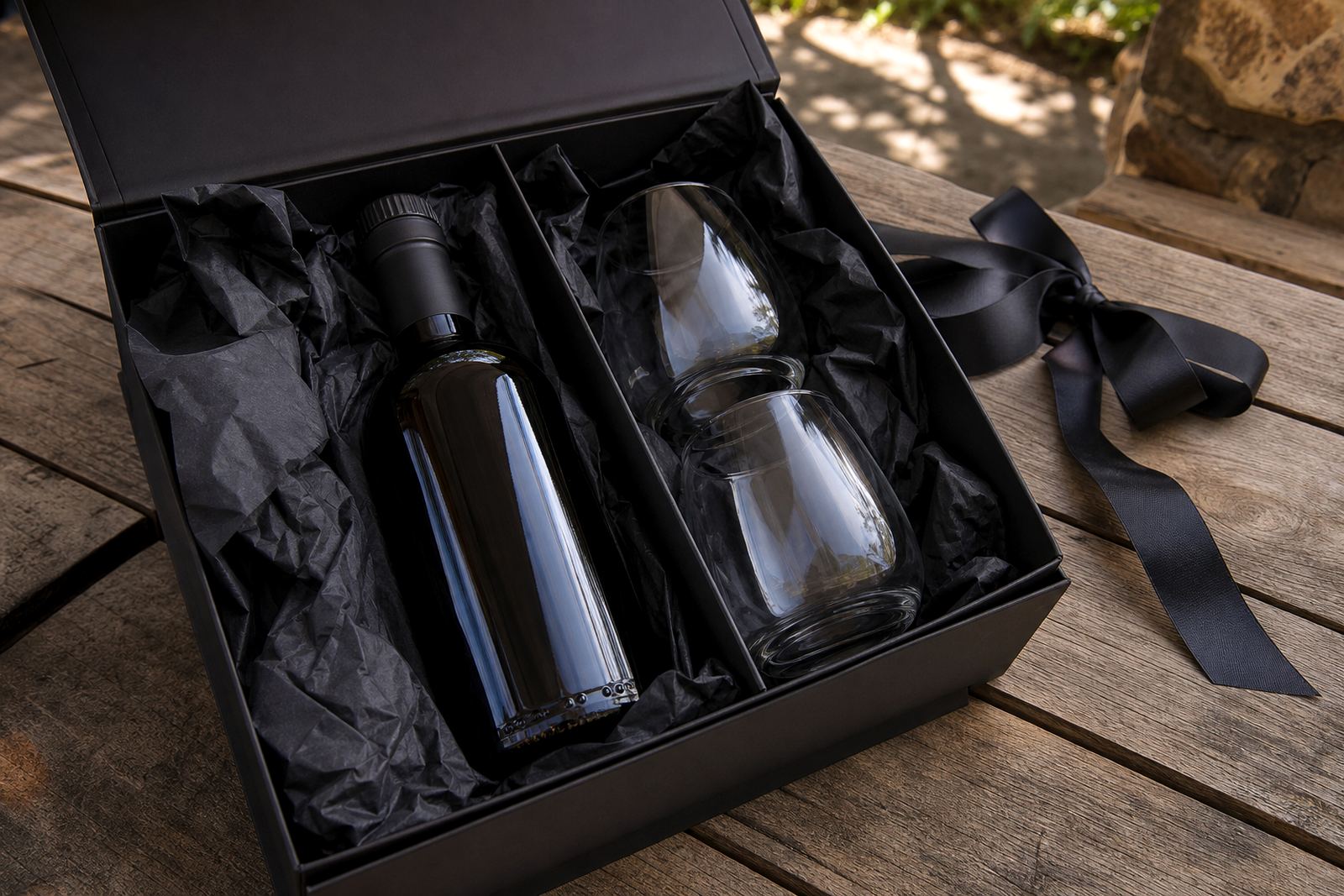
If a range includes wine bottles, gin bottles and water bottles, the safest approach is to group by shape and decoration method rather than only by product name. That keeps the setup cleaner and reduces the risk of one item forcing changes on another. For gifting packs, it also helps to decide whether the bottles travel loose, boxed, or with extra inserts.
Packing notes for local delivery and national shipping
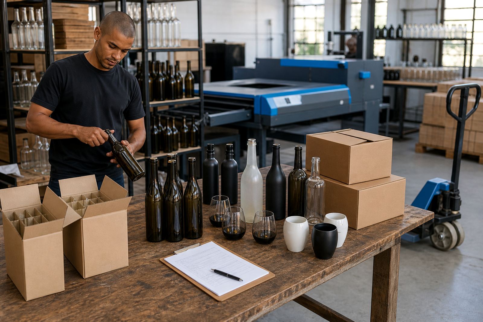
Bottle decoration is only one part of the plan. Finished items need packing that suits glass, labels, shrink wrap or boxed sets. If the job is moving to Cape Town, Stellenbosch, Franschhoek, Johannesburg or Durban, the carton build has to hold the bottles steady through loading and transit. Coastal humidity can also affect labels and cartons, so the packing choice matters.
Where a mixed order includes bottleware and drinkware, it helps to separate product types in the pack list. That makes unpacking easier at the tasting room, event site or gift assembly point. Fragile stock should be counted, marked and packed by line item so the receiving team can match the delivery notes without guesswork.
- Use cartons sized to the bottle shape, not loose space
- Separate glass from ceramic and lighter drinkware
- Mark fragile cases clearly on the outer pack
- Keep line items grouped for easy receiving
A workable path from brief to finished stock
A good short-run brief is plain. It should name the bottle or drinkware type, quantity, decoration method, artwork size and delivery destination. If there is a launch date, tasting, corporate function or cellar-door release, that timing must sit in the brief too. Without it, the job can drift between versions and packaging choices.
The practical sequence is usually: set the count, match the method, check the artwork, approve the proof, confirm packing, then release for production and delivery. That order keeps the job grounded and makes the final stock easier to hand out, display or gift. For wineries, distilleries and event organisers, the difference is often in the small decisions made before print begins.