Start with the serving situation, not the artwork
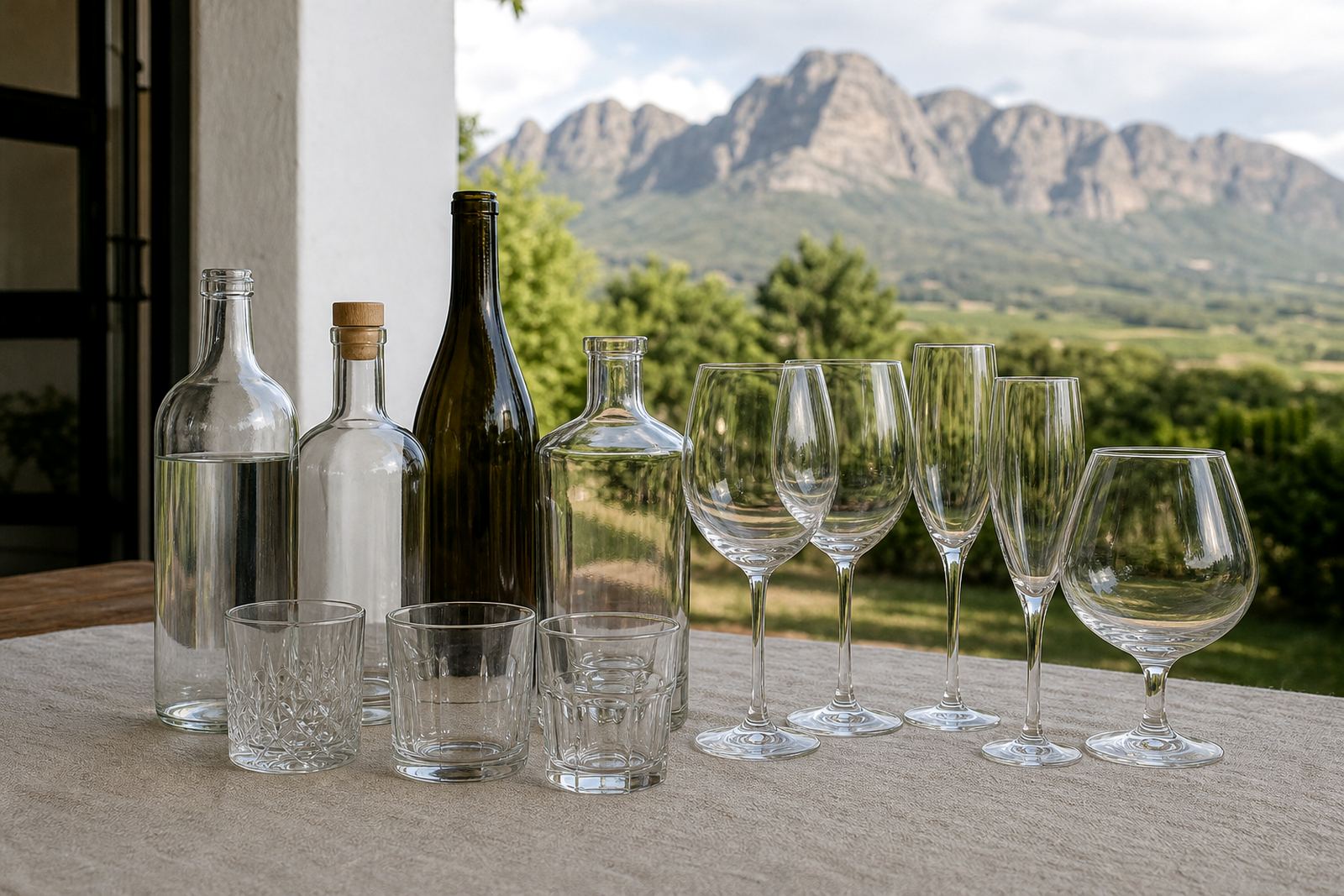
A bottle for a tasting table behaves differently from one packed into a conference bag or placed in a gift box. A slim bottle can feel neat in hand, while a wider shape gives more room for graphics and wording. For winery and gin work, the drinking occasion often matters as much as the bottle itself, because a small table bottle and a retail shelf bottle do not carry the same message.
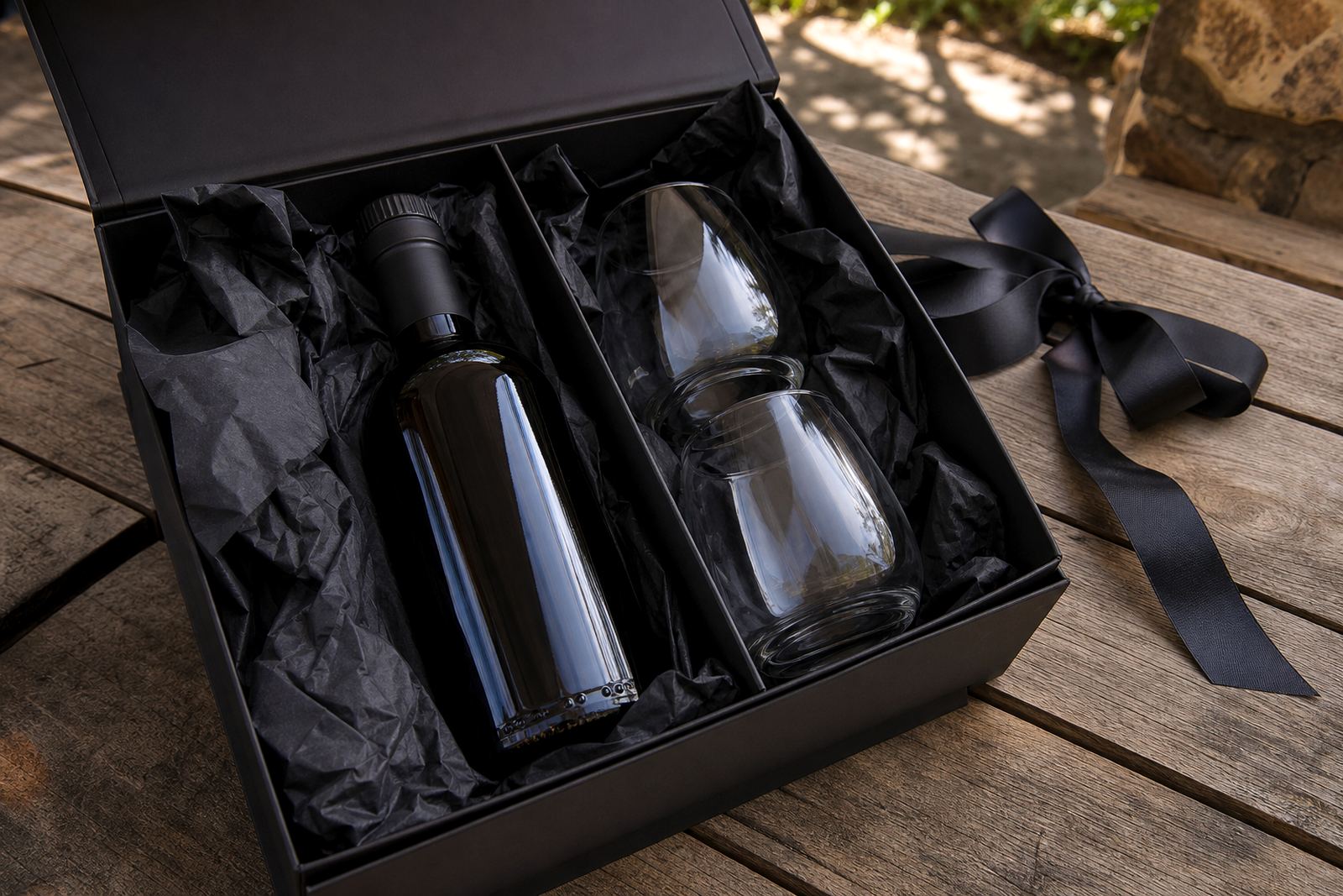
When planning the shape, look at how the bottle will be handed over, stored and transported. Glass bottles suit premium gifting and cellar room presentation, while some drinkware projects use coated or insulated items with a different print approach. If the bottle is going to be moved in quantity, the weight and outer shape matter just as much as the look.
- Table service: shorter, steadier bottles with a broad label area.
- Gifting: clear lines, good neck proportion and neat closure detail.
- Transport: shapes that stack safely and fit standard packing trays.
- Retail display: a front panel that stays readable from shelf height.
Pick a material that matches the finish you want
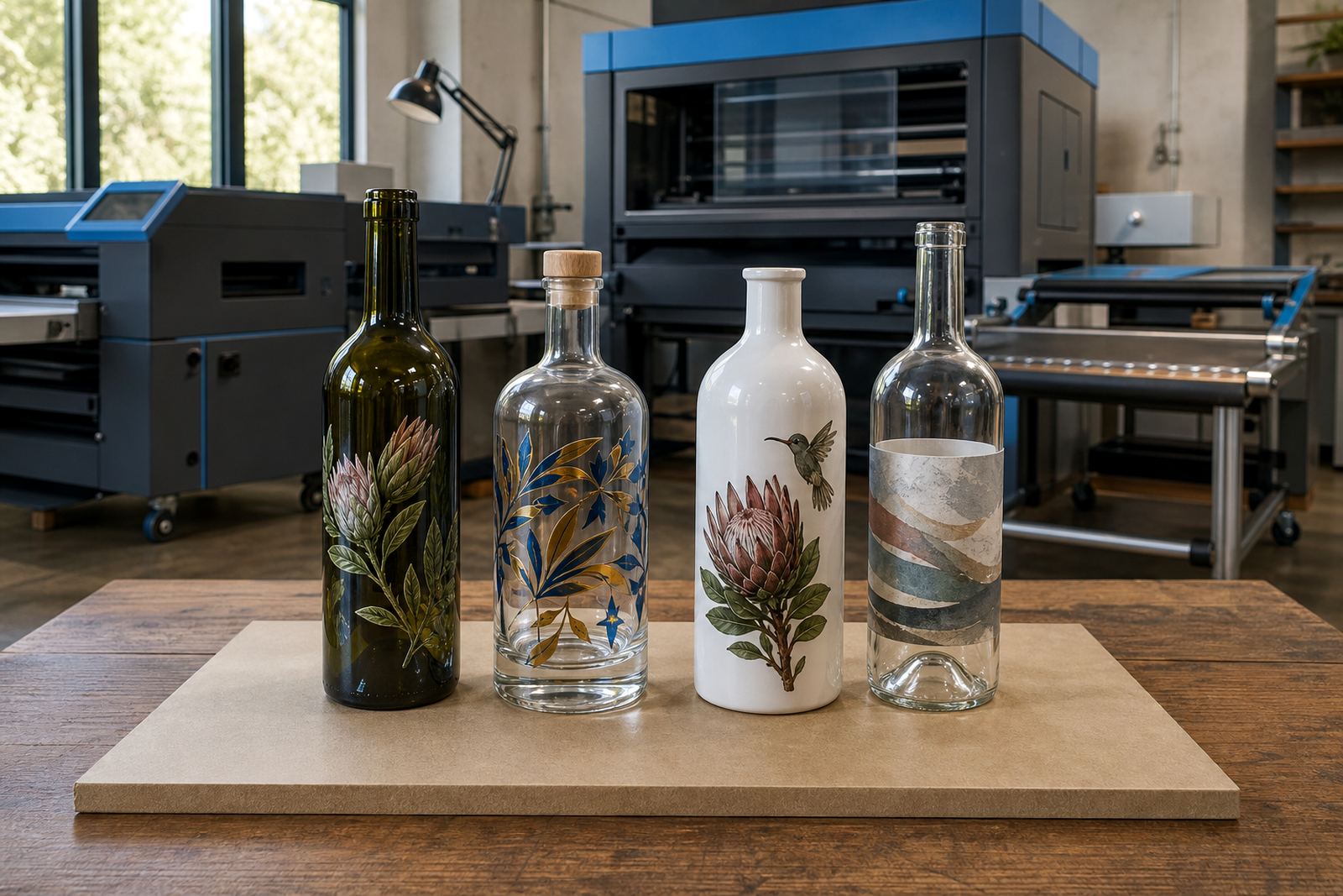
Glass is still the most common choice for wine, gin and premium water presentation. Clear glass shows the liquid inside, while frosted or coloured glass changes the mood before a drop is poured. For drinkware, tumblers and insulated bottles need a different print build, because the surface can be curved, coated or powder finished.
For direct decoration, UV print works well on many smooth bottle surfaces and allows clean colour blocks, text and fine detail. Screen printing suits solid coverage and simple artwork, especially where a bold logo or one or two colours are enough. Ceramic enamel can be used where a fired, durable finish is required, and labels are useful when the bottle shape, run size or artwork call for flexibility.
- Clear glass: good for crisp labels and strong contrast.
- Frosted glass: suits softer branding and premium gifting.
- Coated drinkware: useful for insulated bottles and travel items.
- Simple artwork: often better for screen printing or UV direct print.
Make the print area work for the shape
The print area is where many bottle projects are won or lost. A label that looks neat on a flat proof can crowd the shoulder of a curved bottle. A direct print can also lose impact if the artwork is pushed too high or too close to the curve at the neck. Good planning keeps the logo in a straight, readable zone and gives the bottle enough breathing room.
For short runs, it helps to measure the visible panel rather than the full bottle height. A taller bottle is not always better if the available print band is narrow. White ink layers can lift colour on dark glass, while a second pass may be needed where the bottle surface is tinted or reflective.
- Check the flat or gently curved section first.
- Keep fine text away from sharp shoulders and base tapers.
- Use white underprint where colour needs stronger visibility.
- Leave room for legal text on labels if required.
Closures, necks and handling matter more than people expect
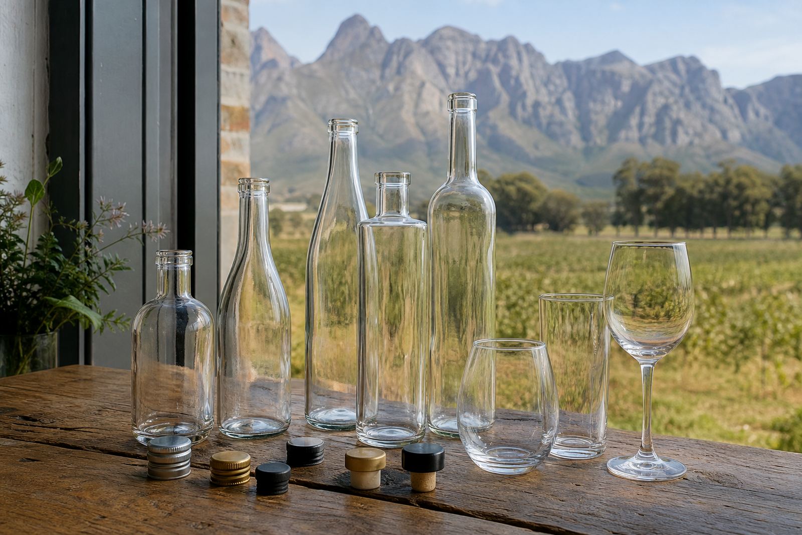
The closure changes how the bottle feels and how it is packed. Cork, screw cap and swing-top closures each bring their own look and handling needs. A narrow neck can feel elegant, but it may limit label position or make hand labelling slower. A broader neck can make packing easier, though it does not always suit every style of wine or gin presentation.
For bottle decoration, the neck area is often overlooked. Yet that section can carry a small mark, a band or a secondary label that ties the whole piece together. If the bottle will be chilled, the decoration must still hold up in condensation and damp handling, especially in coastal towns where humidity is part of daily life.
- Screw cap: practical for water and some retail pack styles.
- Cork or stopper: often used for premium gifting and tasting settings.
- Swing-top: neat for refill-style water bottles and table service.
- Cold handling: allow for damp trays, ice buckets and fridge storage.
Artwork proofing should settle the small details early
Proofs are there to catch line thickness, spacing and placement before the run starts. A logo that sits well on a screen may need adjustment when wrapped around glass. Colour guidance helps when matching brand tones to transparent, frosted or coloured surfaces. We also confirm if the artwork needs a white layer, a spot colour build or a label version for the bottle shape.
Mock-up visuals make it easier to see how the bottle will look from the front, side and back. That matters when a project includes batch numbering, tasting notes or a second panel of information. For bottle printing, the proof should show the exact run position and the final size, not just the artwork by itself.
- Check logo placement from more than one angle.
- Confirm whether text stays readable at real size.
- Compare the colour on the chosen bottle type with what you see on screen.
- Approve the label setup or print layout before production.
Short runs need a clean packing and delivery plan
Short runs work best when the pack format is clear from the start. Bottles may need inner dividers, carton labels or a briefing on how they should be packed for courier or local handover. For events, the order may need to travel to Cape Town, Stellenbosch, Franschhoek, Johannesburg, Durban or another South African address, so the packing brief should match the route and handling method.
Minimum runs depend on the decoration method, bottle type and colour count. A small run of labels can be handled differently from a small run of direct print or ceramic enamel. If the project involves mixed bottle types, it helps to separate them early so the artwork and packing notes stay tidy.
- Use sturdy cartons for longer deliveries.
- Separate glass items with dividers where needed.
- Mark orientation for labels, closure type and fragile handling.
- Keep spare units only if the brief calls for them.