Start With The Decoration Method First
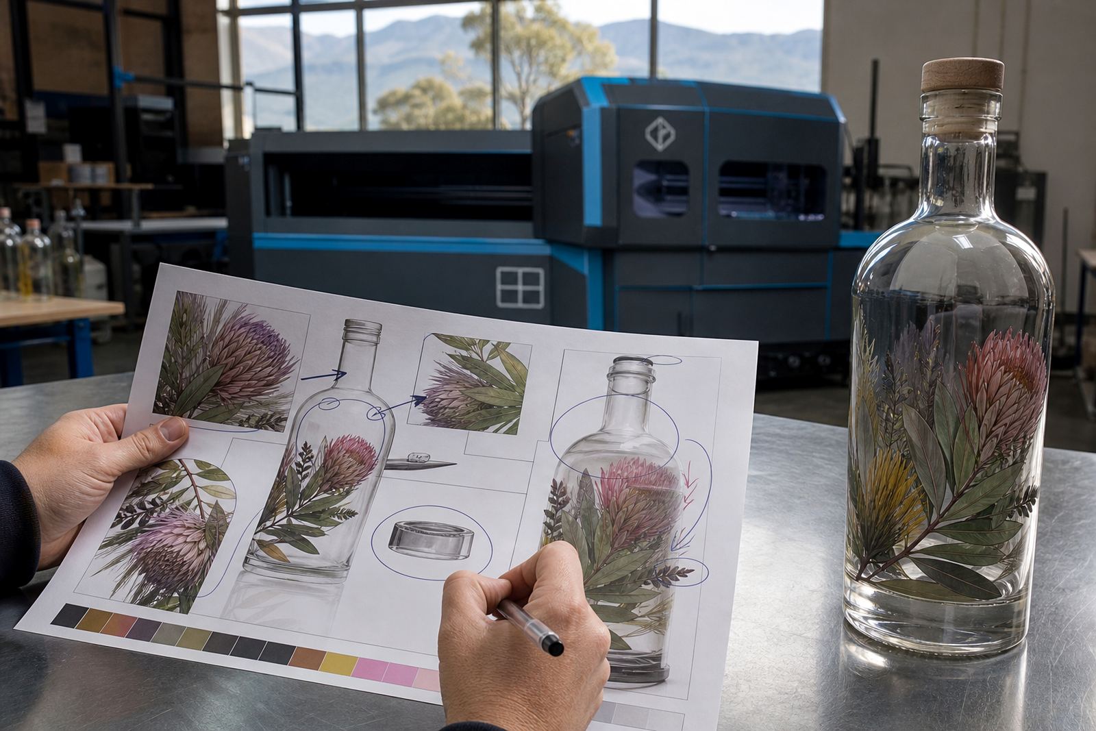
The bottle should suit the decoration method before anyone signs off on artwork. UV direct print works well on clean glass panels and handles detailed artwork neatly. Screen printing suits stronger colour blocks and repeat branding on larger runs. Ceramic enamel gives a fired finish that sits well on premium bottles. Labels help when artwork changes often, when there are several variants, or when a bottle has curves that are awkward for direct print.
If the bottle has narrow shoulders or a heavy taper, some methods need tighter placement planning. Clear glass can show the print area more honestly, while dark or tinted glass changes how white ink and fine detail read. We check those points before a proof is approved, because the same design can behave differently on two bottle shapes.
Bottle Shapes That Work Harder For Gin
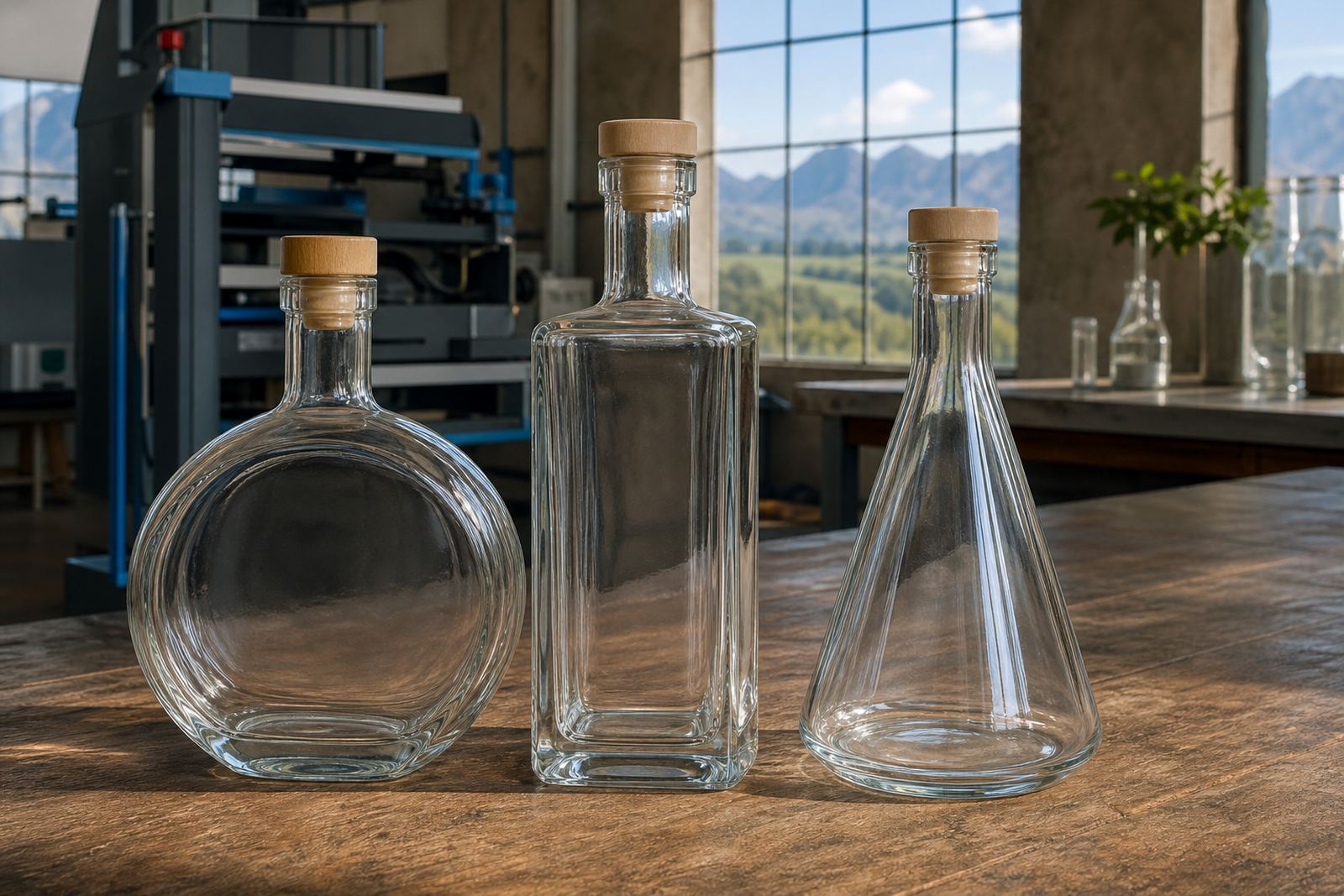
Most gin bottles fall into a few useful families: tall cylindrical bottles, squat premium bottles, fluted bottles and square or rectangular styles. Cylindrical bottles give a larger wrap zone for labels and can take centred decoration well. Square bottles are easy to pack and stack, but the corners reduce usable print width. Premium squat bottles often look good on shelf, though the visible area for text is shorter.
- Wide bodies suit front labels and neck labels together.
- Tapered shoulders need careful print area planning.
- Flat panels help with accurate artwork placement.
- Heavy bases improve the feel of a premium gift bottle.
Glass Colour, Clarity And The Mood Of The Brand
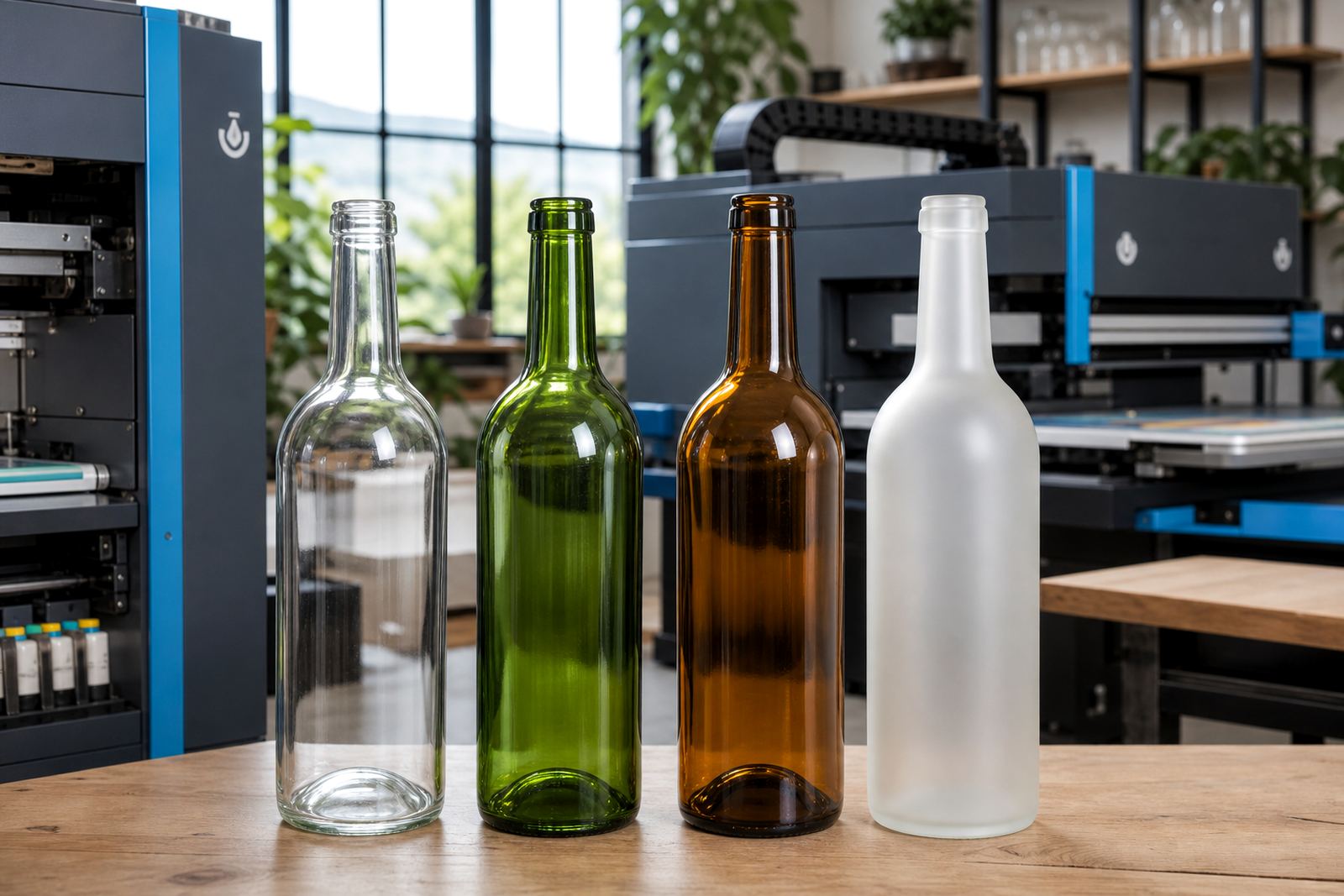
Clear glass gives the cleanest view of the liquid and the bottle shape. Frosted glass softens the look and can hide minor marks on the surface, though it also changes colour contrast. Dark glass feels traditional and works well for gin with a botanical or distilling story. Printed white ink can be useful on tinted glass, especially when artwork needs a crisp edge.
In the Cape Winelands and along the coast, humidity can affect storage and packing decisions, so a bottle finish must be practical as well as attractive. A light condensation line on chilled bottles can change how labels sit, and some finishes show scuffing more quickly than others. We look at the bottle in the hand, not only on a screen, because the final feel matters in real use.
Label Layout That Avoids Crowding
A gin label has to carry the essentials without looking cramped. The front panel usually needs the brand name, product name, volume and a clear decorative hierarchy. Side labels can hold batch detail, tasting notes, ingredients or legally required text where relevant. Long narrow bottles need shorter copy blocks, while broad bottles can handle fuller label panels and stronger borders.
- Leave breathing room around the main mark.
- Keep small text readable at arm’s length.
- Check neck curvature before setting a top line.
- Reserve space for barcodes if the bottle is retail bound.
- Use mock-up visuals to judge proportion before production.
How Run Size Changes The Bottle Choice
Short runs often favour bottle styles that can be decorated with less setup complexity. Labels are usually the most flexible option when artwork changes between batches, or when a job includes several destinations. UV direct print can work well for shorter decorative runs where the bottle surface is consistent and the artwork is fixed. Screen printing and ceramic enamel are more selective, so the bottle shape needs to support clean registration and repeat placement.
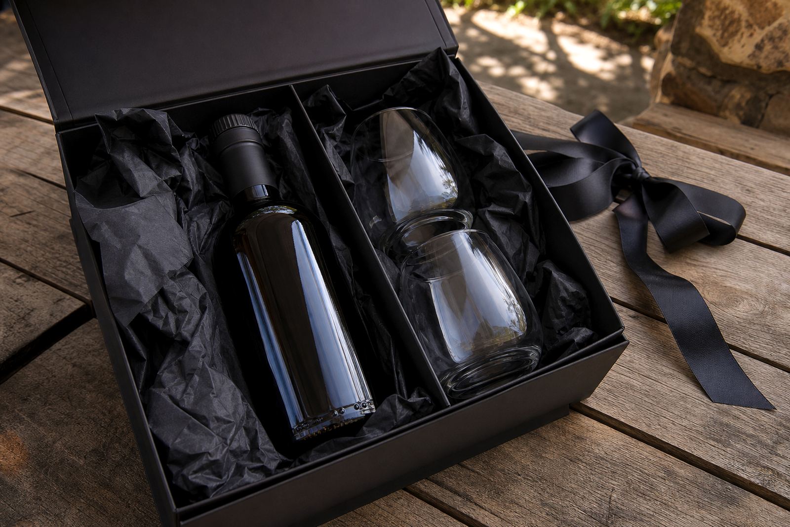
If a job is for a launch, tasting room use or corporate gifting, the minimum run should suit the number of bottles needed without leaving awkward surplus. We talk through practical run sizes, carton counts and packing brief details so the bottle choice fits the actual handover. A bottle that looks strong in a single sample may still need adjustment once quantities, labels and transit are all part of the plan.
Proofs, Artwork Checks And Final Approval
Proofs are where the bottle and the artwork meet properly. We check print area, colour guidance, white ink layers, label artwork setup and any trim or wrap detail before the run is approved. A good proof shows where text sits, how close elements come to an edge, and whether a neck label or back label still leaves space for handling.
- Check the main label against the bottle shoulder.
- Confirm any white underlayer on tinted glass.
- Review the proof at actual size, not only enlarged.
- Watch for fine text near curves or seams.
- Confirm the carton count matches the final brief.
That stage saves wasted decoration later. It also helps if the bottle is going to Cape Town, Stellenbosch, Franschhoek, Johannesburg or Durban, where transit handling can differ and packing needs to support the bottle finish.
A Practical Selection Path For Gin Bottles
Begin with the bottle shape, then test the decoration method against that shape. Next, decide whether the artwork needs a label, direct print or a fired finish. After that, check the bottle colour, the usable panel size and the amount of copy that must fit on the front and back. Finally, think about packing and delivery, especially if the order is moving across South Africa in mixed weather.
For wineries, distilleries and event organisers in Paarl and the wider Cape Winelands, the best bottle is usually the one that keeps the decoration clean and the hand feel solid. The format should support the story of the bottle, while leaving enough room for the artwork to breathe.