Start with the setting, not the print method
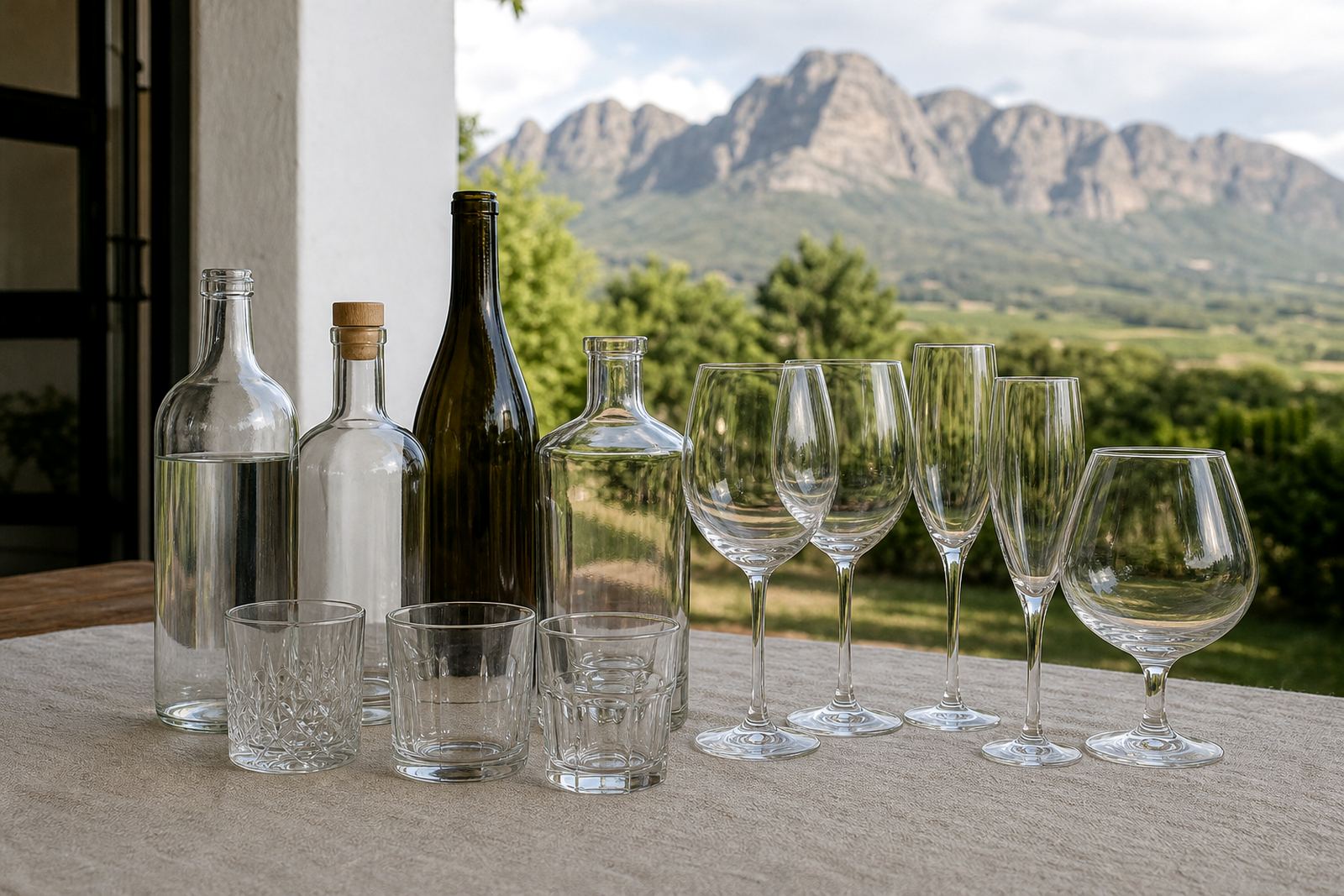
A tasting room table, a conference gift pack and a wedding favour ask for different drinkware. Start with the setting first because the shape, wall thickness and handle style affect both the look and the print area. A slim stemless wine glass gives a very different result from a straight-sided water bottle or a heavy beer-style mug.
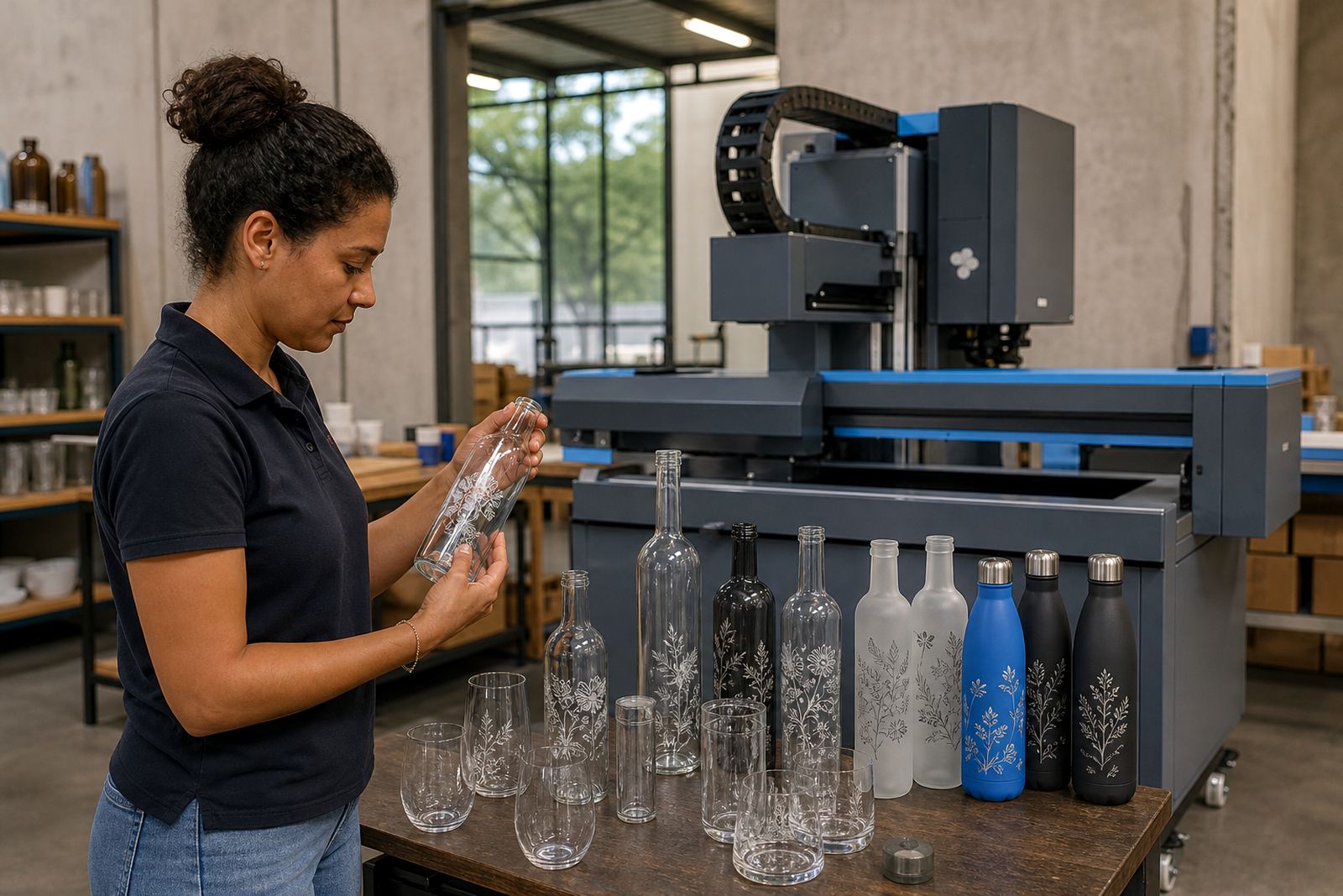
For Cape Winelands events, clear glass often suits tasting pours and table service. Ceramic drinkware works well where the item stays in circulation, while stainless steel and powder-coated items suit outdoor functions and transport between venues. A short run should still feel considered, so it helps to match the item to the purpose before artwork is placed.
Look at the main use in plain terms. If the item will sit on a banquet table, the branding can be broader and more decorative. If it will be carried in a gift bag, the shape should stay practical for packing and transport. If it will be washed many times, the decoration method matters just as much as the item itself.
Glass, ceramic and coated drinkware each behave differently
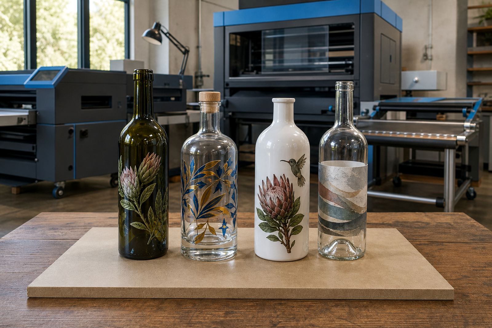
Glass is popular for wine bottles, gin bottles and water bottles because it gives a clean surface and a clear view of the drink inside. Straight walls make print placement easier, while curves around the neck or shoulder need more planning. Frosted glass can soften the look, but print visibility should still be checked carefully in proof stage.
Ceramic drinkware allows strong colour and a more tactile finish. It suits mugs, tankards and certain barware pieces, though kiln firing and surface preparation must be handled with care. Coated or insulated drinkware needs a method that bonds well to the outer finish, especially where the surface is matt, metallic or slightly textured.
For bottle projects, the neck, shoulder and body all offer different branding zones. Water bottles often give a taller print area, while wine bottles can be better for a restrained label, small logo mark or a wrap that follows the curve neatly. Gin bottles usually carry more shape detail, so the label or print field must respect that contour.
- Clear glass: good for a clean, premium finish and visible product colour.
- Ceramic: suited to mugs, barware and items used often in hospitality.
- Coated drinkware: useful where a tougher outer finish is required.
- Curved bottles: need careful artwork placement and proof checking.
Pick a print finish to match the drinkware
UV direct print is useful where sharp detail, smaller quantities and multi-colour artwork matter. It can place fine text and logos directly onto suitable glass or coated surfaces. The artwork should still be prepared with the print area in mind, because any curve, seam or bottle shoulder can change the final result.
Screen printing suits solid colour blocks and repeatable layouts. It is often chosen where a strong brand mark needs a clean finish on bottles or drinkware. Ceramic enamel works well when a fired finish is needed and the item can take that process. Labels remain useful for full-design artwork, variable messaging or bottles that need a wider design field.
White ink layers matter on dark glass, tinted bottles and coloured drinkware. Without a proper white base, colours can sink into the surface and lose clarity. Proofs should show where white sits, how much coverage it gives, and whether any transparent parts of the design need to stay open.
- UV direct print: best for detailed artwork and shorter runs.
- Screen printing: suited to solid branding and repeated layouts.
- Ceramic enamel: useful for fired decoration on selected items.
- Labels: practical for fuller artwork and flexible branding needs.
- White ink: important on dark or tinted surfaces.
Artwork needs more room than the logo file suggests
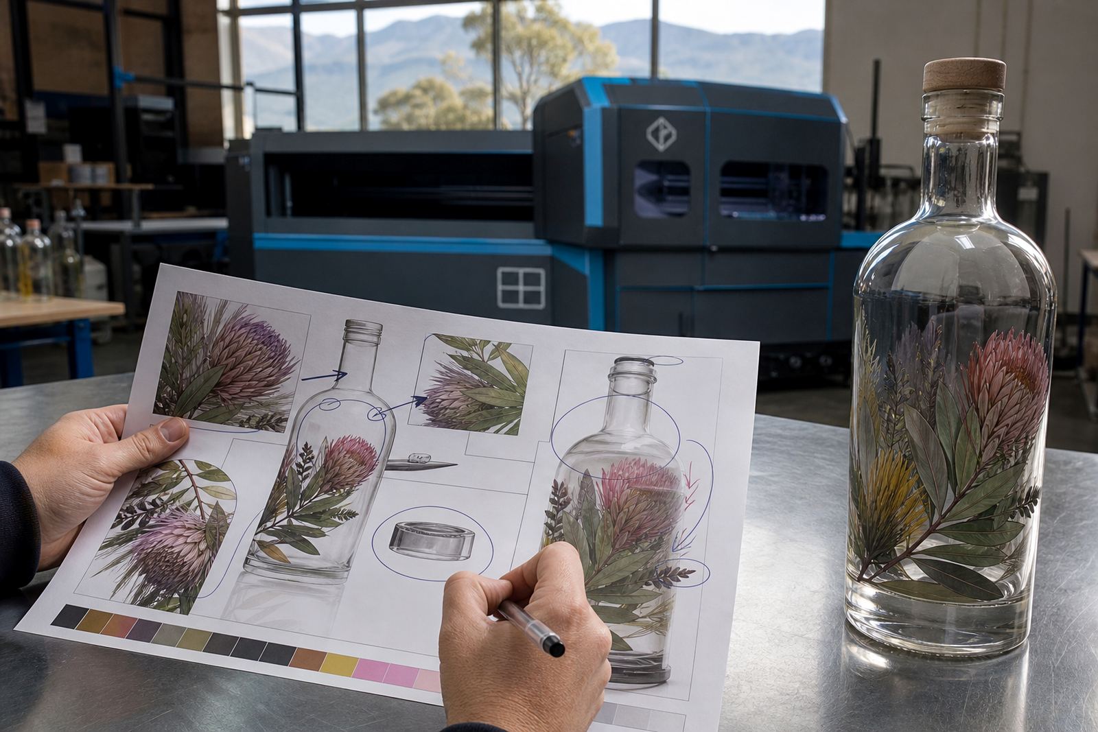
A logo file by itself seldom shows the full picture. Artwork needs to show size, placement, clearance from edges and how the design sits on the form of the item. Bottles narrow near the neck and curve around the shoulder, so a layout that looks neat on a flat screen can shift once wrapped around glass.
The artwork check should cover text size, line weight and any small details that may disappear on a small print area. A serif font can look elegant on a label, but the same font may lose clarity on a tiny direct print. Fine lines and reverse text need extra care, especially on tinted surfaces or busy label backgrounds.
Mock-up visuals help before production starts. They show the front, side and wrap position, so you can see whether the mark feels balanced and whether the chosen item leaves enough room for the message. That step is especially useful when the same artwork has to work across wine bottles, gin bottles and water bottles.
Minimum runs should fit the occasion and the pack plan
Short runs are often the right answer for functions, limited gifting sets and seasonal campaigns. Minimum runs vary by item and decoration method, because setup work, colour counts and surface preparation all affect how the job is planned. A neat small batch can still be efficient when the artwork is clear and the pack count is fixed early.
For event organisers, the run size should follow guest numbers with a little buffer for breakages or extra packs. For wineries and distilleries, the count may tie into tasting room stock, launch quantities or gifting schedules. For corporate work, the pack brief should note whether the bottle travels loose, boxed or as part of a mixed hamper.
Packing matters too. Bottles with narrow shoulders, heavy bases or unusual caps need secure wrapping and correct carton choice. A bottle that looks good on the print table still has to move safely through loading, storage and delivery. Clear packing notes avoid scuffs, leaks and chipped rims.
- Short runs suit launches, tastings and limited gifting sets.
- Guest count should guide the quantity, with a small buffer.
- Packing notes should match the bottle shape and finish.
- Mixed gift packs need artwork that works across every item.
A practical check before the proof is signed off
Before proof approval, look at the brand name spelling, bottle size, print position and surface finish. Check whether the artwork has enough contrast for the selected material and whether the chosen decoration method supports the detail in the design. A busy label on a small bottle can feel crowded, while a simple mark on a larger glass may feel too light if it is not scaled properly.
Picture who will hold the bottle, and how often it gets washed. If it will be chilled, stacked or washed often, the finish should suit that use. If it will be handed out at a function, the bottle or glass should feel stable in the hand and strong enough for transport. That practical check keeps the final pack closer to the brief and avoids unpleasant surprises at dispatch.
When the run is for Paarl, Cape Town, Stellenbosch, Franschhoek, Johannesburg or Durban, the same basics still apply. Match the drinkware to the setting, make the artwork legible, and let the proof show the real shape of the item before print starts.