Begin with the bottle’s purpose
Glass colour is not just a visual choice. A dark green bottle can make pale artwork feel quieter, while clear glass shows every line, edge and colour shift with much less room for error. If the piece is for wine, gin, water or mixed drinkware, the bottle colour should support the drink and the setting it will sit in.
For cellar door sales, gifting or event tables, think about the first impression from a few metres away. In a tasting room, light bounces through clear glass and can soften artwork. On darker glass, a label or print may need stronger contrast and a solid white base to stay readable. Small choices matter more than people expect, and the final result can feel neat or muddy depending on that first call.
How light changes the colour you see
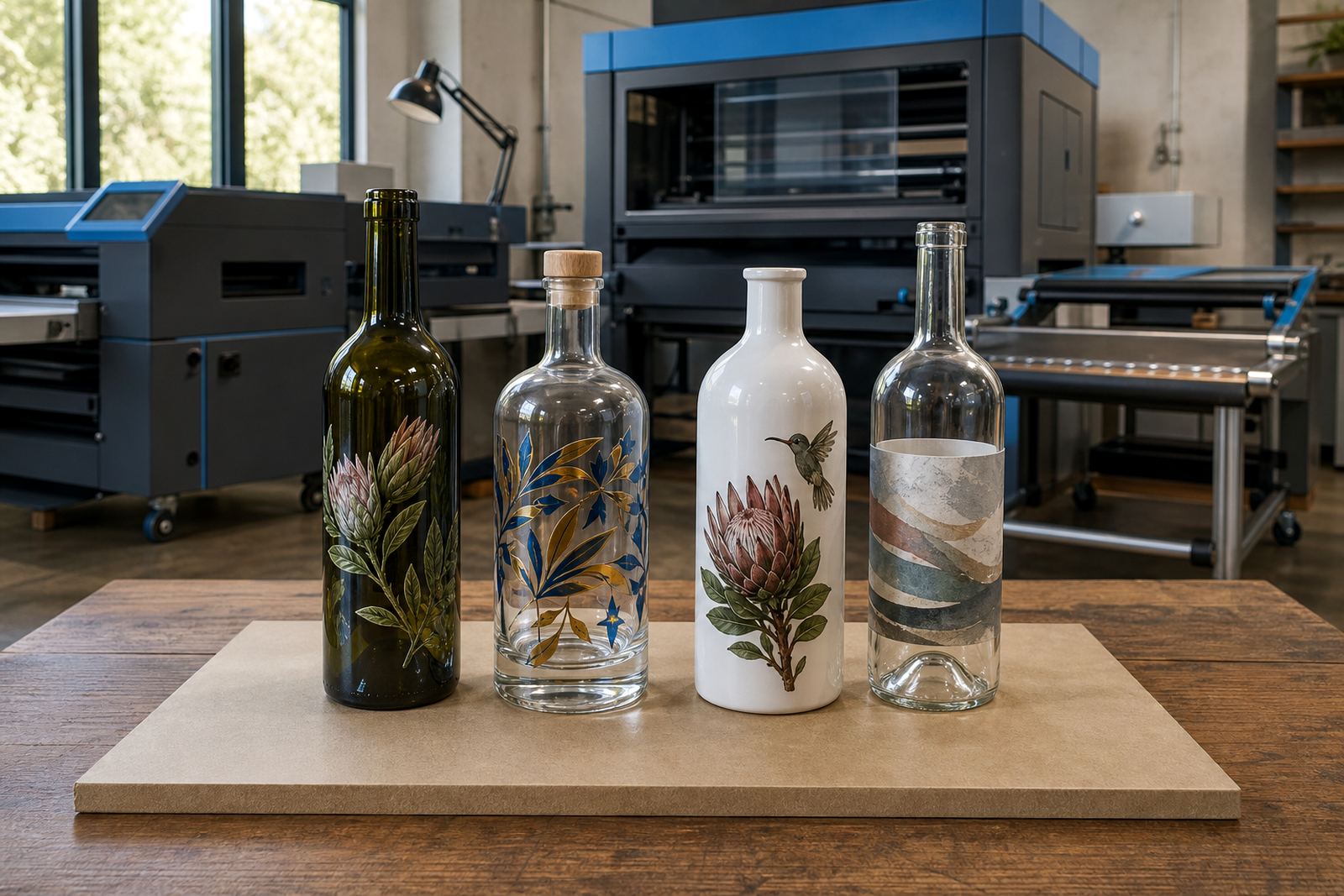
Colour on glass behaves differently in daylight, warm interior light and bright overhead fittings. A label that looks sharp on white stock can disappear on amber or dark green glass if the edges are too fine. Direct print also shifts with the glass surface, especially where curved shoulders and thick bases catch reflections.
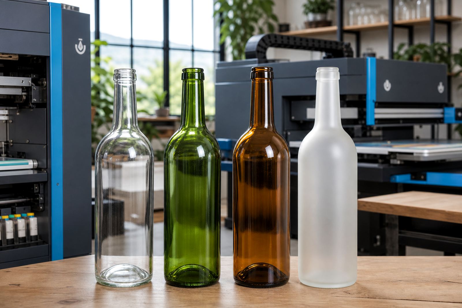
We look at contrast first, then the artwork detail, then the finish. Clear glass suits pale, airy artwork and fine text when the print plan is careful. Green glass can carry richer tones and still feel premium, but very dark artwork may need a white underlayer so the detail does not sink into the bottle. It is worth checking the same artwork on a few colour options, not just one.
- Clear glass shows colour accuracy well
- Green glass helps darker designs feel settled
- Amber and very dark shades need stronger contrast
- Frosted glass can soften hard edges and reflections
Choose a print method that suits the glass colour
Different decoration methods behave differently on each glass colour. UV direct print is useful for detailed artwork, small wording and short runs, especially when a white layer is needed under bright colour. For clean branding and large areas of solid colour, screen printing is a good fit. Ceramic enamel suits a durable fired finish on glass, while labels are useful where artwork needs fine detail, texture or more than one version in a small run.
Glass colour matters because every method handles opacity and coverage in its own way. A deep green bottle may need white ink layers under UV print, while a clear bottle can carry lighter artwork with less buildup. On labels, the glass colour still shows through around the edges, so the label shape and background need to work with that. A minor detail can alter how the finished bottle looks overall.
A short checklist before you settle on a colour
Before a run is approved, it helps to check the bottle shade against the drink, the venue light and the decoration method. This avoids artwork that looks strong on screen but thin in real life. The same design can look striking on a clear bottle and too quiet on a dark one, so the colour should be treated as part of the artwork plan.
- Check whether the artwork needs a white underbase
- Confirm if fine text will stay legible on curved glass
- Decide whether the finish should feel light or formal
- Look at label size against the shoulder and body shape
- Ask if the same artwork must suit more than one bottle type
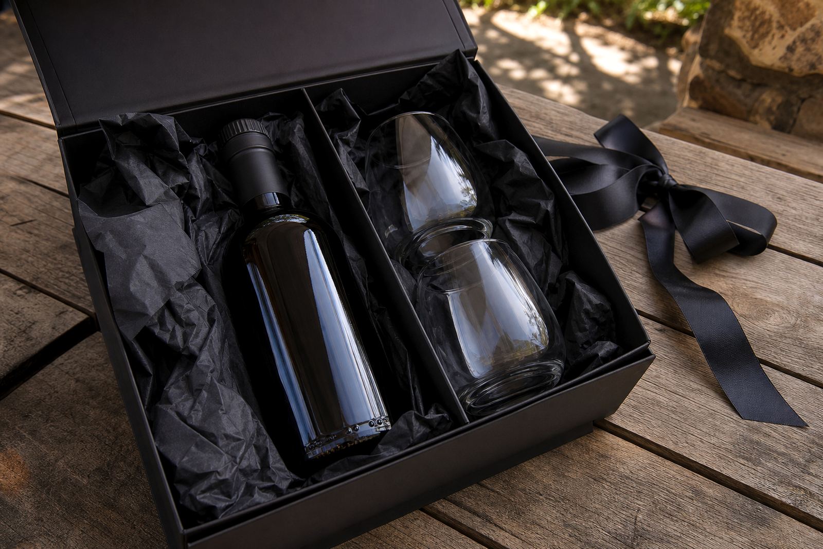
If the bottle is for gifting or an event, make space for practical handling too. A very glossy dark bottle may look elegant in photos but show fingerprints and marks more clearly in service. A more muted colour can be easier to manage in mixed lighting, which is useful when staff are moving quickly.
Small runs, sample checks and proofing steps
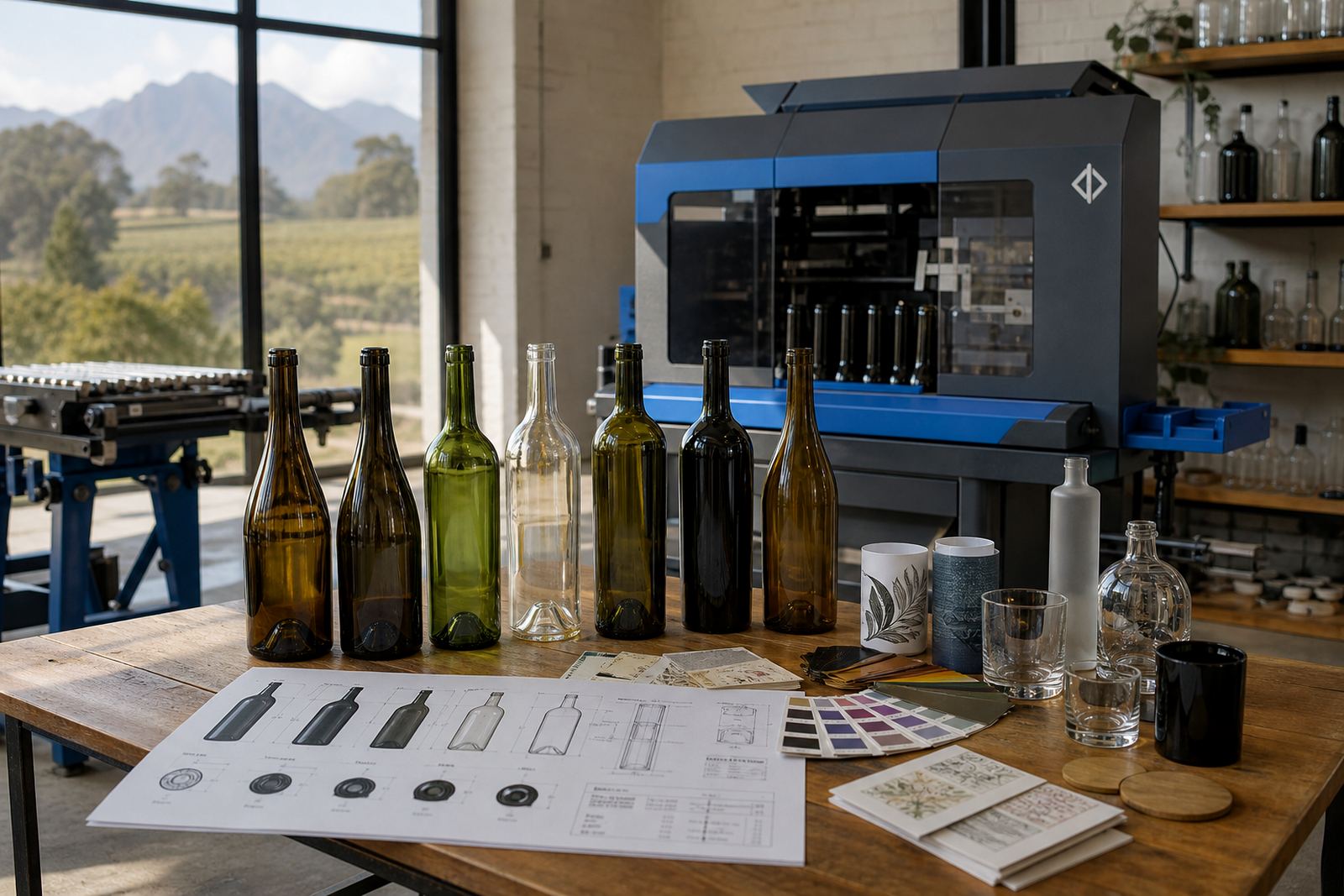
Short runs need careful checking because there is less margin for trial and error. Artwork proofs help show where the print will sit, how much glass is visible and whether the chosen colour supports the design. For labels, a proof also confirms the finish, the cut shape and how the bottle colour will affect the overall read.
A sensible proofing step is to review one version at a time: bottle colour, print method, white layer and text size. If the run includes different bottle shapes or drinkware styles, the same artwork may need minor adjustment for each item. That is normal, and it keeps the result tidy instead of forcing one layout onto every surface.
- Approve the bottle shade before print prep
- Check the proof at full size, not only on a phone
- Look at the logo on both light and dark backgrounds
- Confirm any wording that wraps around the curve
Common colour choices for wine, gin, water and glassware
Wine bottles often lean toward green shades because they sit naturally with the category and handle light well. Gin bottles may use clear or tinted glass depending on the label style and shelf display. Water bottles and drinkware are often clearer, since the drink and the branding need to stay easy to see. Frosted glass can suit more refined gifting pieces, while heavy clear glass works well for tumblers and barware.
No one glass colour suits every brief. The right choice depends on how bold the artwork is, how much of the bottle must stay visible and where the item will be used. For corporate gifting, a calmer glass colour can let the logo take the lead. For venue service, a stronger bottle shade may help the piece feel more grounded and less busy.
What to send when the colour needs to be right
When the artwork is being prepared, send the bottle type, preferred glass colour and the decoration method if that has already been chosen. Add any must-keep colours in the logo, line weights that matter and whether the piece needs room for a label or direct print. If the item has to suit a tasting room, function or gift box, mention that too.
Useful details also include the number of versions, the size of the print area and whether the artwork must sit neatly on a shoulder, body or base section. That gives room for proper planning before proofing starts. With the right colour call, a bottle can look deliberate, readable and suited to the job rather than just printed and hoped for.