Visuals that show the bottle, not just the artwork
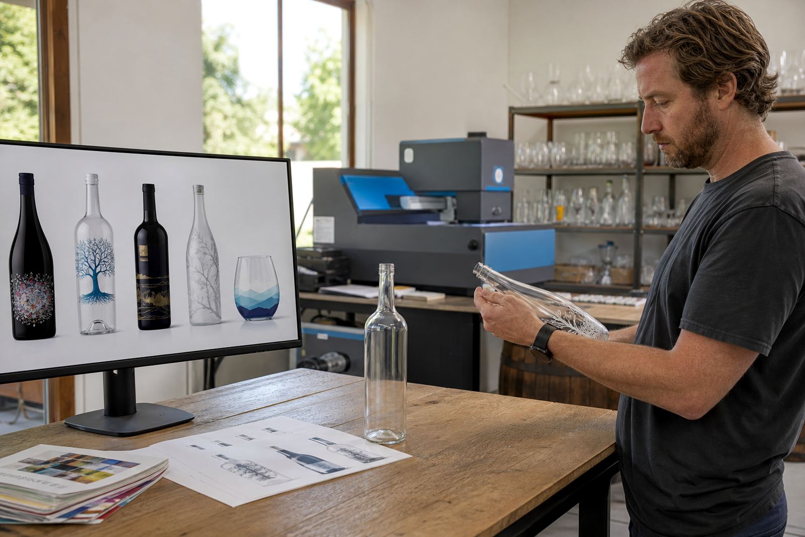
Mock-up visuals place your artwork onto the selected bottle or glassware shape so the layout can be checked in context. A flat logo on a screen can look fine, but once it is wrapped around a curved bottle the neck, shoulder and base all change the reading of the design. That is where a mock-up helps.
We prepare visuals for clear glass, frosted bottles, coloured glass, spirit bottles, wine bottles, water bottles, stemless glasses, tumblers and other drinkware used for hospitality, gifting and events. The aim is to show the label area, direct print zone or enamel print position as it may appear on the finished item.
- Artwork placed to scale on the chosen pack format
- Visible print area boundaries for curved surfaces
- Guidance for white ink, colour and opacity
- Mock-up view for single items or mixed sets
Artwork checks before a visual is prepared
Good mock-up work starts with the right artwork file. We check resolution, artwork size, text legibility and the way fine detail will behave on glass or coated drinkware. A detailed illustration that works on paper may need adjustment before it is suitable for a bottle or cup surface.
The check also helps with print method planning. UV direct print can handle fine detail and colour blocks differently from screen printing. Ceramic enamel needs another approach again, especially where heat resistance and long-term use matter. Labels need clean trim lines, bleed and safe areas so they sit neatly once applied.
- File review for size, format and clarity
- Spacing check around logos, text and borders
- Colour guidance for CMYK, white underlay and special effects
- Notes for label wraps, panel positions and registration marks
How the mock-up stage usually runs
Once the bottle or drinkware type is known, we build the visual around the actual item shape. That may be a standard wine bottle, a gin bottle with tall shoulders, a slim water bottle or a glass tumbler with a narrower base. The profile matters because the eye reads curves differently from flat surfaces.
For short runs, mock-ups are especially useful when there are several variants in one order. A winery may want one artwork for a tasting bottle and another for a gift pack. A distillery might need one layout for a gift bottle and a second for a bar set. Event work can also need a version for each sponsor or table group.
The visual package normally includes front views and, where useful, side placement notes. If the decoration method changes the look, such as a white ink layer under colour or a ceramic enamel finish with a solid hand-feel, that is shown in the artwork notes too.
Decoration methods we map into the mock-up
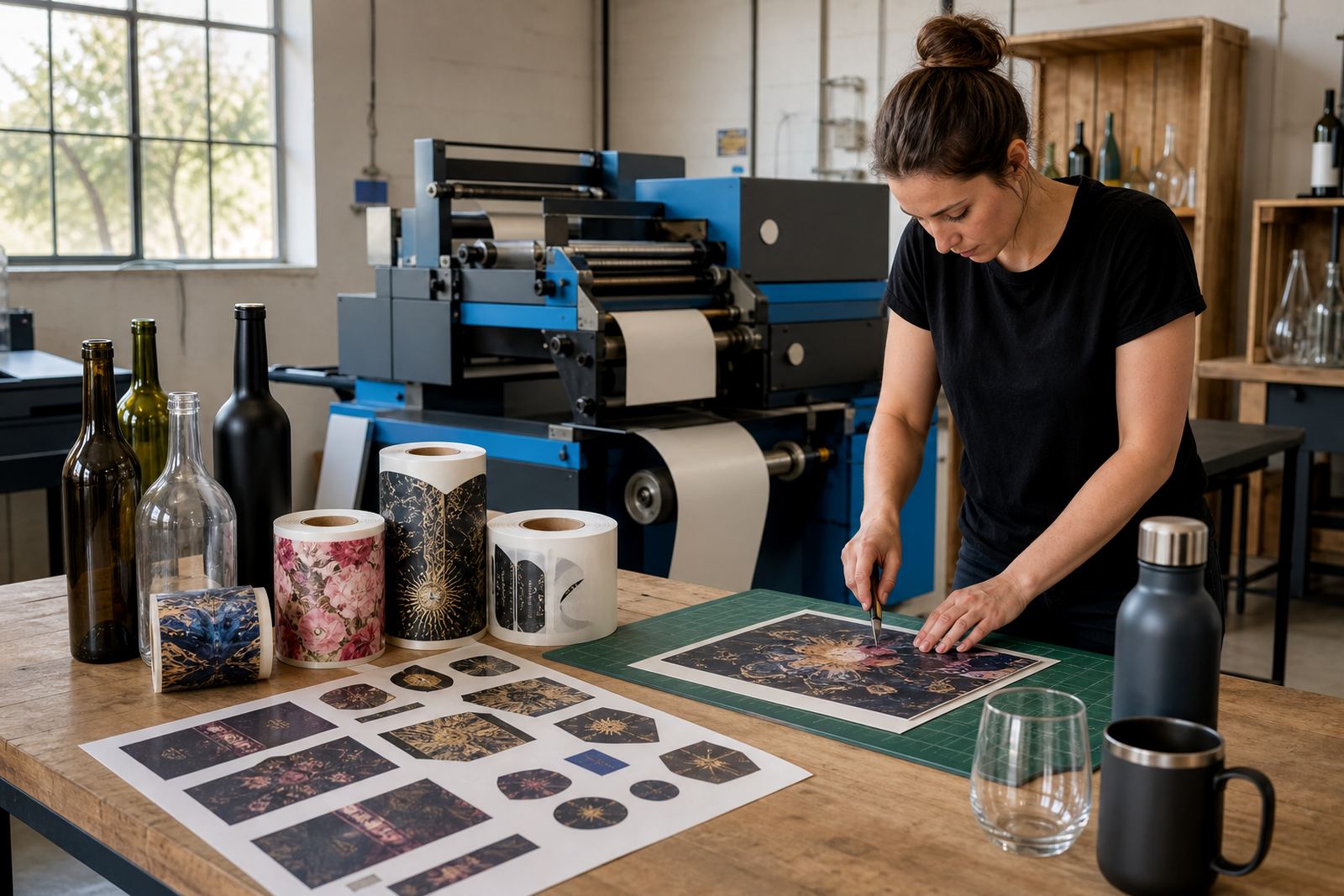
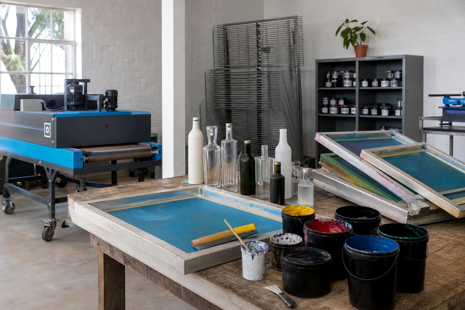
Different decoration methods sit differently on glass and drinkware, so the mock-up has to reflect the method chosen for the run. A label mock-up should show the trimmed edge and panel width. A direct print mock-up should show the ink coverage and how the art follows the curve. Screen printing usually calls for simpler colour blocks and stronger registration control. Ceramic enamel brings its own finish and colour handling, especially on reusable drinkware.
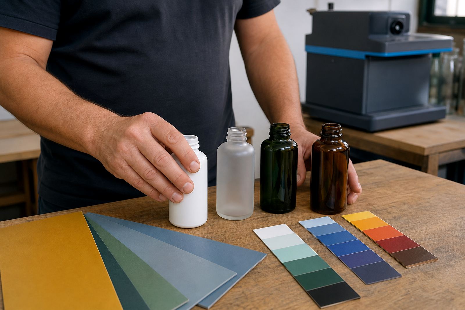
We also prepare visuals for white ink layers where clear or dark substrates need a brighter base. That layer can change the look of artwork quite a bit, so it is worth seeing before the run starts. On some bottles the background of the glass becomes part of the design, while on others the artwork needs a solid base to read properly.
- UV direct print for detailed graphics and short production runs
- Screen printing for simpler artwork and repeatable placement
- Ceramic enamel for durable decorated drinkware
- Labels for flexible layouts, variable content and wrapped branding
What shapes and pack types work best
Mock-up visuals are most useful when the chosen pack type has a visible shoulder, curve or taper. Wine bottles often need careful placement around the body panel. Gin bottles can have wide shoulders or angular necks that affect logo position. Water bottles may carry a tall label zone or a narrower direct print field. Glasses and mugs need attention to the usable height and the hand contact area.
We work with short-run bottle decoration for wineries, distilleries, corporate gifting and event organisers who need a tidy presentation without large volumes. Some jobs use one bottle type throughout, while others mix bottle sizes or add drinkware to the same order. The mock-up keeps each item readable as a separate piece, rather than forcing one layout onto every surface.
- Wine bottles, gin bottles and still water bottles
- Stemmed glasses, tumblers, mugs and reusable drinkware
- Clear, frosted or coloured glass surfaces
- Single-item visuals or matched range sets
Pricing approach and proof approval
Mock-up visuals are priced according to the number of artwork versions, the complexity of the bottle shape and whether several pack types need to be shown. A single bottle with one artwork is straightforward. A mixed order with labels, direct print and different glass sizes takes more layout time and more proofing. We keep the pricing tied to that work rather than adding generic extras.
Every visual is used to support proof approval before the run is released. That means the placement, wording, colour note and print zone can be signed off with fewer surprises later. If a label needs a width change, or a logo needs more breathing space on a curved bottle, that adjustment is handled at this stage.
- Quoted around artwork count and pack variation
- Separate pricing for complex multi-item sets
- Proof approval before production setup
- Corrections handled against the approved visual
Aftercare for repeat and follow-on orders
After a run has been approved and produced, the visual file set and notes are kept ready for future use on the same item family. That helps when a winery needs another short batch for a tasting room, or a corporate client wants the same pack for a later function. If the bottle shape, artwork or decoration method changes, the visual is adjusted to suit the new setup.
We also use the mock-up notes to guide packing briefs and print-area planning on follow-on orders. That keeps the layout consistent where consistency matters, and it flags any changes where the new stock or glassware differs slightly from the last run. In practice, that saves time on checks and keeps the artwork aligned to the item that will actually be printed.
Key facts
| Service area | Paarl, Cape Winelands, with delivery across South Africa |
|---|---|
| Suitable items | Wine bottles, gin bottles, water bottles, glasses, mugs and tumblers |
| Decoration methods | UV direct print, screen printing, ceramic enamel and labels |
| Artwork support | Artwork checks, print area planning, colour guidance and label setup |
| Proofing | Mock-up visuals supplied for approval before production release |
| Run size | Short runs, with minimum run advice based on pack type and method |