Matching colour to the glass in front of you
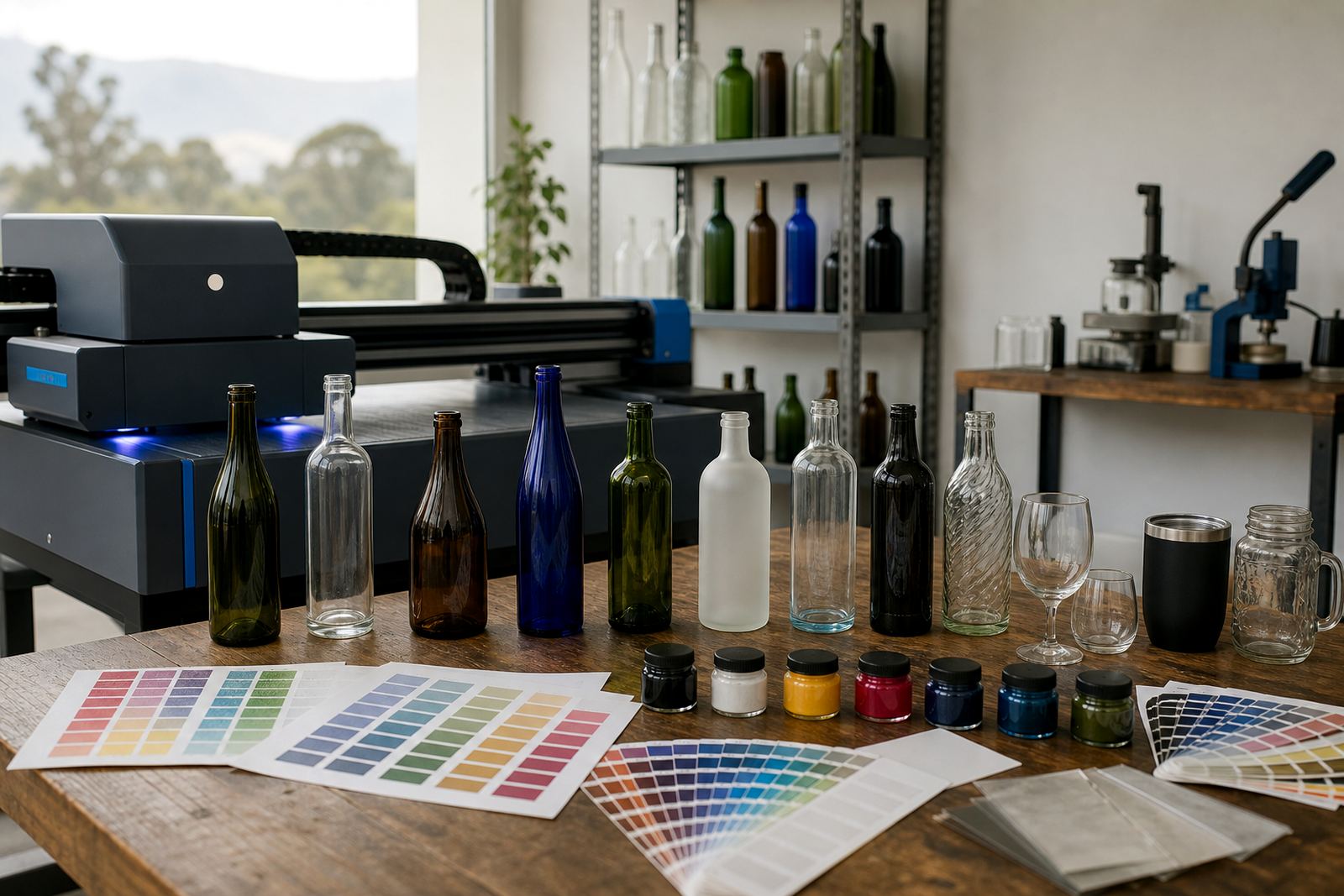
Glass colour changes how ink, labels and fine detail read once the bottle is filled or held against light. Clear glass gives the widest range, but it also shows weak contrast fast. Green glass can mute cool shades and darken pale tones. Amber glass pushes some colours warmer, while frosted glass softens edges and makes fine linework harder to hold. Colour guidance sorts those differences before artwork goes to print.
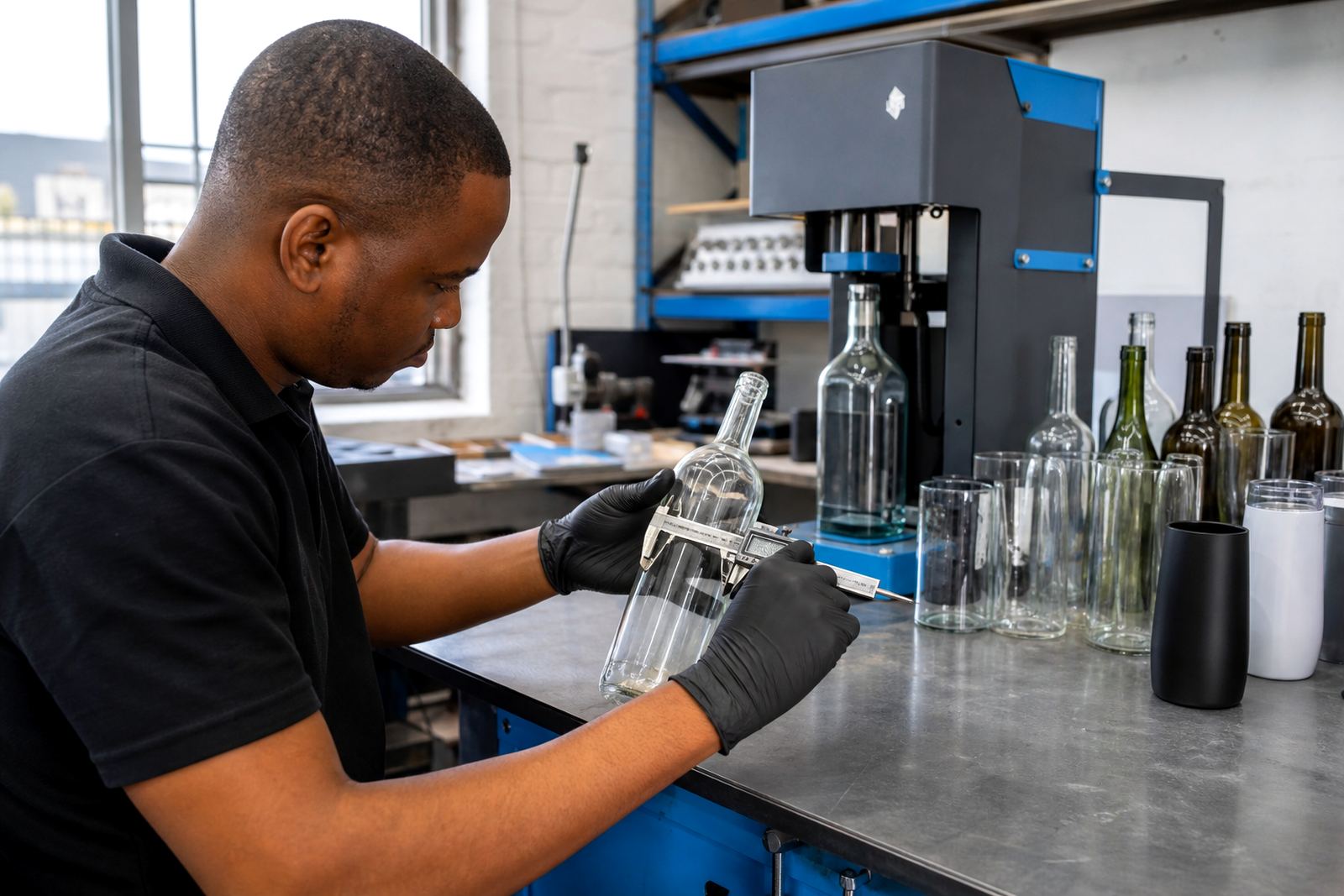
For wine bottles, gin bottles, still water bottles and drinking glasses, we look at the base colour, neck shape, shoulder curvature and how much of the surface stays visible once the label or print sits in place. That matters for tasting events, retail packs and gifting runs where the item has to read well in hand and on a shelf.
- Clear glass suits strong contrast, black type and controlled white ink layers.
- Green glass needs firmer outlines and less dependence on pale tints.
- Amber glass works well with warm colour families and dense solids.
- Frosted glass needs bolder marks, wider spacing and careful edge control.
What colour guidance covers before a run starts
The service starts with your artwork files and ends with a print or label plan that suits the bottle, the method and the batch size. We check whether the design needs a white underlayer, whether small text can hold at the chosen size, and whether the colour palette still works once it moves from screen to glass. If a logo sits too close to a shoulder curve or a flute stem, we adjust the placement so the artwork does not fight the vessel.
This stage also covers minimum run advice. Short runs can favour UV direct print for mixed bottle types, while some larger batches suit screen printing or ceramic enamel where the artwork area is consistent. Labels stay useful where colour needs more freedom, particularly for variable bottle shapes or short event runs with more than one drinkware type.
- Artwork checks for contrast, line weight and legibility.
- Print area planning for labels, body print or neck detail.
- Planning white underprint on clear and dark glass.
- Method advice for UV print, screen print, ceramic enamel and labels.
Proofs, mock-ups and colour checks you can sign off
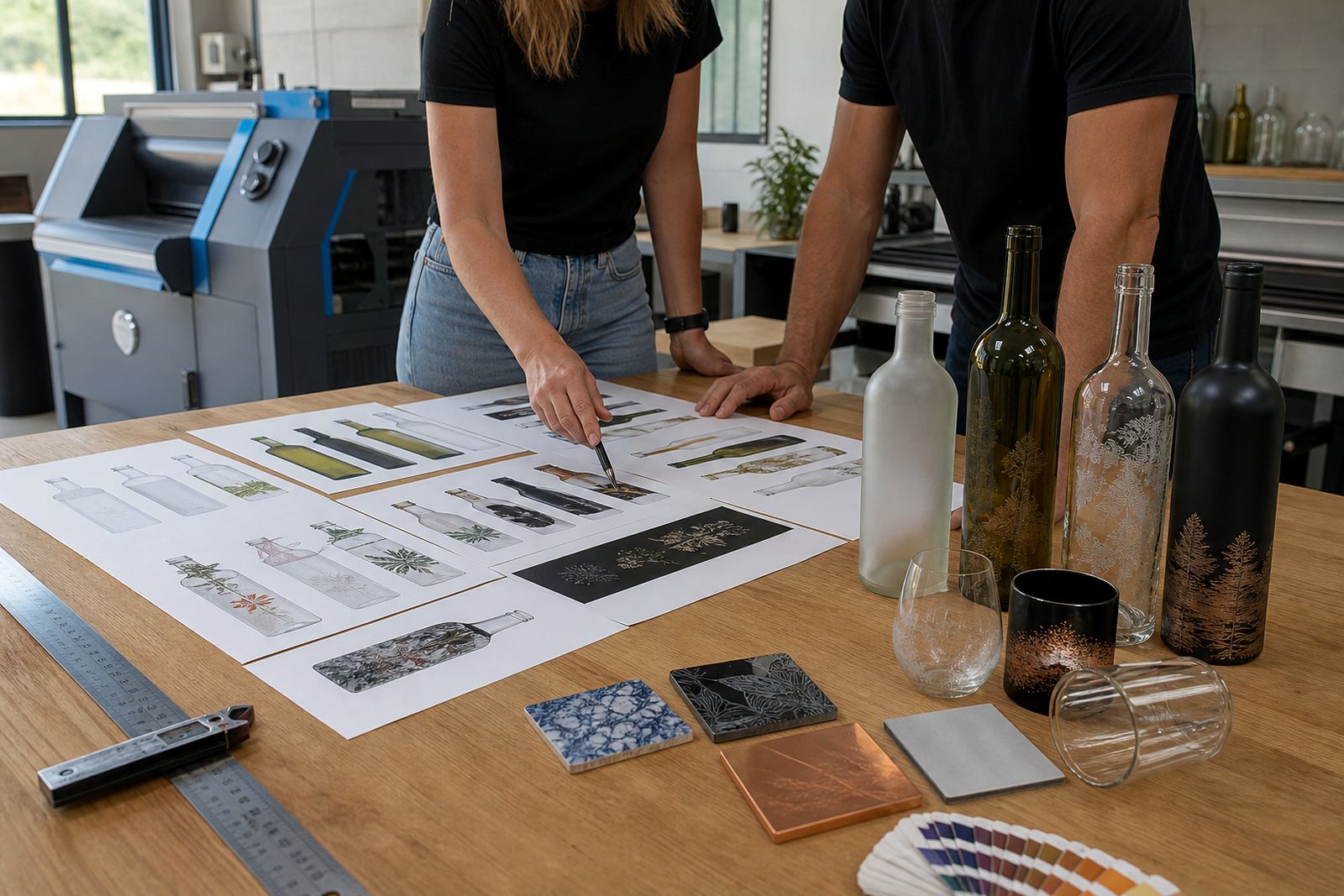
Before production, we prepare proof visuals that show how the artwork sits on the chosen bottle or glass. A proof covers more than colour, including scale, spacing and if the logo still reads when it wraps around a curved surface. For label work, we check trim, bleed and the parts that will disappear at the edge. For direct print, we check alignment to the decoration zone and where the white layer starts and ends.
Mock-ups help when the same artwork must move between a wine bottle, a gin bottle and a water bottle. A mark that looks fine on a flat label may need thicker strokes on frosted glass or a stronger surround on amber glass. If the proof shows weak contrast, the artwork is adjusted before the run begins, rather than after the first bottle is printed.
- Colour proofing for artwork on the actual vessel shape.
- Mock-up visuals for multi-item gifting packs.
- Approval set-up for final sign-off before print.
- Artwork setup for labels, UV print, screen print and ceramic enamel.
How colour guidance fits the production method
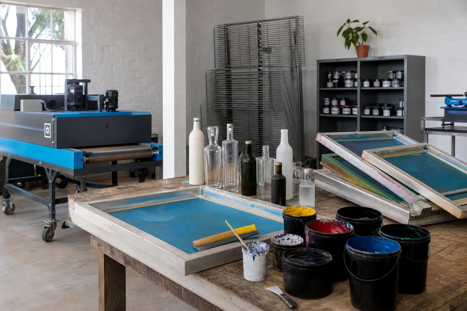
Each decoration method handles colour in its own way. UV direct print works well for shorter runs and detailed logos, but very light tones may need a white base to stay visible on dark glass. Screen printing gives strong solids and a tidy finish on repeat artwork, though fine gradients are not always the best fit. Ceramic enamel suits durable marks fired onto glass, where the colour palette must be planned with the final finish in mind. Labels allow the broadest colour range, with texture and paper choice affecting the final look.
Our role is to keep the design honest to the method. That means advising where a metallic look is practical, when a solid ink block is safer, and when a label gives a cleaner result than direct print. It also means checking artwork files for low contrast areas, hairline fonts and colours that flatten out on glass in bright coastal light or under tasting room lighting.
- UV direct print for detailed short runs and mixed bottle styles.
- Screen printing for repeat artwork with strong solids.
- Ceramic enamel for durable decoration on glass.
- Labels for flexible colour use and varied shapes.
Turnaround flow for short runs in Paarl and beyond
The process is orderly rather than rushed. We review the artwork, confirm the print area, prepare the proof and then move to production once the colour direction is settled. Short runs for wineries, distilleries, corporate gifting and events often need a practical balance between presentation and quantity. That is where clear colour guidance helps, because it prevents wasted time on artwork that will not carry well on the chosen bottle.
Delivery runs go out from Paarl across South Africa, including Cape Town, Stellenbosch, Franschhoek, Johannesburg and Durban. Bottle and drinkware batches are packed with the decoration method in mind, especially where glass surfaces need extra separation or where labels must stay flat in transit. Coastal humidity can affect how labels behave during handling, so the pack brief matters as much as the print brief.
- Artwork review and colour direction.
- Proof preparation and sign-off.
- Print method set-up and decoration.
- Packing brief for safe delivery.
Pricing approach and aftercare for decorated glass
Pricing depends on the decoration method, number of colours, artwork setup needs, bottle shape and run size. A one-colour label on a standard bottle is not priced the same way as a detailed UV print with white ink layers on frosted glass. Colour guidance helps limit unnecessary setup and keeps the artwork within the method that suits it best, which keeps the quote realistic for the job in hand.
Aftercare is about keeping the decorated bottles and drinkware looking presentable after delivery. That includes guidance on handling, washing and storage, especially for printed glass and enamel finishes. Some items are better hand washed, while others need careful stacking so the print area does not rub during use or packing. If the order includes mixed vessels, we explain which items need more care and which can handle regular use more comfortably.
- Pricing linked to method, colour count and setup.
- Advice for handling printed and labelled glassware.
- Care notes for hand wash items and repeated use.
- Packing guidance for mixed bottle and drinkware orders.
Key facts
| Service area | Paarl, Cape Winelands, with delivery to Cape Town, Stellenbosch, Franschhoek, Johannesburg and Durban |
|---|---|
| Bottle types | Wine bottles, gin bottles, water bottles and selected drinkware |
| Print methods | UV direct print, screen printing, ceramic enamel and labels |
| Artwork support | Colour checks, print area planning, mock-up visuals and proof approvals |
| Run size | Short runs with minimum run advice matched to the method |
| Glass finishes | Clear, green, amber and frosted glass |