What gets checked before anything is printed
Every artwork file is read against the item it is meant for, not just against a screen preview. A logo that looks neat on a white page can shift once it is wrapped around a bottle shoulder, squeezed into a small label panel, or reduced for a tasting glass. We check the physical size, the clear space around text, the crop lines, the orientation and the parts that may lose detail at bottle size.
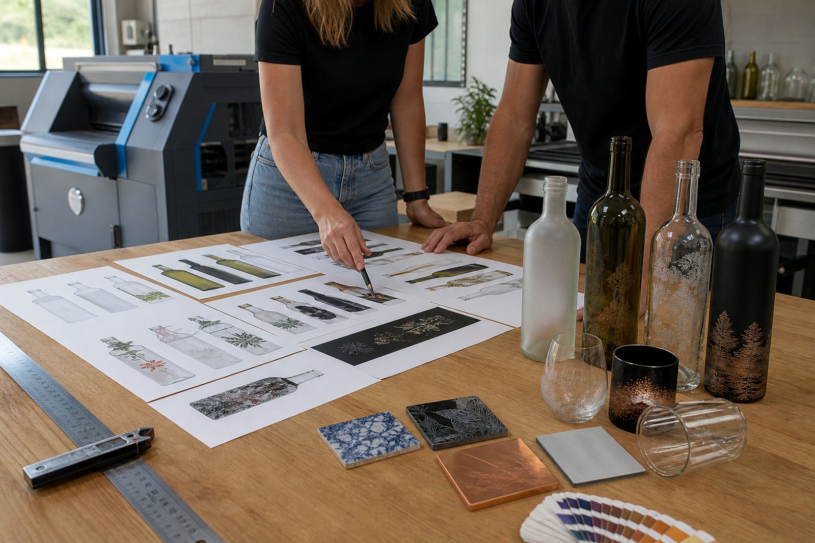
Glass and drinkware each behave differently. Clear glass, frosted glass, coloured glass, stainless steel tumblers and ceramic mugs all need different handling. A pale line on dark glass may need a white underbase. Fine serif type can disappear on a curved surface. For short runs, that planning matters because a small correction at artwork stage is easier than fixing a stack of finished pieces.
- Artwork size matched to the item and print area
- Text checked for legibility at production scale
- Logos checked for safe margins and positioning
- Colour builds checked for the chosen decoration method
- White ink layers reviewed where glass or colour needs coverage
Method matching for bottles, jars and drinkware
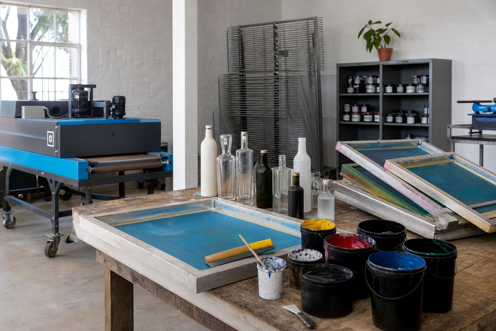
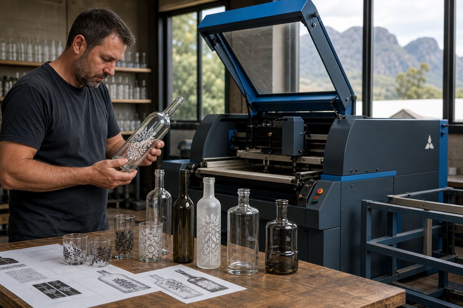
The same artwork can behave very differently under UV direct print, screen printing, ceramic enamel or labels. UV direct print is useful for short runs with detailed artwork and crisp text. Screen printing suits stronger spot colours and repeat work on glass and drinkware. Ceramic enamel is chosen when the item needs a fired finish on the surface. Labels work well when the shape is awkward, the artwork carries fine detail, or the decoration needs more flexibility across bottle sizes.
We check whether the supplied file suits the method selected for the job. That includes line weight, tonal detail, knockouts, overprint settings and the amount of white needed under colour. On dark gin bottles or coloured water bottles, a label may be the cleaner answer where direct print would lose contrast. On clear wine bottles, a direct print can hold a cleaner feel if the artwork is prepared properly.
- UV direct print for detailed short runs on glass and some drinkware
- Screen printing for solid colour blocks and repeat layouts
- Ceramic enamel for durable decorated finishes on suitable ware
- Labels for varied shapes, longer wording or mixed bottle sizes
The file review steps we follow
The review starts with the artwork file itself. We inspect resolution, embedded fonts, image quality and whether the layout has enough room to print cleanly once it moves onto the chosen bottle or mug. If a file is supplied as a low-resolution image, we flag the risk. If a vector logo is available, that usually gives more control over size changes and colour handling.
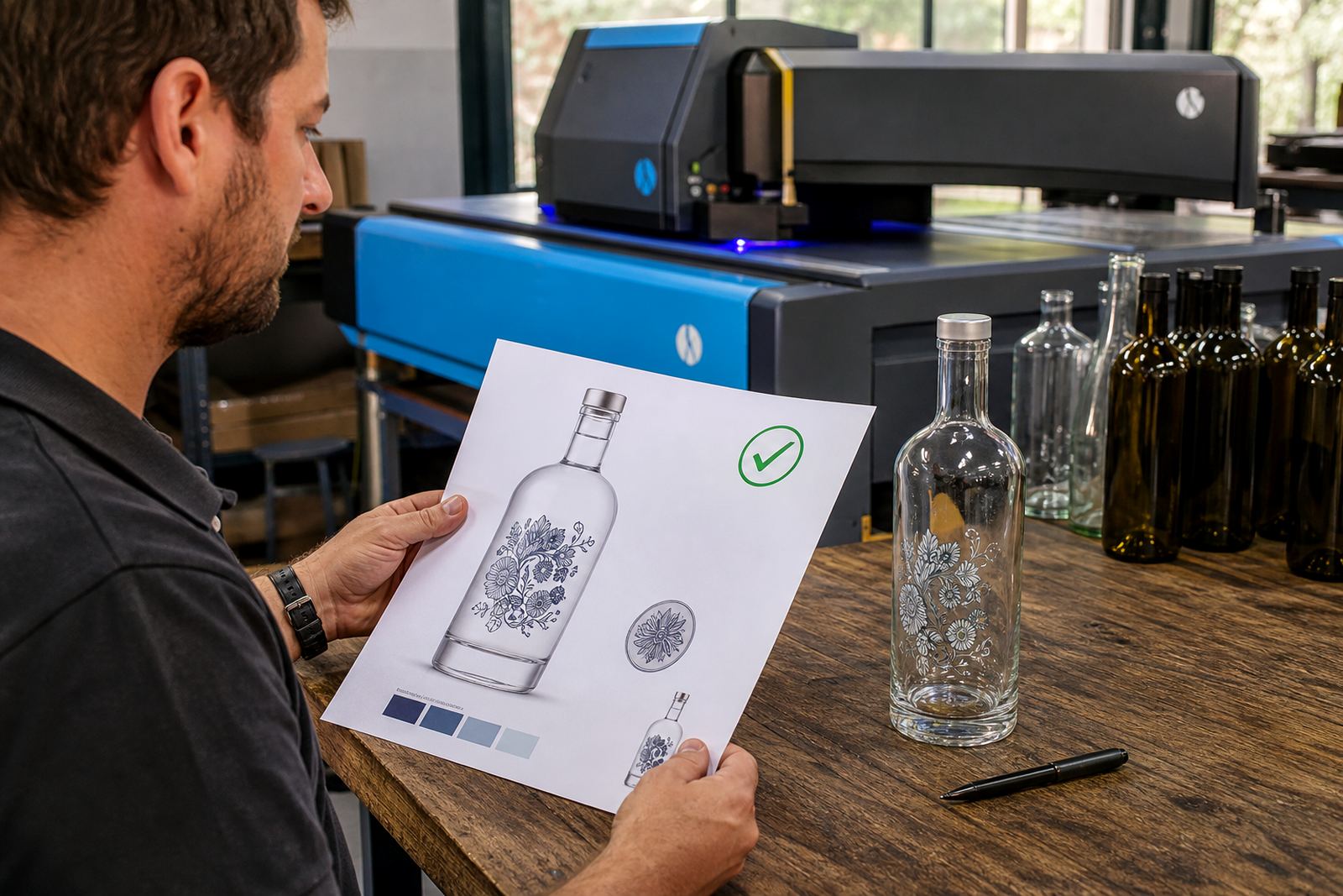
Where needed, we prepare a mock-up visual that shows placement on the item. That helps with neck labels, front panels, wrap labels and centred logos on drinkware. If a file needs small corrections, such as spacing, alignment or a trimmed border, we set those out before proofing. It keeps the run tidy and avoids unnecessary waste.
- Resolution and file type checked
- Fonts, outlines and image sharpness reviewed
- Placement tested against the bottle or cup shape
- Panel width, wrap length and label bleed checked
- Artwork handed back with clear notes for approval
Proof approvals and sign-off points
No run moves ahead without a proof view. The proof shows how the artwork sits on the actual item size, including key placements, colour intent and any white ink layer or label trim line. For a wine bottle, that may mean checking whether the crest, name or vintage line sits high enough to avoid the shoulder. For a tumbler or mug, the proof helps confirm that the graphic will not vanish around a curve or disappear under a handle.
If there are several versions in one job, each version gets checked on its own merits. That includes names for corporate gifting, event wording, or different bottle formats in the same order. Each bottle or glass gets checked for its own print area and finish, since those can differ across items in the same order. A clean sign-off is what keeps the production floor moving in the right direction.
It also gives space for practical notes such as font size, colour shifts on glass and the limits of fine detail. Small changes at this stage matter more than decorative wording later on.
Minimum runs, short runs and pricing structure
Artwork checks sit inside the full job, so the pricing approach depends on the decoration method, the number of artwork versions and the amount of preparation needed. Short runs often need more setup per item than a large repeat order, especially when several bottle types or drinkware styles are involved. Decorated glass always carries these setup costs, and we price them in from the start.
Minimum runs vary by method and item. A label job may allow a smaller quantity than a direct print or fired decoration run. Where a job includes different bottle sizes, several names or mixed glass types, the minimum can shift with the amount of setup. We outline the route clearly before production so the artwork stage and the print stage match the order size.
- Pricing reflects method, item type and artwork complexity
- Short runs carry more setup per unit than bulk repeats
- Multiple versions are priced according to file handling needs
- Label jobs, direct print jobs and fired finishes are costed differently
Aftercare for files, repeats and future orders
After a job is signed off, the approved artwork is kept in a usable state for future repeat work. That makes later reorders easier when the same bottle shape, label panel or drinkware style is used again. If the item changes, we recheck the print area and update the proof rather than guessing. It is a practical safeguard for wineries, distilleries and event teams that work with more than one packaging format.
Aftercare also covers plain guidance on storage, handling and colour consistency. Printed glass and decorated drinkware should be packed with care, especially where a label edge or printed panel could rub during transport. If a client needs the artwork adjusted for a new size or a fresh surface colour, we review it before the next run so the result stays neat and readable.
For many orders the useful work happens before the first bottle is printed. A file that is checked properly is less likely to run into trouble at proof stage, on press or when the packed order is opened at the other end.
Key facts
| Artwork file types accepted | Vector artwork preferred, high-resolution PDF, EPS or AI where possible |
|---|---|
| Minimum print detail | Fine text and linework checked for legibility at production size |
| Decoration methods covered | UV direct print, screen printing, ceramic enamel and label artwork |
| Print surface types | Glass bottles, jars, tumblers, mugs and other drinkware |
| Proof format | Digital proof with placement, trim and colour notes |
| Common checks | Sizing, bleed, margins, white ink layers, font outlines and positioning |