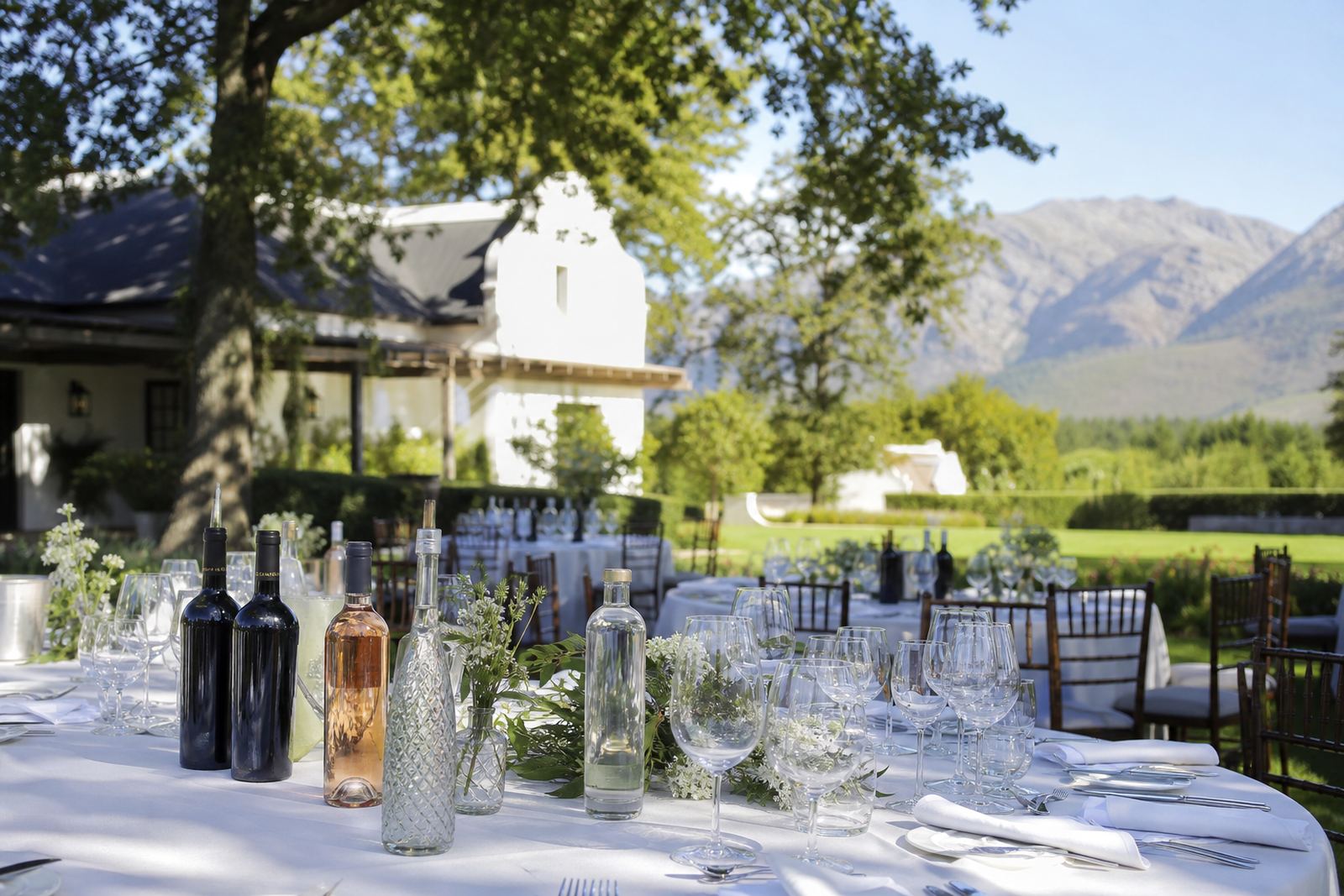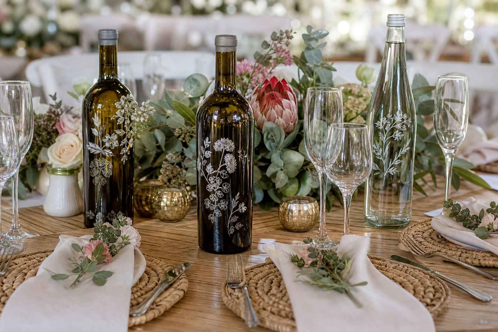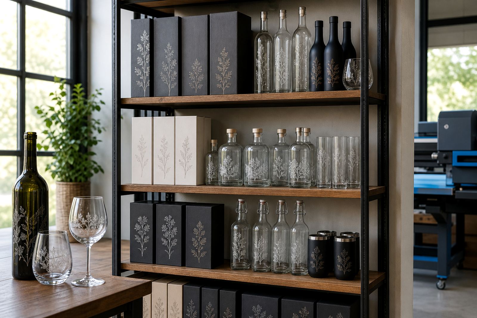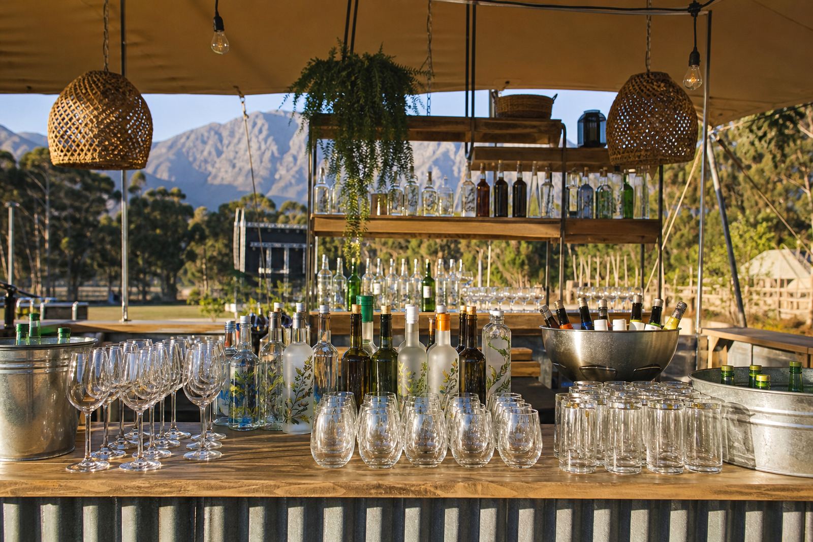
When a festival brief lands on the table
Festival work usually arrives with a tight mix of bottles, glassware and label needs. Some stands want a branded water bottle for staff, others need gin service bottles for a cocktail bar, while VIP areas often ask for cleaner glassware with a restrained logo size and clearer spacing.
In Paarl and across the Cape Winelands, the common challenge is not the artwork alone, it is the pace of set-up, the mix of surfaces and the need to keep each item readable from a distance. We plan the print area around the bottle shape, the neck curve and the usable panel, because a full wrap is not always the best answer on curved glass.
- Short runs suit smaller activations and one-off festival areas.
- Glass bottles, canteens, tumblers and stemless drinkware each need different prep.
- White ink is often needed on coloured glass or tinted items.
- Labels work well when the bottle shape is awkward or the branding needs more detail.
Decoration methods that hold up on site
Different festival pieces call for different decoration methods. UV direct print suits crisp artwork on glass and some drinkware, especially when a bold logo or solid colour block is needed. Screen printing is useful where the artwork is simple and repeatable, with strong colour laydown on a consistent surface.
Ceramic enamel is a practical option where the job needs a more permanent fired finish on glass. Labels are useful for flexible branding, limited runs and sponsor swaps, particularly when the same bottle shape is used for more than one zone. The right method depends on the item, the finish and how much handling the bottle or glass will see during the event.
- Clear glass often needs careful ink selection to keep the logo visible.
- Frosted or tinted bottles can require white underprint layers.
- Curved panels need artwork that is scaled for the print zone, not forced across the shoulder.
- Label stock should suit coolers, ice buckets and condensation.
Artwork, proofs and the tight corners of planning
Festival organisers often send artwork that looks fine on a screen but loses balance when placed on a bottle curve. We check logo placement, line thickness, colour contrast and the space needed for necks, lips and base curves. That matters when a sponsor mark must sit beside an event logo without crowding the front panel.
Proofs are useful before a run starts, especially where a bottle is being used for staff service, guest gifting or bar display. A proof shows how the artwork sits on the actual item, which helps with spacing, size and legibility. It also reduces the risk of a sponsor mark being too small to read once the bottles are chilled and in use.
- Send vector artwork where possible for cleaner setup.
- Plan for a safe margin around logos and fine text.
- Check whether each zone needs the same artwork or a different version.
- Allow for bottle shape, label seam and any textured glass.
Practical layout choices for bars, VIP areas and sponsor stands
Bar areas need speed and clear identification. VIP tables often need less visual noise, with smaller logos and a more polished finish. Sponsor activations are different again, because the bottle may be photographed more often than it is handled, so contrast and camera readability matter.
For water bottles, a simple logo on one face is often enough. For wine or gin service bottles, the brand can sit lower on the body to avoid the shoulder curve. Drinkware sets need a repeatable position so the mark lands in the same place from glass to glass. Where several sponsors share the same event, it helps to keep one artwork system and vary only the logo artwork or label panel.
On fast-moving festival sites, neat packing is part of the job. Bottles should be grouped by artwork version, area and quantity so the team can move stock without confusion during set-up.
Common mistakes that waste a print run
The usual trouble starts with artwork that is too small, too busy or placed too high on the bottle. Another common problem is choosing a decoration method that does not suit the item, such as a detailed label on a damp surface or a print layout that wraps into the shoulder curve. Some festival teams also forget that bottles and glassware may be viewed under bright sun, evening light and camera flash in the same day.
Mixing too many bottle shapes in one short run can slow the process and make packing harder. It is also worth checking whether the drinkware will be washed, chilled or handled repeatedly, because that affects the finish and the best decoration method. A clean layout usually performs better than a crowded one, even when the sponsor wants plenty of presence.
- When a mark carries too many words, people struggle to read it quickly.
- Different bottle shapes need separate setup decisions.
- Condensation can affect labels that are not suited to moisture.
- Dark glass without white ink can swallow fine detail.
Budget ranges that make sense in Rand
Festival budgets usually depend on item type, decoration method, artwork setup and quantity. Short runs with simple single-colour screen printing or labels can sit in a lower bracket, while UV direct print, white ink layers and detailed layout work move the price up. Ceramic enamel preparation also asks for more careful setup and is usually used where the finish needs to last.
For planning purposes, small festival orders can start around R3 500 to R8 000 for simple branded bottles or drinkware, while mixed sets with proofs, artwork setup and multiple item types often sit between R8 000 and R25 000. Larger sponsor packs, premium glassware and more complex decoration can move higher. The final figure depends on the surface, the number of print areas and whether labels, packing briefs and mock-up visuals are all part of the job.
Delivery across South Africa matters too, especially for events in Cape Town, Stellenbosch, Franschhoek, Johannesburg and Durban, where timing around venue access and load-in rules has to be planned carefully.