Gift packs need the print to hold its shape
Corporate gifting jobs usually start with a container, a sleeve, a box or a hamper layout. The bottle or glass has to carry the message without fighting the rest of the pack. On a narrow neck or curved shoulder, the print area is smaller than people expect, so the artwork has to be planned around the shape, not dropped onto it and hoped for the best.
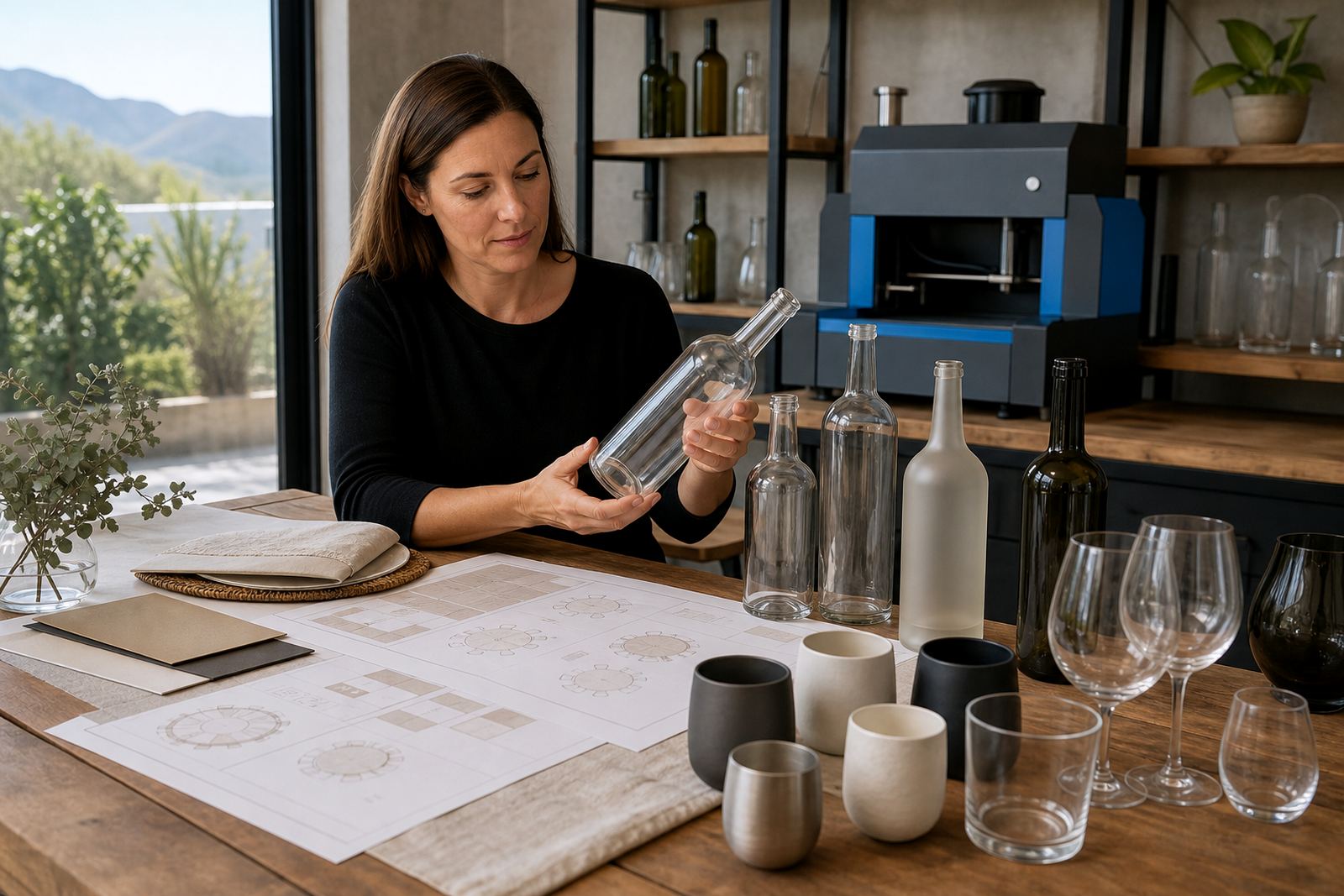
For wine, gin and water gifts we work with glass bottles, clear tumblers, stemless glasses, flasks and insulated drinkware. Some pieces suit direct print, while others are better with a printed label or a ceramic enamel finish. Clear bottles need careful white ink handling when the artwork has pale colours, because transparent glass will make light areas vanish if the underbase is not built correctly.
Decoration methods that suit gift orders
Different gift packs call for different decoration methods. UV direct print suits shorter runs and detailed artwork on glass or coated drinkware. It gives sharp text and solid colour blocks, with a hardwearing finish for handing out at functions or packing into hampers. Screen printing is stronger for simpler artwork and repeated logos, especially when a flatter single-colour look fits the brief. Ceramic enamel is useful where a more permanent fired finish is needed on suitable glass, and labels work well where the pack needs flexibility across bottle sizes or product types.
- UV direct print for detailed logos, gradients and short runs.
- Screen printing for bold marks, fewer colours and repeatable placement.
- Ceramic enamel for selected glass pieces that need a fired finish.
- Labels for mixed packs, variable bottle shapes and easy packaging flow.
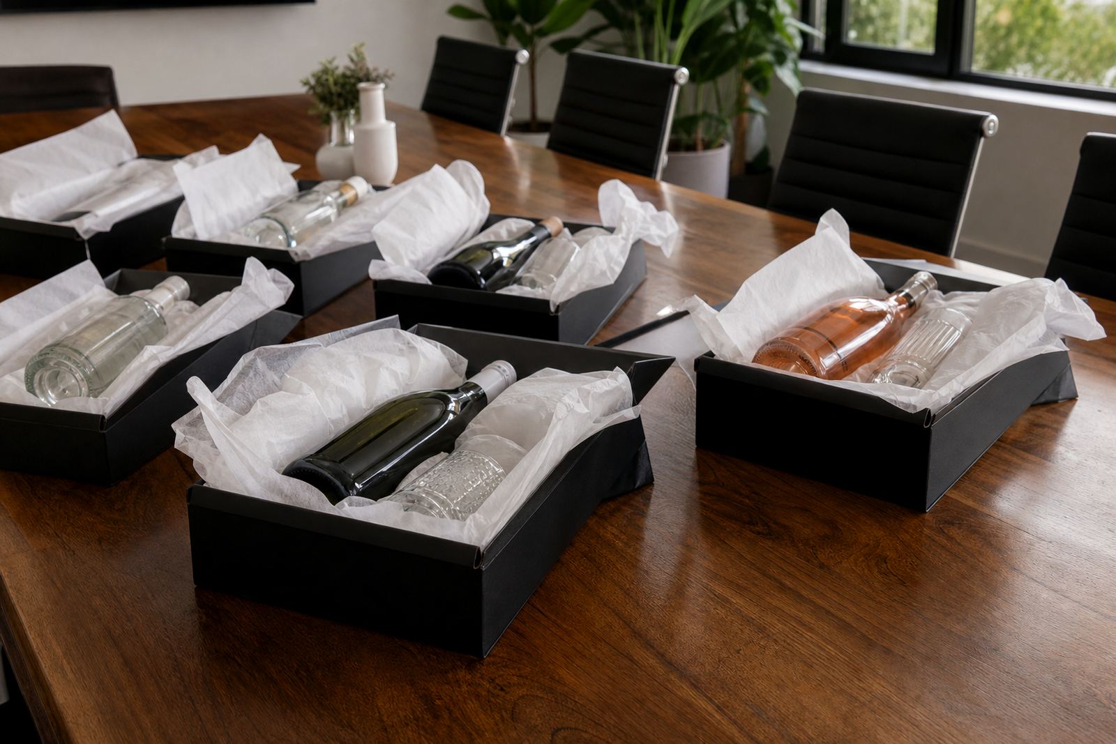
For corporate gifting we also look at how the item will be handled. A packed gift box scratches more easily than a shelf display, so the artwork, ink build and curing method need to match the final use. That is where proofing matters, because a clean render on screen can still need a shift in print area or a thicker white layer on actual glass.
Planning the front panel, back panel and wrap
Gift work often carries more than a logo. There may be a message line, an event date, a venue reference, a team name or a seasonal greeting. The layout needs breathing room, especially on curved surfaces. Text placed too close to a shoulder or base line can distort once wrapped, and small type can disappear against dark liquid or tinted glass.
We normally guide print area planning before production begins. That includes checking the usable height, the safe width around a curve and where the main visual should sit if the bottle is photographed in a hamper or on a table. If the same gift is going to different branches, client teams often need a single artwork system that still allows small changes for names or event wording.
- Keep the main mark on the flattest part of the bottle or glass.
- Leave enough margin above shoulders and below taper points.
- Use one strong message rather than crowded copy.
- Match the decoration method to the packaging sequence.
Artwork checks before a short gift run
Artwork for corporate gifting has to be tidy before it hits print. We check logo position, colour build, line weight, transparency and the amount of white ink needed behind the design. If a file is too fine, a good looking file can turn weak on glass. If the background is dark, the print may need a stronger base layer so the logo does not sink into the bottle.
Proof approvals are part of the process because short runs leave very little room for fixing a mistake later. A mock-up visual helps show where the artwork sits on the item, while a print proof confirms size, placement and the overall feel before the run proceeds. For label work, we also check trim, bleed and panel layout so the label matches the bottle and sits straight once applied.
When packs include mixed items, such as wine bottles and matching glasses, the artwork system has to stay consistent across both. A logo that looks clean on a flat glass tumbler may need a different treatment on a curved wine bottle, and that is normal. It is better to adjust the layout early than to force one file onto every surface.
Common mistakes on gifting orders
The most common error is trying to use too much detail in too small a print area. Fine lines, tiny dates and crowded taglines can all blur on curved glass. Another problem is choosing a decoration method that suits the artwork but not the item, such as a design that looks sharp on paper labels but needs a more durable print for handling inside gift boxes.
People also underestimate lead time for approval and packing. A short run still needs artwork setup, proofing, print prep and packing briefs. If the packaging plan changes late, the print may need a fresh layout to avoid clashes with handles, inserts or seals. That is especially true for event gifting where the same item might be used at registration tables, on conference seats or as a handover item.
- Too much text on a curved surface.
- Colours that disappear without a white base.
- Labels sized without checking the bottle shoulder.
- Artwork sent without print-safe margins.
- Pack layouts that ignore how the item is handled.
Budget bands for corporate gifting runs
Budget depends on item type, decoration method, artwork complexity and quantity. Short runs for corporate gifting can work from about R1 500 to R4 500 for simpler label-based or one-colour setups, especially where the pack uses a standard bottle or glass. Mid-range runs with UV direct print, white ink layers or more detailed setup commonly sit between R4 500 and R12 000. Larger gifting campaigns, mixed drinkware sets or more involved packing briefs can move beyond that, particularly where the same artwork must be adapted across several item types.
What changes the figure most is not just the quantity, but the number of setups. A single logo on one bottle style is easier than three items in one hamper, each needing its own print area planning. When budgets are tight, label artwork or a simpler decoration method can keep the gift presentable without stripping out the branding.
For corporate gifting across Paarl, Cape Town, Stellenbosch, Franschhoek, Johannesburg and Durban, the practical question is usually whether the pack needs shelf appeal, hand-held impact or a reusable keepsake. The answer guides the print method and keeps the spend in line with the use.
Packing notes for delivery across South Africa
Gift items travel better when the packing brief is considered with the print. Bottles and glasses need protection from rubbing, chipping and label lift, especially in humid coastal areas like Cape Town, Durban and Franschhoek-facing routes where moisture can affect some packaging materials. We plan for the way the items will be boxed, stacked and handed out, not just how they look in a photo.
Our Paarl team checks artwork, plans the print area, guides colour choices, approves proofs and prepares packing briefs for corporate gifting runs. That keeps the print stage aligned with the handover stage, whether the order is headed for a boardroom, an event venue or a client hamper pack. Gifting orders can be briefed on the contact form.