The brief for a hospitality gifting pack in Umhlanga
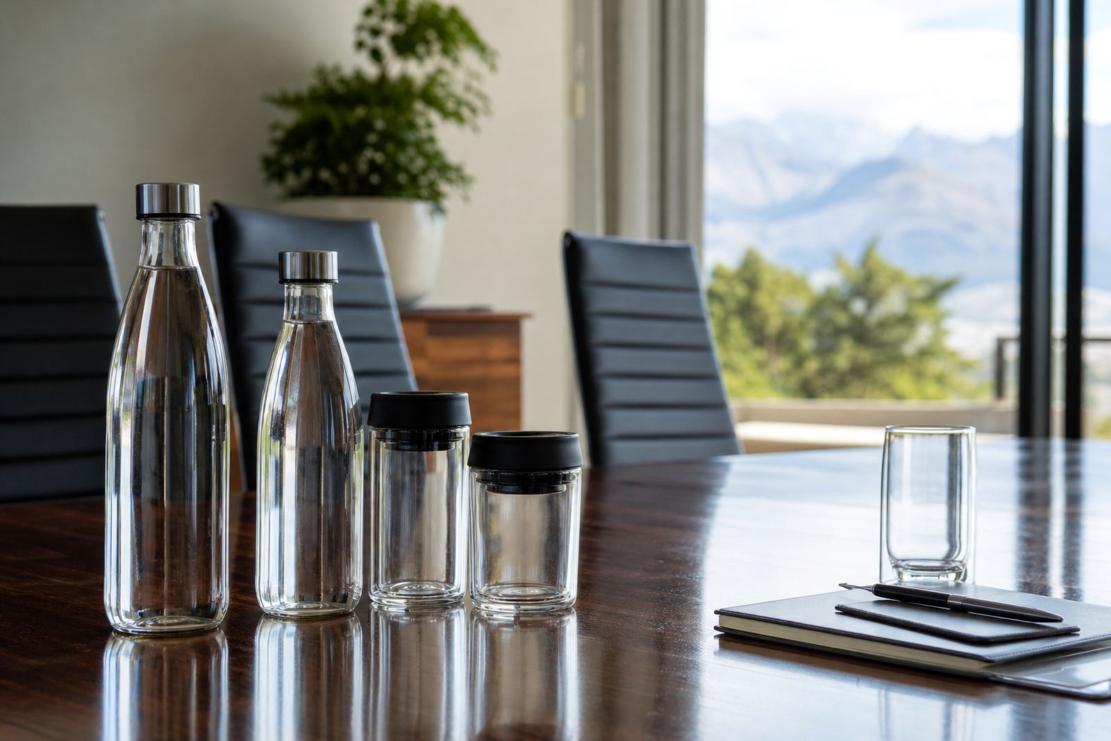
The client was a hospitality group based in Umhlanga, putting together a gifting run for guests and business contacts. The range needed to include branded wine bottles, gin bottles, water bottles and a small set of drinkware, all carrying the same visual language without looking forced across different shapes.
The job needed a clean finish, sensible print areas and clear artwork control from the start. The bottles were for presentation and gifting, not for heavy handling on a production floor, so the print had to read neatly under light and look right on shelf or in a hamper.
- Branded glass bottles for wine, gin and water
- Drinkware to match the bottle artwork
- Short-run production with proof approval before print
- Coastal use in humid Umhlanga conditions
Material mix and decoration methods used
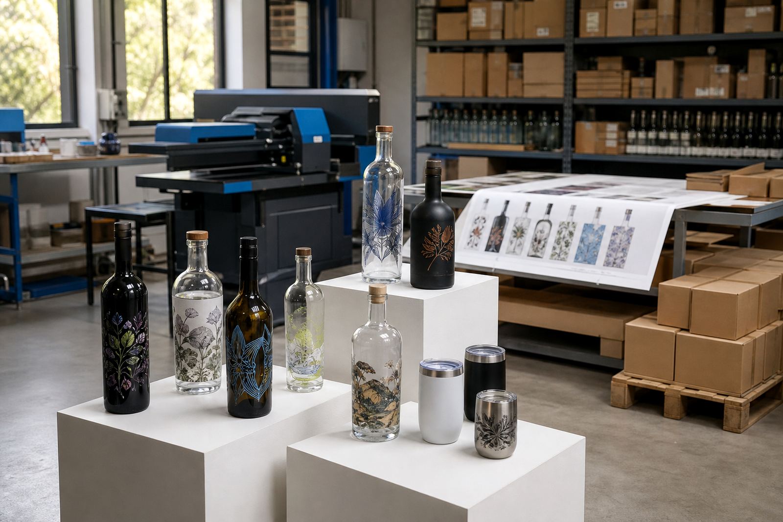
We set up the run around the material that suited each item best. On the glass bottles, UV direct print gave crisp colour and clean edges for logos and lettering, while labels were used where a wrap style or extra information made more sense. For the drinkware, screen printing and ceramic enamel options were kept in view where the shape and intended use supported them.
Different bottles need different handling. Curved surfaces, neck tapers and label panels all affect what can be placed where, so the artwork had to be adjusted rather than forced into one fixed format. That meant checking white ink layers where needed, and setting the print area to the actual bottle geometry, not a guessed size.
- UV direct print for selected glass pieces
- Label artwork setup for information and wrap layouts
- Screen print prep where a simple mark suited the item
- Ceramic enamel prep for durable drinkware decoration
Artwork proofing and print-area planning
The artwork phase carried most of the thinking on this job. We prepared mock-up visuals first so the client could see how the logo sat on each bottle type and where text needed breathing room. On mixed packs, we checked placement on each bottle during proofing so one design stayed consistent across the set and did not break down from bottle to bottle.
We also guided the pack around print-area limits, especially on smaller bottles and drinkware with tighter curves. That included checking the size of line work, the contrast on coloured glass and the use of white ink layers where dark surfaces needed help. A few minor art edits kept the set consistent and gave the client a cleaner finish across the range.
- Mock-up visuals before production
- Artwork checks for logo size and legibility
- White ink layers for darker glass surfaces
- Proof approvals before the run moved ahead
Production notes from the Paarl side
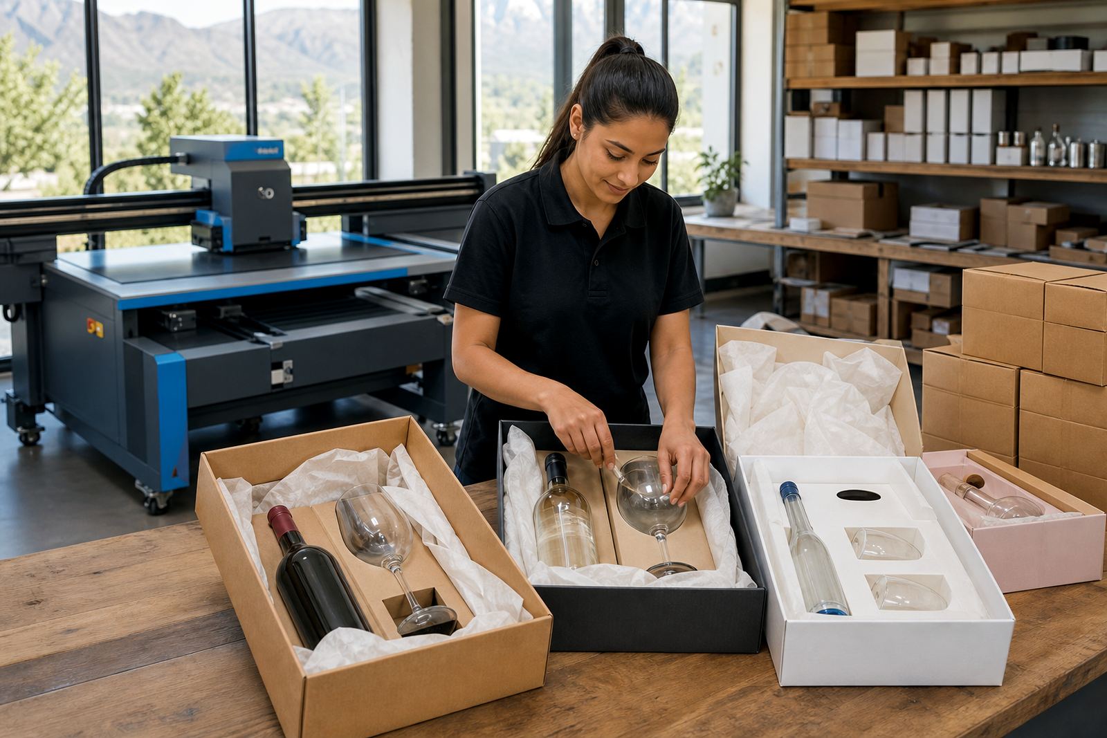
The run was handled from Paarl in the Cape Winelands with the print and logistics work kept close together. Short runs need tight coordination because there is less room for waste, and every bottle counts. The team had to move between bottle types, label setups and packing notes without letting the details drift.
Minimum run advice was part of the discussion early on, because the quantities had to suit a gifting project rather than a large retail order. That gave the client a practical route through the job, with enough stock for the pack and no unnecessary oversupply. Packing briefs were then set around how the items would travel and present on arrival.
- Minimum run advice suited to short gifting quantities
- Packing brief prepared for mixed bottle and drinkware items
- Logistics planned for coastal delivery conditions
- Print stages kept in step with proof sign-off
Delivery across coastal and inland routes
The finished run moved out in mixed deliveries, with coastal dispatch into Umhlanga and support for other South African destinations where needed. Coastal humidity matters on glass and packaging, so the packing method had to hold shape and protect the printed surfaces during transit. The same care was used whether the route was local to KwaZulu-Natal or headed inland.
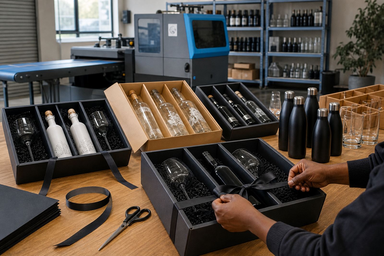
This sort of job is often judged by the moment the pack is opened. The bottles needed to look aligned, the labels had to sit square and the drinkware needed the same visual discipline. When the pieces arrived together, the client had a set that could be placed straight into gifting packs without extra rework.
- Coastal delivery to Umhlanga
- Route support covering Durban, Johannesburg, Cape Town, Stellenbosch and Franschhoek
- Careful packing for glass and decorated drinkware
- Presentation ready on unpacking
What the run delivered for the client
The finished gifting set gave the hospitality team a neat, coordinated range that felt consistent across wine, gin and water bottles plus the matching drinkware. The value was not in volume, but in control: the artwork sat properly, the print methods matched each substrate, and the pack held together as a single gift story.
What worked best on this project was the early proofing and the bottle-by-bottle planning. If we were repeating a similar brief, we would repeat that sequence: confirm the print area, lock the visual layout, check the material behaviour and then pack for the actual route. That keeps the process practical, and it avoids last-minute adjustments that do not help the finished pack.
- Consistent branding across multiple bottle types
- Better presentation for a hospitality gifting run
- Artwork handled for mixed shapes and surfaces
- Proof-led production with fewer surprises at print stage
Key facts
| Project | Umhlanga gifting run for a coastal hospitality client |
|---|---|
| Products | Branded wine bottles, gin bottles, water bottles and drinkware |
| Decoration methods | UV direct print, screen printing, ceramic enamel and labels |
| Location | Paarl, Cape Winelands with delivery to Umhlanga |
| Run type | Short-run gifting pack with proof approval |
| Support | Artwork checks, print area planning, white ink layers, packing briefs |