A boardroom brief with no room for loose detail
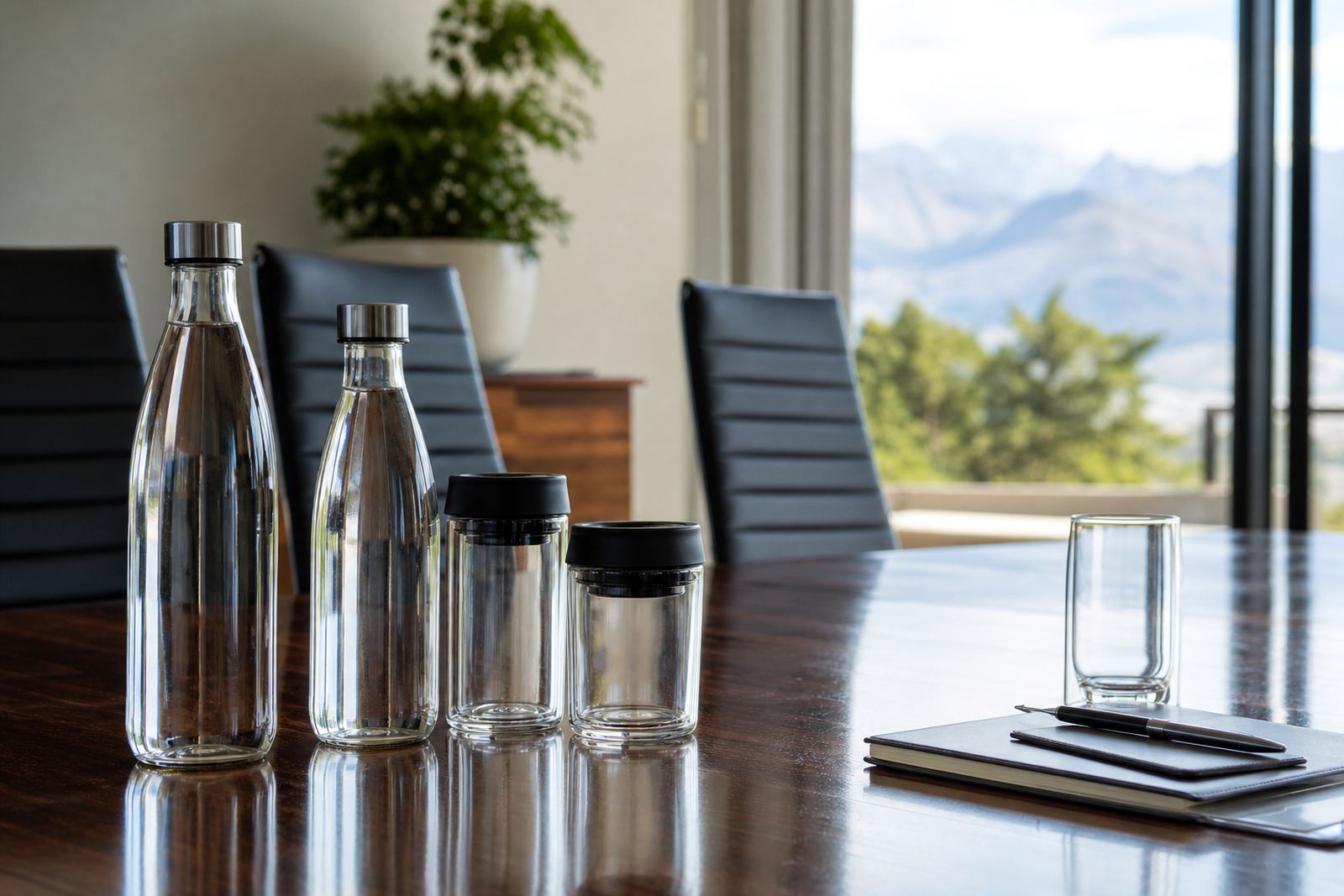
The job came from a corporate team in Sandton that wanted bottled water for meetings, reception trays and visitor hospitality. The bottles had to look tidy at close range, sit well beside glassware and fit a serious boardroom setting without looking noisy or promotional.
The client wanted a short run rather than warehouse volume, and the artwork had to stay readable on a small print area. We worked through the layout on the bottle shape, checked where the logo would sit against the curve, and kept the label and print space clear around the text so the name did not feel cramped.
Because these bottles were for repeated use in meeting rooms, the finish also needed to hold its look across handling, chilling and table presentation. The final spec leaned toward a clean white background, crisp dark text and a single colour accent that matched the corporate stationery.
- Use case: boardroom meetings, reception and visitor hospitality
- Run size: short run for office use
- Look and feel: restrained, clear and formal
Material choice for a polished table presence
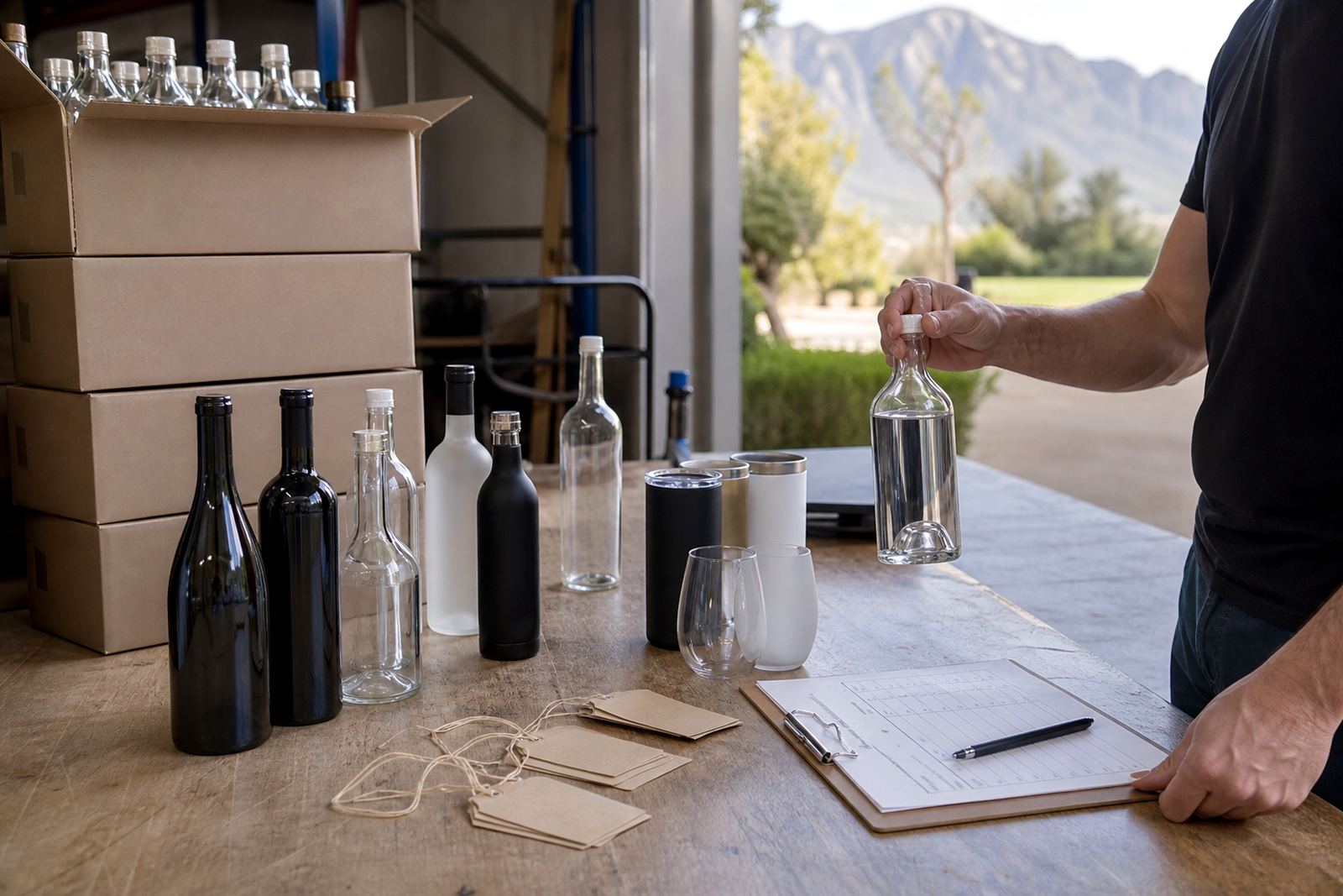
For this run we matched the decoration method to the bottle surface rather than forcing one method onto every item. On glass bottles, UV direct print gives sharp detail and works well for shorter quantities when artwork needs fine edges. Labels suit jobs where the client wants more space for copy, branding or compliance text. Screen printing suits repeat use where the artwork stays simple and the bottle shape allows a stable print area.
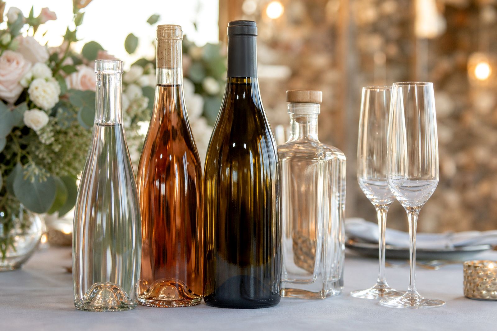
We also looked at the type of drinkware that would sit alongside the bottles. The office wanted a coordinated table set, so the same visual language was carried through to clear glass bottles and simple water glasses used in meetings. Where a bottle has a tighter curve or a smaller panel, white ink layers help the colour stay visible and stop the artwork from sinking into the glass tone.
That sort of planning matters in Sandton, where the setting is often close and formal. A bottle that looks fine in a mock-up can still lose clarity once it is sitting under meeting room lights or on a polished table, so the print area has to be measured properly before production starts.
- Decoration methods used or discussed: UV direct print, screen printing and labels
- Surface planning included white ink layering where needed
- Suitable for glass water bottles and matching drinkware
Artwork checks before the first bottle moved forward
The artwork stage was handled carefully because small bottle work leaves little space for error. Our team checked logo placement, spacing around text, colour balance and the amount of detail that would survive on a compact surface. The client supplied brand elements, then we arranged the print area so the main mark stayed central and easy to read from across a meeting table.
Mock-up visuals helped the client see how the bottles would read once filled and placed in groups. We prepared proof images that showed the front view and the key side angles, then adjusted the layout where the bottle curve tightened the logo more than expected. That kind of proofing saves trouble on short runs, especially where every unit is visible to visitors.
Artwork setup also covered line thickness and small text. Thin lines can disappear on curved glass, and pale colours can wash out if the surface is not prepared properly. In this case we kept the artwork firm, reduced excess detail and made sure the bottle decoration stayed neat from first glance to close inspection.
- Artwork checks covered placement, spacing and print legibility
- Mock-up visuals showed the bottle from more than one angle
- Proof approvals were completed before print preparation
The short run and the two week workflow
The job moved through a two week workflow from briefing to final packing. The first stage was confirming the bottle type, print method and artwork layout. After that, the proof set was approved and the print preparation files were locked in. Once the production side was ready, the bottles moved through the decoration stage, then inspection and packing for dispatch.
Short runs need discipline because there is less room to recover from a careless set-up. The print technician checked alignment on the test pieces, the artwork coordinator watched spacing, and the production manager kept the sequence tight so the run stayed consistent from the first bottle to the last. With bottle work, a steady hand matters more than speed, especially when the bottle curve pulls at the edges of the image.
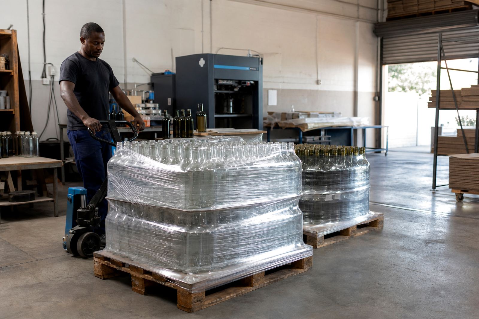
The packing brief also mattered here. Boardroom bottles need to arrive clean, lined up and ready for service, not rattling loosely in a box. We packed them so they could move into the office store room and then straight into meeting use without extra handling.
What the finished bottles delivered in the room
The final bottles gave the Sandton team a presentation piece that fitted the setting instead of fighting it. The branding sat cleanly on the glass, the colour held its place, and the bottles looked measured on the table next to cups, pads and folders. In a hospitality setting, that level of finish matters because the bottle needs to sit naturally in the room and support the overall table setup.
The client also needed a repeatable supply pattern for future meetings and visitor use. A bottle that works in one boardroom can fail in another if the label is too loud or the print is too small. Here the result was calm and practical, with enough brand presence to be noticed but not enough to crowd the table.
The project also showed why the right print method depends on quantity and surface. Some short runs suit direct print, while others are better handled with labels or enamel style decoration on glass. Matching the method to the bottle shape keeps the result sharper and reduces waste.
When the same office water setup is printed again
Bottle shape comes first, then the artwork layout is locked, and only after that do we move into print preparation for this kind of office water setup. That sequence keeps short-run work orderly and reduces mid-run changes. We would also keep the same habit of checking the bottle under the lighting it will face in the room, because boardroom presentation changes once the bottles are filled and set on a polished table.
For offices that want a coordinated hospitality set, the most useful extras are usually modest: a second proof view, a tighter check on white ink coverage, and careful packing so the bottles arrive clean and stable. When the brief is formal, less fuss often gives the better result.
Key facts
| Client type | Corporate office hospitality team in Sandton |
|---|---|
| Product | Branded water bottles for meetings and visitor service |
| Decoration method | UV direct print with label and screen print options |
| Bottle material | Glass water bottles with matching drinkware |
| Artwork support | Artwork checks, mock-up visuals and proof approvals |
| Timeline | Two week workflow from brief to packed dispatch |