A Brief Built For A Corporate Handover
A Johannesburg client in the corporate gifting space needed a compact bottle and drinkware set for an internal celebration. The order had to read well in photographs, look polished on a boardroom table and stay tidy in transit, with no loose pieces shifting inside the cartons. The product mix included branded glass bottles and matching drinkware, kept to a short run so the quantities matched the event plan without excess stock.
The artwork arrived with strong brand colours, small text and a few placement questions around the necks and body panels. We mapped the printable areas first, then checked how the artwork would sit on curved glass, clear glass and coated drinkware. That early planning matters on short runs because every millimetre on the wrap, label panel or print zone affects the final look.
- Client type: corporate gifting team in Johannesburg
- Project type: short-run bottle and drinkware set
- Delivery route: Paarl to Johannesburg
- Artwork focus: logo placement, small type and clean colour separation
Decoration Methods Kept Practical
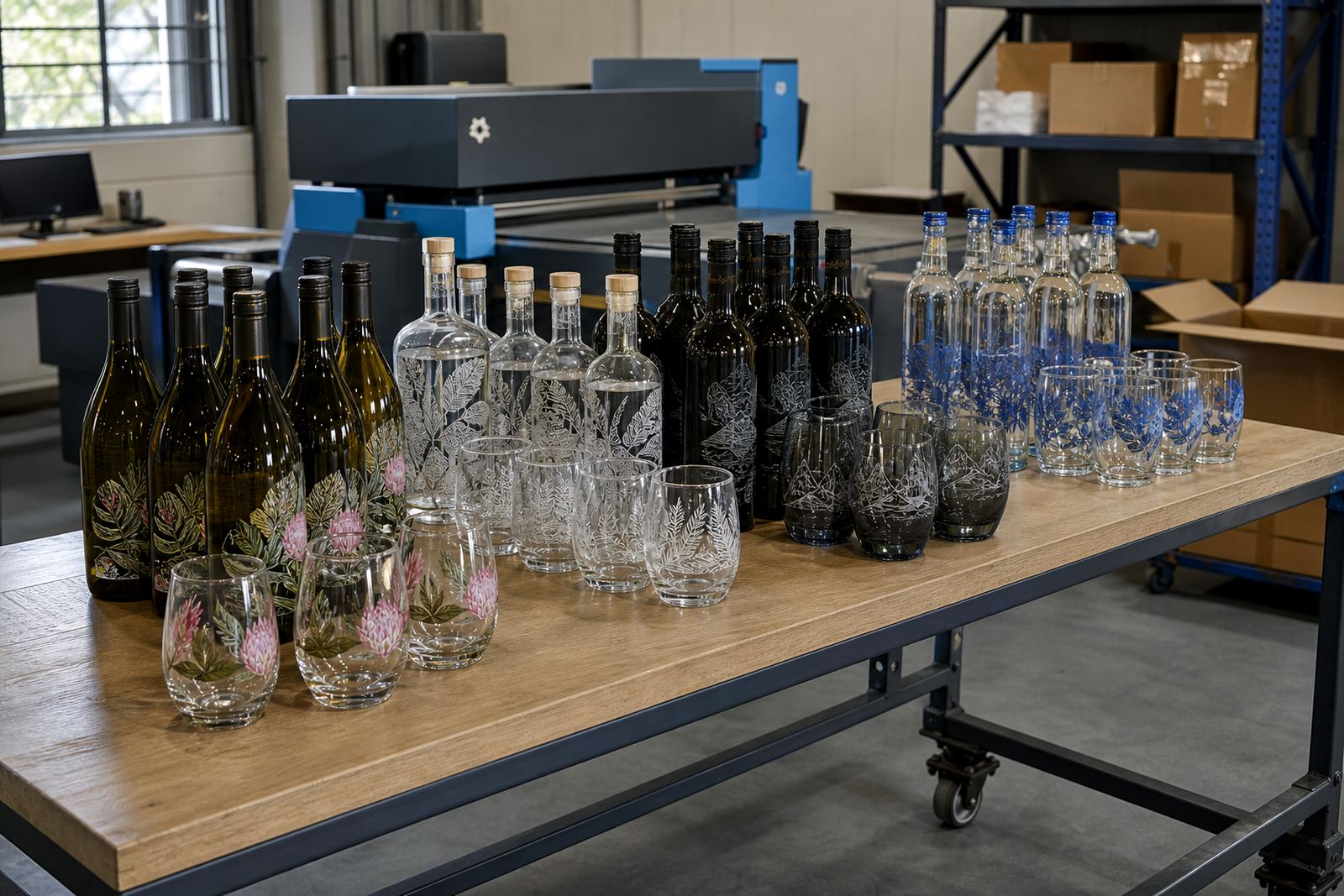
The set used more than one decoration method because different items asked for different handling. On the glass bottles, we looked at UV direct print for sharp branding on smooth surfaces, and label application where the shape or finish needed a more flexible approach. For drinkware, screen printing and ceramic enamel options were considered where the surface and use case called for a tougher mark or a more permanent fired finish.
White ink layers were checked where the client wanted stronger colour on dark or tinted glass. That step helps logos hold their own instead of disappearing into the bottle tone. It also makes fine text easier to read when the print area is narrow, which is often the case on wine-style bottles, slender gin shapes and smaller water bottles.
- UV direct print for crisp branding on glass
- Screen printing for controlled, repeatable artwork on drinkware
- Ceramic enamel for a more durable finished mark
- Labels where the bottle shape suited a wrapped or panelled finish
Artwork Proofs Before Anything Moved Forward
Proofing was handled before production, with a visual check for spacing, alignment and the way the artwork sat on each item. That is where small errors get caught, like text too close to a shoulder curve or a logo drifting into the seam area on a label. The proof stage also gives room for colour guidance, because ink or toner on glass behaves differently from what shows on a screen.
We prepared mock-up visuals for the bottle set and the drinkware set so the client could review placement before the run began. The artwork coordinator checked line weights, white underprint needs and any adjustments needed for small lettering. Where the artwork sat near a neck or side wall, we allowed the shape of the container to guide the final layout rather than forcing a flat design onto a curved product.
- Artwork check for spacing and legibility
- Mock-up visuals for bottle and drinkware placement
- Proof approvals before print preparation
- Colour guidance for glass and coated surfaces
Short-Run Packing For A Clean Johannesburg Arrival
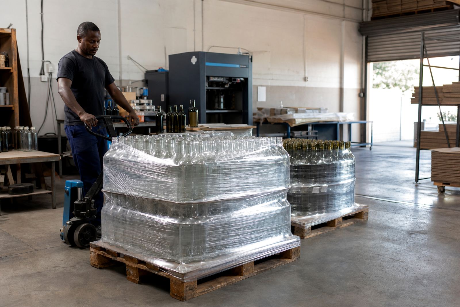
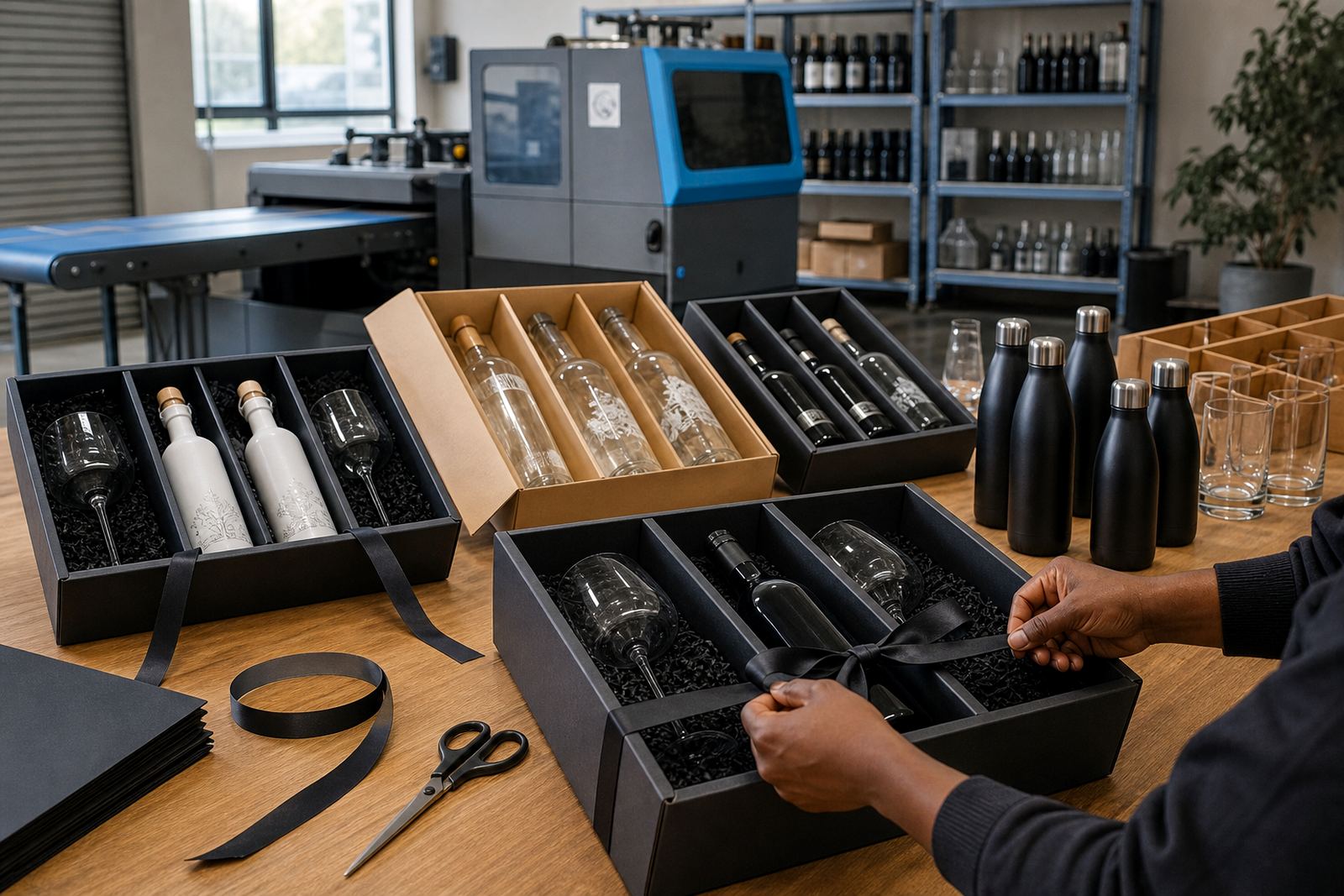
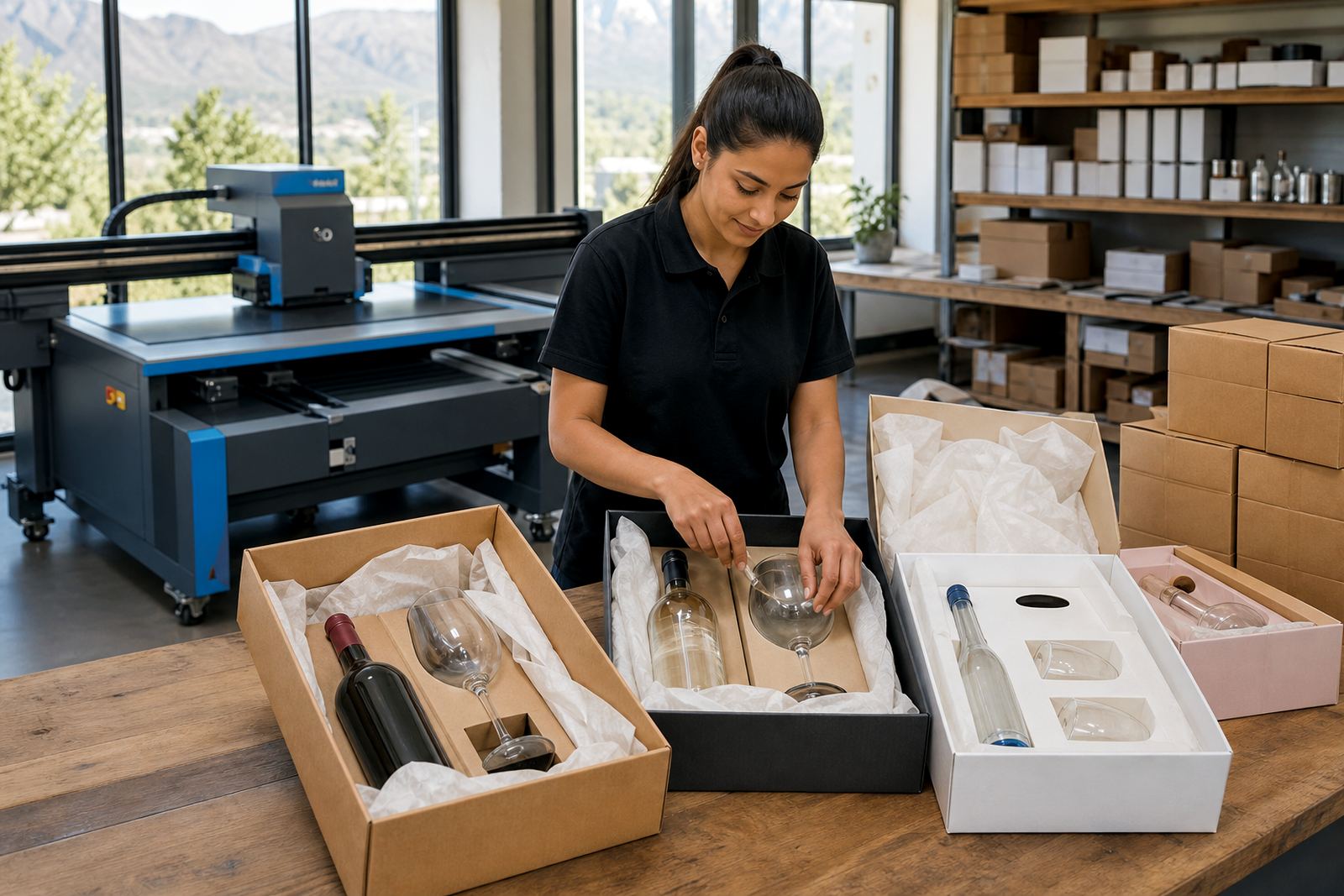
The run was packed as a neat gifting set, with each item counted, separated and protected for the road to Johannesburg. Short runs still need careful packing because a scuffed label or a chipped rim can spoil the presentation when the set is opened. We prepared the cartons with enough internal protection to hold the glass firmly without crowding the print surfaces.
Logistics were planned around the route from Paarl into Gauteng, then the delivery schedule into Johannesburg. The cartons were marked clearly so the receiving team could check quantities and group the sets without opening each pack one by one. That kind of packing note is useful on corporate gifting jobs, especially where the recipient needs tidy handover boxes for staff or guests.
- Pack count matched the confirmed short run
- Individual pieces were cushioned for transit
- Carton marking supported clean handover on arrival
- Delivery handled from the Cape Winelands to Johannesburg
Project Timing Across Three Weeks
The job moved through a three week production window, starting with artwork checks and print area planning, then moving into proofs and print preparation. The second week covered print setup, sample alignment and the decoration stage for the bottles and drinkware. The final week was set aside for packing, carton checks and delivery dispatch.
That timeline suited the brief because the client needed a measured run rather than volume. It also allowed enough time to confirm the label placement, check the line work and keep the finish consistent across each item in the set. Short runs work best when the artwork is settled early and the product mix is confirmed before decoration starts.
The finished sets arrived with a clean corporate look, matching the brief for a boardroom-friendly gifting pack. Logos stayed legible, the colours held together well across the mixed materials and the packaging kept the set in order for presentation. For a project like this, the result is not only how the print looks, but how the full handover feels when the cartons are opened.
What We Would Carry Into The Next Gifting Set
The strongest lessons from this project sat in the pre-production stage. Small-run gifting sets move more smoothly when the bottle shapes, drinkware type and print method are matched before proofing begins. It also helps to keep the artwork tidy from the start, with clear versions for labels, direct print and any white ink support.
For a Johannesburg gifting order, our process stays the same: confirm printable areas early, check artwork against the actual bottle or glass shape, and complete proofing before print setup. That keeps the decoration aligned with the item instead of forcing a one-size approach across mixed glassware. It also makes packing easier because every piece follows the same count and carton plan.
For corporate gifting, that practical flow matters. A short-run set should open neatly, read cleanly and arrive in a condition that suits a business handover. That was the standard for this project, and it is the standard we carry into bottle and drinkware runs for Johannesburg, Cape Town, Stellenbosch, Franschhoek and beyond.
Key facts
| Project type | Corporate gifting short run |
|---|---|
| Delivery area | Johannesburg |
| Base | Paarl, Cape Winelands |
| Decoration methods | UV direct print, screen printing, ceramic enamel, labels |
| Product mix | Branded wine style bottles, gin style bottles, water bottles and drinkware |
| Timeline | Three weeks from artwork check to dispatch |