The brief for a launch in Pretoria
The brief came from a Pretoria events team planning a launch with bottled drinks and coordinated glassware for guests, sponsors and VIP packs. They needed a short run with a neat branded finish, clear logo placement and no guesswork once the cartons were opened on site.
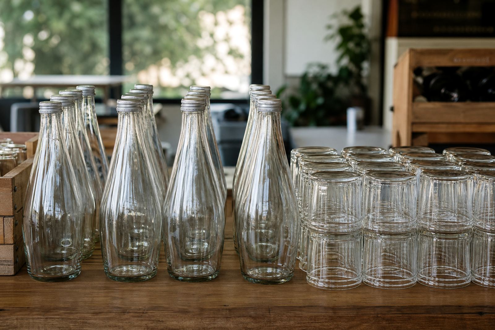
The main challenge was keeping the artwork readable on curved glass while working with mixed bottle shapes. Some units were for still water, some for gin style presentation and some for wine service at the venue, so the decoration had to suit different diameters and label panels.
- Project type: launch activation bottle run
- Town: Pretoria
- Use: on-site event service and gift packs
- Artwork stage: final proof sign-off before production
Print methods set against the bottle shapes
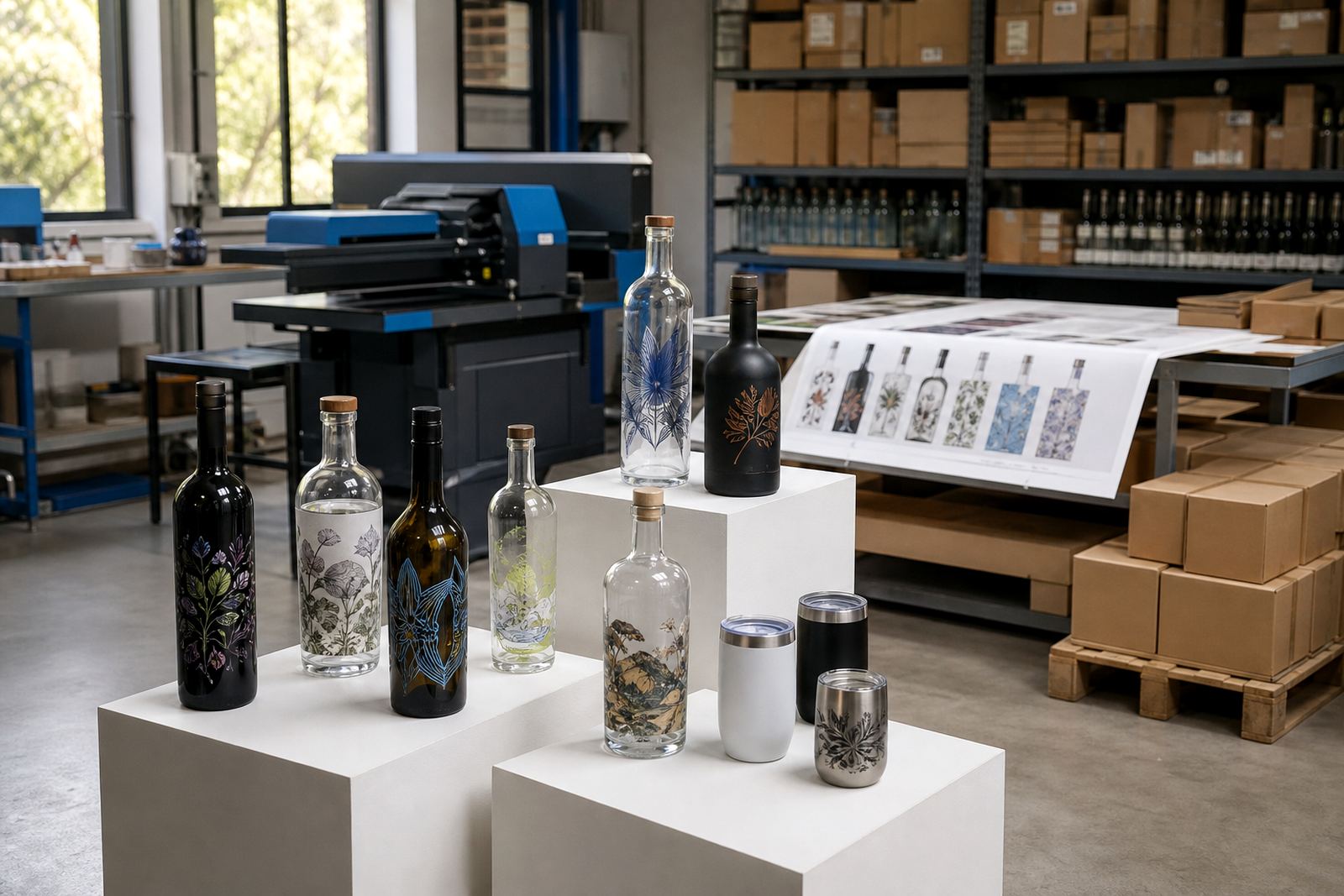
We mapped the print method to each item rather than forcing one process across the full order. For the glass bottles, UV direct print gave crisp detail on the more visible panels, while screen printing suited a solid single-colour mark on straighter sections. Where the client wanted a smoother premium finish for presentation pieces, ceramic enamel was the better fit.
Labels were included for a few items where the shape allowed more room for copy and fine detail. That gave the client a practical mix of decoration methods, and it also made the order easier to pack because each line item had its own production note.
- UV direct print for detailed logos and smaller runs
- Screen printing for bold blocks of colour
- Ceramic enamel for a harder wearing presentation finish
- Labels for flexible layouts and extra text
Artwork checks before the run
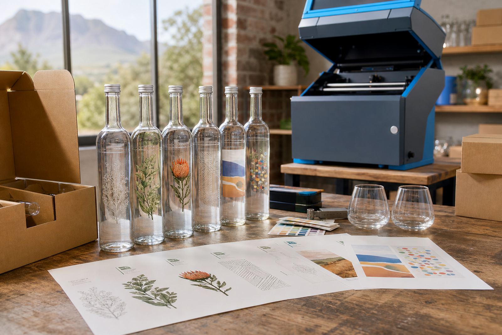
The artwork stage needed careful spacing around necks, shoulders and curve transitions. We checked the logo against the print area, adjusted key line weights and marked out where white ink was needed so the brand colour would hold properly on darker glass.
Because the bottles were going into an activation rather than a retail shelf, the client wanted the front view to carry most of the weight. We prepared mock-up visuals to show the logo on the actual bottle silhouette, then moved to proof approval once the placement felt right.
- Print area planning for curved glass and narrow panels
- White ink layers on darker bottle sections
- Proof approvals before production started
- Mock-up visuals for placement sign-off
Short-run production in the Cape Winelands
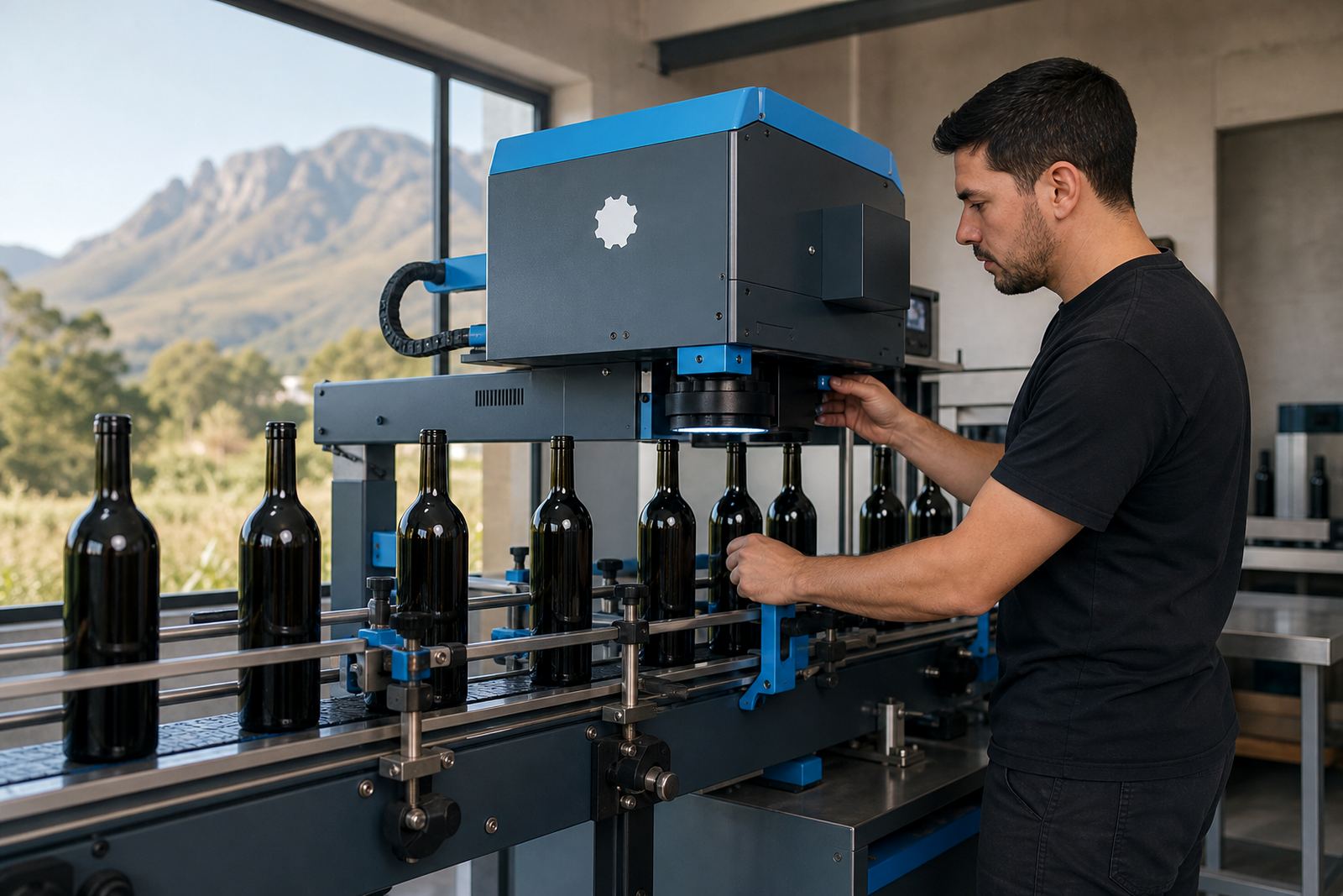
The job moved through production as a short run, which kept the order manageable for a launch with defined guest numbers. We set the prep for each decoration method separately, then packed the finished bottles and drinkware with the carton count checked against the run sheet.
From the initial brief to dispatch, the schedule spanned three weeks. The first stage covered artwork corrections and print setup, the middle stage covered proofing and method selection, and the final stage covered print, drying, packing and delivery coordination to Pretoria.
- Timeline: 3 weeks from brief to dispatch
- Production notes: separate prep for each bottle type
- Packing: count-checked cartons for event handover
- Delivery: sent to Pretoria for activation use
What the finished run solved
The completed bottles gave the event team a neat branded set that worked across bar tables, welcome packs and display areas. The mix of methods kept the visuals consistent without forcing every item into the same finish, and the proof stage meant the final look matched what the client approved.
For event work, that matters because the items move quickly from storage to display to guest use. The print needed to look steady under lights, survive handling and still read cleanly in photos, and this run did that without adding extra complexity at the venue.
How we would plan another launch run like this
For Pretoria launch runs, we use the same order structure: separate bottle types early, lock artwork scale before production, and set proof approval as the last gate before print. That approach cuts down on confusion when a run includes wine bottles, gin-style bottles and water bottles in one delivery.
We would also keep the packing brief tight, especially where the activation has split delivery points or a staged handover. In this case the cleanest result came from clear item naming, careful print-area notes and a plain production sequence that left little room for error.
- Separate bottle types before proofing
- Use one approved artwork set across all related items
- Keep packing notes aligned to the event layout
- Match decoration method to the bottle shape
Key facts
| Project | Pretoria launch bottle run |
|---|---|
| Town | Pretoria |
| Client type | Activation and events team |
| Items | Branded wine bottles, gin style bottles, water bottles and drinkware |
| Decoration methods | UV direct print, screen printing, ceramic enamel and labels |
| Timeline | 3 weeks |
| Proof stage | Final proof sign-off before production |
| Delivery | To Pretoria with South African delivery support |