Launch brief from Cape Town's event floor
The order came from a Cape Town event organiser working on a hosted launch with mixed drinks service, welcome gifts and a few display pieces for the venue entrance. The brief covered wine bottles for the table settings, gin bottles for gifting, and branded glasses for service, all carrying the same event look without feeling overdone.
The client needed short runs rather than full commercial volumes, with each item holding consistent artwork placement across different bottle shapes and glass sizes. The venue had a polished setting and strong lighting, so label edges, print alignment and surface prep all mattered. We also had to keep the packing tidy for separate drop points on site, because the items were being used in more than one area of the programme.
Materials, shapes and decoration choices
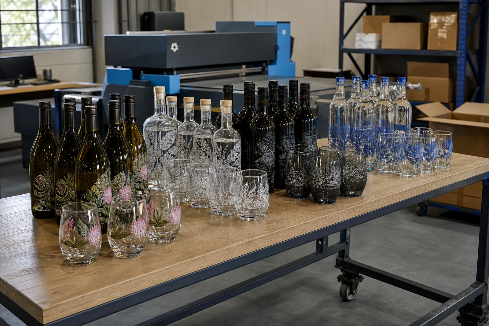
We matched the decoration method to each substrate rather than forcing one method across everything. For glass bottles, UV direct print worked well on selected items where the artwork needed a crisp finish on a smooth surface. For other bottles and drinkware, screen printing gave solid coverage and a steady repeat across short runs. Ceramic enamel was part of the planning for heat-set drinkware where a more durable fired finish was needed. Labels were used where the shape or finish of the bottle called for a different approach.
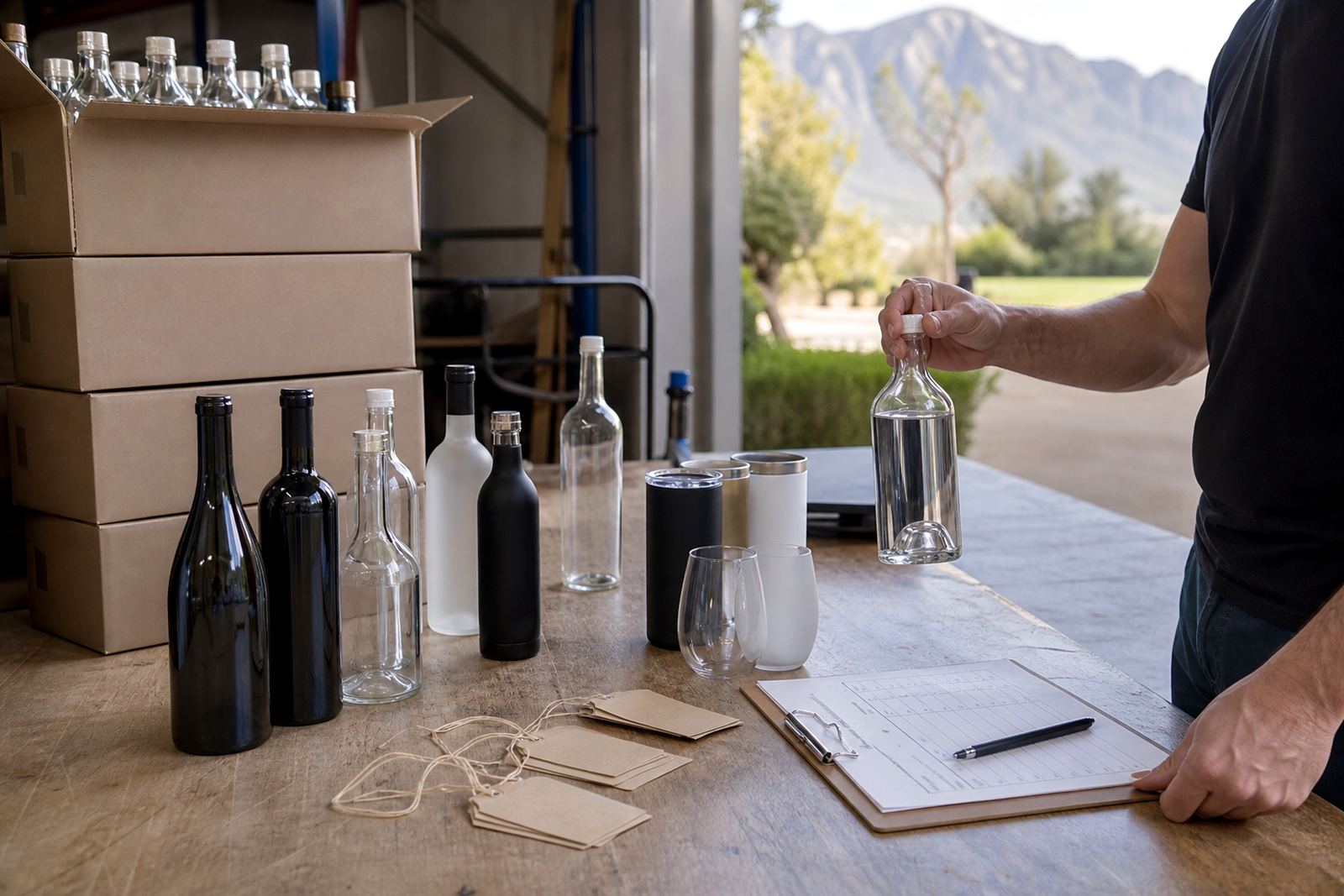
The job included a mix of wine bottles, gin bottles and clear drinkware in the usual event sizes, with surface finish reviewed before print. White ink layers were planned where dark glass or tinted material would have swallowed fine details. Artwork checks covered line thickness, small text, barcode-free event copy and any fine borders that might shift on curved surfaces.
- Glass wine bottles with event branding for table and display use
- Gin bottles for host gifting and takeaway presentation
- Branded glasses for service and photo moments
- Labels for bottle shapes that needed flexible placement
- White ink underprint on darker surfaces where needed
Proofs, mock-ups and print area planning
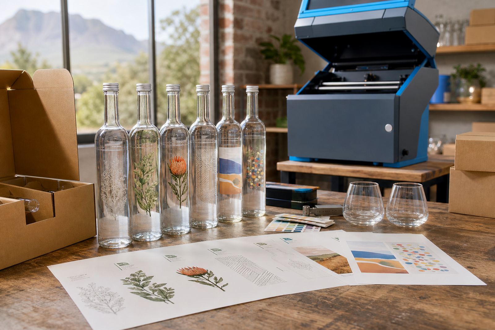
Before anything went into production, we prepared artwork proofs and mock-up visuals so the team could review the layout on each item type. That step mattered because the same logo behaves differently on a tall wine bottle, a short gin bottle and a rounded glass. Small changes in label size or print area can mean a neat finish instead of a crowded one.
We checked the live area on each bottle, marked the safe zones and planned the visible face for the venue. The artwork coordinator set up the files, then the print technician and production manager reviewed ink laydown, registration and spacing. Where the wording sat close to the curve of the glass, we reduced the risk of distortion by adjusting placement rather than pushing the design too far over the bend.
- Artwork setup for multiple bottle and glass formats
- Print area planning for curved surfaces and label edges
- Colour guidance for dark, clear and tinted substrates
- Proof approvals before any run moved forward
Short-run production in two weeks
From final artwork sign-off to packed dispatch, the schedule took two weeks. The first part of the work covered proofing, file adjustment and print prep for the different decoration methods. Once the artwork was locked, the production team handled the bottle and glass runs in sequence so each item type could be checked on its own surface before packing.
Short runs need close control because there is less room for waste if something shifts in placement or finish. The production side kept each batch separate, which made it easier to watch curing, alignment and label consistency. Packing briefs were written per group, so the bottles and drinkware could be sorted for venue use without extra sorting on site.
Transport into Cape Town required careful boxing and spacing, particularly for glass items that had to arrive clean and unchipped. The logistics lead arranged the load for direct handover, with the different cartons marked for bar, gift table and display use. That kept the unpacking process straightforward for the event crew.
What the final order needed to do on site
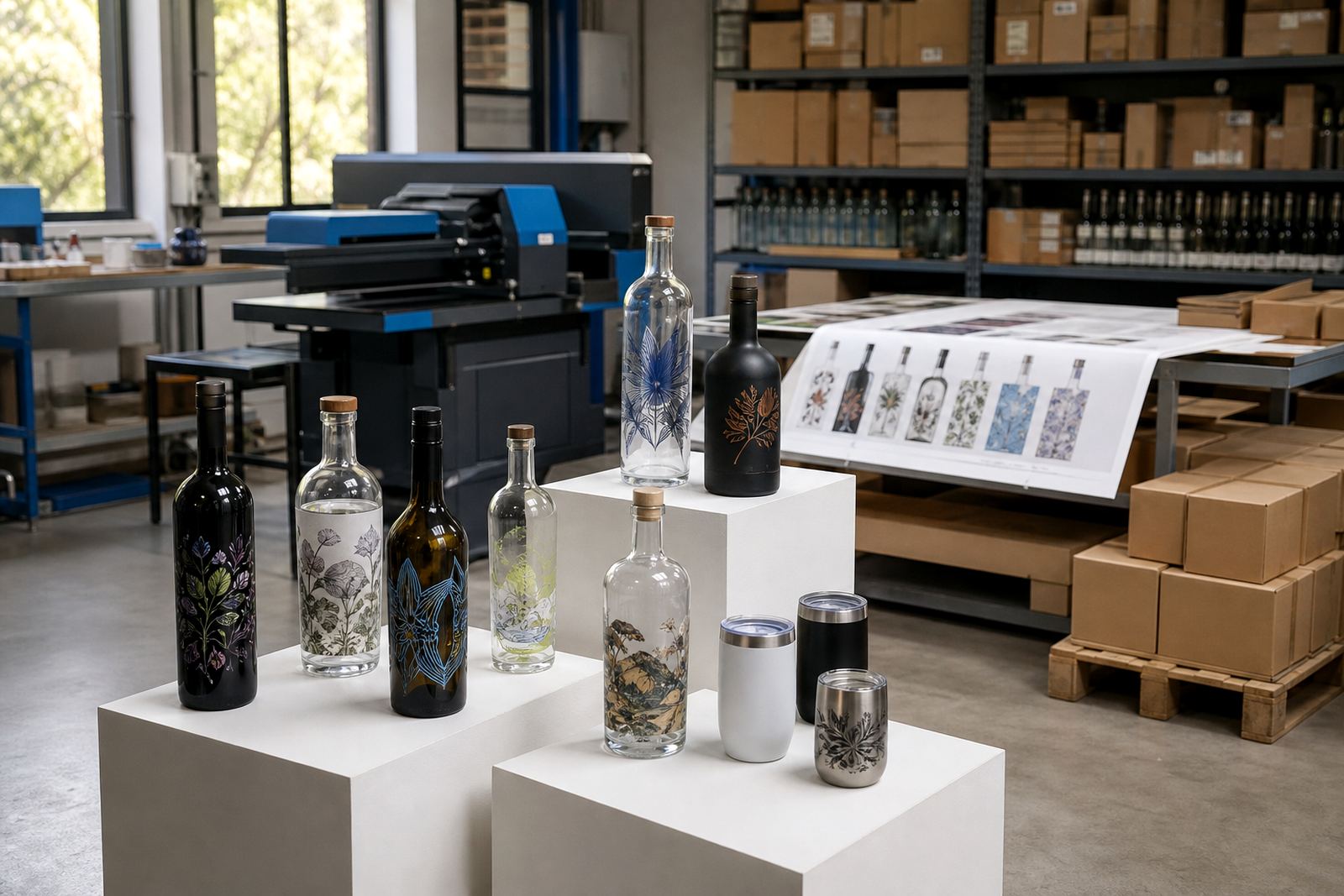
The finished pieces had to look coherent together even though they were produced on different materials. The bottles were for visual presence, while the glasses had to hold branding without getting in the way of service. On an event floor, pieces that look good in the box can still fail if the print sits too close to a lip, handle or seam. This order avoided that by keeping each placement practical and tested.
There was also a presentation point to consider. The client wanted the branding visible in photos, but not so dominant that it fought with the venue styling. That balance came from choosing clean artwork, moderate coverage and the right print method for each item. The result was a set that looked ordered across the room, and still worked under real use conditions.
- Consistent artwork across bottles and glassware
- Clean edges and readable branding under event lighting
- Items packed for separate use zones on site
- Low-risk handling for transport and setup
What we would set up for a Cape Town launch
For a Cape Town launch, we would follow the same order of proofing, print area planning and split packing. That process gave the client control over the final look before production started, and it reduced the chance of awkward placement on curved glass. For mixed bottle and glass orders, the method mix matters more than forcing one decoration route onto every item.
We would also keep the communication between artwork, production and logistics tight from the start. When the event involves bottles, glasses and multiple service zones, the small things matter: carton labels, item counts, and the face of the print on each piece. That is what makes a short run useful on the day rather than just neat in the workshop.
If the next brief includes more than one bottle shape, we would again separate the artwork checks by substrate. That keeps the brand look steady while allowing each item to suit its own surface and use.
Key facts
| Project | Cape Town event run for a hosted launch |
|---|---|
| Client type | Event organiser |
| Town | Cape Town |
| Products | Branded wine bottles, gin bottles and glasses |
| Decoration methods | UV direct print, screen printing, ceramic enamel, labels |
| Timeline | Two weeks from proof approval to dispatch |